In a world filled with logos competing for our attention, it’s clear that the power of these little symbols is no joke. From the golden arches of McDonald’s to the bitten apple of Apple, logos have the ability to build strong brand strategies that stick in our minds like a catchy jingle. So grab your magnifying glass and get ready to dive into the wild world of logos, where even the smallest design can leave a big impression.
The Role of Logos in Brand Recognition
Logos are like the karaoke singers of the branding world. They belt out the name of a company with such gusto that you can’t help but recognize them wherever you go. Just like that friend who always sings “Don’t Stop Believin'” after a few too many drinks, logos stick in your brain whether you want them to or not.
Think of iconic logos like the Golden Arches or the swoosh – they’re like the celebrities of the branding world. Everyone knows who they are, even if they’ve never actually met them in person. It’s like they’re constantly hosting a red carpet event in your brain, complete with paparazzi and screaming fans.
Having a strong logo is like having a secret identity. It’s your brand’s way of putting on a cape and mask and swooping in to save the day. When you see that familiar symbol, you know that help (or a delicious cheeseburger) is on the way. It’s like having your own personal superhero, but with less spandex and more color swatches.
So next time you see a logo out in the wild, give it a little nod of recognition. It’s like saying, ”Hey, I see you doing your thing and I appreciate it.” Who knows, maybe that logo will give you a little wink in return. Just don’t expect it to break out into song – unless it’s the jingle for that catchy commercial you can’t get out of your head.

Creating a Lasting Impression with a Strong Logo
Your logo is like your brand’s flashy outfit that everyone sees at a party – it’s got to make a lasting impression! You want people to remember your brand like they remember that embarrassing dance move you tried to pull off at said party. Here are some tips on how to create a logo that will stick in people’s minds like a catchy tune.
First things first, keep it simple. Your logo shouldn’t look like a toddler’s scribbles after a sugar rush. Think of some of the most iconic logos out there – Nike, Apple, McDonald’s. What do they all have in common? They’re simple, yet memorable. Your logo should be like a haiku – short, sweet, and leaves a lasting impact.
Color is key, my friend. Pick colors that not only reflect your brand but also evoke certain emotions in people. Red for passion, blue for trust, or green for environmental friendliness. Just make sure your logo doesn’t end up looking like an explosion in a Skittles factory.
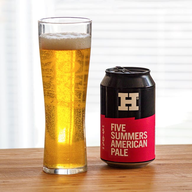
Don’t forget about versatility! Your logo should look good on a billboard, a business card, or even a tiny social media icon. Make sure it’s scalable and works in both color and black and white. You don’t want your logo to look like a blurry mess when someone tries to shrink it down to fit on a tiny screen.

The Influence of Logos on Consumer Perception
Logos, logos, logos. They’re everywhere we look. From the golden arches of McDonald’s to the swoosh of Nike, these little symbols have a big impact on our perception as consumers. But just how much influence do they really have?
Well, let me tell you, dear reader. Logos can make or break a product in the eyes of the consumer. Think about it – would you trust a skincare product with a poorly designed logo? Probably not. But slap a sleek, modern logo on that same bottle, and suddenly you’re reaching for your wallet faster than you can say “moisturize me, baby.”
So what is it about logos that has such a powerful effect on us? Is it the colors, the shapes, the fonts? The answer is yes, yes, and yes. Logos are carefully crafted to convey a certain message to consumers, whether it’s “trust us, we’re reliable” or “buy this or you’ll never be cool.” And let me tell you, they’re pretty damn good at their job.
Next time you’re out shopping, take a look around and pay attention to the logos you see. Notice how they make you feel, what they make you think. You might just be surprised at how much those little symbols can influence your perception as a consumer. Or maybe you won’t be surprised at all. Who knows? Life is full of mysteries, my friend.
 Credibility through Brand Identity”>
Building Trust and Credibility through Brand Identity
Picture this: you’re walking down the street, minding your own business, when suddenly a tall, handsome stranger approaches you and offers you a free sample of their latest product. Do you take it? Of course not! That’s stranger danger 101. But what if that same stranger was wearing a t-shirt with a familiar logo, or handing out samples with a well-known brand name on it? Suddenly, your defenses go down, and you’re more likely to trust them. That’s the power of brand identity.
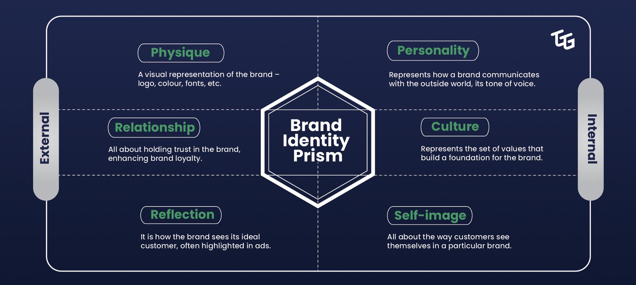
is like creating a secret handshake with your customers. It’s all about making them feel like they belong to something bigger, something special. When they see your logo, your colors, your fonts, they know exactly what to expect. It’s like seeing an old friend in a crowd of strangers – comforting and familiar.
Think about it: would you trust a lawyer who showed up to court in sweatpants and a tank top? Probably not. But if that same lawyer showed up in a sharp suit with a gold embossed business card, you’d be much more likely to take them seriously. That’s the power of brand image. It’s not just about looking good – it’s about commanding respect, building credibility, and ultimately, winning over your customers.
So, next time you’re thinking about revamping your brand identity, remember this: it’s not just about slapping a logo on a t-shirt and calling it a day. It’s about creating an emotional connection with your audience, establishing yourself as a trustworthy authority, and ultimately, standing out in a sea of competitors. So go ahead, embrace your brand identity, and watch as trust and credibility follow suit.

Enhancing Brand Loyalty with a Memorable Logo
So, you want to enhance your brand loyalty with a memorable logo, huh? Well, you’ve come to the right place. Let me tell you, a logo is like the face of your brand – it’s the first thing people see and it better be memorable if you want them to keep coming back for more.
First things first, your logo has to be unique. I mean, you don’t want people confusing your brand with your competitors, do you? So, think outside the box and come up with something that really stands out. Maybe add a splash of color or a quirky design that’ll make people go, “Wow, that’s cool!”
Next, keep it simple. I mean, nobody wants to stare at a logo for hours trying to figure out what it’s supposed to represent. Keep it clean, keep it sleek, and keep it easy to remember. Trust me, people have short attention spans these days – they’ll thank you for it. Plus, a simple logo means you can easily slap it on all your merchandise and marketing materials without it looking cluttered or overwhelming.
Lastly, don’t be afraid to get a little weird with it. Think about some of the most iconic logos out there – Apple, Nike, McDonald’s. They all have one thing in common: they’re unique, they’re simple, and they’re a little quirky. So, go ahead, embrace your weirdness and come up with a logo that’ll make people say, “Hey, that’s awesome!”
Strategies for Designing an Effective Logo for Your Brand
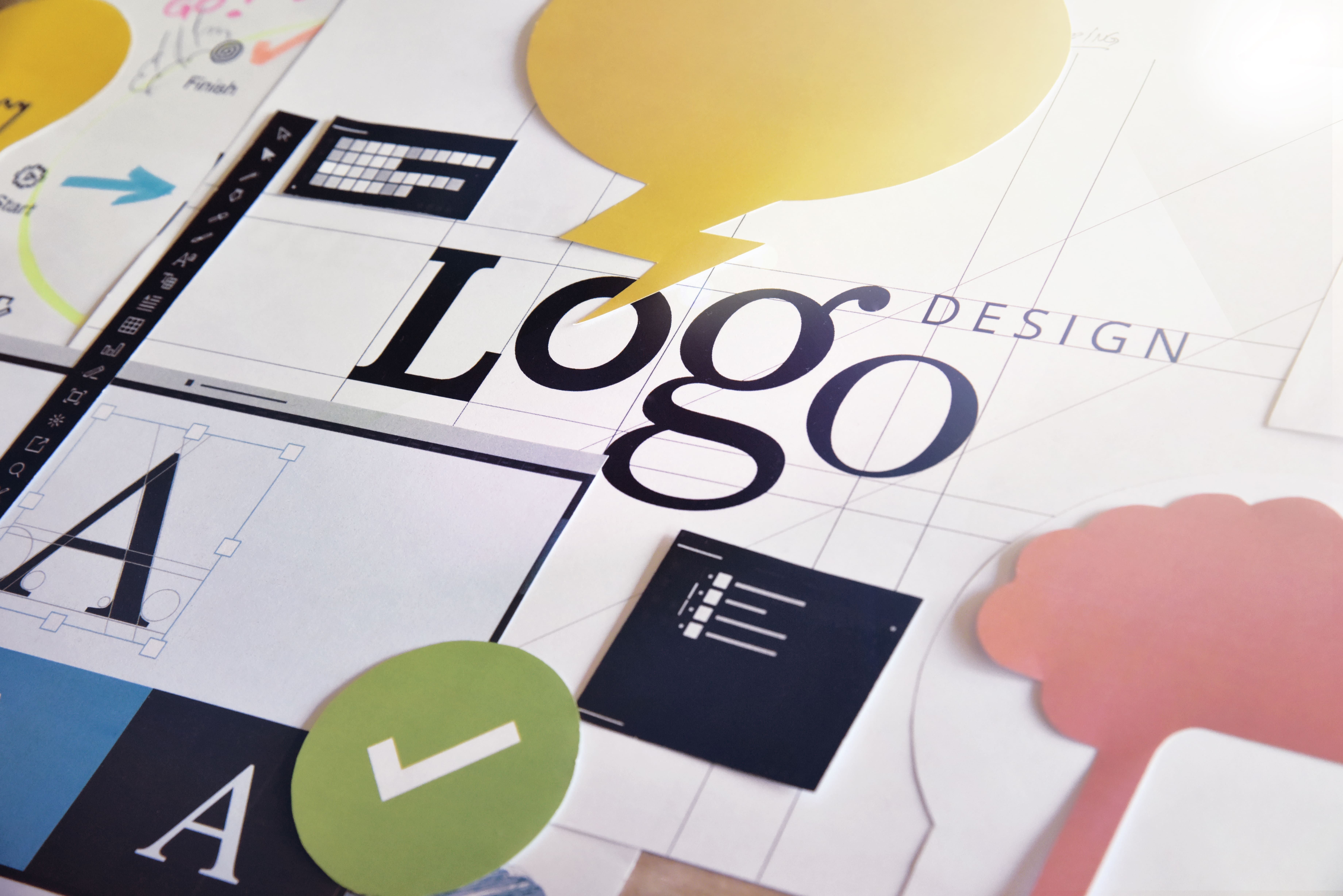
Looking to create a logo that will make your brand stand out in a sea of competition? Well, you’ve come to the right place! I mean, you could just throw a bunch of clip art together and call it a day, but let’s be real, that’s not going to do much for your brand. Here are a few strategies to keep in mind when designing your logo:
Keep it simple: Your logo should be easily recognizable and memorable. You don’t want potential customers to have to squint and tilt their heads just to figure out what your logo is supposed to represent.
Consider the color scheme: Colors can evoke different emotions and convey different messages. Make sure the colors you choose align with the personality of your brand. And please, for the love of all things design, stay away from Comic Sans.
Make it versatile: Your logo should look good on everything from business cards to billboards. It should be scalable, so it doesn’t lose its impact when resized. Plus, you never know when you might want to slap your logo on a custom-branded toaster or something.
Utilizing Logos for Successful Brand Positioning
Brand positioning is key in establishing a business identity and connecting with customers. One powerful tool in achieving this is utilizing logos effectively. Logos are the face of a brand, and they can communicate a lot without saying a word. Here are some tips on how to leverage logos for successful brand positioning:
**Keep it simple:** A cluttered logo is like that annoying friend who talks too much – nobody wants to deal with it! A simple and clean logo design is more likely to be memorable and easily recognizable. Think of iconic logos like Apple or Nike – simple yet effective in leaving a lasting impression.
**Be versatile:** Your logo should be able to adapt to different mediums and sizes without losing its impact. Whether it’s on a billboard or a business card, make sure your logo looks good no matter where it’s displayed. Versatility is the key to staying relevant in an ever-changing digital landscape.
**Tell a story:** A logo should not only be visually appealing but also convey the essence of your brand. Think about what message you want to communicate to your customers and incorporate that into your logo design. A great logo tells a story and leaves a lasting impression on your audience.
**Stay consistent:** Brand consistency is key in building trust and credibility with your audience. Make sure your logo is displayed consistently across all platforms and marketing materials. Consistency breeds familiarity, and familiarity breeds loyalty. Keep your logo front and center in all your branding efforts to position your brand for success.
FAQs
Why are logos important for a brand’s strategy?
Well, without a logo, your brand would just be like a rudderless ship lost at sea – adrift and without direction. Logos provide a visual representation of your brand’s identity, helping to communicate who you are and what you stand for in a quick and memorable way.
How can a logo help a brand stand out from the competition?
Think of your logo as your brand’s superhero cape – it’s what makes you instantly recognizable in a sea of ordinary mortals. A well-designed logo can help you differentiate yourself from your competitors and leave a lasting impression on your target audience.
What makes a good logo design?
A good logo design is like a good joke - simple, clever, and memorable. It should be visually appealing, easy to recognize, and relevant to your brand’s identity. Remember, you want your logo to be like a good sidekick – always there to support and elevate your brand.
How can a logo help with brand loyalty?
Think of your logo as the secret handshake that only your loyal fans know. A strong, well-designed logo can create an emotional connection with your audience, evoking feelings of trust, familiarity, and loyalty. It’s like a warm hug from your brand every time they see it.
Can a logo evolve over time, or should it stay the same?
Just like a superhero’s costume gets updated for the modern age, your logo can evolve over time to stay relevant and fresh. However, it’s important to maintain some elements of consistency to ensure that your audience still recognizes and connects with your brand. So, tweak your logo like a brilliant plot twist – surprising, but still true to the original story.
In Conclusion, Rock on with Your Logo On
Thanks for diving into the world of logos with us! Remember, a logo isn’t just a pretty picture – it’s a superhero cape for your brand. So go forth, embrace the power of your logo, and watch your brand strategy soar to new heights. And hey, if all else fails, just stick a logo on it and call it a day. After all, who needs substance when you’ve got style, am I right? 😉


