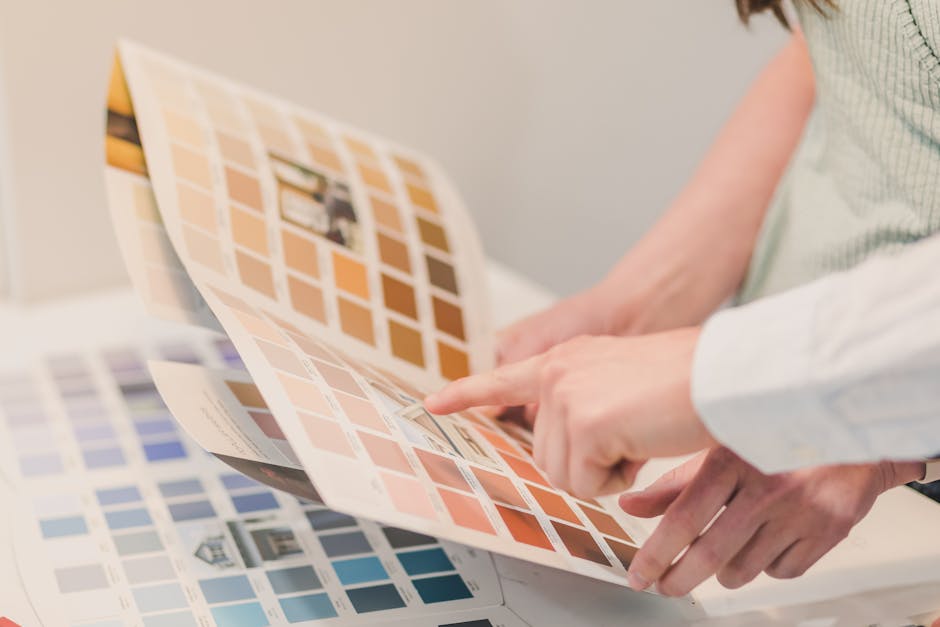
In the magical world of logo design, colors wield a power like no other. They can make a brand pop with vibrancy or fall flat like a soggy pancake. Choosing the right hues is crucial, like picking the perfect shade of lipstick to match your fabulous shoes. So buckle up, dear reader, as we dive headfirst into the rainbow-hued wonderland of logo design and explore the importance of choosing wisely. Let’s paint the town red… or blue… or maybe even chartreuse.
Understanding the Psychology of Color
Colors are more than just pretty hues on a canvas or shades on a spectrum. They actually have a deep psychological impact on the way we feel and behave. It’s like a rainbow ninja, sneaking into our brains and pulling all the strings.
For example, blue is often associated with feelings of calm and tranquility. It’s like a refreshing dip in a cool pool on a hot summer day. Meanwhile, red is like a bull in a china shop, evoking passion, energy, and sometimes even anger. It’s like a spicy chili pepper in a sea of bland mashed potatoes.
But wait, there’s more! Yellow is like a burst of sunshine, bringing joy and optimism to the party. It’s like a lemonade stand on a scorching day, quenching your thirst and lifting your spirits. And let’s not forget green, the color of nature and harmony. It’s like a serene forest bath, washing away your worries and filling you with peace.
So next time you’re feeling blue, maybe all you need is a splash of yellow or a touch of green to turn your frown upside down. Just remember, colors are more than meets the eye – they’re like emotional ninjas playing tricks on your mind and soul.
The Impact of Color on Brand Perception
Think about it – when you see a bright red can of soda, you immediately think of Coca-Cola. And when you see a sleek silver Apple product, you can practically taste the innovation. That’s the power of color in branding!
Colors can evoke specific emotions and associations in consumers’ minds. Just like how yellow can make you feel cheery and optimistic (cue the McDonald’s golden arches), or how black can convey sophistication and luxury (hello, Chanel).
Choosing the right color for your brand is crucial because it can greatly influence how people perceive your products or services. Here are a few ways in which color can impact brand perception:
- Memorability: Just like a catchy jingle, a unique color scheme can make your brand unforgettable. Stand out from the competition with a bold color choice!
- Trustworthiness: Certain colors, like blue, can convey reliability and trustworthiness. Build credibility with a trustworthy color palette.
- Emotional connection: Use warm colors like red or orange to evoke feelings of excitement and passion. Connect with your audience on a deeper emotional level!

Choosing the Right Color Palette for Your Logo
When it comes to choosing the perfect color palette for your logo, it’s no joke. You can’t just slap on any old colors and call it a day. Your logo is the face of your brand, the first thing people see when they look at your company. So, you better make sure you get those colors just right.
Here are a few tips to help you nail that color palette:
- Consider your target audience. Are they more into earth tones or neon colors? Are they sophisticated or playful? Think about what will resonate with them.
- Look at your competition. You don’t want to blend in with the crowd, but you also don’t want to stick out like a sore thumb. Find a balance that sets you apart while still fitting in with your industry.
- Don’t be afraid to get a little quirky. Sometimes the best logos are the ones that break the rules. Be bold, be daring, be unexpected.
Remember, when it comes to color, the possibilities are endless. So, have some fun with it! Experiment, play around, mix and match until you find that perfect color palette that truly represents your brand.

Color Combinations That Work Well Together
When it comes to color combinations, it’s important to find ones that work well together to avoid any fashion faux pas or design disasters. Here are some winning color combos that are sure to make a statement:
- Blue and Orange: This bold pairing is like a sunset on the ocean – vibrant and eye-catching. Mix and match different shades of blue and orange to create a dynamic look that will turn heads wherever you go.
- Pink and Green: Channel your inner preppy with this classic color combo. Think Lilly Pulitzer meets watermelon – it’s fun, fresh, and oh-so chic. Whether you’re wearing it in your wardrobe or incorporating it into your home decor, pink and green are a match made in color heaven.
- Black and White: The yin and yang of color combinations, black and white are a timeless duo that never goes out of style. From formal wear to minimalist decor, this classic pairing exudes sophistication and elegance. Plus, you’ll always look effortlessly chic in black and white.
Remember, when it comes to mixing and matching colors, the key is to have fun and experiment. Don’t be afraid to step out of your comfort zone and try new combinations - you never know what unexpected pairings might just become your new favorites. So go ahead, play with color and let your creativity shine!

Avoiding Common Mistakes in Color Selection
Selecting the perfect color palette can be a daunting task, but fear not, dear readers! I’m here to guide you through the treacherous waters of color selection and help you avoid some common mistakes that many people make. So, grab your paintbrushes and let’s dive right in!
First and foremost, **avoid choosing colors solely based on trends**. Just because millennial pink is all the rage right now doesn’t mean it will still be in style next year. Instead, focus on selecting colors that you genuinely love and that make you happy. After all, you’re the one who has to live with the color scheme, not the interior design gods.
Another mistake to steer clear of is **ignoring the lighting in your space**. Natural and artificial lighting can greatly affect the way a color looks in a room, so be sure to test out your chosen hues in different lighting conditions before committing to a color. You don’t want to end up with a room that looks like a neon nightmare once the sun goes down.
Lastly, **don’t be afraid to go bold**! While it’s important to consider the overall aesthetic of your space, don’t be afraid to inject some personality with vibrant pops of color. Life’s too short for beige walls and neutral furniture. Let your true colors shine through!
Making Your Logo Stand Out with Strategic Color Choices
So, you’ve finally decided to tackle the daunting task of creating a logo for your business. Congratulations! Now comes the fun part – choosing the perfect colors to make your logo pop. With strategic color choices, you can ensure that your logo stands out from the crowd and leaves a lasting impression on your audience.
Here are a few tips to help you make your logo shine:
- Know Your Audience: Before diving into color selection, make sure you have a clear understanding of your target demographic. Are you targeting millennials who love bright, bold colors? Or maybe a more sophisticated audience who appreciates muted tones?
- Stick to a Palette: While it may be tempting to use every color of the rainbow in your logo, less is often more. Choose a primary color and a couple of accent colors to keep your design cohesive and visually appealing.
- Consider Color Psychology: Different colors evoke different emotions in people. For example, blue is often associated with trust and reliability, while red can convey passion and energy. Think about what message you want your logo to send and choose your colors accordingly.
By following these simple tips and making strategic color choices, you can create a logo that not only stands out but also resonates with your target audience. So go ahead, unleash your inner color enthusiast and bring your logo to life!
FAQs
What role does color play in logo design?
Color in logo design plays a crucial role in conveying the brand message, evoking emotions, and attracting the target audience. It can make or break a logo’s effectiveness in capturing attention and leaving a lasting impression.
How do I choose the right color for my logo?
Choosing the right color for your logo involves considering your brand’s personality, target audience, industry standards, and the emotions you want to evoke. Remember, a color that looks good on Instagram might not look so hot on a billboard.
Can I use multiple colors in my logo?
Absolutely! Using multiple colors in a logo can add depth and complexity, but be sure to keep it balanced and cohesive. Just like a good sandwich, too many colors can overwhelm the senses.
What if I’m not sure about which color to choose?
If you’re unsure about which color to choose for your logo, consider consulting with a professional graphic designer who can help narrow down the options based on your brand’s needs and goals. Or you can always resort to the old coin-flip method, but we can’t promise the best results.
Are there any colors I should avoid in logo design?
Avoid using colors that clash or are difficult to read, as well as colors that have negative connotations in your target market. And definitely stay away from puce – trust us, no one likes puce.
Color Your Logo with Success!
So there you have it, folks! When it comes to logo design, choosing the right colors can make all the difference. Whether you want to convey warmth, sophistication, or playfulness, remember that color plays a key role in shaping your brand’s identity. So go ahead, get creative with your color choices and watch your logo shine like a rainbow in a summer storm. Happy designing!


