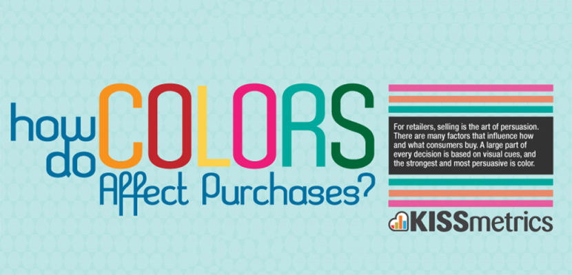
Have you ever stopped to think about why certain design/” title=”Dental Logo Design”>logos catch your eye and draw you in like a moth to a flame? Well, my colorful comrades, strap in for a wild ride through the vibrant world of logo design. In this article, we’re going to delve into the psychological impact of color in logo design and explore just how powerful a hue can be in capturing your attention and leaving a lasting impression. So grab your rainbow shades and prepare to be dazzled by the mesmerizing world of logo color psychology!
The Influence of Color on Perception
Have you ever noticed how the color of something can completely change your perception of it? It’s like putting on a pair of rose-colored glasses, except, you know, without the glasses. Here are a few ways that color can influence how you see the world:
- **Green:** Ah, the color of envy. Green has the power to make us feel calm and relaxed, but it can also make us feel a little jealous. I guess that’s why they say money is the root of all evil – it’s all that green!
- **Red:** The color of passion and anger. Red can make us feel excited and energized, but it can also make us see red – literally. It’s like putting a bull in front of a red cape – watch out!
- **Blue:** The color of calm and serenity. Blue can make us feel peaceful and tranquil, but it can also make us feel a little blue. It’s like a sad song playing on repeat in your head – thanks, blue!
So, next time you’re feeling a certain way, take a look around at the colors that surround you. Maybe there’s a reason why you’re seeing red or feeling a little blue. Colors have a way of sneaking into our subconscious and influencing how we perceive the world around us. It’s like they have magical powers or something!

Color Associations and Emotional Responses
When it comes to , it’s amazing how a simple hue can evoke such strong feelings. Let’s dive into some common color associations and the emotions they can bring out:
- Red: This fiery color is often associated with passion, love, and anger. It’s like the color equivalent of a spicy jalapeno - it can make your heart race and your blood boil!
- Blue: Ah, the calming color of blue. It’s like a gentle ocean breeze, bringing feelings of serenity, peace, and sometimes even sadness. It’s the color you turn to when you need to chill out and contemplate life’s mysteries.
- Yellow: Bright and cheery, yellow is the color of sunshine and happiness. It can lift your spirits and make you feel like you’re walking on sunshine. Just don’t stare at it too long, or you might end up feeling a little too jolly!
But let’s not forget about the black sheep of the color wheel – gray. This neutral hue is often associated with feelings of boredom, dullness, and even depression. It’s like the color you see when you’re stuck in a never-ending meeting with no end in sight. Gray, you may be practical, but you’re definitely not the life of the party!

Creating Brand Identity through Color Psychology
Having a strong brand identity is crucial in today’s competitive market. One way to establish a memorable brand is through the use of color psychology. Colors have a powerful influence on emotions and perceptions, so choosing the right colors can make a big impact on how your brand is perceived by consumers.
When selecting colors for your brand, consider the following tips:
- **Red**: This color is bold and attention-grabbing, making it a good choice for brands that want to convey power and passion. Just be careful not to overdo it, unless you want your customers’ hearts racing every time they see your logo.
– **Blue**: Blue is a calming and trustworthy color, making it ideal for brands that want to establish a sense of security and reliability. Just make sure you don’t go overboard and put your customers to sleep.
– **Yellow**: Yellow is a cheerful and energetic color, perfect for brands that want to convey a sense of optimism and happiness. Just be careful not to blind your customers with too much brightness.
By strategically using colors that align with your brand’s personality and values, you can create a strong and cohesive brand identity that resonates with your target audience. So go ahead, paint the town (or at least your logo) with the colors that will make your brand stand out from the crowd.
The Impact of Color on Consumer Behavior
Have you ever wondered why some brands use red to evoke a sense of urgency and excitement while others opt for blue to convey trust and reliability? Color psychology plays a significant role in influencing consumer behavior, whether we realize it or not. Let’s dive into the rainbow of possibilities that colors can have on our purchasing decisions!
First up, let’s talk about the color red. Red is known to increase appetite, which is why fast-food chains like McDonald’s and KFC incorporate it into their branding. The bold and energetic hue can also create a sense of urgency, making consumers more likely to make impulse purchases. So next time you’re craving a Big Mac, you can blame it on the red logo!
On the flip side, blue is often associated with trust and dependability. That’s why tech giants like IBM and Facebook use this calming color in their logos. Blue can also promote feelings of security and safety, making it a popular choice for financial institutions. So, the next time you trust a bank with your life savings, thank the calming powers of blue!
Remember, each color has its own unique impact on consumer behavior, so next time you’re designing a logo or packaging for your product, think about what message you want to convey through color. Whether it’s the fiery passion of red or the cool trustworthiness of blue, choose wisely and watch as your customers fall under the spell of your colorful charm!
Strategic Use of Color in Logo Design
Color is a powerful tool when it comes to logo design. It can evoke emotions, convey messages, and capture attention. When strategically used, color can make a logo memorable and effective. Here are some tips for using color in logo design:
Consider the psychology of color: Different colors have different meanings and can evoke specific emotions. For example, red is often associated with passion and energy, while blue conveys trust and professionalism. Understanding the psychology of color can help you choose the right hues for your logo.
Create contrast: Using contrasting colors in a logo can help make it more visually appealing and easier to read. Contrast can also help certain elements of the design stand out, making the logo more memorable.
Keep it simple: Although color is important, it’s essential to not go overboard. Too many colors in a logo can make it look cluttered and confusing. Stick to a few key colors that complement each other well.
Test it out: Before finalizing your logo design, test it out in different color schemes. See how it looks in black and white, as well as in various color combinations. This will ensure that your logo is versatile and effective in any situation.
Color Combinations for Maximum Impact
When it comes to creating eye-catching designs, the right color combinations are key. With the right mix of colors, you can create visuals that pack a punch and leave a lasting impression on your audience.
One surefire way to create maximum impact with your color combinations is to use complementary colors. These are pairs of colors that sit opposite each other on the color wheel, creating a bold, high-contrast look. Think red and green, blue and orange, or purple and yellow. These combinations are sure to grab attention and make your designs pop.
Another way to make a statement with your color choices is to embrace the power of triadic color schemes. These are sets of three colors that are evenly spaced around the color wheel, creating a harmonious yet striking look. Try combinations like red, blue, and yellow or green, orange, and purple for a dynamic and visually appealing result.
Don’t be afraid to mix and match different color combinations to see what works best for your design. With a little experimentation and creativity, you can create color palettes that truly make an impact and set your visuals apart from the rest.
FAQs
Why do certain colors trigger specific emotions in consumers?
Well, it’s simple really. Colors are like little emotional ninjas that sneak into our brains and stir up all kinds of feelings. For example, red is like the color of passion and excitement, while blue is all calm and trustworthy. It’s like each color has its own little personality that affects how we perceive a brand.
How can businesses use color psychology to their advantage in logo design?
Businesses can totally hack into our brains using color psychology in their logo design. By choosing the right color palette, they can make us feel all warm and fuzzy inside (or just really hungry for some fast food). It’s like they’re painting a masterpiece straight onto our subconscious minds.
Are there any universal truths about specific colors and their meanings?
Oh, absolutely! It’s like a secret code that the whole world just sort of agrees on. Like, yellow is the color of happiness and sunshine, green is all about growth and health, and black is just so mysterious and edgy. It’s like we all speak the same color language, even if we don’t realize it.
Can using the wrong colors in a logo design actually hurt a brand?
Oh, for sure! Imagine if McDonald’s suddenly decided to switch their signature golden arches to a sickly shade of brown. People would be like, “Um, I think I’ll pass on the Big Mac today.” Colors have the power to make or break a brand’s image, so it’s important to choose wisely.
How can a small business with a limited budget still use color psychology effectively in their logo design?
Who says you need buckets of cash to play the color game? Small businesses can totally rock the color psychology world without breaking the bank. Just pick a few key colors that resonate with your brand’s personality and make sure they’re sending the right message. It’s like a budget-friendly rainbow of success!
So, what’s in a color?
Well, turns out, a whole lot more than you thought! Who knew that something as simple as a hue could have such a profound impact on our brains? Whether it’s making us hungry, calming us down, or sparking our creativity, colors truly have a magical power over us. So next time you’re designing a logo, remember to choose your colors wisely – you never know what kind of psychological tricks they might be playing on your customers!


