Have you ever stopped to think about the powerful influence that colors can have on our minds? No, we’re not talking about how the sight of a bright yellow banana can instantly make your stomach growl (although that is a pretty impressive feat). We’re talking about the impact of logo design and how the clever use of color can make or break a brand’s image faster than you can say “blue-ify me, captain!” Join us on a kaleidoscopic journey through the wild world of color psychology and discover just how hues can make us swoon, cringe, or even whip out our wallets faster than you can say “rainbow unicorn.
The Psychology of Color in Logo Design
Color psychology is a mysterious beast. It can make you feel warm and fuzzy inside or send you running for the hills. When it comes to choosing the right colors for your logo design, it’s important to consider the psychological impact they may have on your audience. Let’s dive into the captivating world of color psychology in logo design.
Red: This bold and passionate color can evoke feelings of excitement, energy, and danger. It’s like the cool kid who always knows how to have a good time. Just be careful not to overdo it, or your logo might end up looking like a flashing emergency light.
Blue: Ah, blue. The color of trust, calmness, and intelligence. It’s like that friend who always manages to keep a level head, even in the craziest of situations. Incorporating blue into your logo design can help establish your brand as a reliable and trustworthy partner in crime. Just don’t be surprised if people start telling you all their deepest, darkest secrets.
Green: The color of growth, harmony, and nature. Green is like that peaceful yoga instructor who always knows how to bring you back to center. Adding a touch of green to your logo design can communicate a sense of eco-friendliness and sustainability. Just don’t be surprised if people start tossing their trash in your direction.
Color Associations and Brand Perception
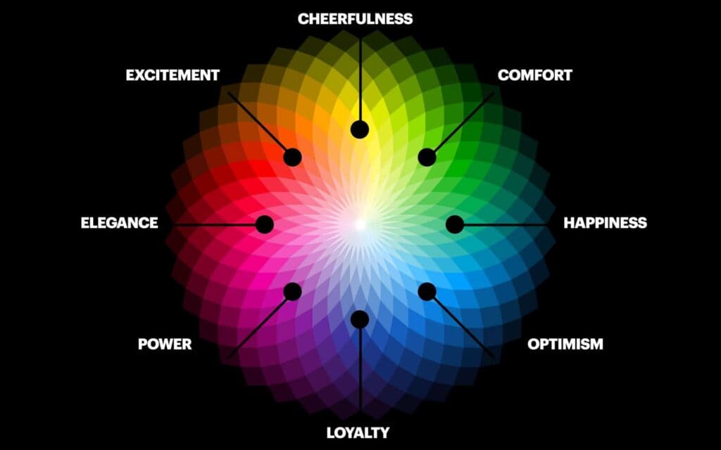
When it comes to branding, the colors you choose can make a huge impact on how consumers perceive your brand. Here are some color associations that could shape the perception of your brand:
- Red: This color is often associated with energy, passion, and excitement. Brands that use red may come across as bold and daring.
- Blue: Blue is a color that conveys trust, reliability, and professionalism. Brands that use blue may be seen as trustworthy and dependable.
- Yellow: Yellow is often associated with happiness, optimism, and creativity. Brands that use yellow may come across as fun and innovative.
It’s important to consider the emotional response that different colors can evoke when choosing the color palette for your brand. Remember, the colors you choose can have a subconscious influence on how your brand is perceived!
So next time you’re deciding on a color scheme for your brand, think about the message you want to send to your audience. Whether you go bold with red, reliable with blue, or fun with yellow, make sure your colors are working for you and not against you.
The Role of Color in Attracting Consumers
Color plays a crucial role in attracting consumers, whether they realize it or not. Think about it – when was the last time you walked by a store with a boring, drab color scheme and thought, “Wow, I need to check out that place!” Probably never. But slap on some vibrant, eye-catching colors and suddenly you’re drawn in like a moth to a flame.
So, what colors are the best at luring us in? Well, let me tell you, it’s not just about slapping on any old hue and calling it a day. Different colors evoke different emotions and responses in consumers. Here are a few examples:
- Red: This color screams “Look at me!” and is often associated with excitement and energy. It’s no wonder that so many sales signs are painted red - they grab our attention and get our hearts racing.
- Blue: On the other hand, blue exudes calm and trustworthiness. That’s why so many banks and financial institutions use this color in their branding – they want you to feel secure and at ease.
And let’s not forget about the power of color psychology. Did you know that fast-food chains often use red and yellow in their logos and decor because these colors have been shown to increase appetite and encourage impulse purchases? It’s all a big, colorful game of manipulation, my friends.
Impact of Color on Memory and Recall
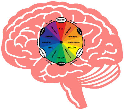
Have you ever wondered how color can affect your memory and recall abilities? It’s like having a magical rainbow at your disposal to help you remember all the important things in life!
Studies have shown that certain colors, like bold and vibrant ones, can enhance memory retention. So next time you need to remember that important date or that grocery list, maybe consider writing it down in bright and bold colors. Who knew that a little splash of color could do wonders for your memory?
On the other hand, dull and muted colors may have a negative impact on your memory and recall. So, if you want to remember where you left your keys or the name of that person you just met, maybe steer clear of those boring beige tones. Let’s keep it colorful, folks!
Just remember, the next time you need a little boost in the memory department, reach for the colors that speak to you. Whether it’s a fiery red, a calming blue, or a happy yellow, let the colors guide you to better recall and memory. Who knew that the secret to remembering it all could be as simple as a splash of color?

Creating Emotional Connections Through Color
When it comes to , it’s all about tapping into our deepest feelings and expressing them through the power of hues. One of the most powerful emotions that can be conveyed through color is passion. The vibrant color red is often associated with love and desire, igniting flames of passion within us.
On the other end of the spectrum, blue is a color that evokes feelings of calmness and tranquility. It’s like a gentle wave washing over us, bringing a sense of peace and serenity. By incorporating shades of blue into your design, you can create a soothing environment that helps people relax and unwind.
Another way to create emotional connections through color is by using bright and bold colors to convey energy and excitement. Colors like yellow and orange can evoke a sense of joy and enthusiasm, making people feel uplifted and energized. These colors are perfect for creating a lively and dynamic atmosphere that sparks creativity and inspiration.
Ultimately, the key to is to understand the psychological associations that different colors have and use them to evoke specific emotions in your audience. By harnessing the power of color, you can create a truly immersive and engaging experience that resonates with people on a deep emotional level.
Color Theory in Logo Design
When it comes to logo design, color theory is like the secret sauce that makes everything pop. Forget about just picking your favorite colors and calling it a day – there’s a science to this, people!
So, why does color matter so much? Well, for starters, different colors evoke different emotions and reactions in people. It’s like setting the mood for a first date – you wouldn’t wear red if you’re going for a chill, friendly vibe, right?
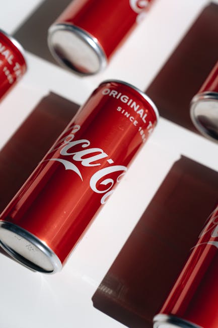
Think about some of the most iconic logos out there – McDonald’s yellow arches, Coca-Cola’s classic red and white, or Starbucks’ calming green siren. These colors were carefully chosen to convey specific messages and create a lasting impression on consumers.
So, the next time you’re brainstorming a logo design, remember to think about what each color represents and how it can help communicate your brand’s values and personality. Don’t just throw a bunch of colors together and hope for the best – be intentional, be strategic, and watch your logo shine!
Harnessing the Power of Color in Branding
Are you feeling blue about your brand’s lackluster identity? It’s time to ditch the boring black and white and embrace the power of color in branding! Colors have a unique way of evoking emotions and connecting with your target audience on a deeper level. Let’s take a look at how you can use color to make your brand stand out:
First up, let’s talk about the psychology behind color choices. Different colors can evoke different emotions and perceptions in people. For example, imagine a world where McDonald’s golden arches were a cool shade of blue instead of their iconic red and yellow. Not quite as appetizing, right? Here are some popular color associations to keep in mind:
- Red: Bold, energetic, and passionate
- Blue: Trustworthy, calming, and professional
- Green: Fresh, natural, and prosperous
- Yellow: Optimistic, cheerful, and youthful
When choosing colors for your brand, think about how you want your audience to feel when they interact with your products or services. Are you aiming for excitement and energy, or do you want to inspire trust and reliability? By harnessing the power of color, you can create a brand identity that resonates with your target market and leaves a lasting impression.
FAQs
How do colors in a logo affect our emotions?
Oh, colors in a logo are like the spices in a dish – they can totally change the flavor! Different colors can evoke different emotions in us. For example, red can make you feel energetic and passionate, while blue can give off a calm and trustworthy vibe. So choose your logo colors wisely!
Can a logo’s color choices affect brand perception?
Absolutely! Just like how you judge someone based on their outfit (come on, we all do it!), people judge a brand based on its logo colors. If your logo is bursting with bright colors, people may think your brand is fun and lively. But if it’s all black and white, they might see your brand as sophisticated and serious.
How should I choose the right colors for my logo design?
Hold a crayon in each hand, close your eyes, spin around, and throw them at a color wheel! Just kidding. When choosing colors for your logo, think about the emotions you want to evoke and the personality of your brand. Consider your target audience too – what colors will appeal to them? And most importantly, trust your gut!
Can changing a logo’s colors improve brand recognition?
Oh, for sure! Think about it – if McDonald’s suddenly switched their golden arches to purple, you’d be like, “Wait, where’s my Big Mac place?” Consistent colors in your logo help people remember and recognize your brand. So don’t go changing them willy-nilly – unless you want to confuse everyone!
Is there a one-size-fits-all solution for logo colors?
Ha, wouldn’t that be convenient? But alas, there’s no magic color that works for every brand. The key is to experiment, see what resonates with your audience, and keep it consistent. Whether you’re all about neon pink or classic navy blue, just own it!
Revolutionize Your Brand with the Power of Color!
Now that you’ve unlocked the secrets of logo design and its impact on our minds, go forth and conquer the world with your newfound color knowledge! Remember, you have the power to evoke emotions, influence decisions, and leave a lasting impression with just a splash of color. So go ahead, paint the town red, blue, or whatever hue speaks to you – the world is your canvas, so why not make it a masterpiece? Embrace the rainbow, my friends, and watch as your brand shines brighter than a double rainbow on a sunny day!


