Have you ever stopped to think about the intricate psychology behind the colors of logos? From the soothing blues of Facebook to the fiery red of Coca-Cola, colors play a pivotal role in shaping our perceptions and emotions towards a brand. In this article, we delve into the fascinating world of logo psychology and explore how different colors can evoke varying reactions and associations in the minds of consumers. So grab your rainbow glasses and get ready to dive into the colorful world of logo psychology!
The Psychology of Color in Logo Design
When it comes to creating the perfect logo, choosing the right colors can make all the difference. The psychology of color plays a crucial role in logo design, as different colors can evoke different emotions and feelings in consumers.
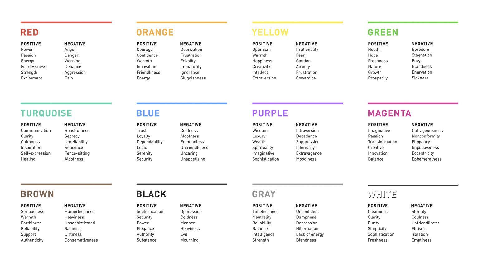
Here are some common colors used in logo design and the psychological associations they typically have:
- Red: Red is often associated with passion, energy, and excitement. It can grab attention and create a sense of urgency.
- Blue: Blue is calming and trustworthy, making it a popular choice for corporate logos.
- Yellow: Yellow is often associated with happiness and positivity, perfect for brands looking to create a friendly and inviting image.
- Green: Green is commonly associated with nature and growth, making it a great choice for environmentally conscious brands.
It’s important to consider your target audience and the message you want to convey when choosing the colors for your logo. Take the time to research the psychological effects of different colors and experiment with different combinations to see what works best for your brand.

Creating Emotions with Color Choices
When it comes to selecting colors for your designs, it’s not just about what looks good – it’s about creating emotions! Colors have the power to evoke feelings and reactions in people, so make sure you choose wisely. Here are a few tips to help you paint with all the colors of the emotional spectrum:
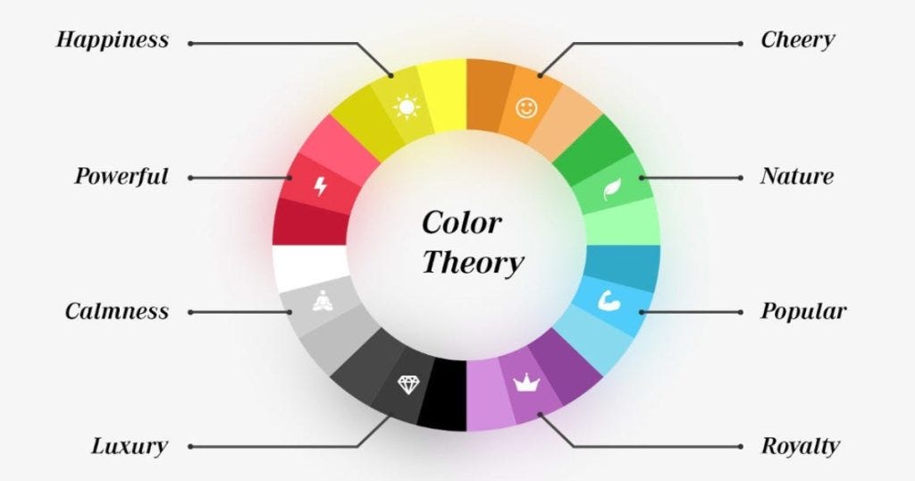
Play with Warm and Cool Tones: Warm colors like reds, oranges, and yellows can create feelings of energy and excitement. Cool colors like blues, greens, and purples, on the other hand, can evoke feelings of calmness and tranquility. Mixing these tones together can create a dynamic and balanced emotional experience.
Consider Cultural Meanings: Different colors can have varying meanings in different cultures. For example, while white represents purity and innocence in Western cultures, it symbolizes mourning in many Eastern cultures. Make sure to research the cultural significance of colors before incorporating them into your designs.
Experiment with Color Combinations: The way that colors interact with each other can greatly impact the emotions they evoke. Complementary colors, like red and green, can create a vibrant and energetic feel. Analogous colors, such as blue and purple, can create a harmonious and soothing atmosphere. Don’t be afraid to mix and match to see what emotional response you can elicit!

Color Associations in Branding
When it comes to branding, choosing the right colors can make or break a company’s image. Let’s take a look at some common :
- Red: Known for being vibrant and energetic, red is often used to grab attention and create a sense of urgency. It’s the color of passion, excitement, and boldness. Think Coca-Cola and Target – they definitely know how to make a statement!
- Blue: Blue is a calming and trustworthy color, often used by tech companies and financial institutions to convey reliability and professionalism. You can trust companies like IBM and Facebook to always be there for you - just like a loyal friend (or at least that’s what they want you to think).
- Yellow: Bright and cheery, yellow is all about optimism and creativity. It’s often used to evoke feelings of happiness and warmth. Brands like McDonald’s and IKEA definitely know how to bring sunshine into your life - and your living room.
So, the next time you’re designing a logo or choosing a color scheme for your brand, remember the power of color associations. Whether you want to evoke excitement, trust, or happiness, there’s a color out there waiting to help you make your mark. Just don’t forget to think outside the crayon box – nobody wants to be known as the company with the “puke green” logo.

Using Color Theory to Influence Consumer Perception
Have you ever walked into a store and felt drawn to a certain product purely based on its color? That’s no coincidence – it’s color theory at work! By understanding how colors can influence our thoughts and emotions, businesses can strategically use this knowledge to sway consumer perception and increase sales.
One way that color theory can impact consumer perception is through the use of warm and cool colors. Warm colors like red and yellow evoke feelings of excitement and urgency, making customers more likely to make impulse purchases. On the other hand, cool colors like blue and green are calming and promote feelings of trust and stability, ideal for building brand loyalty.
Additionally, the psychology of color plays a key role in how consumers perceive a brand. For example, many fast-food chains use red and yellow in their logos and branding because these colors are associated with hunger and energy. Meanwhile, luxury brands often use black and gold to convey sophistication and exclusivity.
So, next time you’re choosing a color scheme for your brand or product packaging, think about the message you want to send to consumers. With a little knowledge of color theory, you can harness the power of color to influence consumer perception and drive sales!

The Impact of Color on Brand Recognition
So, you’re thinking about starting a new business and you’re trying to decide on a brand color. Should you go with a bold red, a calming blue, or maybe even a vibrant yellow? Well, let me tell you, is no joke!
First things first, let’s talk about the psychology of color. Different colors evoke different emotions and can even influence consumer behavior. For example, red is often associated with passion and excitement, while blue is seen as trustworthy and dependable. So, choose your brand color wisely!
Next, let’s discuss the power of consistency. Once you pick a color for your brand, stick with it! Consistent use of color across all platforms, from your logo to your website to your social media channels, will help build brand recognition and create a strong visual identity.
And finally, don’t be afraid to get creative with your color choices. Think outside the box and consider using unexpected colors to make your brand stand out. Remember, in the world of branding, bold is always better! So, go ahead, embrace the power of color and watch your brand recognition soar!
Strategic Use of Color in Logo Design
Color in logo design isn’t just about making things look pretty – it’s about sending a message. Here are some tips on how to use color strategically in your logo designs:
– Red: This is the color of passion, love, and excitement. Use red in your logo if you want to grab attention and make a bold statement.
– Blue: Blue is the color of trust, professionalism, and stability. Incorporate blue into your logo if you want to convey reliability and security.
– Yellow: Yellow is the color of sunshine, happiness, and optimism. Use yellow in your logo design to evoke feelings of joy and positivity.
– Black: Black is the color of sophistication, elegance, and power. Incorporate black into your logo if you want to convey a sense of luxury and exclusivity.
Remember, color is a powerful tool in logo design. Choose wisely and use it to your advantage to create a logo that truly stands out and communicates the message you want to convey.
FAQs
Why is choosing the right color important for a logo?
Well, if you want your logo to give off the right vibe, you can’t just slap any color on it and call it a day. Each color carries its own set of feelings and associations, so choosing the right one can make or break your logo’s effectiveness.
How does the color red influence people’s perception of a logo?
Ah, red – the color of passion, energy, and danger. Slap some red on your logo, and you’re telling the world that you mean business. Just don’t overdo it, unless you want people thinking you’re running a blood donation center.
Can you explain the psychological impact of using blue in a logo?
Blue, the color of trust, calm, and professionalism. If you want people to feel at ease and trust your brand, blue is the way to go. Just don’t go too dark, or people might think you’re running a funeral home.
What emotions does the color yellow evoke in a logo?
Yellow, the color of sunshine, happiness, and caution. Slap some yellow on your logo, and you’ll be telling the world that you’re a ray of sunshine in a dreary world. Just don’t use too much, or people might think you’re in the business of selling bananas.


