Have you ever stopped to think about how your favorite logo color could be psychologically manipulating you? No, we’re not talking about mind control – we’re talking about the fascinating world of logo psychology! From the calming effects of blue to the bold statements made by red, the colors in logos have a power of their own. So sit back, relax, and prepare to be dazzled by the mesmerizing influence of colors in logo psychology!
The Power of Color in Logo Psychology
Have you ever wondered why certain logos catch your eye and leave a lasting impression? It’s not just a random coincidence – it’s at play!
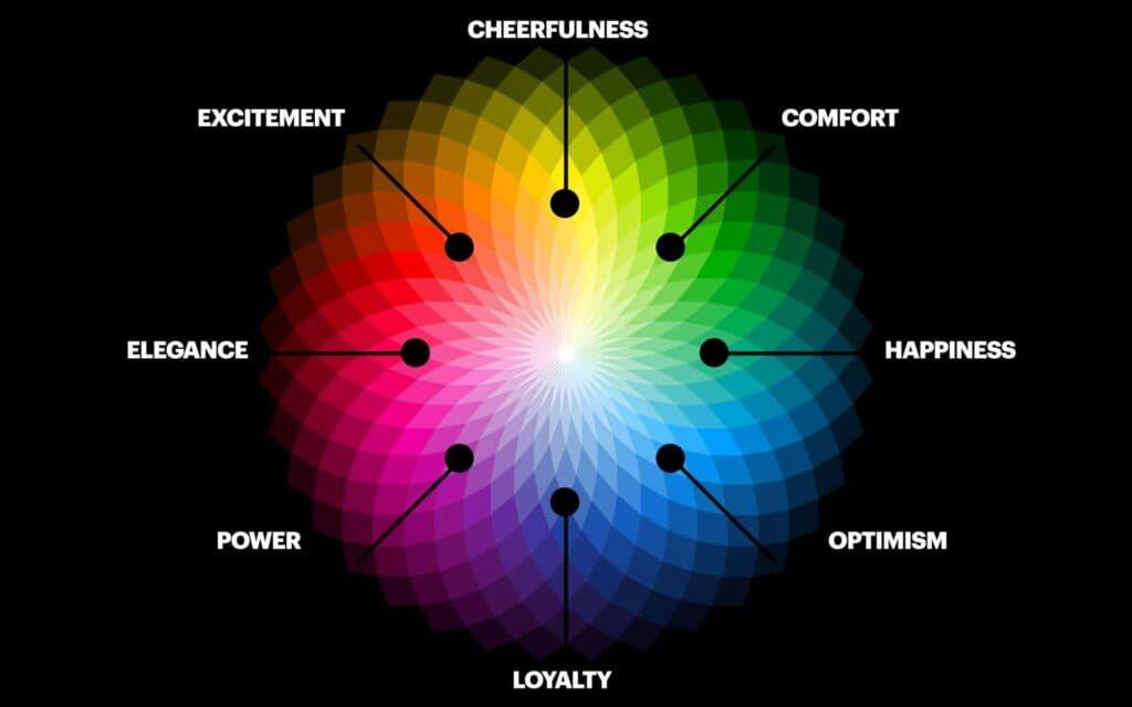
Colors have the ability to evoke a wide range of emotions and associations in our minds. That’s why companies put so much thought into choosing the perfect color palette for their logos. Here’s a breakdown of some popular colors and the psychological impact they have:
- Red: This color is known for being energetic and attention-grabbing. It can convey a sense of urgency or excitement, making it a popular choice for logos in the food and beverage industry.
- Blue: Often associated with trust and reliability, blue is a common choice for logos in the technology and finance sectors. It gives off a sense of calm and professionalism.
- Yellow: Yellow is typically associated with optimism and youthfulness. It’s often used in logos to convey a sense of positivity and creativity, making it a popular choice for brands targeting a younger demographic.
So, next time you see a logo that really speaks to you, take a closer look at the colors being used. You might just uncover the secret behind its success!

How Colors Evoke Emotions in Consumers
Have you ever wondered why some colors make you feel warm and fuzzy inside, while others make you want to run for the hills? It turns out that the colors we see can have a huge impact on our emotions and behaviors. Here’s a breakdown of how different colors can evoke different feelings in consumers:
Red: This fiery color is often associated with passion, excitement, and energy. It can also stimulate the appetite (hello, fast food chains!) and create a sense of urgency.
Blue: Known for its calming and serene qualities, blue is often used to promote trust and reliability. It’s also a favorite choice for brands in the tech industry, as it conveys intelligence and professionalism.
Yellow: Bright and cheerful, yellow is often used to grab attention and promote optimism. It can also stimulate creativity and evoke feelings of happiness.
Green: The color of balance and harmony, green is often associated with nature, growth, and health. It can create a sense of peace and relaxation, making it a popular choice for brands in the wellness industry.

Creating Brand Identity Through Strategic Color Choices
Creating a brand identity through strategic color choices is like picking the perfect outfit for a first date - it’s all about making a lasting impression. Just like wearing a neon green suit might not be the best choice for a romantic dinner, choosing colors that clash with your brand’s message can leave potential customers feeling confused and unimpressed.
When deciding on colors, think about what emotions you want your brand to evoke. Is your brand all about adventure and excitement? Maybe go for bold, vibrant colors like red or orange. If you’re going for a more calming and peaceful vibe, opt for softer hues like blue or green. Remember, colors have the power to influence how people perceive your brand, so choose wisely.
One of the keys to creating a strong brand identity through color choices is consistency. Make sure that the colors you choose are used consistently across all of your branding materials – from your logo to your website to your social media posts. This will help to solidify your brand’s image in the minds of consumers, making it easier for them to recognize and remember your brand.
And finally, don’t be afraid to think outside the box when it comes to color choices. Sometimes the most unexpected color combinations can lead to the most memorable branding. So go ahead, be bold, be daring, and most importantly, be colorful in your branding choices. Your brand will thank you for it!
The Psychological Impact of Color in Logo Design
Color psychology can play a huge role in how consumers perceive a brand. When it comes to logo design, choosing the right colors can make a big impact on how your company is viewed. Here are some ways color can influence the psychological perception of your logo:
- Red: This color is known to stimulate appetite, which is why so many fast food chains use it in their logos. It can also evoke feelings of passion and excitement, perfect for brands looking to make a bold statement.
- Blue: Blue is often associated with trust and reliability, making it a popular choice for banks and tech companies. It can also have a calming effect, making customers feel at ease when interacting with your brand.
- Yellow: This cheerful color is often used to convey optimism and energy. It can help your brand appear more approachable and friendly, perfect for businesses in the hospitality or entertainment industry.
- Black: Black is often associated with sophistication and luxury, making it a popular choice for high-end brands. It can also convey a sense of mystery and elegance, perfect for creating a sense of intrigue around your brand.

Utilizing Color Theory to Influence Consumer Behavior
When it comes to influencing consumer behavior, color theory is your secret weapon. By strategically choosing colors for your product packaging, website design, or marketing materials, you can subliminally sway potential customers to make a purchase. Here are a few ways you can use color theory to your advantage:
1. Create a sense of urgency: Red is the color of urgency and excitement, so using it in your call-to-action buttons can make customers feel a sense of urgency to buy now. Just be careful not to overdo it unless you want your customers to feel like they’re in a perpetual state of emergency.
2. Establish trust: Blue is known for its calming and trustworthy qualities, making it the perfect color for financial institutions and healthcare providers. So go ahead, slap some blue on your logo and watch the trust roll in (hopefully).
3. Spark creativity: If you’re in a creative industry, like design or fashion, incorporating purple into your branding can evoke feelings of creativity and originality. Just be prepared for your customers to start showing up in head-to-toe purple outfits. Hey, at least they’re feeling creative, right?
The Role of Color in Building Brand Loyalty and Recognition
When it comes to building brand loyalty and recognition, color plays a crucial role. In fact, it can be the difference between standing out from the competition or getting lost in the crowd. Here’s a closer look at how color influences consumer perceptions and behaviors:
1. **Emotional Connections**: Color has the power to evoke strong emotions and feelings in consumers. Whether it’s the calming effect of blue, the energy of red, or the optimism of yellow, the right color can create a deep emotional connection with your brand.
2. **Brand Personality**: Just like people, brands have personalities too. Color can help communicate your brand’s values, mission, and personality to consumers. Whether you want to convey luxury with gold or trustworthiness with blue, choosing the right colors can help shape how your brand is perceived.
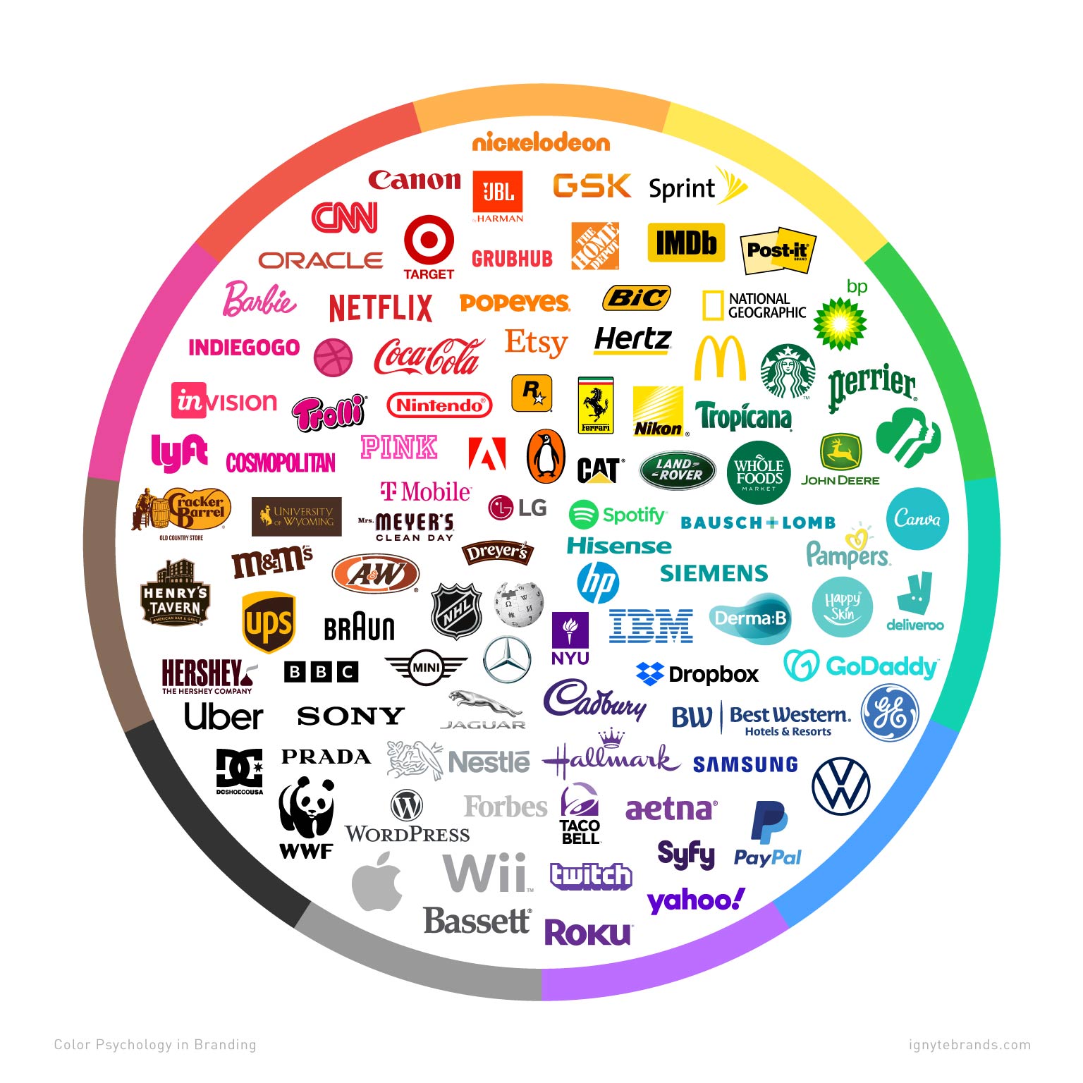
3. **Recognition**: Consistent use of color in branding can help create instant recognition among consumers. Think of the iconic red and white of Coca-Cola or the vibrant green of Starbucks. These colors have become synonymous with the brands, making them instantly recognizable wherever they are seen.
Maximizing the Effectiveness of Your Logo through Color Psychology
So you’ve got a logo, huh? Congrats! But wait, are you using the right colors to appeal to your audience’s subconscious? Color psychology can make or break your brand image, so let’s dive into how to maximize the effectiveness of your logo through the power of colors.
First up, let’s talk about the color red. Red is bold, it’s in-your-face, it demands attention. Use red in your logo if you want to convey passion, energy, or urgency. Just avoid it if you don’t want your audience to feel intense emotions or start craving a Big Mac.
Next, we have blue. Ah, soothing, calming blue. Use blue in your logo if you want to create a sense of trust, security, or professionalism. Just don’t use too much blue unless you want your audience to start feeling a bit too chill and nodding off during your big presentation.
And last but not least, let’s not forget about yellow. Yellow is cheerful, optimistic, and screams “Look at me!” Use yellow in your logo if you want to evoke feelings of happiness, energy, or creativity. Just steer clear of overusing yellow unless you want your audience to start feeling like they’re trapped in a never-ending summer vacation.
FAQs
Why are colors important in logo psychology?
Because colors have a secret ninja power that can sneak into our brains and influence our emotions and perceptions without us even realizing it. That’s right, colors are like the sneaky little spies of the design world.
How do different colors in logos impact consumer behavior?
Well, let me tell you, each color is like a little magician casting spells on our brains. Red can make us feel hungry, which is why it’s often used in fast food logos. Blue makes us think of trust and dependability, which is why it’s all over those big banks and tech companies. And yellow? Well, yellow is just plain happy.
Can the wrong color in a logo turn customers off?
Absolutely! Imagine going to a funeral and the funeral home’s logo is bright pink. You’d probably do a double-take, right? That’s because colors carry so much emotional baggage that if they’re not used appropriately, they can really throw people off.
Are there any universal meanings associated with certain colors in logo psychology?
Oh, totally! Like I mentioned before, red often signifies hunger or passion, blue is all about trustworthiness, and green is typically associated with health or nature. These are like the basic building blocks of the color wheel, so they’re pretty much universal.
How can businesses choose the right colors for their logos?
Well, they could always consult a color psychologist, but those are hard to come by. The next best thing is to think about their brand’s personality and target audience. Are they fun and quirky? Maybe go for some bright colors. Are they more serious and professional? Stick to the blues and grays. It’s all about matching the vibe, baby.
Color Us Impressed!
From red to blue and everything in between, the power of colors in logo psychology is truly a sight to behold. So next time you’re designing a logo, don’t just pick any old hue – choose wisely and watch your brand shine! Remember, it’s not just black and white, there’s a whole rainbow of possibilities out there. Happy coloring!


