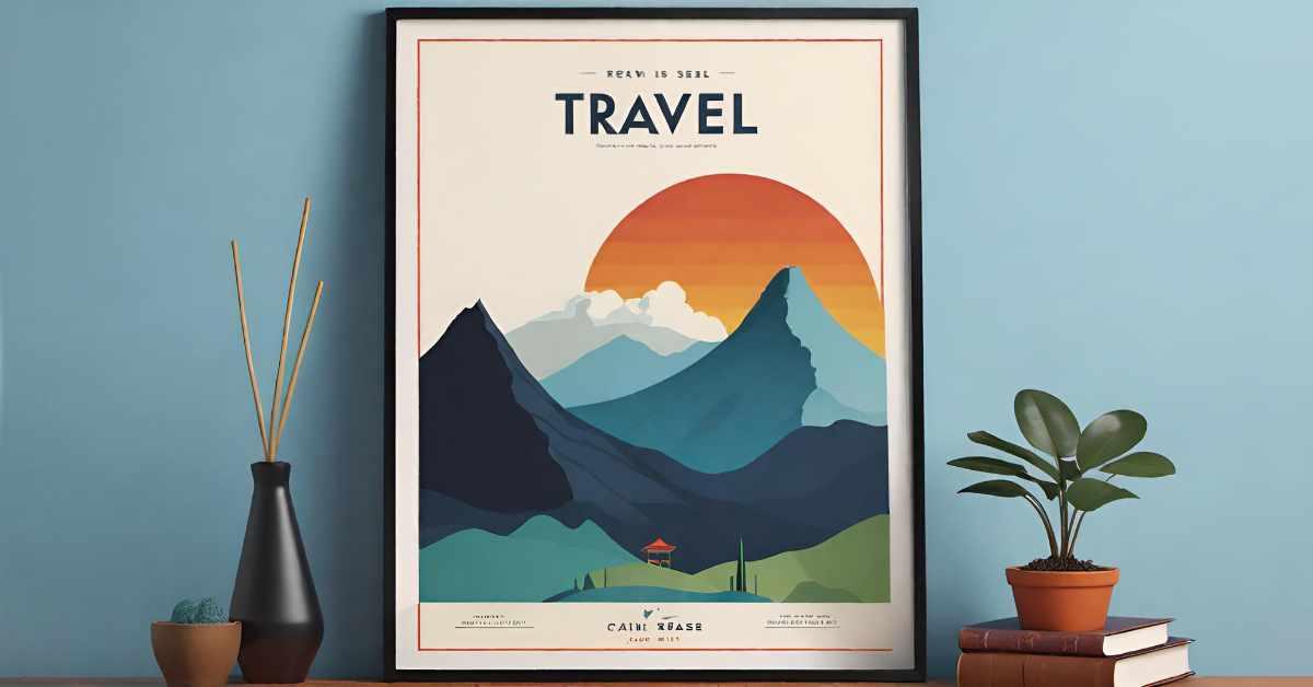
In a world full of flashy logos and over-the-top designs, sometimes less really is more. Welcome to the wonderful world of minimalism, where simplicity reigns supreme and less is definitely more. Get ready to learn the art of creating logos that are so striking, they’ll have your competitors green with envy. So grab your pencil (or mouse, if you prefer) and get ready to wow the design world with your sleek and stylish creations. Let’s dive into the art of minimalism and create some logos that are anything but basic! Minimalism in Logo Design”>
Understanding Minimalism in Logo Design
Minimalism in logo design is like the little black dress of the design world - simple, elegant, and always in style. But what exactly does it mean to be a minimalist logo designer? Let’s break it down into bite-sized chunks, shall we?
First off, a minimalist logo is all about keeping things clean and clutter-free. Think of it as Marie Kondo-ing your design - if it doesn’t spark joy, toss it out! A minimalist logo should be able to convey a brand’s message in the simplest way possible, without the need for a thousand bells and whistles.
Secondly, less is definitely more when it comes to minimalist logo design. Forget about elaborate graphics and flashy colors - a minimalist logo is all about using the bare minimum to make a big impact. It’s like the design equivalent of a haiku - short, sweet, and profound.
Lastly, a minimalist logo should be flexible and adaptable. It should be able to look just as sleek and stylish on a business card as it does on a billboard. After all, who wants a logo that falls apart when you resize it?

Simplifying Design Elements for Impact
Have you ever tried to design something and ended up with a cluttered mess that looks like a toddler got hold of some crayons? Fear not, fellow designers! I am here to help you simplify your design elements for maximum impact with minimal effort.
First and foremost, remember the mantra: less is more. Embrace white space like it’s your long-lost lover. Don’t be afraid to leave areas of your design blank, allowing the eye to rest and focus on the important elements. Think of it like a spa day for your design – give it room to breathe!
Next, choose a cohesive color palette and stick to it like glue. Mixing too many colors is like mixing too many drinks – it may seem like a good idea at the time, but it will end in regret and a headache. Pick a few key colors that complement each other and use them consistently throughout your design.
Lastly, don’t forget the power of bold typography. Use different font weights and sizes to create hierarchy and draw attention to important information. Think of it like shouting from a mountaintop – sometimes you need to be loud and proud to get your point across!

Choosing the Right Colors for Minimalist Logos
When it comes to minimalist logos, choosing the right colors can make or break your design. Here are some tips to help you nail the perfect color scheme:
- Keep it simple: Stick to a limited color palette to maintain that clean and simplistic look. Think black, white, and maybe a pop of color if you’re feeling adventurous.
- Consider the psychology: Colors evoke emotions, so think about what message you want your logo to convey. Use blue for trust, yellow for happiness, or red for passion (or anger, depending on how you’re feeling).
- Contrast is key: Make sure there’s enough contrast between your colors so your logo doesn’t look like a blob of indiscernible shades. You want it to be minimal, not invisible.
Remember, the colors you choose for your minimalist logo can say a lot about your brand. So make sure you pick hues that resonate with your audience and reflect your brand’s personality. And if all else fails, just go with black and white – you can never go wrong with a classic!
Playing with Negative Space for Maximum Effect
Negative space is like that friend who always lurks in the background but ends up stealing the show. Sure, they might not be the life of the party, but they bring a certain je ne sais quoi that just can’t be ignored.
When it comes to design, negative space can be your secret weapon, elevating your work from ”meh” to “wowza!”. By playing with the empty spaces around your subject, you can create a sense of balance, harmony, and visual interest that will make your audience stop and take notice.
So how can you make the most of negative space in your designs? Here are a few tips to get you started:
– **Less is more**: Don’t be afraid to leave some breathing room around your subject. By giving it space to shine, you’ll draw attention to the main focal point and create a sense of elegance and sophistication.
– **Use contrast**: Play around with the contrast between positive and negative space to create visual tension. The juxtaposition of light and dark can add depth and drama to your designs.
– **Think outside the box**: Negative space doesn’t have to be limited to the areas around your subject. Get creative and use it to create shapes, patterns, and even text within the empty spaces of your design.
Utilizing Bold Typography in Minimalist Logos
Incorporating bold typography in minimalist logos can really make your brand stand out. By using bold typefaces, you can create a logo that is not only sleek and modern, but also eye-catching and memorable.
One of the benefits of using bold typography in minimalist logos is that it helps to emphasize key words or phrases in your brand’s name or tagline. This can help to communicate your brand’s message more effectively and make it easier for customers to remember. Plus, bold typefaces can add a touch of personality and attitude to an otherwise simple logo design.
When choosing a bold typeface for your minimalist logo, be sure to consider the overall vibe and aesthetic of your brand. Are you going for something more elegant and refined, or something more bold and edgy? Whatever style you choose, make sure it reflects the essence of your brand and resonates with your target audience.
In conclusion, bold typography can be a powerful tool in creating minimalist logos that are both visually appealing and impactful. So don’t be afraid to experiment with different typefaces and styles to find the perfect balance for your brand. Remember, simplicity is key, but a little boldness never hurt anyone!
Balancing Simplicity and Symbolism in Logo Design
When designing a logo, it’s important to strike a balance between simplicity and symbolism. You want your logo to be easily recognizable and memorable, but you also want it to convey the essence of your brand. Here are a few tips to help you navigate this tricky tightrope:
First and foremost, keep it simple. Remember, your logo should be able to be scaled down to the size of a postage stamp and still be easily recognizable. Avoid clutter and unnecessary details – think of it as a minimalist work of art. A clean, uncluttered design will make a stronger impact and stand the test of time.
However, simplicity doesn’t have to mean boring. Incorporating subtle symbolism can add depth and meaning to your logo. Think of hidden messages or double meanings that can add a layer of intrigue to your design. This will give your logo a playful edge that will keep people coming back for more.
At the end of the day, the key to is to think outside the box. Don’t be afraid to take risks and push the boundaries of conventional design. The best logos are the ones that make you stop and think, “Hmm, I see what they did there.” So go ahead, get creative and have fun with it!
FAQs
What are the key components of a minimalist logo?
The key components of a minimalist logo are simple and clean design elements, limited color palette, negative space, and a focus on essential shapes or symbols.
How can I ensure my minimalist logo is striking and memorable?
To ensure your minimalist logo is striking and memorable, focus on creating a unique and impactful design that effectively communicates your brand’s identity and message. Keep it simple but make it stand out!
Do minimalist logos work for all types of businesses?
Minimalist logos can work for almost any type of business, as long as the design effectively represents the brand and resonates with the target audience. Just remember, less is more!
What are some common mistakes to avoid when creating a minimalist logo?
Some common mistakes to avoid when creating a minimalist logo include overcomplicating the design, using too many colors or elements, and not considering how the logo will look across different mediums and sizes.
How can I make sure my minimalist logo is versatile and scalable?
To make sure your minimalist logo is versatile and scalable, test it out in various sizes and formats to ensure it remains clear and legible. Also, consider creating different variations of the logo for different applications.
Less is More, But More is Boring
And there you have it, folks! The art of minimalism is all about making a big impact with just a few simple elements. So next time you’re designing a logo, remember to keep it clean, sleek, and straight to the point. After all, who needs all that extra clutter? Keep it simple, keep it striking, and let your logo do the talking. Minimalism never looked so good!


