Welcome to the wild and wonderful world of logo design, where words and images come together in a beautiful, harmonious dance of branding glory. A journey filled with trials, triumphs, and more font choices than you can shake a ruler at. Join us as we explore the art of logo design and tap into our inner Picasso with a splash of Helvetica. So buckle up, grab your color wheel, and let’s embark on a creative journey that will leave you feeling more design-savvy than a unicorn in a Pantone factory.
Understanding the Purpose of a Logo
So, you’ve got yourself a logo for your business, but do you really understand its purpose? Let’s break it down for you in a way that even a kindergartener could understand (no offense to kindergarteners, they’re pretty smart).
First of all, a logo is like the face of your business. Just like you wouldn’t walk around with a paper bag on your head (unless it’s a really good look for you, we don’t judge), your business shouldn’t be wandering the streets of the internet without a recognizable face. Your logo is the first thing people see and remember about your business, so it better be good!
Think of your logo as your business’s wingman (or wingwoman, we don’t discriminate here). It’s there to support you, make you look good, and help you stand out in a crowd. A killer logo can make your business look professional, trustworthy, and memorable. Plus, it can help you attract the right customers who vibe with your brand.
So, next time you see your logo, give it a little wink and a thumbs up. It’s out there doing the hard work, making sure your business is seen and remembered. And hey, if you ever need a reminder of its importance, just think about how lost you’d be without your own face. Yikes!

Exploring Different Design Elements
In the world of design, there are endless possibilities when it comes to incorporating different elements into your work. From colors to shapes to textures, the options are as vast as the universe itself.
**Color:** When it comes to choosing colors for your design, the possibilities are endless. Why settle for a boring black and white palette when you can spice things up with a vibrant rainbow of colors? Don’t be afraid to think outside the box and experiment with unexpected color combinations.
**Shapes:** Who says you have to stick to boring old squares and circles? Shake things up with some unconventional shapes like triangles, hexagons, or even octagons. Embrace your inner geometry nerd and let your designs stand out from the crowd.
**Textures:** Adding textures to your designs can take them to a whole new level. Whether you’re into sleek and shiny surfaces or rough and rugged textures, there’s something out there for everyone. Play around with different textures to add depth and interest to your work.
So go ahead, unleash your creativity and explore all the different design elements at your disposal. With a little imagination and a lot of experimentation, the possibilities are endless.
The Importance of Simplicity in Logo Design
When it comes to logo design, simplicity is key to creating a memorable and effective brand image. A cluttered and overly complex logo can confuse potential customers and dilute your brand message. Keep it simple, folks!
Think about some of the most recognizable logos out there – Nike’s swoosh, Apple’s apple, and McDonald’s golden arches. These logos are effortlessly simple yet instantly recognizable. It’s like a magic trick that captivates your audience without all the smoke and mirrors.
So, why complicate things? Stick to the basics and let your logo do the talking. Your audience will thank you for it! Remember, less is more in the world of logo design.
Embrace the beauty of simplicity and let your logo shine bright like a diamond in a world full of cubic zirconias. Keep it clean, keep it classy, and watch your brand soar to new heights!

Creating a Memorable and Timeless Logo
When creating a logo that is both memorable and timeless, it is important to keep a few key elements in mind. First and foremost, make sure your logo stands out from the crowd. You don’t want to blend in with all the other boring logos out there!
One way to achieve this is by incorporating bold colors and unique shapes into your design. Think outside the box and don’t be afraid to take risks! Your logo should be a reflection of your brand’s personality, so let it shine through.
Another tip for creating a memorable logo is to keep it simple. Don’t overload your design with too many elements or intricate details. A clean and streamlined logo will be easier for customers to remember and recognize.
And finally, don’t forget about versatility. Your logo should look just as good on a billboard as it does on a business card. Make sure it can be scaled up or down without losing its impact. With these tips in mind, you’ll be well on your way to creating a logo that will stand the test of time!

Utilizing Color Theory and Psychology in Logo Design
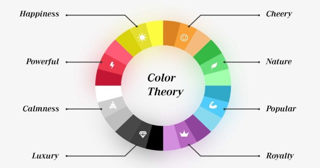
When it comes to creating a logo that really pops, color theory and psychology can be your secret weapons. By understanding the meanings and emotions associated with different colors, you can create a logo that speaks volumes without saying a word.
Consider the following tips when choosing colors for your logo:
- Red: This bold color is often associated with passion, energy, and excitement. It’s a great choice for logos that want to make a strong statement.
- Blue: Cool and calming, blue conveys trust, stability, and professionalism. Perfect for businesses that want to appear reliable and trustworthy.
- Yellow: Symbolizing positivity and optimism, yellow is a great choice for logos that want to radiate joy and happiness.
When designing your logo, it’s important to consider not only what colors look good together, but also what emotions you want to evoke in your audience. By taking the time to choose your colors wisely, you can create a logo that truly resonates with your target market.
Choosing the Right Typography for Your Logo Design
When it comes to , it’s like picking out the perfect outfit for a first date – you want to make a good impression, stand out from the crowd, and leave a lasting impression. Here are some tips to help you find the right font for your brand:
First things first, consider the personality of your brand. Is it fun and whimsical? Sophisticated and elegant? Bold and daring? Your font should reflect the essence of your brand. If you’re a quirky ice cream shop, a playful and bubbly font might be just the scoop you need. If you’re a luxury jewelry store, a sleek and elegant serif font could be the perfect accessory.
Next, think about readability. You don’t want your customers squinting and straining their eyes to read your logo. Choose a font that is clear, legible, and easy on the eyes. Remember, you want your logo to be memorable for the right reasons, not because people couldn’t figure out what it says.
Lastly, consider versatility. Your logo will be used across a variety of platforms – from business cards to billboards to social media. Choose a font that looks great in different sizes and formats. A font that looks fabulous on a billboard might be a hot mess on a business card. Be sure to test out your font in different scenarios to ensure it’s the right fit for all occasions.
The Evolution of Logo Design Trends
Throughout the years, logo design trends have undergone a fascinating transformation. From simple and classic to bold and eye-catching, logos have evolved with the times. Let’s take a closer look at how logo design trends have evolved over the years.
First up, we have the minimalist trend. Less is more, right? Logos of this trend feature clean lines, simple shapes, and a minimalist color palette. Think of the Apple logo or the Nike swoosh. These logos are like the yoga instructors of the design world – calm, balanced, and always in style.
Next, we have the retro resurgence. Everything old is new again, including logo design. Logos of this trend are like your grandma’s favorite sofa – bold, bright, and a little bit funky. Think of those retro diner signs or old-school soda logos. They may be vintage, but they’re definitely making a comeback.
And finally, we have the quirky and playful trend. Logos in this category are like the class clowns of the design world - fun, quirky, and oh-so-memorable. Picture the Twitter bird logo or the Mailchimp monkey. These logos aren’t afraid to show their personality and have a little fun along the way.
FAQs
Why is logo design important?
Well, imagine a world without logos. It would be chaos! Logos help distinguish one company from another and are essential for brand recognition.
What makes a good logo design?
A good logo design should be simple, memorable, versatile, and reflect the personality of the brand. It should also look good in both color and black and white.
What are some common mistakes to avoid in logo design?
Avoid using too many colors, intricate designs, or trendy fonts that may not stand the test of time. Your logo should be timeless, like a fine wine or a classic movie.
How do you start the logo design process?
Start by researching the company’s history, values, and target audience. Then sketch out as many ideas as possible, because you never know where creativity will strike!
What tools are helpful for logo design?
A good designer needs a trusty sketchbook, pencils, and erasers for brainstorming ideas. Once you have a concept, tools like Adobe Illustrator or Canva can help bring your vision to life.
So, What’s the Point?
Hopefully, this article has given you some insight into the creative and often quirky world of logo design. Remember, a logo is not just a simple graphic; it’s a representation of a brand’s identity and values. It’s a visual ambassador, a silent spokesperson, a tiny but mighty symbol that can speak volumes. So next time you see a logo, take a closer look and appreciate the thought, effort, and creativity that went into its design. And who knows, maybe one day you’ll embark on your own creative journey in the magical realm of logo design!
Thanks for reading!


