Welcome to the world of colorful communication, where the power of hues can make or break your brand‘s message faster than you can say “Puce”. In this article, we’ll dive into the wild and wonderful world of logo colors and how they can captivate your audience faster than a squirrel with a shiny object. So grab your paintbrush and prepare to splash some serious color onto your brand’s canvas, because we’re about to turn up the saturation on your audience engagement game. Let’s paint the town red, blue, and every shade in between!
Understanding the Psychology of Color
Have you ever looked at a red stop sign and thought to yourself, ”Hmm, that color really speaks to me”? Or have you found yourself feeling more peaceful in a room painted in calming blues and greens? Well, my friend, that’s the magical world of color psychology at work!
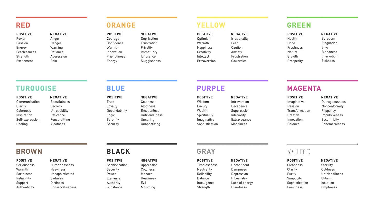
Colors have the power to evoke all sorts of emotions and reactions in us mere mortals. For example, blue is often associated with trust and reliability, which is probably why we tend to trust people in blue suits more. But be careful, too much blue can also leave you feeling a bit blue…it’s all about finding that color balance, like in a well-decorated ice cream parlor.
Now, let’s talk about the color red. This fiery hue is known for its ability to grab attention and get the blood pumping. That’s probably why it’s used in so many fast food logos – they want you to feel that hunger! But be warned, staring at too much red can also make you feel a bit angry…like a bull seeing red. So, it’s all about using red strategically, like a cunning fox in a red coat.
And let’s not forget about yellow, the color of sunshine and happiness – or jaundice, depending on who you ask. Yellow is associated with positivity and energy, making it a popular choice for playful brands. But too much yellow can also leave you feeling a bit overwhelmed…like a big ol’ sunbeam crashing your picnic. So, embrace yellow in moderation, like a splash of lemon in your tea!

Choosing the Right Colors for Your Logo
When it comes to selecting the perfect colors for your logo, it’s important to remember that not all shades are created equal. You want to choose hues that not only represent your brand but also resonate with your target audience. Here are some tips to help you make the right color choices:
Consider Color Psychology: Different colors evoke different emotions and perceptions. For example, red is often associated with passion and excitement, while blue conveys trust and reliability. Think about how you want your audience to feel when they see your logo and choose colors accordingly.
Think About Contrast: It’s essential to pick colors that work well together and provide enough contrast for your logo to stand out. Avoid selecting colors that are too similar or blend into each other, as this can make your logo difficult to read or recognize.
Keep it Simple: While it might be tempting to include a rainbow of colors in your logo, it’s usually best to stick to a few key hues. Too many colors can overwhelm the viewer and dilute your brand message. Focus on selecting a primary color and one or two accent colors to keep things cohesive and memorable.
How Different Colors Affect Audience Perception
Color psychology
Have you ever noticed how certain colors make you feel a certain way? It’s not just your imagination! Different colors have psychological effects on our brains, influencing our emotions and perceptions in surprising ways. Here’s a breakdown of how various colors can affect audience perception:
Red:
Red is often associated with passion and excitement, making it a great choice for grabbing attention and evoking strong emotions. It can also symbolize danger or urgency, making it a popular choice for warning signs and emergency vehicles.
Blue:
Blue is often seen as calming and trustworthy, making it an excellent choice for brands looking to convey reliability and professionalism. However, too much blue can come across as cold or aloof, so it’s essential to strike the right balance.
Yellow:
Yellow is often associated with optimism and happiness, making it a great choice for brands looking to convey a sense of warmth and friendliness. However, too much yellow can be overwhelming and even agitating, so use it sparingly.
In conclusion, the colors you choose can have a significant impact on how your audience perceives your brand or message. So, next time you’re designing a logo or creating a presentation, think about the psychological effects of each color choice—and choose wisely!
Creating an Emotional Connection Through Color
Think about the last time you saw a painting that made you want to cry. Was it the expert brushstrokes or the emotional depth behind the colors that moved you?
Color has the power to evoke deep emotions and create a connection that words often fail to achieve. By understanding the psychology behind color, you can harness its potential to connect with your audience on a whole new level.
Here are a few tips to help you create an emotional connection through color:
- Tap into nostalgia: Use colors that remind your audience of happy memories or childhood experiences. Whether it’s the yellow of a sunflower or the blue of a summer sky, nostalgic colors can instantly create a bond.
- Play with contrast: Experiment with contrasting colors to create a visual impact. Colors that clash can evoke strong emotions and make your audience sit up and take notice.
- Go for the unexpected: Break away from traditional color schemes and surprise your audience with unexpected combinations. Think outside the box and let your creativity run wild.

Utilizing Color Theory to Enhance Brand Messaging
When it comes to , the possibilities are endless! With a little creativity and a basic understanding of color psychology, you can take your branding to the next level. Here are a few tips to help you get started:
First and foremost, it’s essential to choose colors that not only reflect your brand’s personality but also resonate with your target audience. Think about what emotions you want to evoke and choose colors accordingly. For example, if you want to convey trustworthiness and reliability, blue is a great choice. If you’re aiming for excitement and passion, red is the way to go.
Next, consider the contrast between different colors. High contrast can create a sense of urgency or command attention, while low contrast can evoke a sense of calm and harmony. Experiment with different combinations to see what works best for your brand and messaging.
Finally, don’t be afraid to think outside the box and use unexpected color combinations to make your brand stand out. Be bold, be daring, and most importantly, have fun with it! Remember, color is a powerful tool that can help you connect with your audience on a deeper level and make a lasting impression.
The Impact of Color Consistency on Brand Recognition
When it comes to branding, color consistency is key. Did you know that certain colors can evoke specific emotions and associations in customers’ minds? It’s true! That’s why it’s important for your brand to stick to a consistent color palette.
Imagine if McDonald’s suddenly changed their iconic red and yellow colors to green and purple. Would you still crave those golden arches for a Big Mac? Probably not. Consistency in color helps build brand recognition and keeps customers coming back for more.
Think about it – when you see that unmistakable Coca-Cola red or Tiffany & Co. blue, you immediately know what brand it is. That’s the power of color consistency! So, next time you’re brainstorming a new logo or packaging design, remember to choose colors that reflect your brand’s values and stick with them.
Take a look at some successful brands like Nike, Starbucks, and Apple. What do they all have in common? They all have a strong, consistent color scheme that sets them apart from the competition. So, don’t be afraid to embrace the power of color in branding – it could be the key to unlocking your brand’s success!
Maximizing Audience Engagement Through Strategic Color Usage
When it comes to engaging your audience, strategic color usage is key. You want to grab their attention and keep them coming back for more, right? Well, lucky for you, I’ve got some tips and tricks up my sleeve to help you do just that!
First things first, consider the psychology behind colors. Different hues evoke different emotions, so choose wisely. Want to convey trust and professionalism? Go for a nice, calming blue. Or maybe you’re looking to amp up the excitement and energy? Red is your go-to. Just remember, it’s all about striking the right balance!
Next, think about contrast. You want your content to pop, so don’t be afraid to play around with complementary colors. A bold red against a bright yellow background? Yes, please! And don’t forget about readability – make sure your text is easy on the eyes, no one wants to strain to read your fantastic content!
And finally, don’t be afraid to get a little creative. Experiment with different color combinations, try out new palettes, and see what works best for you and your audience. After all, who says engaging your audience can’t be fun? So go ahead, get colorful!
FAQs
How can different colors in a logo influence audience engagement?
Well, it’s like choosing your outfit for a party - you want to stand out, right? The colors in your logo can help you do just that. Bright and bold colors like red and yellow can grab attention and evoke strong emotions, while softer colors like pastels can create a more calming and approachable vibe. It’s all about setting the right mood for your audience!
Are there certain colors that work best for specific industries?
Absolutely! Just like you wouldn’t wear a ball gown to a baseball game, you wouldn’t want to use the wrong colors for your industry. For example, blue is often associated with trust and reliability, making it a great choice for finance or healthcare logos. On the other hand, green is often linked to nature and health, so it’s perfect for businesses in the eco-friendly or wellness industries.
Can using too many colors in a logo be overwhelming for audiences?
Think of it like trying to juggle too many balls at once – eventually, one of them is going to drop. While using multiple colors can be eye-catching, it’s important to strike the right balance. Too many colors can overwhelm your audience and dilute your message. Stick to a few key colors that reflect your brand and make a strong impact!
How can a company use color psychology to their advantage in logo design?
Color psychology is like having a secret weapon in your branding arsenal. By understanding the emotions and associations that different colors evoke, you can strategically choose colors that resonate with your target audience. For example, if you want to convey innovation and creativity, purple might be the way to go. It’s all about using colors to speak to your audience on a subconscious level!
Color Your World with Vibrant Logo Colors!
Congratulations, you’ve now experienced a rainbow of information on how logo colors can captivate your audience and enhance your brand’s message. Remember, the art of colorful communication is not just about selecting hues randomly – it’s about strategically choosing colors that speak to your audience on a subconscious level and leave a lasting impression. So go ahead, paint the town red, blue, yellow, or any color that tickles your fancy! Just remember to keep it colorful, keep it engaging, and keep them coming back for more. Happy branding!


