Are you tired of your logo getting lost in the sea of competition, like a lone fish swimming in a school of sharks? Well, fear not, because we’ve got the inside scoop on how to make your logo stand out and make a splash in the marketing world. By following these strategic logo design tips, you’ll be able to reel in customers like never before and make your brand the catch of the day. So grab your fishing rod and let’s dive into the ocean of logo design!
Key Elements of Effective Logo Design
When it comes to creating a killer logo, there are a few key elements that every designer should keep in mind. Let’s break it down, shall we?
First up, **simplicity** is key. You don’t want your logo to be too cluttered or complicated. Keep it clean, sleek, and easy on the eyes. Think of the most iconic logos out there – Nike, Apple, McDonald’s. What do they all have in common? They’re simple, yet effective.
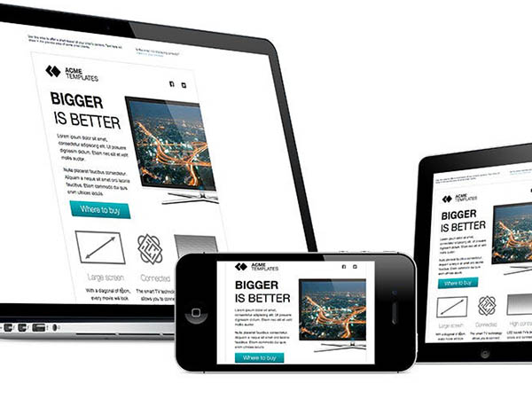
Next, **versatility** is crucial. Your logo should look just as good on a business card as it does on a billboard. Make sure it can be scaled up or down without losing its impact. You never know where your logo might end up, so it’s important to be prepared for any situation.
**Memorability** is also key when it comes to effective logo design. You want your logo to stick in people’s minds long after they’ve seen it. Get creative, think outside the box, and make sure your logo is something that people won’t soon forget.

Understanding Brand Identity and Target Audience
When it comes to brand identity, think of it as the superhero costume for your business. It’s what sets you apart from the competition and makes you memorable to your target audience. Just like Batman needs his cape and cowl, your brand needs a consistent look, message, and values that resonate with your customers.
Now, let’s talk about your target audience. These are the folks who will be cheering you on from the sidelines, eagerly waiting for your next move. It’s important to understand who they are, what they like, and where they hang out. Think of them as your loyal sidekicks, ready to support you in your quest for market domination.
So, how do you make sure your brand identity and target audience are a match made in marketing heaven? Here are a few tips:
- Research, research, research: Get to know your target audience inside and out. What are their pain points? What makes them tick? The more you know, the better you can tailor your brand identity to meet their needs.
- Be authentic: Your brand identity should reflect who you are as a business. Don’t try to be something you’re not just to appeal to a certain demographic. Authenticity speaks volumes in a world full of copycats.
- Listen and learn: Engage with your target audience on social media, surveys, or focus groups. Ask for feedback and make adjustments as needed. Your audience’s opinions are like golden nuggets of marketing wisdom.

Choosing the Right Colors and Fonts
When it comes to for your project, it can be a daunting task. But fear not, dear reader, for I am here to guide you through this treacherous journey. First off, let’s talk about colors.
Colors:
- Choose colors that reflect your brand’s personality and message. If your brand is fun and playful, go for bright and bold colors. If it’s more sophisticated and elegant, opt for muted tones.
- Consider color psychology - different colors evoke different emotions. Want to convey trust and reliability? Blue is your friend. Need to add a pop of excitement? Red is the way to go.
Now, onto fonts. Fonts can make or break your design, so choose wisely.
Fonts:
- Stick to 2-3 fonts max. Too many fonts can make your design look cluttered and unprofessional.
- Pair fonts that complement each other. A good rule of thumb is to pair a decorative font with a more simple, easy-to-read font.
Remember, the key to a successful design is balance. Find the right harmony between colors and fonts to create a visually appealing and cohesive look. So go forth, brave designer, and choose your colors and fonts wisely!
Simplicity is Key: Avoid Clutter and Complexity
Are you tired of sifting through piles of clutter and complexity in your life? It’s time to embrace the mantra of simplicity is key! Say goodbye to the chaos and confusion with these tips to streamline your world.
First and foremost, declutter your physical space. Get rid of all those unnecessary knick-knacks and doodads that are taking up valuable real estate in your home. Keep only the essentials and create a minimalist oasis that will bring a sense of peace and calm to your surroundings.
Next, simplify your schedule. Cut out any unnecessary commitments and obligations that are bogging you down. Focus on what truly brings you joy and fulfillment, and say no to anything that doesn’t align with your priorities.
Lastly, clear out the mental clutter. Use techniques like meditation, mindfulness, and journaling to declutter your mind and focus on what’s truly important. Remember, simplicity is not about depriving yourself, but rather about creating space for what truly matters in your life.
Ensuring Versatility Across Different Platforms
When it comes to ensuring your content is versatile across different platforms, it’s important to think outside the box! Don’t just stick to the traditional ways of sharing your content, get creative!
One way to ensure versatility is to make sure your content is easily shareable. Include social media buttons on your website so that your readers can easily share your content with their friends and followers. You can also repurpose your content for different platforms – turn a blog post into a video, or a podcast episode into a blog post.
Don’t be afraid to experiment with different formats and mediums. Maybe try creating infographics, memes, or even GIFs to spice up your content and make it more engaging. The key is to keep your audience entertained and interested in what you have to say.
Remember, the key to versatility across different platforms is to adapt and evolve. Stay up-to-date with the latest trends and technologies and be open to trying new things. Who knows, you might just stumble upon a new platform that takes your content to the next level!
Seeking Feedback and Iterating for Success
When it comes to seeking feedback, it’s important to remember that criticism is just feedback in disguise! Embrace it, learn from it, and use it to make improvements. And if all else fails, just remember that feedback is like a box of chocolates - sometimes you get the ones you love, and sometimes you get the ones that make you want to spit them out!
Iterating for success is all about trial and error, with an emphasis on the error part. But hey, Rome wasn’t built in a day – it probably took a few hundred tries before they got those columns just right! So don’t be afraid to try, fail, and try again. After all, it’s not the destination that matters, it’s the journey – full of bumps, detours, and hilarious mishaps along the way!
Remember, feedback is like a treasure hunt - sometimes you have to dig through a lot of dirt to find that shiny gold nugget. So keep digging, keep iterating, and keep pushing forward. Success isn’t just about getting it right the first time, it’s about never giving up until you’ve reached that pot of gold at the end of the rainbow!
FAQs
Q: How can a company’s logo help improve its marketing impact?
A: Well, imagine your logo as a superhero cape for your brand. It’s the first thing people see and can instantly convey your brand’s identity, values, and unique selling points. A well-designed logo can grab attention, create brand recognition, and ultimately help drive sales.
Q: What are some key elements to consider when designing a logo for marketing impact?
A: Think of your logo as a first date outfit – it should be attractive, memorable, and leave a lasting impression. Make sure it’s simple, versatile, and relevant to your brand. Also, don’t forget about colors and fonts – they can evoke emotions and influence buyer behavior.
Q: How can a strategic logo design help a company stand out from competitors?
A: In a sea of boring logos, yours should be the Beyoncé of the bunch – fierce, fabulous, and unforgettable. By creating a logo that is unique, eye-catching, and reflective of your brand’s personality, you can easily differentiate yourself from competitors and attract your target audience like bees to honey.
Q: Is it important to consider scalability and adaptability when designing a logo for marketing purposes?
A: Absolutely! Your logo should be like a chameleon – able to adapt to different environments and sizes without losing its essence. Whether it’s on a billboard or a tiny social media profile picture, your logo should be easily recognizable and impactful. So, think big (and small) when designing your logo!
Q: How can a company ensure that their logo resonates with their target audience for maximum marketing impact?
A: It’s like choosing the right playlist for a party – you want to cater to your audience’s tastes and preferences. Conduct market research, gather feedback, and tweak your logo design until it resonates with your target audience. Remember, your logo should speak to them on a personal level and make them want to engage with your brand.
Put Your Best Logo Forward!
Congratulations! You now have the tools to create a logo that will knock your competition out of the park. Remember, simplicity is key, color is crucial, and creativity is your secret weapon. So go forth, design warriors, and craft a logo that will make your brand stand out like a unicorn in a field of horses. Happy designing!


