Do you ever look at a logo and think, “Wow, that design is so simple yet so amazing”? Well, you’re not alone, my friend. In the world of graphic design, minimalist logos are like the cool kids at school – effortlessly stylish and oh-so-hip. So, grab your skinny latte and get ready to dive into the world of ”Simplified Perfection: Minimalist Logo Design Principles.
Defining Minimalist Logo Design
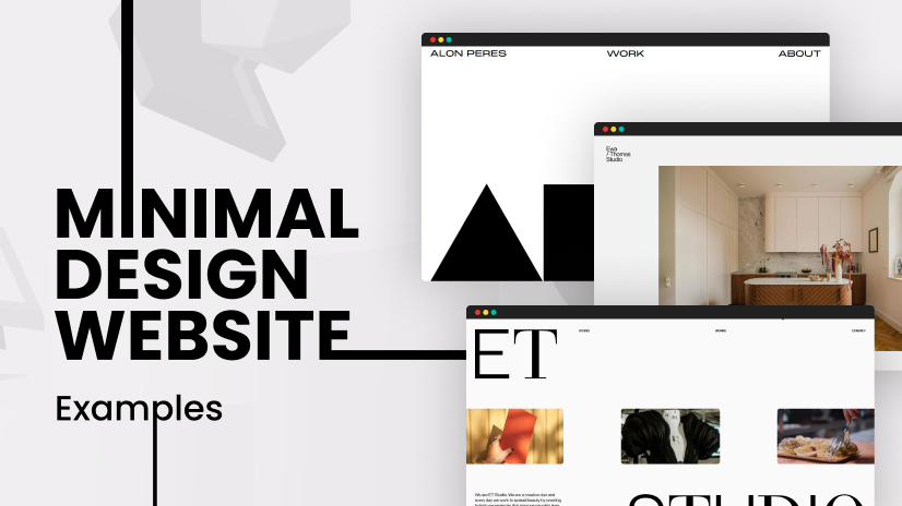
Minimalist logo design is all about keeping things simple and sleek. Stripping away the unnecessary clutter and leaving only the essentials. It’s like giving your logo a Marie Kondo makeover - if it doesn’t spark joy, it’s gotta go!
Think of minimalist logos as the cool kids of the design world. They don’t need flashy colors or intricate details to make a statement. They can rock a basic black and white color scheme and still turn heads.
Here are a few key features of minimalist logo design:
- Whitespace: Embracing the empty spaces to let your logo breathe.
- Simplified shapes: Less is more, baby. Stick to basic geometric shapes and watch your logo shine.
- Clean fonts: Say goodbye to fancy script fonts and hello to sleek, modern typography.
So, next time you’re designing a logo, remember: less is more. Channel your inner minimalist and watch your logo reach new levels of chicness.
The Power of Simplicity in Branding
When it comes to branding, sometimes less is definitely more. Embracing simplicity in your branding strategy can pack a powerful punch and leave a lasting impression on your audience. Here are a few reasons why simplicity reigns supreme:
1. **Memorability**: Simple logos and brand elements are easier for consumers to remember. Think of the Nike swoosh or Apple’s bitten apple – these iconic symbols are instantly recognizable and stick in people’s minds.
2. **Clarity**: A simple brand message is easier for consumers to understand. Avoiding clutter and complexity helps your audience grasp the essence of your brand quickly and easily.
3. **Timeless Appeal**: Simple branding tends to age well. By sticking to clean, minimalistic designs, you can avoid the risk of your brand looking outdated in a few years. Remember, classic never goes out of style.
Key Elements of Minimalist Logo Design
In order to create a top-notch minimalist logo, there are a few key elements that you absolutely must include. First and foremost, simplicity is key. Your logo should be clean, sleek, and free of any unnecessary clutter. Remember, less is more!
Next, make sure to focus on using a limited color palette. Stick to just one or two colors to keep things looking sleek and professional. A pop of color here and there can be effective, but too many colors can quickly turn your minimalist design into a maximalist nightmare.
Another important element to consider is negative space. Embrace the blank spaces in your design, as they can often be just as important as the shapes and symbols you choose to include. Negative space can add depth and visual interest to your logo, making it stand out in a crowded market.
Lastly, when choosing fonts for your minimalist logo, less is more. Stick to simple, clean fonts that are easy to read and won’t distract from your overall design. A bold, sans-serif font can be a great choice for minimalist logos, adding a touch of modernity and sophistication to your brand.
 Typography for a Minimalist Logo”>
Choosing the Right Typography for a Minimalist Logo
When it comes to creating a minimalist logo, choosing the right typography is crucial. Your font choice can make or break the overall look and feel of your logo. Here are some tips to help you select the perfect typography for your minimalist masterpiece:
First off, keep it simple. Minimalist logos are all about simplicity, so opt for a font that is clean and unfussy. Avoid overly ornate or decorative fonts that can clutter your design. Go for something sleek and minimal, like a sans-serif font.
Another important factor to consider is readability. Make sure your chosen font is easy to read both up close and from a distance. You want people to be able to quickly and easily identify your brand, not squint and struggle to make out the text.
Don’t be afraid to experiment with different font weights and styles. Play around with bold, italic, and regular versions of the same font to see what works best for your logo. Mix and match until you find the perfect combination that conveys your brand’s message effectively.

The Impact of Color in Minimalist Logo Design
One of the key elements in minimalist logo design is the clever use of color. While some may think that minimalist logos are all about being black and white, color can actually play a huge role in making these designs pop. Here are some ways in which the impact of color can be seen in minimalist logo design:
1. Conveying emotion: Color has the power to evoke certain emotions and feelings in people. By choosing the right color palette for your minimalist logo, you can communicate the essence of your brand in a subtle yet powerful way. For example, blue can convey trust and reliability, while yellow can evoke feelings of happiness and positivity.
2. Creating contrast: When designing a minimalist logo, it’s important to create contrast to make your design stand out. By using bold and vibrant colors against a simple background, you can create a striking visual impact that will leave a lasting impression on your audience.
3. Adding depth: Color can also be used to add depth and dimension to a minimalist logo design. By using different shades and tones of the same color, you can create a sense of depth that will make your logo more visually interesting and dynamic.
4. Establishing brand identity: The colors you choose for your minimalist logo can help establish your brand identity and set you apart from your competitors. By using a unique color palette that reflects your brand’s personality and values, you can create a strong and memorable visual identity that will resonate with your target audience.
How Negative Space Enhances Minimalist Logos
Did you know that negative space is like the unsung hero of minimalist logos? It’s the white space that often goes unnoticed but plays a significant role in making a logo stand out. Here’s :
1. Adds Depth: Negative space creates a sense of depth and dimension in a logo, making it more visually interesting and engaging.
2. Increases Visual Impact: By using negative space effectively, minimalist logos can grab attention and leave a lasting impression on viewers.
3. Enhances Simplicity: While minimalist logos are all about simplicity, negative space helps to maintain a clean and uncluttered look while still conveying a strong message.
So next time you see a minimalist logo, take a moment to appreciate the negative space that’s working its magic behind the scenes!
FAQs
What is minimalist logo design?
Think of a minimalist logo as the Marie Kondo of logos – it’s all about keeping only what’s essential and getting rid of the unnecessary clutter. Less is truly more in minimalist logo design.
Why should businesses consider minimalist logo design?
Because let’s face it, in a world where everyone’s fighting for attention, sometimes the best way to stand out is by keeping things simple. Plus, minimalist logos are like the cool, calm, and collected friend at the party – they always make a statement without even trying too hard.
What are some key principles of minimalist logo design?
First rule of minimalist logo design club: Less is more. Second rule: Less is still more. Keep your design clean, simple, and memorable – it’s like the logo version of a classic little black dress that never goes out of style.
How can businesses ensure the effectiveness of their minimalist logo design?
Remember, a minimalist logo isn’t just about looking pretty – it should also reflect your brand values and personality. And hey, if your logo can make a statement with just a few simple lines or shapes, you know you’ve nailed it!
Is there a secret sauce to creating a successful minimalist logo design?
Well, if we told you, it wouldn’t be a secret anymore, would it? But here’s a hint: focus on the essence of your brand and let that guide your design. And hey, if all else fails, just remember the mantra: Keep it simple, silly!
Less is More… Literally!
And there you have it, folks! The art of minimalist logo design is all about saying more with less. So next time you’re brainstorming ideas for a logo, remember to keep it simple, elegant, and oh-so-trendy. Embrace the white space, go easy on the colors, and let your creativity shine through in the most understated way possible. Because when it comes to design, less really is more. Stay stylish, stay minimal, and keep on logo-ing!


