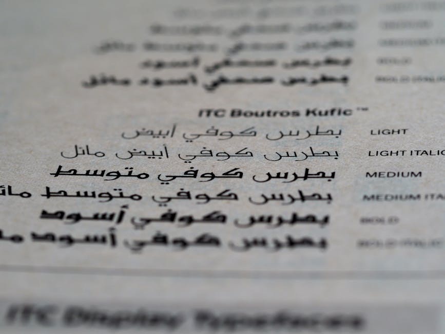
Welcome to the wonderful world of typography, where fonts are more than just letters – they’re an expression of your brand’s personality, style, and overall vibe. Just like choosing the perfect outfit for a hot date or selecting the ideal cheese to pair with your wine, picking the right typeface for your logo is a crucial decision that can make or break your brand’s image. So buckle up, buttercup, because we’re about to embark on a typographic journey filled with drama, intrigue, and maybe even a few unexpected twists and turns. Let’s dive into the wild and wacky world of font selection, and learn how to find the perfect typeface for your logo.
Understanding Typography Basics
Typography. The beautiful art of arranging and designing type to make written language readable and appealing. Without it, the world would be a sad, bland place filled with Comic Sans and Papyrus. We don’t want that, now do we?
Let’s dive into the wacky world of typography basics, shall we? First things first, let’s talk about fonts. Fonts are like shoes for your words. They come in all shapes and sizes, from sleek and sophisticated to loud and obnoxious. Choose wisely, because your font says a lot about you. *Cue dramatic music*
Next up, kerning. Kerning is the space between each letter in a word. It’s like giving your words personal space so they don’t bump into each other at the awkward typography party. Remember, just because two letters are next to each other doesn’t mean they have to be best friends. Give them some space to breathe.
Now, let’s chat about alignment. Just like a game of Tetris, your words need to line up properly to create a visually pleasing design. There are four main types of alignment: left, right, center, and justify. Choose wisely, aligning willy-nilly will make your text look like it’s dancing at a club without rhythm. And nobody wants that. *Insert funky dance moves*
Considerations for Logo Design
When it comes to logo design, there are some important considerations to keep in mind. Your logo is like the face of your brand, so you want to make sure it’s sending the right message. Here are a few things to think about:
First and foremost, **simplicity** is key. You want your logo to be easy to recognize and remember. Avoid cluttering it up with too many elements or intricate designs. Remember, less is more!
Next, consider the **color scheme**. Colors evoke different emotions and can help set the tone for your brand. Make sure the colors you choose reflect the personality of your business. And remember, your logo should look good in black and white too!
Another important factor to consider is **versatility**. Your logo should look great across all platforms, from business cards to billboards. Make sure it’s scalable and works well in different sizes and formats.

Choosing the Right Font Style
When it comes to , it’s important to consider the personality and vibe you want to convey. Whether you’re aiming for a sleek and modern look or a quirky and fun feel, the font you choose can make all the difference. Here are some tips to help you find the perfect font for your project:
- Consider the Audience: Think about who will be reading your content and choose a font that will resonate with them. For example, if you’re targeting a younger audience, you might want to go for a more playful and casual font.
- Don’t Be Afraid to Experiment: Trying out different fonts is like going on a blind date – you never know what you might end up falling in love with. So, don’t be afraid to step outside your comfort zone and give some unusual fonts a chance.
- Find the Right Balance: Just like in a relationship, balance is key. Make sure your chosen font complements your overall design and doesn’t overshadow the other elements.
Remember, the font you choose can say a lot about your brand or message, so take the time to pick one that speaks volumes (pun intended). And hey, if all else fails, just go with Comic Sans – because life’s too short to take everything too seriously!

Exploring Serif vs. Sans Serif Fonts
If you’ve ever found yourself squinting at your computer screen, trying to decide between a serif or sans serif font, you’re not alone. The age-old debate over which typeface is superior rages on, with graphic designers and typophiles alike getting caught in the crossfire.
Proponents of serif fonts argue that the little feet on each character lend a touch of sophistication and elegance to any design. They believe that serif fonts are more traditional and are best suited for long blocks of text, such as novels or essays. On the other hand, sans serif enthusiasts swear by the clean lines and modern aesthetic of their preferred typeface. They argue that sans serif fonts are easier to read on screens and are perfect for minimalist designs.
When it comes down to choosing between serif and sans serif fonts, remember that there are no hard and fast rules. It ultimately depends on the context and purpose of your design. Whether you go with the classic elegance of a serif font or the sleek modernity of a sans serif, just make sure to have fun experimenting with different typefaces and finding the perfect match for your project!

Evaluating Font Weight and Contrast
So, you’ve chosen the perfect font for your project. But now comes the crucial step of . It’s kind of like finding the perfect outfit - you want to make sure everything complements each other without clashing.
To start off, play around with different font weights to see which one suits your design. **Bold**, light, medium – the possibilities are endless! Just like adding spices to your favorite dish, finding the right balance is key. Don’t be afraid to experiment and see what catches your eye.
Next up, consider the contrast between your text and background. **High contrast** can make your text pop, while low contrast can create a more subtle effect. It’s all about finding that sweet spot that makes your words easy to read without straining your audience’s eyes.
Remember, the goal is to make your text visually appealing and easy to read. Don’t be afraid to mix and match fonts, weights, and contrasts until you find the perfect combination. After all, design is all about having fun and getting creative!
Testing and Finalizing Your Typeface Selection
So, you think you’ve found the perfect typeface for your project, eh? Time to put it to the test and make sure it’s the one for you!
First things first, make sure to test your typeface in different sizes. **Size matters**, folks! You don’t want your font to look too big or too small; it’s all about finding that **Goldilocks** size that’s just right.
Next, try out your typeface in various weights. **Skinny fonts, chubby fonts, bold fonts**, oh my! You want to see how your typeface holds up under pressure, so throw some weight around and see how it looks.
Don’t forget about spacing! **Kerning and leading** can make or break your typeface selection. Play around with the spacing between letters and lines to ensure your text is easy to read and aesthetically pleasing. And remember, when in doubt, **let it breathe**!
Once you’ve tested and tweaked to your heart’s content, it’s time to finalize your typeface selection. Trust your gut and go with your instincts. After all, **a font is worth a thousand words**!
FAQs
What should I consider when selecting a typeface for my logo?
Consider factors like your brand identity, target audience, and the message you want to convey. Choose a typeface that reflects the personality of your brand and resonates with your customers.
How many typefaces should I use in my logo?
Avoid using more than two typefaces in your logo to keep it simple and cohesive. Stick to one main typeface for the logo itself and consider using a different typeface for any tagline or additional text.
Should I use a serif or sans-serif typeface for my logo?
It depends on the style of your brand and the image you want to project. Serif typefaces convey tradition and elegance, while sans-serif typefaces are modern and clean. Choose a typeface that aligns with your brand’s aesthetic.
Do I need to create a custom typeface for my logo?
Creating a custom typeface can help differentiate your brand and make your logo more unique. However, it can be costly and time-consuming. Consider whether a custom typeface is necessary for your brand before making that investment.
How important is font size and spacing in logo typography?
Font size and spacing are crucial in logo typography. Make sure your text is legible and balanced within the design. Pay attention to the spacing between letters and lines to ensure readability and visual appeal.
Can I use a free font for my logo?
Using a free font for your logo is risky, as many free fonts lack quality and may be overused. Invest in a high-quality, unique font to make your logo stand out and avoid any potential legal issues with using free fonts for commercial purposes.
In conclusion, choose wisely!
Remember, when it comes to selecting the perfect typeface for your logo, don’t just pick one at random. Take your time, explore your options, and most importantly, have fun with it! After all, finding the right font is like finding the perfect pair of shoes – it may take some trial and error, but when you finally find the one that fits, you’ll know it’s meant to be.
So go forth, typography enthusiasts, and may the font be with you in your logo design endeavors!


