In a world cluttered with over-the-top logos fighting for attention like toddlers in a toy store, minimalist logo design stands out like a sleek, sophisticated adult sipping a fine glass of champagne. So grab your monocle and prepare to embark on a journey through the world of Pure Elegance: Exploring the Art of Minimalist Logo Design. But don’t worry, there’s no need to pack light – we left all the unnecessary frills behind.
Understanding Minimalist Logo Design
Minimalist logo design is all about simplicity. It’s about taking away all the unnecessary clutter and leaving only the bare essentials. Think of it as the Marie Kondo of logo design – does that swoosh really spark joy? If not, it’s outta there!
When creating a minimalist logo, less is definitely more. You want to focus on clean lines, bold shapes, and negative space. Embrace the empty space around your design like it’s a long-lost friend. Remember, negative space isn’t just the absence of something – it’s an integral part of the design itself.
Some key elements to keep in mind when designing a minimalist logo include:
– Keep it simple. Seriously, no one needs a logo with 27 different elements.
- Use flat colors. Gradient schmadient, just stick to one solid hue.
– Typography matters. Choose a font that complements your design, but keeps it clean and easy to read.
– Test it in black and white. A good minimalist logo should still look striking in simple monochrome.
So next time you’re designing a logo, remember that sometimes less really is more. Unless you’re talking about chocolate cake – in that case, more is always better.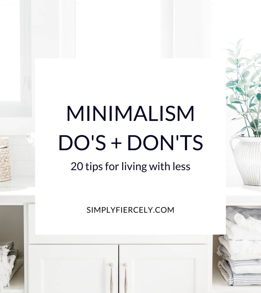
The Principles of Minimalism
Minimalism is all about living with intention and simplifying our lives to focus on what truly matters. Here are some key principles to help guide you on your minimalist journey:
- Declutter: Say goodbye to all those dust-gathering trinkets and clothes you haven’t worn in years. If it doesn’t bring you joy or serve a purpose, toss it!
- Quality over quantity: Invest in high-quality items that will last longer, rather than buying cheap, disposable things that will clutter your space.
- Less is more: Embrace the beauty of simplicity and avoid the temptation to fill your home with unnecessary stuff. Remember, empty space can be just as striking as a crowded room.
By embracing these principles, you’ll find that life becomes a lot less stressful and more fulfilling. So, grab a trash bag and channel your inner minimalist – you got this!
Simplicity in Color Choices
When it comes to selecting colors, less is definitely more. Think of a monochromatic color palette like a solo act at a One Direction concert - it’s simple, it’s sleek, and it’s bound to steal the show. A well-chosen color scheme can make your design pop like a confetti-filled pinata.
Remember, you don’t need to reinvent the wheel when it comes to color choices. Stick with the classics like black, white, and ____. These hues are like the Taylor Swift of the color world – they never go out of style. And if you’re feeling adventurous, throw in a pop of color to really make a statement. Just don’t go overboard - we’re aiming for simplicity, not a clown car explosion.
Next time you’re trying to decide between ‘Cerulean Blue’ and ‘Pacific Ocean Teal’, take a step back and ask yourself: does this color choice spark joy? If the answer is yes, go for it! If the answer is no, well, it’s time to cut ties with that shade faster than a bad Tinder date. Remember, simplicity is key - the fewer colors you have to juggle, the easier it is to create a cohesive and visually pleasing design.
Choosing the Right Typeface
When it comes to , the options are endless. But fear not, I’m here to help you navigate through the world of fonts with a little bit of humor thrown in!
First things first, consider the mood you want to convey with your text. Are you going for something elegant and sophisticated? Or maybe quirky and fun? Remember, just like choosing an outfit for a first date, the font you pick says a lot about you.
Next, think about the readability of your chosen typeface. Sure, that curly script font might look pretty, but if your readers have to squint to decipher what it says, you might want to reconsider. It’s all fun and games until someone can’t read your blog post.
Lastly, don’t be afraid to mix and match different typefaces to create a unique look. Just like peanut butter and jelly, some fonts were meant to be paired together. Embrace your inner font nerd and experiment with bolds, italics, and underlines until you find the perfect combination that makes your text pop!

balance-and-harmony“>Creating Balance and Harmony
Balance and harmony are key to maintaining a peaceful and joyful life. Just like a gymnast gracefully balancing on a beam, we too must find our equilibrium to navigate the ups and downs of daily life. It’s all about finding that sweet spot where everything feels just right.
One way to create balance is by prioritizing self-care. Treat yourself like the queen or king you are - whether it’s with a decadent bubble bath, a soothing cup of tea, or a night of binge-watching your favorite show (no judgment here!). Remember, a happy you means a happy universe!
Another trick to finding harmony is by decluttering your physical space. Get rid of all those clothes you haven’t worn since the 90s (yes, tie-die is making a comeback, but maybe not THAT tie-die), organize your junk drawer (we all have one), and let go of anything that no longer serves you. Trust me, your living room will thank you!
Lastly, don’t forget to nurture your relationships. Spend quality time with loved ones, laugh until your abs hurt, and create memories that will last a lifetime. A support system is like a warm hug on a cold day - it just makes everything better.
Utilizing Negative Space
Negative space, also known as the area around and between the subject of an image, is like the forgotten sibling of positive space. But hey, just because it’s not in the spotlight doesn’t mean it’s not important! In fact, can really make your designs pop and stand out. So let’s embrace the emptiness and play around with those blank spaces!
One way to utilize negative space is by using it to create clever optical illusions. Picture this: a minimalist logo that, when you look closer, actually forms a hidden message or image within the negative space. It’s like a visual puzzle waiting to be solved! Plus, it adds an element of surprise and intrigue to your design.
Another cool trick is using negative space to create balance and harmony in your compositions. When you let the empty spaces breathe, it can help give your design a sense of flow and cohesion. It’s like giving your design room to stretch and relax – because let’s face it, nobody likes a cramped and cluttered space, not even your design elements!
And don’t forget about the power of negative space in creating emphasis and focus. By strategically leaving areas blank, you can direct the viewer’s eye to the most important parts of your design. It’s like putting a spotlight on the star of the show – whether it’s a product, a message, or a funky illustration. So go ahead, embrace the emptiness and see how negative space can work its magic in your designs!
Achieving Timeless and Versatile Designs
When it comes to , there are a few key factors to keep in mind. First and foremost, remember that simplicity is key! Keep your designs clean and uncluttered, and steer clear of any trends that may become outdated in a few months (we’re looking at you, neon colors).
Another essential element of is to choose classic pieces that can be easily mixed and matched. Think of your design like a well-curated wardrobe – you want pieces that can be effortlessly paired together to create countless stylish combinations. Plus, investing in timeless staples means you won’t have to constantly update your designs to keep up with the latest fads.
Additionally, don’t be afraid to play with textures and materials to add depth and interest to your designs. Mixing and matching different fabrics, finishes, and patterns can create a dynamic and visually appealing look that will stand the test of time. And remember, a little bit of contrast can go a long way in creating a design that is both versatile and eye-catching.
So, whether you’re designing a room in your home or creating a brand new logo for your business, keep these tips in mind to achieve designs that are truly timeless and versatile. Your future self will thank you for it!
FAQs
What exactly is minimalist logo design?
Think of it as the art of saying a lot with very little. Minimalist logo design strips away all the unnecessary frills and focuses on clean, simple elements that pack a powerful punch.
Why should a company consider minimalist logo design?
Because in a world cluttered with logos, standing out with a sleek and sophisticated design could be just what your brand needs to make a lasting impression. Plus, it’s like the little black dress of the design world – always classy and never goes out of style.
How can a minimalist logo still convey a company’s message effectively?
It’s all about choosing the right elements to represent your brand. Less is definitely more in the world of minimalist design, so make every line, shape, and color count. Remember, you’re not just designing a logo - you’re creating a visual identity for your brand.
Are there any famous examples of minimalist logo design?
Absolutely! Think of the iconic Apple logo - just a simple apple silhouette with a bite taken out of it. Or the Nike swoosh – a sleek, minimalistic design that embodies speed and movement. These logos prove that you don’t need to be flashy to make a big impact.
How can a company get started with minimalist logo design?
Start by defining your brand identity and the message you want to convey. Then, work with a talented designer who can bring your vision to life in a clean, minimalist way. Remember, simplicity is key – less is definitely more when it comes to minimalist logo design.
Keep it simple, stylish, and chic
Congratulations, you’ve now unlocked the secrets to mastering the art of minimalist logo design. Remember, less is always more when it comes to creating a sleek and sophisticated brand identity. So go forth, unleash your creativity, and let your minimalist logo designs shine with pure elegance. And hey, who knows? Maybe your next logo will be the talk of the town for all the right reasons. Keep it classy, folks!


