Are you tired of your logo blending into the background like a chameleon at a rainbow convention? Do you want your brand to scream “Look at me!” louder than a toddler at a quiet restaurant? Well, buckle up buttercup, because we’re about to dive headfirst into the wonderful world of color psychology in logo design. Time to put on your designer hat (or beret, if you’re feeling fancy) and get ready to make an impact that’s so big, even your grandma’s bingo group will take notice. Let’s paint the town red… or blue… or green… or whatever color makes your target audience tick. Welcome to the rainbow revolution, my friend. It’s going to be a colorful ride.
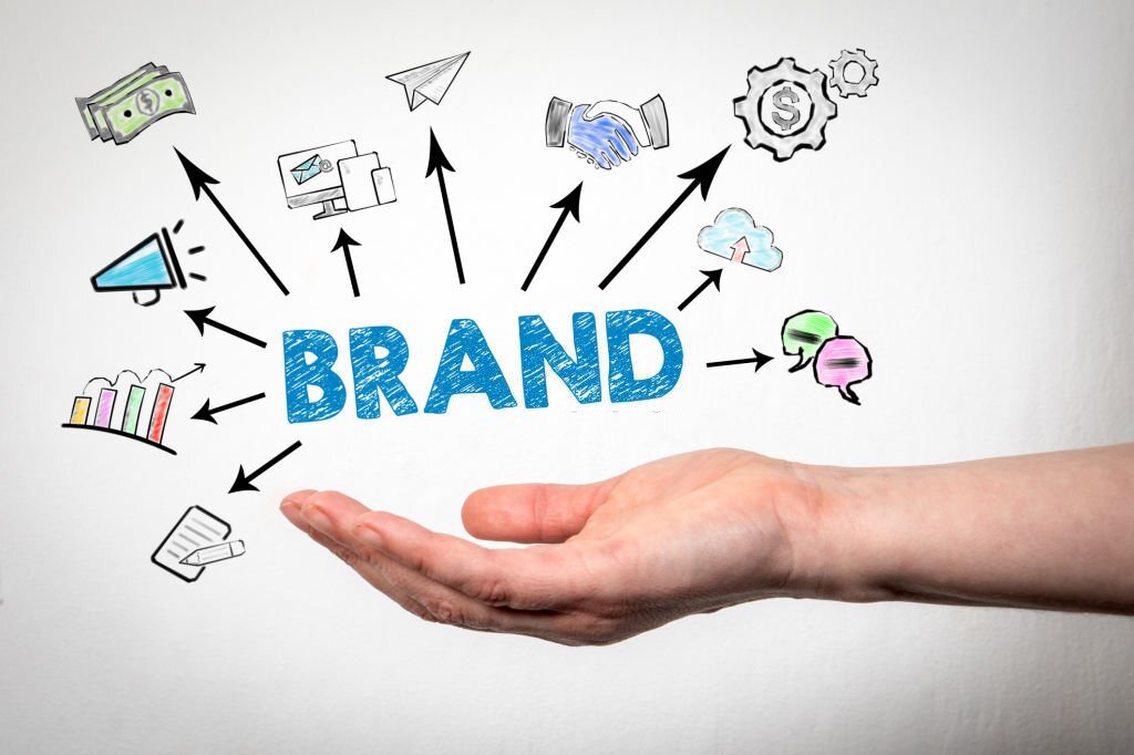
Understanding Color Psychology in Logo Design
When it comes to logo design, color psychology plays a crucial role in conveying the right message to your audience. Let’s dive into some key points to help you understand how different colors can impact the perception of your brand.
Warm Colors:
- Red: Bold and energetic, perfect for grabbing attention.
- Orange: Represents enthusiasm and creativity, ideal for playful brands.
- Yellow: Radiates positivity and happiness, great for cheerful and bright brands.
Cool Colors:
- Blue: Conveys trust and professionalism, ideal for corporate brands.
- Green: Symbolizes growth and harmony, perfect for eco-friendly or wellness brands.
- Purple: Represents luxury and sophistication, great for high-end brands.
Remember, the colors you choose for your logo should align with your brand’s values and target audience. So, next time you’re brainstorming logo ideas, keep color psychology in mind to create a design that truly speaks to your audience!
Choosing the Right Colors for Your Brand Identity
So you’re ready to choose the perfect colors for your brand identity, huh? Well, buckle up because this is no ordinary task. Your brand colors are like the cherry on top of your marketing sundae – they need to be just right.
First things first, think about the emotions you want your brand to evoke. Are you going for a serene vibe or a bold, in-your-face statement? Once you’ve nailed down the mood, it’s time to dive into the world of color psychology. Yes, that’s a thing, and yes, it’s fascinating!
Don’t just pick your favorite colors and call it a day. Consider how different colors make people feel and what they represent. For example, using blue can convey trust and professionalism, while yellow is all about optimism and happiness. It’s like creating a mood board, but with fewer pictures of puppies and more hex codes.
Remember, your brand colors are going to be everywhere – on your website, on your business cards, even tattooed on your forehead (just kidding… maybe). So take your time, do your research, and choose the colors that truly represent who you are as a brand. And hey, if all else fails, just go with rainbow - you can never go wrong with rainbow.
Creating Emotional Connections Through Color Selection
When it comes to choosing colors for your design projects, it’s important to remember that different colors can evoke different emotions in people. By carefully selecting your color palette, you can create a strong emotional connection with your audience. Here are some tips and tricks to help you make the most of your color choices:
Consider the cultural significance of colors: Different colors hold different meanings in different cultures. For example, in Western cultures, white is often associated with purity and innocence, while in some Asian cultures, it’s a color of mourning. Make sure you’re aware of the cultural connotations of the colors you choose.
Think about the mood you want to convey: Are you going for a calming, serene vibe? Consider using cool colors like blues and greens. Want to create a sense of excitement and energy? Opt for bold, warm colors like reds and yellows. The right color palette can set the tone for your entire design.
Experiment with contrasting colors: Sometimes, the most effective way to create an emotional connection with your audience is to use colors that starkly contrast with each other. Think about the classic pairing of black and white – it’s bold, dramatic, and definitely makes a statement. Don’t be afraid to play around with unexpected color combinations!

Color Combinations That Signify Trust, Innovation, and Energy
When it comes to choosing , there are endless possibilities to play around with. Understanding the psychology behind colors can help you make the right choices to convey your desired message effectively.
For trust, you can never go wrong with a classic combination of blue and white. Blue is known to evoke feelings of security and reliability, while white represents purity and honesty. Together, they create a sense of credibility and professionalism that will make your audience feel confident in your brand.
When it comes to innovation, think outside the box and experiment with bold and unconventional color pairings. Consider combining purple and green for a fresh and modern look that screams creativity. Purple symbolizes luxury and originality, while green is associated with growth and progress. This dynamic duo will showcase your forward-thinking approach and set you apart from the competition.
For an energy-packed color scheme, nothing beats the vibrant combination of red and yellow. Red is known to stimulate excitement and passion, while yellow exudes joy and optimism. Together, they create a high-energy vibe that will captivate your audience and leave a lasting impression. So go ahead, unleash your creative juices and get ready to paint the town red (and yellow)!

Optimizing Brand Recognition with Strategic Color Choices
When it comes to optimizing brand recognition, choosing the right colors can make all the difference. You want your brand to stand out in a sea of competitors, and the right color choices can help you do just that.
Here are some strategic tips for selecting colors that will make your brand shine:
- Know your audience: Understanding your target demographic is key to picking the right colors. Are you targeting young millennials who respond well to bright, vibrant colors? Or is your brand more sophisticated and aimed at an older, more refined audience?
- Consider the psychology of color: Different colors evoke different emotions and associations. For example, red can evoke feelings of passion and energy, while blue is often associated with trust and reliability. Choose colors that align with the message you want to convey.
- Be consistent: Once you’ve chosen your brand colors, stick with them. Consistency is key to building brand recognition. Use your chosen colors across all marketing materials, from your website to your social media profiles to your business cards.
By making strategic color choices, you can ensure that your brand is memorable, recognizable, and leaves a lasting impression on your target audience. So next time you’re choosing colors for your brand, think strategically and watch your recognition soar!
FAQs
Why is color psychology important in logo design?
Well, imagine if the McDonald’s logo was purple instead of yellow. You’d probably be craving grapes instead of fries!
How can color choices in a logo impact consumer behavior?
It’s like magic! The right colors can make people feel calm, excited, hungry, or even trustworthy. Just think of the power that a little dot of color holds.
What are some common color associations in logo design?
Red can make you feel energized (or hungry – think fast-food chains), blue can make you feel calm and reliable (hello, tech companies), and yellow can make you feel happy (like a ray of sunshine).
How can a business choose the right colors for their logo?
Step one: Consult a magic 8-ball. Step two: Just kidding! Do some research on your target audience and what emotions you want to evoke, and then pick your colors accordingly.
Can using color psychology in logo design really make a difference?
Absolutely! Just look at how that little green mermaid on your Starbucks cup makes you willing to pay an arm and a leg for a latte. It’s all in the colors, people!
Color Your Logo, Color Your World!
Thank you for diving into the world of color psychology with us and learning how to utilize it in logo design. Remember, a little bit of red can evoke passion, while a touch of green can bring about feelings of harmony. So go ahead, unleash your inner artist and paint the town (or at least your logo) with all the colors of the rainbow! Now go out there and make your brand shine brighter than a neon pink unicorn on a sunny day!


