Have you ever looked at a logo and felt an instant burst of joy or a wave of calm wash over you? That’s the magic of color psychology at work, my friends. In this article, we’re going to dive headfirst into the rainbow-infused world of logo design and explore how mastering the art of color can make your brand stand out like a fabulous unicorn in a sea of boring donkeys. So grab your paint palette and buckle up, it’s going to be a wild ride!
Understanding Color Theory in Logo Design
Color theory in logo design can be a bit like choosing ice cream flavors for a picky toddler – it requires careful thought and consideration. But fear not, aspiring logo designers! With a little understanding of color psychology, you can create logos that make an impact and leave a lasting impression.
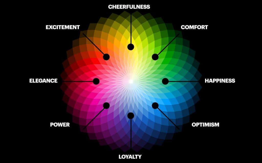
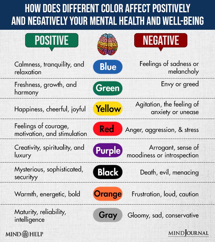
So, what’s the deal with all these colors, you ask? Well, each color has its own unique personality. From the warmth of red to the tranquility of blue, colors have the power to evoke emotions and convey messages without saying a single word. By harnessing the magic of color theory, you can design logos that speak volumes and captivate your audience.
But wait, there’s more! Just like a good cocktail mixologist, you need to understand how different colors interact with each other. Some colors play well together and create a harmonious blend, while others clash like a bad reality TV show. By mastering the art of color harmony, you can create logos that are visually appealing and aesthetically pleasing to the eye.
In conclusion, color theory in logo design is like a delicious buffet of options waiting to be explored. So, grab your color wheel and let your creativity run wild! Remember, when it comes to color, the sky’s the limit. Let your imagination soar and create logos that not only look good but also tell a compelling story. After all, who needs words when you have the power of color at your fingertips
The Impact of Color on Consumer Perception
When it comes to consumer perception, color plays a crucial role in influencing our buying decisions. Think about it, have you ever been drawn to a product just because of its vibrant packaging? That’s the power of color psychology at play!
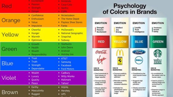
Research shows that different colors evoke different emotions and behaviors in consumers. For example, blue is often associated with trust and reliability, which is why many financial institutions use it in their branding. On the other hand, red is known to stimulate appetite, which is why fast-food chains like McDonald’s and KFC use it to entice hungry customers.
So, the next time you’re designing a product or launching a marketing campaign, consider the impact of color on your target audience. By choosing the right color palette, you can create a powerful connection with consumers and influence their perception of your brand.
Remember, color is not just a visual element – it’s a powerful tool that can shape how consumers view your product or service. So, don’t underestimate the importance of color in your marketing strategy. Embrace the rainbow and watch your sales soar!

Choosing the Right Colors for Your Brand
When it comes to choosing the perfect colors for your brand, it’s not as simple as picking your favorite shades of pink and purple and calling it a day. Your brand colors need to evoke the right emotions and convey the right message to your audience. Here are a few tips to help you pick the perfect hues:
First things first, think about the personality of your brand. Is it fun and quirky? Professional and trustworthy? Adventurous and bold? Choose colors that reflect the vibe you want to portray. Remember, colors have meanings, so think about what emotions you want to evoke.
Consider the competition. You don’t want your brand to get lost in a sea of similar colors. Stand out by choosing a unique palette that sets you apart. Bold and bright colors can grab attention, while softer, more muted tones can convey sophistication.
Don’t forget about color psychology. Certain colors have been shown to evoke specific emotions. For example, blue is often associated with trust and reliability, while yellow can convey energy and optimism. Think about the message you want to send and choose colors that support that message.

Using Colors to Evoke Emotional Responses
Imagine a world where everything was black and white. Boring, right? Colors play a huge role in how we perceive the world around us, and they can also evoke a range of emotional responses. By strategically using colors in your daily life, you can create a more vibrant and emotionally engaging experience.
One way to use colors to evoke emotional responses is through the design of your living space. For example, **bold** and bright colors like red and orange can create a sense of energy and excitement, while cooler tones like blue and green can evoke feelings of calm and tranquility. Consider painting a feature wall in your favorite color or adding pops of color through throw pillows or artwork to instantly change the mood of a room.
In addition to your living space, you can also use colors to evoke emotional responses in your wardrobe. **Mixing and matching** different colors can create a unique and visually stimulating look, while wearing colors that make you feel happy and confident can boost your mood and overall well-being. Don’t be afraid to experiment with different color combinations and see how they make you feel.
The power of color doesn’t stop at interior design and fashion – you can also use colors to evoke emotional responses in your work environment. **Highlight important tasks** in a vibrant color to increase your productivity and motivation, or create a calming environment with pastel shades to reduce stress and promote creativity. Experiment with different color schemes to see which ones resonate with you the most and make your workday more enjoyable.
Creating a Harmonious Color Palette for Your Logo Design
Choosing the perfect color palette for your logo design can be a daunting task. But fear not, with a little creativity and a touch of flair, you can create a harmonious masterpiece that will make your competitors green with envy!
Here are some tips to help you on your color quest:
- Start with a base color that represents your brand personality. Is your brand bold and fearless? Go for a bright red or electric blue. Is it classy and sophisticated? Opt for a deep navy or emerald green.
- Use complementary colors to add depth and dimension to your design. Think of these as the sidekicks to your hero base color – they should enhance, not overpower.
- Experiment with different shades and tones of your chosen colors. Mix and match until you find the perfect balance that speaks to the essence of your brand.
Remember, the key to a harmonious color palette is cohesion and unity. Your colors should work together like a well-oiled machine, each playing a unique role in the overall design. So go forth, brave designer, and paint the town (or at least your logo) with a rainbow of creativity!
FAQs
Why is color psychology important in logo design?
Because if your logo is the wrong color, you might as well be coloring outside the lines of success. Colors can evoke emotions and perceptions that can make or break your brand’s image.
How can I choose the right colors for my logo?
Well, first off, close your eyes and think about how you want your audience to feel when they see your logo. Are you going for calming blues or fiery reds? Once you’ve got a sense of the vibe you want, do some research on what colors align with those emotions.
What do different colors symbolize?
Oh, so many things! Red can represent passion and energy, while blue can give off feelings of trust and professionalism. Green is often associated with nature and growth, while yellow can bring happiness and positivity to the table.
Can I use multiple colors in my logo?
Sure, you can be a rainbow if you want to! Just make sure the colors work well together and don’t clash like a bad outfit choice. Using a color wheel can help you find harmonious color combinations.
Is it okay to break the rules of color psychology in logo design?
Of course! Rules are made to be broken, or so they say. If breaking the color psychology rules helps your logo stand out and communicate your brand’s message better, then by all means, be a rebel with a cause.
Wrapping Up: Becoming a Logo Color Wizard
Congratulations, color connoisseur! You have now unlocked the mystical powers of color psychology in logo design. Armed with this knowledge, you are ready to wield your magical color palette and captivate the minds of consumers everywhere.
Remember, just like a wizard honing their craft, practice makes perfect. Experiment with different color combinations, explore the emotions they evoke, and watch as your logos come to life in ways you never thought possible.
So go forth, brave designer, and may your logos be as vibrant and captivating as a rainbow shooting out of a unicorn’s butt!


