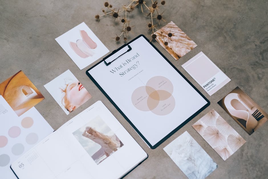
Ever heard of ‘Speak softly and carry a big logo’? No? Well, that’s probably because I just made it up. But hey, who says branding can’t be fun? In this article, we’re going to explore how a logo design can do all the talking for your brand – whether you want to shout it from the rooftops or whisper sweet nothings to your customers. So buckle up, folks, because we’re about to take a wild ride through the wacky world of mapping brand voice with logo design!
Understanding Brand Voice
Brand voice is like a superhero cape for your company – it’s what makes you stand out in a sea of mundane business jargon. But just like Batman wouldn’t be caught dead in a pink tutu, your brand voice should also be consistent and reflective of your company’s personality.
So how do you find your unique brand voice? It’s like going on a blind date with your business – you need to ask the right questions and make sure you’re compatible. And just like a bad date, a mismatched brand voice will make your customers want to run for the hills.
One key aspect of brand voice is tone – are you going for casual and friendly, or formal and professional? Are you the Deadpool of your industry or more of a Captain America? Whatever you choose, just make sure it aligns with your brand’s values and mission. Because let’s face it, no one wants to see Deadpool giving a TED talk on quantum physics.
Once you’ve found your brand voice, stick with it like glue. Consistency is key to building trust with your audience - no one wants to feel like they’re talking to Dr. Jekyll one day and Mr. Hyde the next. So put on your superhero cape and let your brand voice fly high!

Defining the Role of Logo Design
So you want to know what the heck a logo designer actually does, huh? Well, buckle up because I’m about to lay it all out for you in a way that even your grandma could understand. Basically, a logo designer is like a magician, but instead of pulling a rabbit out of a hat, they pull a sleek, eye-catching visual representation of a company out of their brain.
Think of a logo designer as a secret agent of branding. Their mission? To create a visual identity that communicates a company’s values, vision, and personality all in one tiny little graphic. They’re like the modern-day superheroes of the design world, swooping in to save the day with a killer logo that makes everyone go, “Whoa, that’s cool!”
But it’s not all fun and games being a logo designer. They have to navigate a minefield of client feedback, color choices, and font pairing to create a logo that not only looks good but also makes sense. It’s a delicate dance of creativity and practicality, like trying to juggle flaming torches while riding a unicycle. In other words, it’s not for the faint of heart.
So next time you see a logo that makes you do a double-take or feel all warm and fuzzy inside, remember that there’s a logo designer behind it, toiling away in the design trenches to make the world a more beautiful and cohesive place, one logo at a time.

colors-and-fonts”>Choosing the Right Colors and Fonts
When it comes to for your project, it’s like picking the perfect outfit for a first date – you want to make a good impression! But instead of worrying about whether plaid clashes with stripes, you’re trying to find the perfect combination of hues and typefaces that will make your design pop.
First things first, let’s talk about colors. Remember, it’s not just about what looks pretty – you’ve got to consider the psychology behind each shade. Red is bold and passionate, perfect for making a statement. Blue is calming and trustworthy, ideal for evoking a sense of reliability. And yellow…well, yellow is just an all-around happy color that screams, “Look at me!”
Now, onto fonts. Fonts are like the personality of your design – serif fonts are classic and sophisticated, like a fine wine. Sans-serif fonts are modern and minimalistic, like a sleek sports car. And don’t even get me started on Comic Sans – it’s like showing up to a black-tie event in your pajamas.
So, mix and match, experiment and play around with different colors and fonts until you find the perfect combination that speaks to you. After all, design is subjective – there’s no right or wrong answer, just a whole lot of trial and error. Just remember, when all else fails, you can never go wrong with a little pop of **bold color** and a touch of **impactful font** to really make a statement.
Incorporating Brand Personality
When it comes to , there are a few key things to keep in mind:
- Stay True to Your Roots: Just like you shouldn’t try to become a whole new person just to fit in with a cool crowd, your brand shouldn’t try to be something it’s not. Embrace the quirks and unique traits that make your brand stand out!
- Get Creative with Communication: Don’t be afraid to let your brand’s personality shine through in your communication style. Whether it’s through witty social media posts or clever ad campaigns, find ways to make your brand voice heard.
- Have Fun with Visuals: Your brand’s visual identity is another great way to showcase its personality. Whether it’s through vibrant colors, playful graphics, or quirky logos, let your brand’s visual elements reflect its one-of-a-kind personality.
Remember, when it comes to , the key is to be authentic, creative, and true to yourself. So go ahead, let your brand’s personality out to play!

Creating a Consistent Look and Feel
So you want your website to look like it was put together by a professional, not your cousin who just discovered Photoshop last weekend. is the key to making your site scream “I know what I’m doing!” and not whisper “I have no idea what I’m doing.” Here are some tips to help you achieve that polished, cohesive vibe:
- Color Palette: Pick a few key colors and stick with them like glue. Don’t go adding random shades of neon green just because you think it looks cool – trust me, it doesn’t.
- Typography: Choose 2-3 fonts for your headings and body text and use them consistently throughout your site. Mixing Comic Sans with Times New Roman is a big no-no unless you’re trying to give your visitors a headache.
- Images: Use high-quality images that all have a similar style and vibe. Don’t throw in a pixelated cartoon next to a high-res stock photo of a beach – unless you’re going for that avant-garde, confused artist look.
Remember, consistency is key when it comes to creating a professional-looking website. So put down the glitter fonts and stop playing around with that rainbow gradient – unless you’re throwing a 90s-themed party on your homepage, in which case, carry on. But for the rest of us, let’s stick to a clean, cohesive look that makes visitors want to stay and explore, not run screaming for the back button.
success-and-making-adjustments”>Evaluating Success and Making Adjustments
After launching your latest project with all the pomp and circumstance of a royal wedding, it’s time to take a step back and evaluate its success. Did it soar to the top of the charts like a majestic eagle, or did it flop like a fish out of water? No matter the outcome, it’s important to take a closer look and make any necessary adjustments to ensure future success.
First, gather feedback from customers, clients, and anyone else who had a front-row seat to your project. Were they more thrilled than a kid in a candy store, or were they left scratching their heads in confusion? Take note of both the positive and negative feedback, and use it to guide your next steps.
Next, analyze the data like a detective solving a mystery. Look at metrics such as sales numbers, website traffic, and social media engagement to get a clearer picture of how your project performed. Did it hit the mark like an archer’s bullseye, or did it miss the target by a mile? Use this information to identify areas for improvement.
Once you’ve identified areas for improvement, it’s time to roll up your sleeves and make some adjustments. Whether it’s tweaking your marketing strategy, revamping your product offerings, or fine-tuning your customer service, don’t be afraid to shake things up. After all, if you keep doing the same thing, you’ll keep getting the same results. Embrace change like a chameleon changing colors, and watch your success soar to new heights!
FAQs
Why is brand voice important in logo design?
Well, imagine if your favorite fast-food joint suddenly had a logo that looked like it belonged on a luxury spa. Confusing, right? Your brand voice sets the tone for your entire business, and your logo is like the megaphone shouting it out to the world.
How can logo design reflect brand voice?
Think of your logo as the outfit your brand wears to the party. If you’re a funky, fun-loving brand, your logo should be rocking those neon colors and quirky shapes. If you’re more on the serious side, maybe stick to sleek lines and classic colors.
Can a logo design change over time as brand voice evolves?
Absolutely! Just like you wouldn’t wear the same outfit you wore in high school to a job interview, your brand’s logo may need some updating as it grows and changes. Embrace the evolution and give your logo a little facelift from time to time.
How does mapping brand voice with logo design help with brand recognition?
Have you ever walked down the street and instantly recognized a brand just by its logo? That’s the power of consistent branding. By mapping your brand voice with your logo design, you create a recognizable and memorable image that sticks in people’s minds like a catchy jingle.
What are some common mistakes businesses make when mapping brand voice with logo design?
One big mistake is trying to be something you’re not. If your brand voice is all about laid-back vibes and chillaxing, don’t try to force a super formal, uptight logo. Stay true to who you are, and the rest will follow.
In Conclusion: Unleash Your Brand’s Roar!
Congratulations, you’ve now mastered the art of mapping brand voice with logo design! Remember, your logo is the visual representation of your brand’s personality, so make sure it speaks loud and clear. Whether you want to convey sophistication, playfulness, or downright quirkiness, your logo is your brand’s voicebox. So go ahead, unleash your brand’s roar and let your logo do the talking! Who knew a few pixels and colors could speak volumes? Remember, a well-designed logo is worth a thousand words…or maybe even a million!


