A logo is like the handshake of your brand – it’s the first impression that can make or break your relationship with consumers. But, just like in real life, an awkward handshake can leave a lasting cringe-worthy memory. In the world of logo design, there are plenty of common pitfalls that can turn your brand’s greeting into a limp, clammy mess. Fear not, dear designer, for we have compiled a list of pro tips to help you navigate the treacherous waters of logo design and avoid those cringe-inducing missteps. So grab your creative toolbox and let’s dive in!
Identifying Your Target Audience
So you want to reach your target audience, huh? Well, first things first – you gotta know who they are! Here are some tips to help you pinpoint those elusive folks:
- Take a look at your current customers – who are they? What do they like? What makes them tick?
- Do some research – hit the internet, stalk people on social media (in a non-creepy way, of course), and gather as much info as you can.
- Ask yourself some important questions – What age group do they fall into? What are their interests? What problems do they face that your product or service can solve?
Once you have a better idea of who your target audience is, you can start tailoring your content to appeal to them. Remember, it’s all about making that connection and showing them that you understand their needs and wants. So go forth, brave marketer, and conquer that target audience!
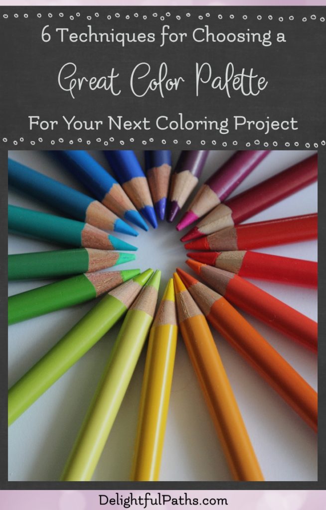
Choosing the Right Color Palette
When it comes to , it can be a daunting task. But fear not, with a little guidance, you can become a color pro in no time!
One way to choose the perfect color palette is to start by determining the mood you want to convey. Are you going for a calming vibe? Choose cool tones like blues and greens. Want to add some energy to your space? Opt for warm tones like reds and yellows. Remember, color has a powerful impact on emotions, so choose wisely!
Another important factor to consider is the overall aesthetic you’re going for. Do you want a bold, modern look? Stick to high-contrast colors like black and white with a pop of neon. Or maybe you prefer a more subtle, natural feel? Opt for earthy tones like browns and greens. The possibilities are endless!
Don’t be afraid to get creative with your color choices. Mixing and matching different shades can create a unique and visually appealing palette. And if you’re feeling stuck, don’t be afraid to seek inspiration from nature, fashion, or even your favorite painting. The world is full of color, so embrace it!

Avoiding Overly Complex Designs
When it comes to design, less is often more. Here are some tips for :
- Keep it simple: Stick to a clean and minimalistic aesthetic. Avoid cluttering your design with unnecessary elements.
- Use white space: White space is your friend. It helps to create a sense of balance and allows for easier navigation.
- Limit color choices: Too many colors can be overwhelming. Stick to a cohesive color palette to keep things visually appealing.
- Avoid excessive detail: Sometimes less is more. Don’t overcomplicate your design with too many intricate details.
Remember, the goal is to create a design that is both visually appealing and functional. By keeping things simple and , you can create a more enjoyable user experience.

Ensuring Scalability and Versatility
When it comes to , you want to make sure that your system can handle any situation that comes its way. You don’t want to be stuck with a one-trick pony that can’t adapt to changing needs.
One way to ensure scalability is to use cloud-based services. Cloud services can easily scale up or down based on demand, so you won’t be left high and dry when traffic spikes unexpectedly. Plus, with the cloud, you can access your data from anywhere, making it easier to work on the go.
Another key factor in is modular design. By breaking down your system into smaller, reusable components, you can easily add or remove functionality as needed. Think of it like building with Lego blocks – you can mix and match pieces to create a custom solution that fits your needs.
Lastly, don’t forget about automation. By automating routine tasks, you can free up time for more important things, like brainstorming new ideas or watching cat videos. Plus, automation can help reduce errors and ensure consistency across your system, making it easier to scale up without breaking a sweat.

Utilizing Negative Space Effectively
Negative space is like the unsung hero of design. It’s the quiet star that makes the main elements in your design shine brighter than a diamond in the rough. To make the most out of negative space, you’ve got to be strategic and intentioned in your design choices.
Here are some fun and quirky ways to utilize negative space effectively:
- Embrace the whitespace: Don’t be afraid of empty spaces in your design. Embracing the whitespace can create a sense of elegance and sophistication that will make your design stand out from the clutter.
- Use negative space to create clever illusions: Play around with negative space to create clever optical illusions. You can incorporate hidden images or messages within the negative space that will make your design truly unforgettable.
- Let negative space guide the viewer’s eye: Use negative space to direct the viewer’s focus to the most important elements in your design. By strategically placing negative space around key elements, you can make them pop and captivate your audience’s attention.
Seeking Inspiration from Industry Leaders
So you’re feeling a little stagnant in your career, huh? Well, fear not! Sometimes all it takes is a little inspiration from the greats in your industry to recharge your creative juices and get you back on track. Here are a few ways you can seek out that much-needed inspo:
- Get your Google on: Dive into the depths of the internet and start researching those industry leaders who make your heart skip a beat. Read up on their success stories, their latest projects, and maybe even stalk them a little on social media. Hey, no judgments here!
- Attend conferences and events: Nothing beats the jolt of energy you get from being surrounded by like-minded professionals. Check out upcoming conferences and events in your field, and don’t be shy about introducing yourself to those leaders who you admire. Who knows, you might just make a new friend!
And remember, inspiration doesn’t always have to come from the big-wigs in your industry. Sometimes it’s those unsung heroes right next to you who can provide the spark you need to keep going. So keep your eyes and ears open, and be ready to pounce on inspiration whenever and wherever it strikes!
FAQs
What kind of fonts should I avoid using in my logo design?
Stay away from using Comic Sans, Papyrus, and any overused or cliched fonts like Curlz MT or Impact. Aim for fonts that are unique, easily readable, and complement the overall design of your logo.
How can I make sure my logo design is scalable?
To ensure your logo design is easily scalable, try to avoid intricate details and opt for simpler, clean lines. Test your logo in different sizes to see if the elements remain clear and legible. Remember, your logo needs to look great on both a billboard and a business card.
What colors should I avoid when creating a logo?
Avoid using too many colors that can make your logo appear busy and overwhelming. Stick to a maximum of three colors that complement each other well. Also, be mindful of how your color choices might look in black and white or grayscale.
Should I incorporate trendy design elements into my logo?
While it may be tempting to follow the latest design trends, be cautious about incorporating them into your logo. Trends come and go, but your logo should stand the test of time. Opt for a timeless design that reflects your brand values and will remain relevant for years to come.
How do I know when my logo design is finished?
Knowing when to stop tweaking your logo is a common struggle for designers. Trust your instincts and listen to feedback from others. If your logo effectively communicates your brand identity and resonates with your target audience, then it’s likely finished. Remember, perfection is the enemy of progress!
Avoid the Design Deception Trap
So, dear logo designers, remember the wise words of Confucius: “A logo may be small, but its impact is mighty!” By avoiding these common pitfalls and following our pro tips, you’ll be well on your way to creating logo masterpieces that attract attention and leave a lasting impression. Let your creativity flow and your design skills shine – the world is waiting for your next logo masterpiece! Go forth and design with confidence, dear designers!


