In a world where design/” title=”Automotive Logo Design”>communication spans continents and cultures faster than you can say ”logo,” the importance of global logo design can’t be overstated. With a dizzying array of languages, symbols, and customs to consider, the task of bridging cultural divides through design may seem daunting. But fear not, dear reader, for in this article we’ll dive headfirst into the wild, wonderful world of global logo design – where East meets West, where ancient traditions collide with modern aesthetics, and where, if we’re lucky, we might just emerge with a universal symbol of harmony (and perhaps a few laughs along the way). So grab your passport and your Pantone swatches, because we’re about to embark on a design journey like no other. Let’s make the world a little smaller, one logo at a time.
Logo Design Trends Around the World
In the ever-evolving world of logo design, trends come and go faster than a pack of stray cats in the night. From sleek minimalist designs to bold and colorful creations, there’s no shortage of ways to make your mark in the global design scene.
One trend that’s been sweeping the design world like a hurricane on roller skates is the use of vibrant gradients. Who needs boring old solid colors when you can have a logo that looks like a magical rainbow unicorn threw up all over it? Embrace the gradient, my friends, and watch your logo stand out like a zebra in a sea of horses.
Another hot trend that’s been making waves is the return of retro-inspired designs. Think disco balls, lava lamps, and bell-bottom pants. You heard it here first, folks – the ’70s are back, baby! So dust off your platform shoes and get ready to groove with logos that scream “peace, love, and Helvetica.”
And let’s not forget about the power of negative space. Why settle for a logo that’s as crowded as a New York City subway car at rush hour when you can have one that’s as clean and airy as a freshly laundered bedsheet? Embrace the negative space, people – it’s like giving your logo a breath of fresh air!

The Impact of Cultural Differences on Logo Design
When it comes to logo design, cultural differences can play a huge role in how a brand is perceived. Here are a few ways that various cultural influences can impact logo design:
- Color – In Western cultures, white often symbolizes purity and innocence, while in some Eastern cultures it represents death and mourning. So, a logo featuring a lot of white might have different connotations depending on where it’s being viewed.
- Symbolism – Certain symbols have completely different meanings in different cultures. For example, the color red symbolizes luck and prosperity in China, but danger and warning in Western cultures. So, incorporating certain symbols into a logo could potentially send the wrong message.
- Typography – Different scripts and fonts can evoke different emotions and associations. For example, a logo using a playful, curvy font might appeal to a younger audience in Western cultures, while in some Middle Eastern cultures, it could be seen as unprofessional.
Overall, it’s important to consider the cultural implications of logo design to ensure that your brand is communicating the right message. So, before finalizing a logo, make sure to do your research and consider how it might be perceived in various cultural contexts!

Strategies for Creating Globally Appealing Logos
Ready to take your logo design skills to the next level and create globally appealing logos? Here are some strategies to help you reach a wider audience:
Firstly, consider the use of color psychology in your logo design. Different cultures associate different meanings with colors, so choose your color palette wisely. For example, in Western cultures, red can symbolize passion and energy, while in some Asian cultures, it represents luck and prosperity. Be sure to do your research to ensure your color choices resonate with your target audience.
Next, keep your design simple and versatile. A cluttered logo with too many elements can be overwhelming and difficult to reproduce on different mediums. Think of iconic logos like Nike’s swoosh or Apple’s bitten apple – they’re easily recognizable and work well in various sizes and formats. Aim for a design that can stand the test of time and doesn’t rely on trends that might not translate well globally.
Another key strategy is to incorporate cultural elements that resonate with a global audience. Consider symbols or icons that are universally understood, like the sun representing warmth and energy, or a tree symbolizing growth and sustainability. By incorporating these universal symbols, you can create a logo that transcends language barriers and speaks to people from different backgrounds.

Case Studies: Successful Global Logo Designs
Let’s dive into some epic global logo design case studies that not only hit the mark but also left their mark on the world!
First up, we have the iconic McDonald’s Golden Arches logo. This logo transcends borders and languages, making it instantly recognizable no matter where you are in the world. The golden arches symbolize not just fast food, but a global phenomenon that unites burger lovers everywhere.
Next, we have the Apple logo, a simple yet powerful design that has become synonymous with innovation and cutting-edge technology. This logo has become a beacon of creativity and style, setting Apple products apart from the competition and solidifying their place as a global tech giant.
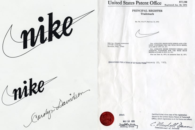
And who can forget the Nike Swoosh? This simple checkmark has come to represent not just a sports brand, but a lifestyle and a mindset. The Swoosh is a symbol of victory, determination, and excellence that resonates with athletes and aspiring athletes worldwide.

diverse-audiences”>Challenges of Designing Logos for Diverse Audiences
Designing logos for diverse audiences can be quite a challenge. Here are some of the obstacles you may face:
- Clarity: Trying to create a logo that appeals to multiple demographics while still maintaining a clear message can be like trying to juggle flaming chainsaws. It’s a risky business.
- Cultural Sensitivity: What might be a harmless reference in one culture could be a major faux pas in another. It’s like walking through a minefield blindfolded.
- Color Theory: Different colors can have vastly different meanings across cultures. Using red might convey passion in one culture, but anger in another. It’s like trying to pick the right shade of lipstick for a chameleon.
Despite these challenges, it’s important to remember that diversity is what makes the world interesting. Embrace the differences and create logos that can speak to a wide range of audiences. Just make sure you have a good helmet and a sturdy pair of boots to navigate through the logo design jungle!
The Role of Color Psychology in Global Logo Design
Color psychology plays a crucial role in global logo design, influencing how consumers perceive and interact with brands. Different colors evoke specific emotions and associations, making it essential for designers to choose wisely. Here are some fun insights into the fascinating world of color psychology in logo design:
- Red: Often associated with passion and energy, red is commonly used in logos to convey excitement and urgency. Think of brands like Coca-Cola and Netflix, whose bold red logos demand attention.
- Blue: A universal favorite, blue signifies trust and serenity. Many tech companies, such as Facebook and IBM, opt for blue logos to convey reliability and professionalism.
- Yellow: Bright and cheerful, yellow is often used to evoke feelings of optimism and warmth. Brands like McDonald’s and IKEA utilize yellow logos to create a welcoming and energetic vibe.
Remember, cultural differences can also impact color perceptions, so it’s crucial for global brands to consider how colors are interpreted in different regions. Whether you’re designing a logo for a local startup or a multinational corporation, understanding the role of color psychology can help create a powerful and impactful brand identity.
Tips for Ensuring Cultural Sensitivity in Logo Design
When designing a logo, it’s important to consider cultural sensitivity to avoid any unintended misinterpretations. Here are some tips to help you navigate this tricky terrain:
- Research, research, research: Before diving into designing your logo, make sure you do your homework on different cultures and their symbols. You don’t want to accidentally incorporate a symbol that has a negative connotation in a particular culture.
- Avoid stereotypes: Stay away from using clichés or stereotypical images that may be offensive to a particular group of people. Think outside the box and come up with creative, unique ideas that appeal to a diverse audience.
- Get feedback: Show your logo design to a diverse group of people to get their opinions. What may seem harmless to you could be offensive to someone else, so it’s always good to get a second (or third) pair of eyes on your work.
- Keep it simple: Sometimes, less is more when it comes to cultural sensitivity. Avoid overcrowding your logo with too many symbols or elements, as this can lead to confusion or misinterpretation.
FAQs
Will a logo designed for one culture work in another?
Absolutely! Just like how you can wear a sombrero while eating sushi, logos can transcend cultural barriers with the right design.
How can a logo incorporate multiple cultural influences?
Throw in some sushi, a taco, and maybe a bit of borscht, and voila! Your logo will have more cultural influences than a United Nations potluck.
Can a logo offend people from different cultures?
Only if you decide to include a pineapple as the main logo element in a pizza-loving country. Be careful, folks, don’t mess with people’s food!
What are some common symbols in logo designs that work globally?
Birds, stars, and the classic smiley face – because who doesn’t like a smiling bird under a starry sky?
How important is research in global logo design?
About as important as knowing whether to bow, shake hands, or do a fist bump when meeting someone for the first time. Do your homework, people!
Can colors in a logo design have different meanings in various cultures?
Absolutely! In one culture, red might symbolize love and passion, while in another, it could mean “Stop! No love here, please.”
How can a logo designer avoid cultural appropriation?
Just as you wouldn’t show up to a costume party dressed as a stereotypical version of someone’s culture, make sure your logo design is respectful and accurate. A little sensitivity goes a long way!
What are some examples of successful globally accepted logo designs?
Think McDonald’s golden arches, Coca-Cola’s iconic script, and Apple’s sleek bitten apple – all recognized worldwide, no translation needed.
Stay tuned for global logo design that unites the world!
As we’ve explored the fascinating world of global logo design and its impact on bridging cultural divides, we hope you’ve gained some insight into how the power of visual communication can transcend boundaries. Whether you’re a designer, marketer, or simply someone interested in the intersection of culture and design, there’s always more to learn and discover in this ever-evolving field. So keep an eye out for the next big logo that unites us all - who knows, it might just be right around the corner!


