In a world where everything from our phones to our socks have logos slapped on them, brand identity has never been more important. So, why settle for a boring old logo when you could be on the cutting edge of design trends instead? Get ready to dive into the wild and wonderful world of brand logo design, where unicorns, rainbows, and maybe even a glitter explosion or two are all fair game. Let your creativity run wild as we explore the latest trends that are shaping the way we see brands. Ready to shake things up (and maybe even stir the pot a little)? Let’s go logo exploring!
New Techniques in Minimalist Logo Design
Minimalist logo design is all the rage these days, and staying on top of the latest techniques is crucial for any designer looking to make a splash in the industry. Forget about busy, cluttered designs - less is definitely more when it comes to creating a memorable logo that stands out from the crowd.
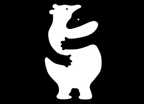
One new technique that has been gaining popularity is the use of negative space to create a clever and eye-catching design. By incorporating hidden symbols or shapes within the empty spaces of your logo, you can add an extra layer of intrigue that will keep viewers coming back for more. The key is to strike the perfect balance between simplicity and complexity, leaving just enough to the imagination to make a lasting impression.
Another trend that has been making waves in minimalist logo design is the use of geometric shapes and patterns. By combining basic shapes like circles, squares, and triangles in unexpected ways, designers can create logos that are both visually striking and deceptively simple. Whether it’s a playful arrangement of shapes or a more structured approach, the possibilities are endless when it comes to geometric design.
When it comes to color schemes, less is definitely more in minimalist logo design. By sticking to a limited palette of two or three colors, designers can create a clean and cohesive look that is both modern and timeless. Whether you opt for a monochromatic scheme or mix and match complementary colors, the key is to keep it simple and let the design speak for itself.

Incorporating Dynamic Color Schemes
When it comes to into your designs, the possibilities are endless! Forget boring monochromatic palettes – it’s time to embrace the rainbow and let your creativity shine. Here are some tips and tricks to help you take your designs to the next level:
Try experimenting with bold, contrasting colors to create visual interest and make your designs pop. Think outside the box and don’t be afraid to mix unexpected hues together – the more daring, the better! Remember, boring is for the birds, so spread your wings and fly high with your color choices.
Use color theory to your advantage by creating harmonious color schemes that evoke different moods and emotions. Whether you’re going for a peaceful pastel palette or a vibrant neon explosion, understanding color psychology can help you convey the right message to your audience. So go ahead, paint the town red – or blue, or green, or purple!
Don’t forget to consider the impact of different color combinations on accessibility and readability. Just because you love that eye-searing neon pink doesn’t mean it’s the best choice for your text color. Make sure your designs are user-friendly and easy on the eyes – after all, you want people to actually be able to read them, right?

Utilizing Negative Space for Impactful Logos
When it comes to designing logos, sometimes less is more. Utilizing negative space is a clever technique that can add depth and intrigue to your brand’s visual identity. Here are some tips for incorporating negative space into your logo design:
- Think outside the box – Literally! Consider using negative space to create hidden images or messages within your logo. This can add a fun element of surprise for viewers.
- Keep it simple – Negative space works best when it’s used sparingly. Don’t overload your logo with too many intricate details or it will be difficult for viewers to decipher.
- Play with contrast – Utilize the contrast between positive and negative space to make certain elements of your logo pop. This can draw the viewer’s eye and create a more dynamic design.
Remember, negative space doesn’t have to be boring. In fact, some of the most iconic logos in history have employed this technique to great effect. Take a cue from brands like FedEx with its hidden arrow or the classic IBM logo with its cleverly incorporated letters. By thinking creatively and strategically about how to use negative space, you can create a logo that is not only visually appealing but also memorable and impactful.

Innovative Typography Choices for Brand Identity
Ever feel like your brand identity could use a little pizzazz? Well, look no further than innovative typography choices! No more boring Times New Roman or Arial for you - it’s time to shake things up with some sleek, stylish fonts.
First up, let’s talk about using a bold, eye-catching font for your logo. No one’s going to remember your brand if it’s in the same old boring font as everyone else’s. Stand out from the crowd with a unique font that screams “look at me!”. Remember, bold is beautiful!
Next, consider incorporating a playful, hand-drawn font into your branding. Nothing says “fun and approachable” like a cute, quirky font that looks like it was doodled on a napkin. Plus, it’ll make your brand feel more personal and relatable to your audience.
And don’t forget about the power of mixing and matching fonts! Pair a clean, modern font with a vintage, ornate one for a look that’s both classic and contemporary. The possibilities are endless when it comes to typography choices – so go ahead, get creative and make a statement with your brand identity!
The Rise of Responsive Logos in the Digital Age
In today’s digital age, logos are having to adapt to the ever-changing landscape of technology. With the rise of mobile devices and varying screen sizes, the need for responsive logos has become more prevalent than ever. Gone are the days of a one-size-fits-all approach – logos now need to be able to shrink down to fit a tiny smartwatch screen or expand to fill a giant billboard.
Responsive logos are like the chameleons of the design world, seamlessly adapting to their surroundings without losing their identity. It’s like they’re saying, “Oh, you need me to be smaller? No problem, I’ll just tuck in my serifs a bit.” And when faced with a larger canvas, they puff out their chests and say, “Look at me, I’m the king of the world!”
But creating a responsive logo isn’t just about scaling it up or down – it’s about maintaining brand recognition across all platforms. A good responsive logo should be able to communicate the essence of a brand, no matter how it’s displayed. It’s like a secret code that only the most design-savvy can crack. So next time you see a logo seamlessly transition from a website to a social media icon to a business card, take a moment to appreciate the art of responsiveness. Who knew logos could be so flexible
Experimenting with Animated Logos for Visual Appeal
So you wanna jazz up your logo with some snazzy animations, huh? Well, buckle up, because we’re about to take a wild ride through the world of visual appeal. Get ready to have your logo go from zero to hero in no time!
First up, let’s talk about different types of animations you can experiment with to make your logo pop. From simple fades and spins to more complex movements like bouncing and flipping, the possibilities are endless. Mix and match different effects to create a truly one-of-a-kind animated masterpiece that will leave your audience in awe.
Don’t forget to consider the timing of your animations – a well-timed logo reveal can make all the difference. Whether you want to go for a quick, attention-grabbing animation or a more subtle, sophisticated reveal, play around with the timing until you find the perfect fit.
And finally, remember that less is more. While it may be tempting to throw every animation effect in the book at your logo, sometimes simplicity is key. Choose a few key animations that complement your brand’s aesthetic and stick with them. Trust us, your logo will thank you.
FAQs
What are some emerging trends in brand logo design?
Forget boring old logos with just text and an image. Now, brands are getting creative with negative space, geometric shapes, and even animated logos!
How important is simplicity in logo design?
Simplicity is key! A cluttered logo can confuse potential customers and make your brand forgettable. Keep it clean, keep it simple.
Why are brands moving towards minimalistic designs?
Minimalistic designs are all the rage because they are timeless, versatile, and easy to recognize. Plus, they look super sleek and modern!
What role does color play in logo design?
Color can make or break a logo! It sets the tone for your brand and can evoke different emotions in your audience. Choose wisely!
Are there any specific fonts that are trending in logo design?
Forget boring old Times New Roman! Brands are experimenting with bold, quirky fonts to make their logos stand out. Just make sure it’s legible!
How can brands ensure their logo is unique and memorable?
Originality is key! Do your research, think outside the box, and don’t be afraid to take risks. Your logo should reflect your brand’s personality and values.


