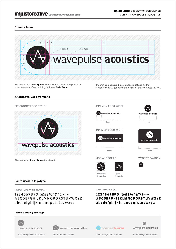
Are you tired of your brand looking like it’s stuck in the 90s? Do you cringe every time you hand out a business card with a logo that screams “I used WordArt”? Fear not, dear reader, for we are here to guide you through the wild and wacky world of logo design. Get ready to refresh your brand and kick those outdated designs to the curb with our handy dandy guide. So grab your metaphorical spray paint cans and let’s get tagging… I mean designing! Design“>Logo Design”>
Understanding the Importance of Logo Design
So you think logo design is just about throwing some colors and shapes together? Think again! Logo design is actually a crucial element in establishing your brand identity. A well-designed logo can communicate your values, mission, and personality to potential customers in a single glance.
Imagine your logo as the face of your brand - it’s the first thing people see and the thing they’ll remember. A memorable logo can help your brand stand out in a sea of competitors. It’s like having a superpower – except instead of shooting laser beams from your eyes, you’re shooting brand recognition straight into people’s minds.
Not convinced yet? Well, consider this – a poorly designed logo can actually hurt your business. It’s like showing up to a job interview wearing a stained shirt and mismatched socks. People are going to question your professionalism and credibility. Don’t let your logo be the fashion faux-pas of your brand!
So, next time you think about slapping together a logo on Microsoft Paint, remember the importance of logo design. Your brand’s future may depend on it. Plus, who doesn’t want a logo that’s so fabulous it could strut down the runway at Fashion Week?

Identifying the Key Elements of a Successful Logo
When creating a successful logo, it’s important to consider certain key elements that can make or break your design. Let’s break down the components that are essential for a logo to stand out from the crowd!
- Simplicity: Keep it simple, silly! A logo should be easily recognizable and memorable. Avoid clutter and too many details that can confuse or overwhelm your audience.
- Uniqueness: Stand out from the competition by creating a logo that is distinctive and original. Avoid copying or imitating other logos, as this can diminish the impact of your brand.
- Relevance: Make sure your logo aligns with your brand and communicates the right message to your target audience. Consider the industry, values, and personality of your brand when designing your logo.
- Versatility: Your logo should be adaptable and look great in various sizes, formats, and applications. Make sure it works well in black and white, as well as in color, and across different mediums.
By focusing on these key elements, you can create a logo that not only represents your brand effectively but also leaves a lasting impression on your audience. Remember, a successful logo is like a good joke – it should be simple, unique, relevant, and versatile to truly make a statement!
Exploring Different Logo Design Styles
When it comes to logo design, the possibilities are endless. From minimalist and modern to bold and colorful, there are so many styles to choose from that it can be overwhelming. Let’s take a look at some of the most popular logo design styles that you can explore for your own brand:
1. Vintage: Retro is all the rage right now, so why not hop on the bandwagon with a vintage-inspired logo design? Think old-school typography, distressed textures, and classic color palettes. It’s like taking a step back in time to when logos were hand-painted on shop windows.
2. Geometric: If you’re a fan of clean lines and symmetry, then a geometric logo might be just what you need. This style is all about precision and mathematical shapes, so get ready to bust out your protractor and ruler. Triangles, circles, squares – oh my!
3. Hand-lettered: Want to add a personal touch to your logo? Consider a hand-lettered design. Whether it’s whimsical and playful or elegant and sophisticated, hand-lettering adds a human element that can’t be replicated by a computer. Just make sure your calligraphy skills are up to par – no pressure!

Tips for Refreshing Your Brand Through Logo Design
So, you’ve decided that your brand is in need of a makeover and you’re ready to take the plunge into logo design. Here are a few tips to help you refresh your brand and create a logo that truly stands out:
- Keep it simple: Remember, less is more when it comes to logo design. Opt for clean lines and minimalistic designs that are easy to recognize and remember. Your logo should be able to convey your brand’s message at a glance.
- Get inspired: Take a look at what other successful brands are doing and see if you can draw inspiration from their logos. Don’t copy their designs, but use them as a jumping-off point to come up with something unique for your own brand.
- Think about color: Colors can evoke different emotions and meanings, so choose your palette wisely. Consider how different colors will be perceived by your target audience and how they can help convey the message of your brand.
Remember, your logo is often the first thing that potential customers will see when they encounter your brand, so make sure it leaves a lasting impression. With these tips in mind, you’ll be well on your way to refreshing your brand through logo design!

Choosing the Right Colors and Fonts for Your Logo
When it comes to , you want to make sure you’re not just throwing together a mishmash of random elements. Your logo is like the face of your brand, so you want it to make a good first impression!
First, let’s talk about colors. You wouldn’t wear mismatched socks to an important meeting, so why would you choose clashing colors for your logo? Stick to a color palette that reflects the tone and personality of your brand. Think about what emotions you want your logo to evoke. Feeling green with envy? Go for a fresh, vibrant green! Feeling blue? Maybe a calming shade of blue is more your style.
Now, onto fonts. Fonts can make or break a logo, so choose wisely. Avoid using Comic Sans at all costs – unless your brand is a clown college. Opt for a font that is easy to read and matches the overall vibe of your brand. Want to convey sophistication and elegance? Try a sleek serif font. Going for a more modern and edgy look? A bold sans-serif font might be the way to go.
Remember, your logo is the visual representation of your brand, so don’t rush the decision-making process. Take the time to play around with different color combinations and fonts until you find the perfect match. After all, you want your logo to stand out for all the right reasons!
Creating a Timeless and Memorable Logo Design
When it comes to creating a logo that stands the test of time, there are a few key elements to keep in mind. Let’s dive into some tips and tricks for crafting a logo that will be remembered for years to come.
First and foremost, **simplicity** is key. A cluttered logo will only confuse your audience and make it difficult to remember. Keep your design clean and streamlined, focusing on a few key elements that represent your brand effectively. Think of some of the most iconic logos in history – Nike, Apple, McDonald’s. What do they all have in common? They are simple and easy to recognize.
Secondly, **relevance** is important when designing a logo. Make sure that your logo reflects your brand’s values, mission, and aesthetic. A logo that is out of touch with your brand will confuse consumers and fail to make a lasting impression. Consider what sets your brand apart from the competition and incorporate those unique elements into your logo design.
Lastly, **consistency** is key when it comes to creating a timeless logo. Make sure that your logo looks good in a variety of contexts – on your website, on print materials, on social media. Consistency across all platforms will help solidify your brand image in the minds of consumers and make your logo instantly recognizable.
Utilizing Professional Design Tools for Logo Creation
Are you tired of using those outdated, free logo generators that make your brand look like it was created by a toddler? It’s time to step up your logo game and start utilizing professional design tools. Trust me, your brand will thank you!
With professional design tools like Adobe Illustrator and Sketch, you can create logos that are not only visually appealing but also unique and memorable. These tools offer a plethora of features that allow you to unleash your creativity and design a logo that truly represents your brand.
Forget about those cookie-cutter templates that everyone and their mother are using. With professional design tools, the possibilities are endless. You can experiment with different fonts, colors, and shapes to create a logo that stands out from the crowd.
So don’t settle for mediocrity when it comes to your logo design. Invest in professional design tools and take your brand to the next level. Your logo is the face of your brand, so make sure it’s a face that people won’t forget!
FAQs
Why is logo design important for a brand?
Well, if you’ve ever judged a book by its cover, you know the answer to this one! Your logo is the face of your brand, the first thing people see and remember about you. So, it better make a good first impression!
How often should a brand refresh their logo?
As often as you change your underwear…just kidding! But seriously, it’s a good idea to refresh your logo every few years to keep up with changing trends and to show that your brand is evolving with the times.
What are some tips for refreshing a logo design?
First, don’t be afraid to shake things up! Consider playing with colors, fonts, or even the overall design. Just make sure the essence of your brand is still recognizable. And most importantly, get feedback from your target audience – they’re the ones who will be looking at your logo every day, after all!
Can I refresh my logo design without starting from scratch?
Absolutely! You can keep elements of your old logo that you love and update them for a more modern look. Think of it like giving your logo a fancy makeover – same core features, just more stylish!
Time to Unleash Your Inner Picasso!
And there you have it, folks! You are now armed with the knowledge and creativity to refresh your brand with a stunning new logo design. So get out there, grab your trusty design tools, and unleash your inner Picasso! Remember, the sky’s the limit when it comes to capturing the essence of your brand in a single iconic image. Happy designing, and may your logo be forever memorable!


