Welcome, fellow fontophiles and typographical titans, to a daring expedition through the wild and wacky world of logo design. Prepare to embark on a journey that will challenge your perceptions of the alphabet and redefine the boundaries of creativity. Join us as we uncover the hidden treasures of innovative typography and discover just how far we can push the boundaries of design. So grab your Type-A personality and let’s dive headfirst into the wonderfully weird world of logo design!
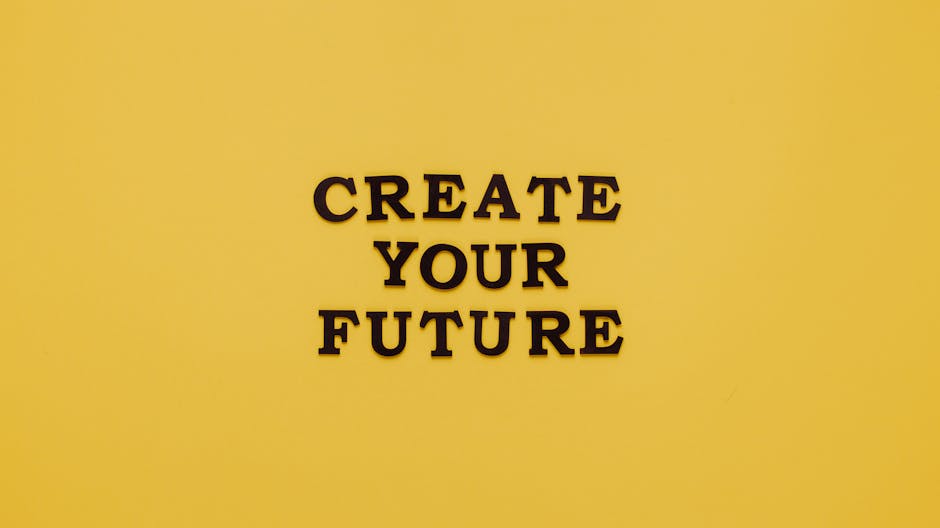
The Power of Typography in Logo Design
Typography in logo design has the ability to make or break a brand. It’s like the font whispering sweet nothings to your audience, convincing them to buy your products or services. Here are some ways typography wields its power in logo design:
- **Personality**: The font you choose can convey a sense of personality for your brand. Whether you want to come across as friendly and approachable or sleek and professional, typography can help set the tone.
– **Memorability**: A well-designed logo with clever typography can stick in people’s minds like a catchy jingle. Just think of Coca-Cola’s iconic script font – you can practically taste the sugary sweetness of the soda just by looking at it.
– **Legibility**: No one wants a logo that looks like a jumbled mess of letters. Choosing the right typography ensures that your logo is easily readable, even from a distance. After all, you don’t want potential customers squinting in confusion trying to decipher your brand name.
So, the next time you’re designing a logo, remember the power of typography. With the right font choices, you can create a logo that not only looks great but also effectively communicates your brand’s message to the world.
Utilizing Negative Space for Impact
Negative space isn’t just something that happens when you accidentally leave a blank spot on your canvas – it’s a powerful tool that can add impact and depth to your design. By utilizing negative space effectively, you can create eye-catching visuals that draw your audience in and make them think.
One way to use negative space for impact is to create clever optical illusions. By strategically placing objects in relation to the negative space around them, you can trick the eye into seeing things that aren’t really there. This can add an element of surprise and intrigue to your design, making it more memorable and engaging for viewers.
Another way to make use of negative space is to create contrast and balance in your composition. By playing with the proportions of positive and negative space, you can create a sense of harmony and flow that guides the viewer’s eye through your design. This can help to emphasize certain elements of your composition and create a more dynamic and visually interesting overall effect.
So next time you’re working on a design project, don’t underestimate the power of negative space. With some creativity and a little bit of planning, you can use negative space to make a big impact and take your designs to the next level.
Incorporating Handwritten Fonts for a Personal Touch
Who doesn’t love adding a personal touch to their designs by incorporating handwritten fonts? It’s like adding a little sprinkle of your personality to make everything more fabulous. Here are a few creative ways you can use handwritten fonts to jazz up your projects:
Want to make your wedding invitations extra special? Use a handwritten font for the names of the bride and groom to add a romantic and intimate feel. Your guests will be swooning over the personal touch!
For your next flyer design, try using a handwritten font for the heading to draw attention and create a more casual and friendly vibe. People will be like, “Wow, this flyer is so cool and approachable!”
When designing a greeting card, handwritten fonts are a must. Whether it’s a birthday card, thank you card, or holiday card, adding a handwritten message will make the recipient feel extra loved and appreciated. Plus, it’s way more fun!
Exploring Non-Traditional Typography for a Unique Brand Identity
Are you tired of using the same old boring fonts for your brand identity? It’s time to shake things up and explore non-traditional typography that will make your brand stand out from the rest. Forget about Times New Roman and Arial, it’s time to get funky with your fonts!
Think outside the box and consider using unique and quirky fonts that reflect the personality of your brand. From hand-drawn scripts to geometric sans-serifs, the possibilities are endless. Be bold and experiment with different weights, sizes, and styles to create a truly one-of-a-kind look.
Don’t be afraid to mix and match different fonts to create interesting contrasts and visual hierarchy. Remember, the goal is to grab your audience’s attention and make a lasting impression. Use unconventional typography to express your brand’s creativity and individuality.
So, why stick to the status quo when you can embrace non-traditional typography to elevate your brand’s identity? Let your imagination run wild and explore all the unique fonts out there. Your brand will thank you for it!

Playing with Scale and Proportions for Visual Interest
When it comes to creating visually interesting designs, playing with scale and proportions can be a game-changer. Forget about sticking to the same old boring dimensions - let your creativity run wild!
Imagine a tiny elephant towering over a city skyline or a colossal flower sprouting from a tiny teacup. By playing with scale, you can create whimsical and eye-catching designs that will leave your audience in awe.
Don’t be afraid to mix things up and experiment with different proportions. Who says a giant pineapple can’t be the centerpiece of your design? Embrace the unexpected and watch your creations come to life in ways you never thought possible.
Remember, boldness is key when it comes to playing with scale and proportions. Don’t be afraid to push the boundaries and have fun with your designs. Who knows, you might just stumble upon your next big breakthrough!
Utilizing Custom Fonts to Stand Out in a Crowded Market
Are you tired of blending in with the crowd? Want to make a bold statement in a sea of generic fonts? Look no further than custom fonts to elevate your brand and stand out in a crowded market!
When you utilize custom fonts, you’re not just another face in the crowd – you’re the life of the party! With endless options to choose from, you can pick a font that perfectly reflects your brand personality and sets you apart from the competition. Say goodbye to boring Arial and Times New Roman – it’s time to get creative!
With custom fonts, the possibilities are endless. Whether you’re looking for a sleek modern look or a quirky retro vibe, there’s a font out there for every style. Stand out from the crowd with a unique font that catches the eye and leaves a lasting impression on your audience. Let your brand personality shine through with a font that speaks volumes without saying a word.
So why settle for mediocrity when you could be extraordinary? Don’t blend in with the crowd – stand out with custom fonts that make a statement and set your brand apart from the rest. Embrace your uniqueness and let your creativity soar with fonts that scream “look at me!” Your brand deserves to shine, so why not give it the spotlight it deserves?
Experimenting with Color and Texture in Typography-Based Logos
When it comes to typography-based logos, there are endless possibilities for adding a pop of color and texture to make your designs stand out. Think of it as putting a fancy bow tie on your logo – it’s not necessary, but it sure does look sharp!
One fun way to experiment with color is to use gradients in your typography. Not just any old gradients, though – we’re talking about gradients that go from neon pink to electric blue, or from sunshine yellow to cherry red. Don’t be afraid to get a little wild with your color choices!
Texture is another element that can take your typography-based logo to the next level. Consider incorporating a subtle watercolor effect, a metallic foil overlay, or even a faux leather embossment. The key is to keep it tasteful and not go overboard – we want your logo to look classy, not like a tacky velvet painting.
Remember, the goal of is to have fun and get creative. So grab your virtual paintbrushes and start playing around with different combinations until you find something that really speaks to you. Who knows, you may just come up with the next iconic logo design!
FAQs
Question 1: How can incorporating innovative typography make a logo stand out?
Creative typography can add personality and uniqueness to a logo, making it memorable and eye-catching. It allows designers to play with different fonts, sizes, and colors to create a one-of-a-kind design that sets the brand apart from competitors.
Question 2: What are some examples of brands that have successfully used innovative typography in their logos?
Look no further than brands like Coca-Cola, Disney, and FedEx. These companies have all used creative typography to establish their brand identities and make a lasting impression on consumers. Just think about how the swooping script of Coca-Cola or the playful Disney font instantly comes to mind when you see their logos!
Question 3: How can designers ensure that innovative typography is still legible in a logo design?
While it’s important to get unique with typography, readability should always be a top priority. Designers can achieve this by choosing fonts that are clear and easy to read, experimenting with different sizes and spacing, and avoiding overly complex or decorative fonts that can be hard to decipher at a glance.
Question 4: Can innovative typography be used in any industry or is it better suited for certain types of businesses?
Typography is a versatile design element that can be used in any industry, from tech startups to fashion brands to food companies. However, it may be more effective for businesses that want to convey a sense of creativity, modernity, or playfulness in their branding. So if you’re a law firm or a funeral home, you might want to stick with a more traditional font.


