Money makes the world go ’round, and with that in mind, financial brands are constantly evolving to stay ahead of the game. From sleek and minimalist designs to bold and innovative creations, the world of logo design in the financial industry is anything but boring. So grab your briefcase and put on your thinking cap as we dive into the current logo design trends in financial branding and discover what’s hot, what’s not, and what’s just downright hilarious. Let’s make some (financially savvy) magic happen! Clean and Minimalist Designs”>
Clean and Minimalist Designs
When it comes to design, why clutter your space with unnecessary bells and whistles? are the way to go! Not only do they provide a sleek and modern aesthetic, but they also help declutter your mind from unnecessary distractions.
With , less is definitely more. Say goodbye to overwhelming color palettes and chaotic layouts. Instead, embrace the simplicity of a neutral color scheme and plenty of white space. Trust us, your eyes will thank you!
So what makes a design truly clean and minimalist? Look for these key features:
- Sleek lines and geometric shapes
- Plenty of whitespace
- Simple typography
- Minimalist color palette
Embrace the beauty of simplicity with . Your eyes, your mind, and your overall aesthetic will thank you!
Use of Bold Typography
Have you ever felt like your text is just screaming for attention? Well, guess what? Bold typography is here to save the day! With just a few simple HTML tags, you can easily make your text stand out like a lime green polka dot in a sea of beige.
Imagine the possibilities! Your headings can be as bold as a superhero in spandex, demanding the attention they deserve. Your important points can leap off the screen like a gazelle on Red Bull. And don’t even get me started on how much fun you can have with emphasis! It’s like giving your words a megaphone and telling them to shout from the rooftops.
But wait, there’s more! Bold typography isn’t just for making your text visually pop. It can also add depth and personality to your content. Want to emphasize a particular word or phrase? Just slap some bold tags around it and watch it come alive. Need to create a sense of urgency? Bold is your best friend. Plus, it’s a great way to break up walls of text and keep your readers engaged. So go ahead, unleash the power of bold typography and watch your words come to life!
Geometric Shapes and Patterns
Ever wonder why certain shapes and patterns just seem to be more pleasing to the eye? It’s all about geometry, baby! From the simplicity of a circle to the complexity of a fractal, are all around us, even if we don’t always notice them.
Whether it’s the symmetry of a snowflake or the repeated tessellations in a honeycomb, have a way of capturing our attention and making us stop in our tracks. They’re like the visual equivalent of a catchy tune – you can’t help but admire their beauty.
So the next time you find yourself staring at a chevron pattern or marveling at a spiral staircase, take a moment to appreciate the mathematical genius behind it all. Who knew that geometry could be so fun and fashionable?
From the mesmerizing swirls of a mandala to the sharp angles of a diamond, offer endless possibilities for creative expression. So go ahead, embrace your inner math geek and let the beauty of geometry inspire you!

Incorporating Negative Space
When it comes to design, negative space is your best friend. It’s like that quiet friend who always has your back – it may not always stand out, but it sure knows how to make a statement. Here are some fun ways to incorporate negative space into your designs:
1. **Typography Tricks**: Use negative space to create clever typographic designs. Play around with the flow of text to create unique shapes and patterns. Who knew that the space between letters could be so much fun?
2. **Iconic Images**: Don’t underestimate the power of empty space. Use negative space to outline iconic images and let the viewer’s imagination fill in the rest. It’s like a game of connect the dots, but way cooler.
3. **Interactive Design**: Negative space isn’t just for static images. Use it to create interactive designs that change as the viewer interacts with them. It’s like a hidden puzzle waiting to be solved, except way less frustrating.

Modern Color Palettes
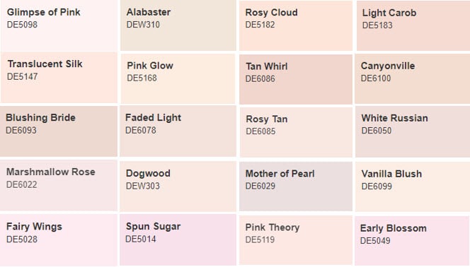
Are you tired of using the same old boring color combinations in your designs? Well, fret no more because are here to save the day! These trendy color schemes are sure to make your projects stand out from the crowd.
With , you can say goodbye to dull and drab designs and hello to bold and vibrant creations. From soft pastels to bold neons, the options are endless. So why settle for the same old colors when you can add a pop of excitement to your work?
Don’t be afraid to experiment with different combinations – mix and match colors you never thought would go together. Who knows, you might just stumble upon the next big color trend! Stay ahead of the curve and keep your designs fresh and exciting with .
So go ahead, break free from the constraints of traditional color schemes and let your creative juices flow. Embrace the world of and unleash your inner artist! Your designs will thank you.
Subtle Incorporation of Symbols
Symbols are everywhere, even in the most inconspicuous places. From the subtle hint of a clover in your morning cereal to the mysterious smiley face at the bottom of your coffee cup, symbols can sneak into our lives when we least expect them. Believe it or not, there are hidden symbols all around us just waiting to be discovered. Keep your eyes peeled, you might just stumble upon a secret code hidden in plain sight.
One of the most common ways symbols are subtly incorporated is through product logos. Companies love to sneak in hidden messages or symbols in their designs that only the most astute observer will catch. Next time you’re out shopping, take a closer look at the logo on your favorite product - you might just uncover a hidden treasure trove of symbols that will make you see that brand in a whole new light.
Another sneaky way symbols make their way into our lives is through architecture. Architects love to incorporate hidden symbols in their designs, whether it’s through the shape of a building or the placement of a window. Keep an eye out for subtle nods to ancient symbols or secret codes hidden within the walls of your favorite building – you never know what kind of hidden message might be waiting for you to discover.
And let’s not forget about the world of art, where symbols reign supreme. Artists have been incorporating hidden messages in their work for centuries, using symbols to convey deeper meanings or to challenge the viewer’s perception. Next time you’re at a gallery, take a closer look at the paintings on the wall – you might just uncover a hidden symbol that will make you see the artwork in a whole new light. Symbols are all around us, waiting to be discovered and decoded. Keep your eyes open, and who knows what hidden treasures you might find lurking just beneath the surface.
Focus on Innovation and Technology
Think of the possibilities! With the continuous advancement of technology, the sky’s the limit. From AI to VR, innovation is at an all-time high. Why stay stuck in the dark ages when you can ride the wave of the future?
Embrace change and witness your business soar to new heights. Stay ahead of the curve by investing in the latest gadgets and gizmos. Remember, innovation is not just a buzzword—it’s a way of life.
Don’t be afraid to think outside the box. Break free from the mundane and explore what’s out there. Who knows, your next big idea might just revolutionize the industry!
So, what are you waiting for? Dive headfirst into the world of innovation and technology. The possibilities are endless, and the rewards are monumental. Get ready to wow the world with your cutting-edge ideas and groundbreaking solutions!
FAQs
Why is it important for financial brands to keep up with logo design trends?
Well, let’s face it – money talks. And these days, it’s not just about making sound financial decisions, it’s also about looking good while doing it. Keeping up with logo design trends in the financial industry can help your brand stand out amongst the sea of boring old bank logos.
What are some current logo design trends in financial branding?
Think sleek and minimalist. Geometric shapes, sans-serif fonts, and subtle gradients are all the rage right now. It’s all about projecting a sense of stability and trustworthiness while still looking modern and cutting-edge.
How can financial brands incorporate these trends into their logo designs?
Don’t be afraid to simplify. Less is more in the world of finance, so ditch the clutter and focus on a clean, streamlined design. Experiment with different typography and color schemes to find a combination that reflects your brand’s personality while still staying on-trend.
Are there any pitfalls to avoid when redesigning a financial brand logo?
Absolutely! Avoid being too flashy or trendy. While it’s important to stay current, you don’t want your logo to look dated in a year. Stick to classic design principles and make sure your logo will stand the test of time.
What tips do you have for financial brands looking to refresh their logo design?
Do your research and look at what other successful financial brands are doing. Take note of what works and what doesn’t, and use that insight to inform your own design decisions. And most importantly, don’t be afraid to take risks – sometimes a little bit of creativity can go a long way in making your brand stand out from the crowd.
Don’t let your brand be left in the past!
So there you have it, the latest and greatest trends in logo design for financial brands. Now it’s up to you to take this knowledge and use it to revamp your own logo. Remember, it’s all about staying current and relevant in the ever-changing world of finance. So go forth, get creative, and let your logo shine bright like a diamond in the rough sea of financial branding!


