Are you tired of your local brand logo looking like it was slapped together by a kindergartner with a box of crayons? Well, fear not, because we are here to help you craft the perfect logo that will make all the other businesses in town green with envy. It’s time to stop blending in with the crowd and start standing out like a fluorescent flier on a telephone pole. So grab your glue gun and glitter, because we’re about to dive headfirst into the wonderful world of crafting the perfect local brand logo.
importance-of-a-strong-local-brand-logo”>The Importance of a Strong Local Brand Logo
Having a strong local brand logo is like having a superpower in the business world. It’s your calling card, your mark of distinction, your badge of honor. Your logo is what sets you apart from the competition and makes you unforgettable to your customers.
When it comes to local branding, your logo is your cape, your shield, your secret weapon. It’s what gives you that extra edge in a crowded marketplace and helps you stand out from the crowd. And let’s face it, in a world where consumers have the attention span of a goldfish, you need all the help you can get!
With a powerful logo, you can communicate your brand’s personality, values, and aesthetic in a single glance. It’s like handing out your business card without even opening your mouth. And believe me, in a world where first impressions are everything, a strong logo can make all the difference.
So, don’t underestimate the importance of a killer logo for your local brand. It’s not just a pretty picture - it’s your ticket to success, your key to unlocking the hearts and minds of your customers. So go forth, brand warriors, and conquer the world with your mighty logo!
Understanding Your Brand Identity
So, you think you know your brand identity, huh? Think again! It’s like trying to solve a Rubik’s cube blindfolded – tricky, but not impossible. Let’s break it down and really get to the core of what makes your brand tick.
First things first, your brand identity is like your fashion sense – it’s what sets you apart from the crowd. It’s like showing up to a party in a hot pink feather boa when everyone else is wearing basic black. Embrace your uniqueness and flaunt it!
Next up, take a good hard look in the mirror and ask yourself, “Who am I really?” No, not in a existential crisis sort of way, but in a branding context. Are you the laid-back cool kid or the quirky intellectual? Once you figure out your brand persona, it’s smooth sailing from there.
Don’t forget to sprinkle a little magic on top – by magic, I mean your brand values. These are like the secret ingredients in a recipe that make it absolutely delicious. Whether it’s transparency, creativity, or just good old-fashioned fun, make sure your brand values shine through in everything you do.
Choosing the Right Colors and Fonts
When it comes to for your project, it’s like finding the perfect outfit for a first date - you want to impress without looking like you’re trying too hard. So, let’s dive into some tips and tricks to help you navigate the world of design like a pro!
First things first, colors make the world go round, or was it coffee? Either way, choosing the right color palette can make or break your design. Remember, less is more when it comes to colors – just like too many toppings on a pizza can ruin the flavor. Stick to a maximum of three main colors and a couple of accent shades to keep things cohesive and visually appealing.
Next up, let’s talk fonts - the wardrobe staple of the design world. Fonts can evoke different emotions and set the tone of your project, so choose wisely. Consider pairing a bold sans-serif with a sleek serif for a modern twist, or mix and match different weights of the same font for a clean and sophisticated look. Just remember, don’t go overboard with fonts – stick to two or three max to avoid a typographical fashion disaster.
And finally, when in doubt, go back to basics. Black and white never go out of style, just like a classic little black dress. Use black text on a white background for optimal readability, and throw in a pop of color for a fun and fresh vibe. Remember, the key to successful design is all about balance and harmony – just like finding the perfect balance between wine and cheese at a party. So, trust your instincts, experiment with different combinations, and have fun with it!
Incorporating Local Elements
When it comes to , the possibilities are endless! Why stick to the same old boring routine when you can add a splash of local flavor to spice things up?
From incorporating traditional dishes from the area into your menu to collaborating with local artists for unique decor, there are so many fun ways to add some local flair to your business. It’s a great way to show your customers that you care about the community and support local talent.
Don’t forget about including local slang or phrases in your marketing materials - it’s a surefire way to connect with your audience on a more personal level. And why not host special events featuring local musicians or performers? It’s a win-win for everyone involved!
Overall, into your business is a great way to differentiate yourself from the competition and create a truly one-of-a-kind experience for your customers. So go ahead, get creative and have fun with it!
Simplicity is Key to Memorable Logos
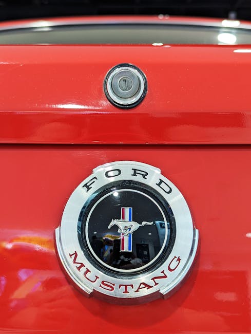
When it comes to creating a memorable logo, simplicity reigns supreme. Think about it – some of the most iconic logos in the world are incredibly simple in design. Take the golden arches of McDonald’s or the swoosh of Nike, for example. These logos are instantly recognizable and are burned into our collective consciousness.
So, why is simplicity so important when it comes to logos? Well, for starters, simple logos are easier to remember. If a logo is too busy or complex, it can be overwhelming for the viewer and difficult to recall. A simple logo, on the other hand, is clean, concise, and easy to process.
Another reason is that simple designs are versatile. A simple logo can be scaled down to tiny sizes or blown up to massive proportions without losing its impact. This versatility is crucial for a logo that needs to be reproduced across a variety of mediums, from business cards to billboards.
So, when you’re designing your logo, remember: keep it simple! A simple design will not only stand the test of time but will also be more likely to stick in the minds of your audience. And who knows - maybe one day your logo will be as iconic as the golden arches or the Nike swoosh! Now, that’s something to strive for.
Finding the Balance Between Tradition and Modernity
Are you caught between a rock and a hard place when it comes to choosing between tradition and modernity? Fear not, for you are not alone in this eternal struggle! Here are a few tips to help you find that sweet spot where tradition and modernity coexist harmoniously:
- Embrace the best of both worlds – why choose when you can have your cake and eat it too? Incorporate traditional practices into your modern lifestyle, like using your grandmother’s recipe for apple pie but baking it in a fancy new oven.
- Don’t be afraid to mix and match - traditional and modern styles can complement each other beautifully. Pair your vintage silk saree with a trendy crop top for a look that’s both timeless and edgy.
- Keep an open mind - traditions evolve over time, so don’t be afraid to adapt and embrace new ideas. Who knows, maybe you’ll discover a modern twist on an old tradition that’s even better than the original!
Remember, is like walking a tightrope – it may be a bit tricky at first, but with a little practice and a lot of creativity, you’ll be able to navigate the fine line between the past and the present with ease. So go ahead, embrace your unique blend of old-school charm and cutting-edge coolness – the world is your oyster!
FAQs
What are some common mistakes to avoid when designing a local brand logo?
Avoid overcomplicating your design – simplicity is key! Don’t use trendy fonts or colors that may become outdated quickly. Also, make sure your logo is scalable and looks good in both color and black-and-white.
How can I make my local brand logo stand out from the competition?
Think about what makes your brand unique and try to incorporate that into your logo. Maybe there’s a local landmark or icon that you can use as inspiration. Don’t be afraid to think outside the box and get creative!
Should I hire a professional designer or try to create my logo myself?
Unless you’re a design whiz, it’s probably best to leave it to the professionals. A well-designed logo can make a huge difference in how your brand is perceived, so it’s worth investing in a designer who can bring your vision to life.
How important is it to have a logo that reflects the local community?
Having a logo that resonates with your local community can help you build a loyal customer base. Consider incorporating elements that are unique to your area, such as local landmarks, colors, or symbols that people associate with your town or city.
What are some tips for choosing the right colors for my local brand logo?
Think about the emotions you want your logo to evoke – bold, energetic colors can convey a sense of excitement, while softer, muted tones may create a more calming vibe. Consider the psychology of color and how different hues can impact how your brand is perceived.
Happy branding, local legends!
We hope this article has given you some inspiration and guidance in crafting the perfect logo for your local brand. Remember, a great logo is like a good joke - simple, memorable, and makes people smile. So go forth and create a logo that truly represents your brand and leaves a lasting impression on your community. And if all else fails, just stick a picture of a cute animal on it - everyone loves cute animals!


