In the wild world of branding, a logo is like your company’s signature cocktail – it’s gotta be just right to leave a lasting impression. Crafting a professional logo is not just about making something pretty to slap on your business cards or website; it’s your key to unlocking the door to brand identity success. So grab your design tools and let’s stir up some logo magic, because we’re about to show you how to craft a logo that will make your competition weep with envy. Let’s dive in and turn that bland blob of clipart into a branding masterpiece! Colors and Fonts“>
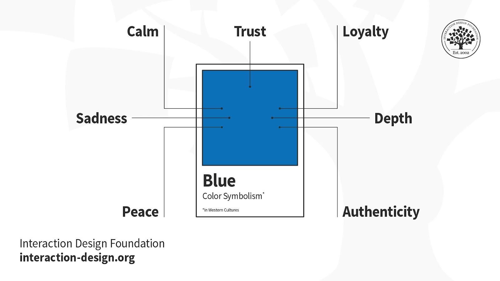
Choosing the Right Colors and Fonts
So, you’re ready to jazz up your website with some fancy colors and fonts, huh? Well, buckle up because we’re about to dive into the wonderful world of design choices. First things first, let’s talk about colors. Choosing the right color scheme can make or break your website’s aesthetic, so choose wisely!
When selecting colors, think about the mood you want to convey. Are you going for a sleek and professional look? Opt for cool tones like blues and greys. Want something more playful and energetic? Go for bright and bold colors like reds and yellows. And remember, less is more! Stick to a few key colors to keep things cohesive and visually appealing.
Now, onto fonts! Fonts can really set the tone for your website, so choose ones that reflect your brand’s personality. **Bold** and **modern** fonts can give off a sleek and contemporary vibe, while **script** and **handwritten** fonts add a touch of elegance and charm. Just make sure your fonts are easy to read – nobody likes squinting at a website trying to decipher your fancy cursive font!
In conclusion, is crucial for creating a visually appealing website. Do some research, play around with different combinations, and trust your gut. And remember, when in doubt, keep it simple and let your creativity shine!
Creating a Strong Concept for Your Design“>Logo
When it comes to designing a logo, having a strong concept is crucial. Your logo represents your brand, so you want it to be memorable and instantly recognizable. Here are some tips to help you create a killer concept for your logo:
- Know your brand: Before you start brainstorming ideas, make sure you have a clear understanding of your brand’s values, target audience, and personality. This will help guide your logo concept.
- Research your competitors: Take a look at what other companies in your industry are doing with their logos. You want your logo to stand out, so make sure you’re not inadvertently copying someone else.
- Think outside the box: Don’t be afraid to get creative with your logo concept. The more unique and original it is, the more likely it will leave a lasting impression on your audience.
Remember, a strong concept is the foundation of a great logo. So, take your time and really think about what you want your logo to say about your brand. With a little creativity and a lot of determination, you’ll come up with a concept that will set your logo apart from the rest!
Integrating Relevant Symbols and Imagery
When it comes to into your work, think outside the box! Embrace your inner artist and let your imagination run wild. Here are some tips to help you create visually stunning pieces that will leave a lasting impression:
- Utilize symbols that speak to your audience – whether it’s a peace sign, a heart, or a lightning bolt, choose symbols that resonate with your message.
- Get creative with your imagery – think beyond the typical stock photos and clip art. Consider using hand-drawn illustrations, collages, or even emojis to add a unique touch to your work.
- Experiment with color and composition - play around with different color schemes and layouts to create eye-catching designs that draw the viewer in.
Remember, the key is to be bold and daring in your choices. Don’t be afraid to take risks and push the boundaries of traditional design. By incorporating relevant symbols and imagery in unexpected ways, you can create work that is not only visually stunning but also thought-provoking and memorable.

Utilizing Negative Space Effectively
When it comes to design, sometimes less is more. Negative space, also known as white space, is the empty space around and between the elements of a design. It may sound counterintuitive, but can actually enhance the overall look and feel of a design. Here are a few tips to help you make the most of the space you’re not using:
You don’t need to cram every inch of your design with content. Leave some room to breathe! Negative space can help create balance and harmony in a design, making it more visually appealing. So don’t be afraid to let your design breathe a little.
Think of negative space as the unsung hero of design. It may not be the star of the show, but it plays a crucial role in making the design shine. By strategically using negative space, you can draw attention to the most important elements of your design and create a sense of focus and clarity.
Remember, negative space doesn’t have to be white. It can be any color or texture that contrasts with the elements of your design. Experiment with different backgrounds and spacing options to see what works best for your design. And don’t be afraid to think outside the box (or outside the negative space, in this case)!

Balancing Simplicity and Complexity in Design
When it comes to design, finding the perfect balance between simplicity and complexity can feel like trying to walk a tightrope while juggling flaming torches. But fear not, dear designers, for there is a method to this madness!
Embrace the less is more mantra, but don’t be afraid to sprinkle in some complexity for that extra pizzazz. Think of it like adding a dash of hot sauce to your avocado toast – just enough to spice things up without overwhelming your taste buds.
Consider using clean lines and minimalistic elements to keep things simple, but don’t shy away from incorporating intricate patterns or bold colors to add depth and interest to your design. It’s all about finding that sweet spot where simplicity and complexity can coexist in harmony like peanut butter and jelly.
Remember, at the end of the day, design is all about striking a balance between functionality and aesthetics. So go forth, brave designers, and create works of art that toe the line between simplicity and complexity with grace and finesse!
Testing Your Logo for Scalability and Versatility
So you’ve finally come up with a logo that you think perfectly captures your brand’s essence – congratulations! But before you start plastering it everywhere from your website to your social media profiles, it’s crucial to test its scalability and versatility. After all, you don’t want your logo looking pixelated on a billboard or unreadable on a business card.
One way to test your logo’s scalability is to zoom in and out on it. If it starts to look distorted or loses its clarity when you resize it, it’s time to go back to the drawing board. Remember, your logo should look good whether it’s the size of a postage stamp or the size of a billboard.
Next, test your logo in different colors and backgrounds. Your logo should be easily recognizable whether it’s on a white background, a black background, or even a rainbow background. If your logo loses its impact or gets lost in certain color schemes, it’s probably not versatile enough for all situations.
Lastly, imagine your logo on various marketing materials – from business cards to t-shirts to billboards. If it looks just as good on a tiny business card as it does blown up on a billboard, you’ve got yourself a winner. Remember, versatility is key when it comes to creating a logo that will stand the test of time.
FAQs
What are the essential elements to include in a professional logo?
Think of your logo like a good stew - you need the right ingredients for it to be delicious! Make sure to include elements that represent your brand, are memorable, and are versatile enough to use across different platforms.
How can I make sure my logo stands out from the competition?
It’s all about being unique, just like that weird cousin you only see at family reunions. Do some research, get inspired, and think outside the box to create a logo that sets you apart from the crowd.
What are some common mistakes to avoid when designing a logo?
Avoid being too literal, like using a pineapple to represent a fruit company (unless you’re selling pineapples, of course). Keep it simple, avoid trendy fonts, and don’t be afraid to get feedback from others.
How important is color in a logo design?
Color can make or break your logo, just like choosing between a regular coffee or a caramel macchiato at your favorite café. Make sure to pick colors that evoke the right emotions and reflect your brand’s personality.
Is it worth investing in a professional designer for my logo?
Think of hiring a professional designer like going to the dentist – sure, you could do it yourself, but do you really want to mess with your teeth? A professional designer can bring your vision to life and ensure your logo looks top-notch.
In conclusion, a professional logo is the key to unlocking your brand’s true identity
Thank you for joining us on this logo crafting adventure! Remember, a logo isn’t just a pretty picture – it’s the face of your brand. So, put on your creative thinking caps and get ready to design a logo that will make your competitors green with envy. Happy crafting! 🎨🔑 #LogoGoals


