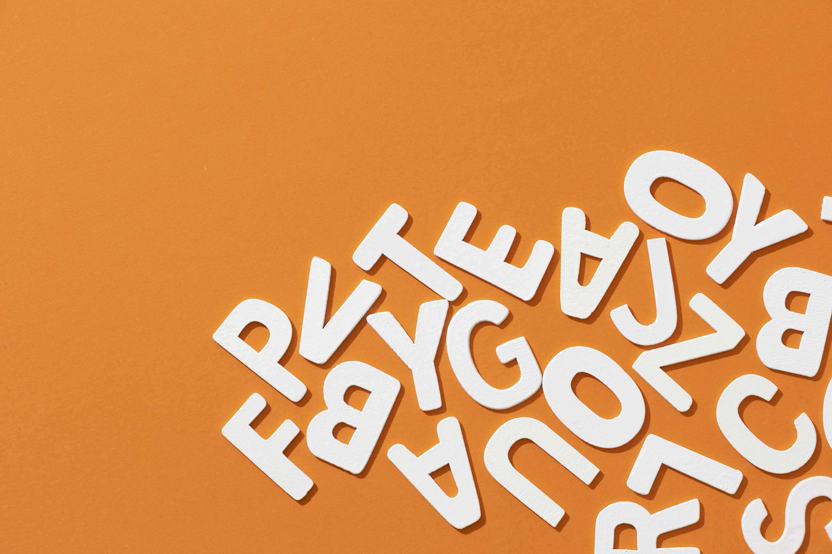
Forget about Comic Sans and Times New Roman – when it comes to logo design, typography is everything! Crafting Stories: Typography in Logo Design dives deep into the world of fonts and serifs, exploring how the right typeface can make or break a brand. So grab your pencils, polish up those calligraphy skills, and get ready to turn some heads (and fonts) with your logo designs!
Choosing the Right Typeface for Your Logo Design
When it comes to designing a logo, choosing the right typeface can make all the difference. After all, your logo is like the face of your brand - you want it to look good, right? But with so many fonts out there, how do you even begin to pick the perfect one? Here are a few tips to make sure your logo stands out:
First things first, think about the personality of your brand. Is it bold and modern? Classic and elegant? Fun and quirky? Choose a typeface that reflects the vibe you’re going for. Remember, your logo should be a visual representation of your brand’s personality, so make sure the typeface matches.
Next, consider the readability of the font. Sure, that fancy script font might look beautiful, but if no one can read it, what’s the point? Stick to clean, simple typefaces for easy readability. And hey, if you want to get a little fancy, try pairing a bold sans-serif font with a sleek serif font for a dynamic look.
And finally, don’t be afraid to get creative! Experiment with different fonts, sizes, and styles to see what works best for your logo. Try mixing and matching different typefaces to create a unique look that sets your brand apart. Remember, your logo is the first thing people will see, so make sure it’s a font-tastic one!
Creating a Unique Visual Identity with Typography
Typography is like the spice in your design dish – it adds flavor and personality to your visual identity. So let’s sprinkle some creativity and sass into your fonts to make your branding pop!
First things first, choose a font that matches your brand’s vibe. Are you a fun and quirky business? Go for a playful script font. Are you a sleek and sophisticated brand? Opt for a modern sans-serif font. Mix and match different font styles to create a visually interesting text hierarchy that grabs attention.
Don’t be afraid to play around with font sizes, weights, and colors. Emphasize key words or phrases by making them bigger and bolder. Use color to create contrast and draw the eye to important information. Experiment with different text alignments and spacing to create visual interest and flow.
Remember, consistency is key when it comes to typography. Use the same fonts and styles across all your branding materials to create a cohesive look. And don’t forget to have fun with it – typography is a creative playground where you can let your imagination run wild!![]()
Balancing Readability and Aesthetics in Logo Typography
When it comes to designing a logo, finding the perfect balance between readability and aesthetics in logo typography can be quite the challenge. You want your logo to be eye-catching and memorable, but you also want it to be legible enough that people can actually read it without squinting. It’s a delicate dance, like trying to walk a tightrope while juggling flaming torches and reciting the alphabet backwards.
One way to ensure that your logo is both readable and visually appealing is to choose a font that strikes the right balance. Consider fonts that are clean and simple, with clear lines and shapes that make them easy to read at a glance. Avoid overly elaborate fonts that might look pretty, but are so swirly and intricate that they end up being more of a hassle to read than a feather boa in a windstorm.
Another important factor to consider is the spacing between the letters in your logo. Too much space and your text will look like it’s doing the cha-cha across the page. Too little space and your letters will be smooshed together like a bunch of sardines in a can. Aim for a Goldilocks-approved amount of space – not too much, not too little, but just right.
At the end of the day, finding the perfect balance between readability and aesthetics in logo typography is all about trial and error. Experiment with different fonts, sizes, and spacings until you find the combination that is both visually appealing and easy to read. And remember, if all else fails, you can always go back to the drawing board and start again – just don’t forget to bring your torches and your feather boa!
Utilizing Typography to Convey Brand Values and Personality
When it comes to showcasing your brand values and personality through typography, the possibilities are endless! Fonts can be like superheroes, each with their own unique powers to convey different emotions and characteristics. So, why settle for Comic Sans when you could be using the bold confidence of Helvetica or the elegant charm of Baskerville?
By choosing the right fonts for your brand, you can communicate everything from playfulness to professionalism. Want to show off your quirky side? Embrace the whimsical curls of a handwritten script font. Is your brand all about sleek sophistication? Opt for a sleek, modern sans serif font. Mix and match fonts like a fashionista putting together the perfect outfit – bold headings paired with understated body text, or a mix of serif and sans serif for that trendy eclectic vibe.
Don’t forget about text size, spacing, and alignment! These design elements can make or break your brand’s personality. Bold headlines demand attention, while smaller text can whisper sweet nothings in your customer’s ear. Embrace the whitespace, giving your words room to breathe and creating a sense of elegance and refinement. And remember, alignment is key – center-aligned text says ‘Hey, look at me!’ while left-aligned text is more laid-back and casual.
So, why stick with the same tired fonts when you could be unleashing the full potential of typography to express your brand’s true self? Let your words shine like the stars they are, guiding your customers on a journey through the magical world of your brand values and personality!
![]()
Exploring the Relationship Between Typeface and Logo Design Elements
When it comes to logo design, choosing the right typeface can make all the difference. Fonts are like the spices in a logo design recipe – too much or too little can ruin the whole dish. So let’s dive into the magical world where typeface and logo design collide!
First up, the classic pairing of a bold sans-serif typeface with a sleek and modern logo. Think of it as the peanut butter and jelly of the design world – they just belong together. The clean lines of the sans-serif font complement the sharp edges of the logo design, creating a cohesive and eye-catching look.
On the other end of the spectrum, we have the elegant serif typeface paired with a sophisticated and intricate logo design. This duo is like a fancy dinner party – all about the details. The serifs add a touch of class to the logo, while the intricate design elements create a sense of luxury and refinement.
And let’s not forget about the wild card – the playful script typeface paired with a whimsical and fun logo design. This combo is like a child’s birthday party – full of laughter and joy. The flowing script adds a sense of movement and personality to the logo, while the whimsical design elements bring a sense of wonder and delight.
Tips for Incorporating Typography into Logo Design Successfully
Typography is a crucial element in logo design that can make or break the entire look of your brand. Here are some tips to help you incorporate typography into your logo design successfully:
- Choose the Right Font: Choose a font that reflects the personality and values of your brand. Whether you go for a classic serif font or a modern sans-serif, make sure it aligns with your brand identity.
- Experiment with Size and Weight: Play around with different sizes and weights of your chosen font to create hierarchy and visual interest in your logo. Remember, not all letters need to be the same size or weight!
- Consider Negative Space: Sometimes, the space around the text in your logo is just as important as the text itself. Don’t be afraid to experiment with negative space to create unique and eye-catching logo designs.
And remember, practice makes perfect when it comes to typography in logo design. Don’t be afraid to try new fonts, sizes, and layouts until you find the perfect combination that represents your brand in the best possible way!
FAQs
What is the importance of typography in logo design?
Typography in logo design is like the cherry on top of a sundae – it can make or break the entire design. The right font can convey the brand’s personality and message in a way that grabs attention and leaves a lasting impression.
How can different fonts evoke different emotions or convey different messages?
Oh, fonts are sneaky little things – they have the power to evoke emotions you didn’t even know you had. A bold, slab serif font screams “strong and reliable,” while a playful script font whispers “fun and friendly.” Choose wisely!
Can you mix and match different fonts in a logo design?
Mixing fonts in a logo design is like playing matchmaker – it can be a hit or a miss. If done right, different fonts can complement each other and create a harmonious design. But if done wrong, well, let’s just say it’s a fontastic disaster.
How can typography help make a logo design memorable?
Think of typography as the secret ingredient in a recipe – it’s what makes a logo design stand out and stick in people’s minds. The right font can create a visual identity that people will remember long after they’ve seen it.
Are there any common typography mistakes to avoid in logo design?
Oh, there are plenty of typography pitfalls to steer clear of in logo design. Avoid using too many fonts, choosing overly trendy fonts, or using illegible fonts. Remember, simplicity is key when it comes to typography in logo design.
The End – But the Story Continues!
And there you have it folks, the tale of how typography plays a starring role in logo design. So, the next time you see a logo, take a closer look at the letters – they might just be telling you a story you never knew existed. Keep on crafting those stories, and remember, the font is mightier than the sword!


