Welcome to the wild world of logo design, where your brand’s identity hangs in the balance of a few carefully chosen pixels and a whole lot of aesthetic judgment. In this article, we’re diving deep into the art of crafting memorable logos for the digital age, where social media visibility reigns supreme. So grab your punny pencils and get ready to amp up your online presence with some seriously stylish design tips!
The Importance of Creating a Memorable Logo
Having a memorable logo is like having a signature dance move at a party – it sets you apart from the crowd and makes you unforgettable. Your logo is the face of your business, so why not make it fabulous?
Here are some reasons why creating a memorable logo is so important:
- Brand Recognition: A memorable logo helps customers identify and remember your brand. It’s like a little flag waving in their minds saying, ”Hey, remember me? I’m awesome!”
- Professionalism: A well-designed logo shows that you mean business. It’s like wearing a fancy suit to a job interview – you look sharp and ready to impress.
- Trustworthiness: People are more likely to trust a business with a strong, memorable logo. It’s like having that one friend who always has your back – reliable and trustworthy.
So, don’t settle for a bland, forgettable logo – let your creativity shine and create something that will leave a lasting impression. Your logo is the superhero cape of your business - make it bold, make it memorable, and watch your brand soar to new heights!

Understanding the Elements of an Effective Logo
Logos are like the superhero costumes of branding – they need to be bold, memorable, and make a lasting impression. But what makes a logo truly effective? Let’s dive into the elements that make up a logo that packs a punch!
1. Simplicity is Key
Think of some of the most iconic logos out there – McDonald’s golden arches, Nike’s swoosh, Apple’s bitten apple. What do they all have in common? They are simple, yet instantly recognizable. A cluttered logo is like a bad toupee – it doesn’t fool anyone and only makes you look ridiculous.
2. A Splash of Color
Color can evoke emotion and convey a message without saying a word. Whether you choose a bold primary color or a subtle pastel shade, make sure it reflects the personality of your brand. Just remember, too many colors can make your logo look like a rainbow threw up on it – not a good look.
3. Versatility is Key
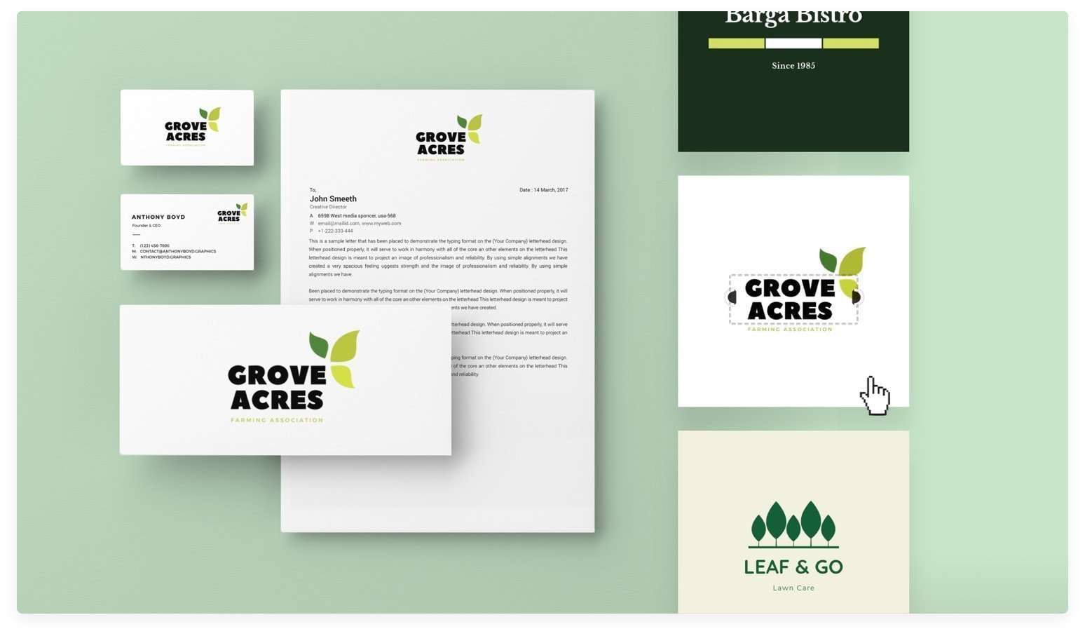
Your logo should be able to adapt to different mediums and sizes without losing its impact. Whether it’s being printed on a business card or plastered on a billboard, your logo should look just as good in any situation. If your logo is as inflexible as a yoga instructor turned bodybuilder, it may be time for a redesign.
Utilizing Color Psychology in Logo Design
When it comes to logo design, color psychology plays a crucial role in conveying the right message to your audience. By strategically choosing colors that evoke certain emotions or associations, you can create a logo that truly resonates with your target market.
Here are some tips on how to utilize color psychology in your logo design:
- Red: This color is often associated with passion, energy, and excitement. Use red in your logo to grab attention and create a sense of urgency.
- Blue: Blue is calming and trustworthy, making it a great choice for corporate logos or brands that want to convey dependability.
- Green: Green symbolizes growth, health, and nature. It’s perfect for environmentally friendly brands or businesses in the health and wellness industry.
- Yellow: Yellow is cheerful and optimistic, making it a great choice for brands that want to convey a sense of positivity and warmth.
Remember, the key is to choose colors that align with your brand identity and the message you want to convey. So, next time you’re designing a logo, think about the emotions you want to evoke in your audience and choose your colors accordingly!

Incorporating Industry Trends for Social Media Visibility
When it comes to standing out on social media, you’ve got to be on top of the latest industry trends! And no, we’re not talking about those ridiculous TikTok dances that everyone seems to be doing these days. We’re talking about incorporating trends that will actually boost your visibility and engagement. Here’s a few tips to help you stay ahead of the game:
- Embrace video content: Whether it’s live streaming, Instagram Stories, or TikTok videos, video content is all the rage right now. People love watching short, engaging videos, so make sure to incorporate them into your social media strategy.
- Jump on trending hashtags: Keep an eye on trending hashtags within your industry and jump on board. This can help you reach a wider audience and show that you’re up to date with what’s happening in your field.
- Collaborate with industry influencers: Partnering with influencers can help you reach a wider audience and add credibility to your brand. Find influencers within your industry and see if you can collaborate on a campaign or project.
Remember, it’s not just about following trends for the sake of it. You need to incorporate trends that align with your brand and target audience. So, next time you’re scrolling through your social media feeds, keep an eye out for industry trends that you can use to boost your visibility and engagement.

Designing a Versatile Logo for Different Platforms
When it comes to designing a logo that works across various platforms, versatility is key! You want a logo that looks great on a website, social media profile, business card, or even on a billboard. Here are some tips to ensure your logo shines no matter where it appears:
Keep it simple: A cluttered logo won’t translate well on different platforms. Opt for a clean, minimalist design that is easy to read and recognize.
Choose the right colors: Make sure your logo looks good in both color and black-and-white. Consider how it will appear on different backgrounds, whether it’s a white webpage or a colorful poster.
Test it out: Before finalizing your logo, test it on various platforms to see how it looks. Make adjustments as needed to ensure it looks great everywhere.
The Role of Typography in Logo Recognition
Typography plays a crucial role in logo recognition. It’s not just about slapping some fancy letters together and calling it a day. No sir, typography is an art form in itself. Here’s why:
- Typography sets the mood and tone of a logo. Whether it’s elegant and sophisticated or bold and edgy, the right font can make or break a logo.
- Fonts can convey a sense of nostalgia or modernity. Times New Roman might remind you of typing up a term paper in high school, while Gotham screams sleek and contemporary.
- Spacing matters, people! The kerning and leading of a logo can greatly affect its readability and overall impact. So don’t be afraid to play around with those settings until it feels just right.
And let’s not forget about font pairings. Mixing and matching different typefaces can create a harmonious balance in a logo design. Just like peanut butter and jelly, some fonts are meant to be together.
Implementing Strategies for Maximizing Brand Impact on Social Media
So, you want to make a splash on social media, huh? Well, get ready to strap on your marketing boots and dive headfirst into the wild world of brand impact! Here are some strategies that will have your brand shining brighter than a disco ball on a Saturday night.
First things first, let’s talk content. You can’t just post any old picture of your cat wearing sunglasses and expect to go viral. No, you need to think outside the box! Get creative, get quirky, get downright weird if you have to. The more unique and eye-catching your content is, the more likely it is to grab people’s attention.
Next up, engagement is key. You can’t just sit back and wait for the likes and shares to roll in. No, you need to get interactive! Respond to comments, ask questions, run polls – the more you engage with your audience, the more invested they’ll become in your brand.
And finally, don’t be afraid to collaborate with others. Team up with influencers, partner with other brands, heck, even get your grandma involved if you have to. The more connections you make, the wider your reach will be. So, get out there, get creative, and watch your brand impact soar to new heights on social media!
FAQs
Q: How can I make my logo stand out on social media?
Well, darling, first things first – you gotta keep it simple! Social media is a fast-paced world, so don’t clutter your logo with unnecessary details. Make sure it’s easy to read and memorable at a glance.
Q: Is there a specific color palette I should use for my social media logo?
Oh, honey, absolutely! Choose colors that evoke the right emotions for your brand. Bright and vibrant colors can grab attention, while softer shades can create a more calming vibe. Just make sure the colors are cohesive with your overall branding.
Q: What should I consider when designing a logo for social media platforms with different sizes and dimensions?
Oh, my dear, the key here is versatility! Your logo should look fabulous no matter what size or shape it’s in. Make sure it’s scalable and works well in both horizontal and vertical orientations. And don’t forget about those pesky profile picture circles – keep your logo centered and avoid any intricate details that might get cut off.
Q: How can I ensure my social media logo stays on brand?
Sweetie, consistency is key! Your logo should seamlessly blend in with the rest of your social media content. Make sure to use the same fonts, colors, and overall aesthetic across all your platforms so that your audience can easily recognize and remember your brand.
Q: Any tips for creating a logo that resonates with my target audience on social media?
Darling, know your audience like the back of your hand! Research their preferences, interests, and behaviors to create a logo that speaks directly to them. Think about what would catch their eye and make them want to engage with your brand. Oh, and don’t forget to test out different versions of your logo to see what resonates best!
Go forth and design your iconic logos!
Now that you’ve learned the ins and outs of crafting memorable logos for social media visibility, it’s time to unleash your creativity and start designing. Remember, a great logo should be like a superhero cape - bold, memorable, and ready to save the day (or at least your brand’s image).
So grab your design tools, channel your inner Picasso, and let your logo-making skills shine. And don’t forget to keep up with the latest trends and stay ahead of the curve. Who knows, your logo could be the next viral sensation on social media!
Happy designing, logo warriors!


