Are you tired of staring at your company’s lackluster logo and wondering why it doesn’t pack the same punch as your competitors’? Well, dear reader, it’s time to dive into the mysterious world of logo design and uncover the psychological secrets behind those cleverly crafted symbols. Get ready to unlock the hidden meanings behind colors, shapes, and fonts as we navigate through the wild and wacky world of branding. So grab your creative thinking cap and let’s unravel the enigmatic realm of crafting logos! Logo Design”>
symbolism-in-logo-design”>The Power of Symbolism in Logo Design
Have you ever looked at a logo and felt an inexplicable connection to it? That’s ! Symbols have a way of speaking to our subconscious minds and evoking certain emotions or meanings. When it comes to creating a logo, utilizing symbolism can make a brand memorable and impactful.
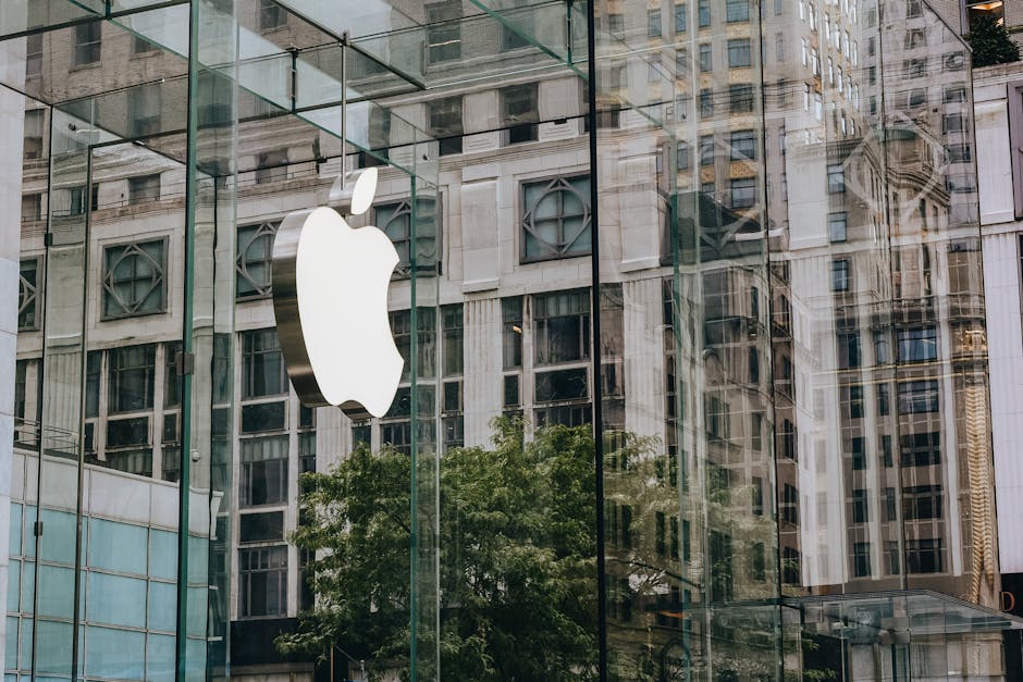
Think about some of the most iconic logos out there – Apple’s bitten apple, Nike’s swoosh, or McDonald’s golden arches. These symbols have become instantly recognizable and synonymous with their respective brands. They convey a message or identity without the need for words.
So, how can you harness the power of symbolism in your own logo design? Here are a few tips:
- Keep it simple: Complex symbols can be overwhelming and confusing. Stick to one central image that conveys your brand’s essence.
- Use color strategically: Different colors evoke different emotions. Choose colors that align with your brand message.
- Research cultural meanings: Symbols can have different meanings in different cultures. Make sure your symbol doesn’t inadvertently offend anyone.
Remember, a logo is often the first interaction a customer has with your brand. Make it count by harnessing the power of symbolism!

Perception and Interpretation of Symbols
Symbols are a funny thing, aren’t they? We see a heart emoji and automatically assume love, but maybe it actually means someone had a spicy burrito for lunch.
Our brains love to slap meaning onto every little squiggle or shape we come across. Whether it’s a stop sign or a random doodle on a napkin, we just can’t help but try to decipher the hidden messages the universe is sending us.
But let’s be real, sometimes a banana is just a banana. It’s not a secret code from aliens or a sign that you should start a fruit-themed cult. It’s just a delicious snack with a yellow peel.
So next time you see a symbol and feel the urge to analyze its deeper meaning, just take a step back and remember that sometimes a cigar is just a cigar. And sometimes it’s a hidden camera watching your every move. But hey, paranoia is a great ab workout, right?

Color Psychology: Choosing the Right Palette
Let’s talk about colors, baby! If you’ve ever felt overwhelmed by the sheer number of paint swatches at the hardware store, fear not. We’re diving into the wonderful world of color psychology to help you choose the perfect palette for your space.
First things first, let’s break down some common colors and their emotional associations:
– **Red:** Bold, passionate, and full of energy. Use this color for a living room or dining room to spark lively conversations and hearty laughter.
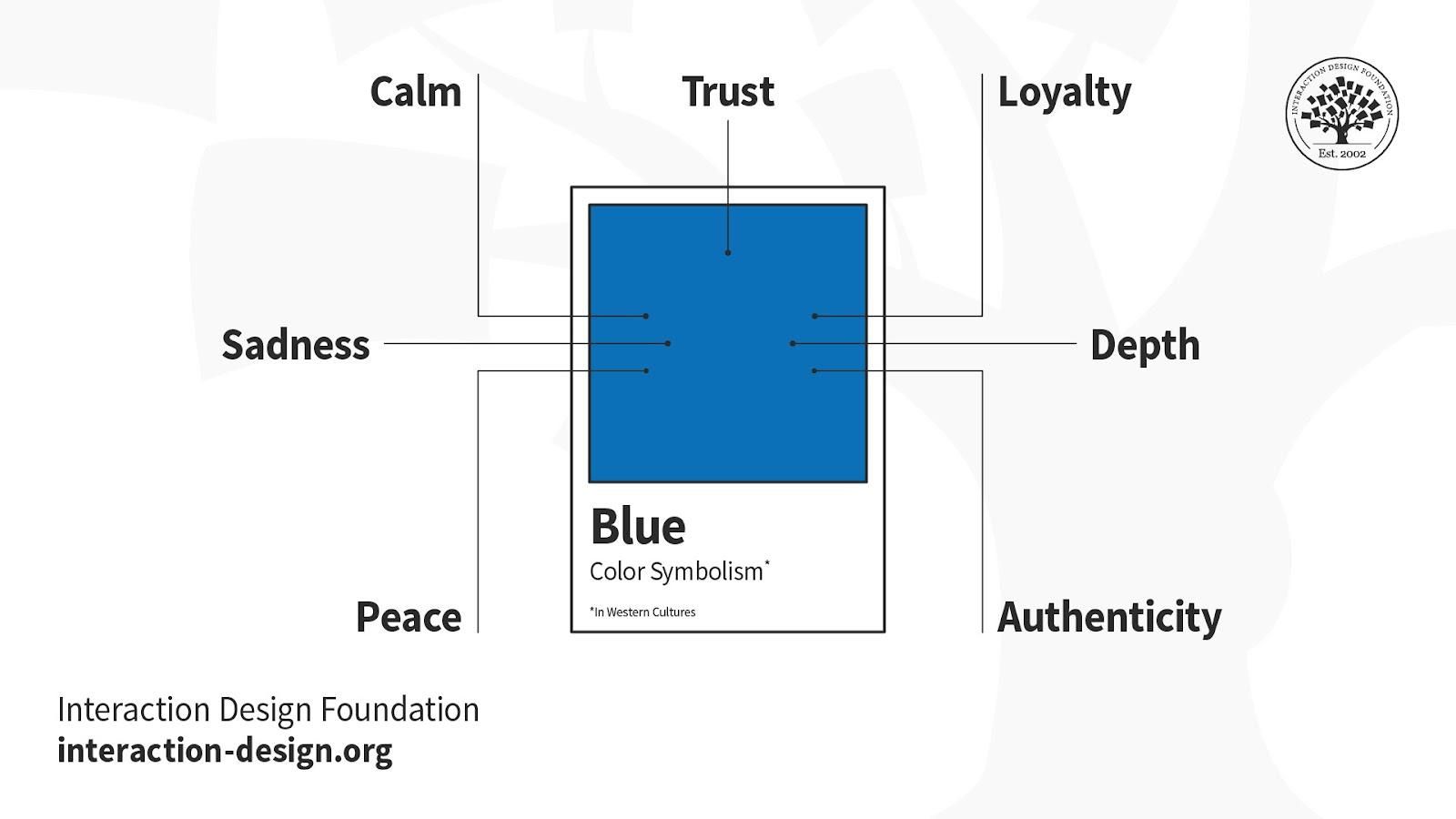
– **Blue:** Calm, serene, and peaceful. Perfect for a bedroom or home office to promote relaxation and focus.
– **Yellow:** Bright, cheerful, and optimistic. A splash of yellow in the kitchen or bathroom can bring sunshine into your daily routine.
Remember, it’s not just about the individual colors, but how they work together. Consider the following color combinations and their mood-setting abilities:
– **Complementary:** Colors that are opposite each other on the color wheel (think blue and orange) create a dynamic, high-contrast look.
- **Analogous:** Colors that are next to each other on the color wheel (like yellow, green, and blue) create a harmonious, soothing feel.
So, whether you’re painting a nursery for your bundle of joy or sprucing up your home office for maximum productivity, keep these color psychology tips in mind. And remember, the only rule when it comes to choosing a color palette is to have fun with it!
Shapes and Emotions: How Forms Influence Perception
Have you ever stopped to think about how different shapes can evoke various emotions? It’s not just your crazy art teacher from middle school rambling on about squares and circles – there’s actually some scientific evidence behind this stuff! Let’s break it down, shall we?
First up, we have circles. These bad boys are all about harmony and unity. They represent things like wholeness and completion. So, next time you’re feeling scattered and all over the place, maybe meditate on a circle or two and see if it helps calm your crazy nerves.
On the flip side, we have triangles. These pointy little shapes are all about stability and power. Think about it – pyramids are built with triangles for a reason. So, if you’re feeling a little insecure or powerless, maybe surround yourself with some triangle-shaped items and channel your inner boss babe.
And last but not least, we have squares. These guys are all about strength and structure. They’re like the backbone of the shape world – reliable, sturdy, and always there to hold things together. So, if your life feels like it’s falling apart, maybe embrace the square and find some stability in the chaos.
Cultural Influences on Logo Design
When it comes to logo design, cultural influences play a huge role in shaping the aesthetics and messaging of a brand. From colors to symbols to typography, every element of a logo can be influenced by the culture it represents.
The following are some hilarious examples of how cultural influences have impacted logo design:
- Color: In Western culture, the color white symbolizes purity and cleanliness. However, in some Eastern cultures, white is associated with mourning and death. Imagine the confusion if a Western brand tried to expand into an Eastern market with a logo predominantly featuring white!
- Symbols: The use of specific symbols in logo design can either attract or repel customers, depending on their cultural context. For example, the use of the number four in a logo may be considered unlucky in Chinese culture, as it sounds similar to the word for “death.”
- Typography: Different cultures have different preferences when it comes to typography. For example, serif fonts may be more appealing to a Western audience, while a more minimalist sans-serif font might resonate better with an Eastern audience.
The Role of Memory and Recognition in Logo Success
Let’s face it, we’ve all had that moment of recognition when seeing a familiar logo – whether it’s the golden arches of McDonald’s or the swoosh of Nike. But have you ever stopped to think about the role that memory and recognition play in the success of these logos?
Memory is like the unsung hero of logo success. Without it, we’d all be wandering around in a logo-less world, unsure of which fast food joint serves those delicious fries or where to find the perfect pair of running shoes. It’s memory that allows us to instantly associate a logo with a brand, product, or service, making it a crucial element in the success of any logo design.
Recognition, on the other hand, is like the cool kid at school – everyone wants to be associated with it. A logo that is easily recognized is more likely to stick in the minds of consumers, leading to increased brand awareness and ultimately, more sales. Think about it, when you see that iconic apple with a bite taken out of it, you instantly know you’re looking at an iPhone – now that’s the power of recognition!
So, the next time you’re designing a logo, remember the importance of memory and recognition. Make sure your logo is memorable and easy to recognize, and who knows – maybe one day it’ll be as iconic as the golden arches or the swoosh.
FAQs
What makes a logo successful from a psychological perspective?
A successful logo taps into the subconscious minds of consumers, invoking emotions and creating a connection with the brand. It should be memorable, simple, and versatile, yet packed with hidden meanings that resonate with the target audience.
How can color choices impact the effectiveness of a logo?
Color is crucial in logo design as different colors evoke different emotional responses. For example, blue conveys trust and professionalism, while red signifies passion and energy. By choosing the right color palette, a brand can influence how customers perceive their products or services.
What role do fonts play in logo design?
Fonts are like the wardrobe of a logo – they can make or break the first impression. Serif fonts suggest tradition and reliability, while sans-serif fonts scream modernity and innovation. The right font choice can help communicate the brand’s personality and values at a glance.
How do symbols and shapes affect the perception of a logo?
Symbols and shapes have a profound impact on how a logo is perceived. For example, a circle represents unity and eternity, while a triangle symbolizes stability and strength. By incorporating meaningful symbols and shapes, a logo can convey a message that goes beyond words.
Can a poorly crafted logo damage a brand’s reputation?
Absolutely! A poorly crafted logo can tarnish a brand’s reputation faster than you can say “design disaster”. If a logo is confusing, unprofessional, or just plain ugly, consumers will associate those qualities with the brand itself. It’s like wearing a mismatched outfit to a job interview – not a good look!
Craft on, Logo Lovers!
So next time you see a logo, remember that there’s more to it than meets the eye. The psychology behind symbols is a fascinating world that we’ve only just scratched the surface of. Keep creating, keep crafting, and keep unraveling the mysteries behind those cleverly designed logos! Who knows, maybe you’ll uncover the secret to world domination through the power of a perfectly crafted symbol. Until next time, happy crafting!


