
Step aside, amateur logo designers! It’s time to elevate your craft to new heights with a precision that would make even the most OCD architect jealous. In this article, we’re diving into the world of crafting innovative logos with architectural precision. Get ready to take your logo game from “meh” to mind-blowing as we explore the art of creating logos that are not only visually stunning, but also meticulously crafted with the precision of a master builder. So grab your T-squares and rulers, because it’s time to get architectural up in here!
Creating a Strong Foundation of Brand Identity
Building a strong foundation of brand identity is like building the perfect outfit – it needs to be well put together, stylish, and make a statement. But instead of using fabric and accessories, you’ll be using visual elements, messaging, and personality. Here are some key ways to create a standout brand identity:
- Define your brand’s personality – Is your brand friendly and approachable, or more sophisticated and professional? Knowing your brand’s personality will help guide all branding decisions going forward.
- Create a memorable logo – Your logo is like the cherry on top of a sundae; it’s the finishing touch that ties everything together. Make sure it’s unique, recognizable, and representative of your brand’s values.
- Choose a signature color palette – Just like picking the right accessories for an outfit, selecting the perfect colors for your brand can make all the difference. Stick to a consistent color scheme across all branding materials.
And don’t forget to sprinkle in some brand voice and tone to really make your identity pop! Whether you want to be witty and irreverent or sincere and heartfelt, having a consistent voice will help your audience connect with your brand on a deeper level. So, put on your branding hat and start building that strong foundation – your brand will thank you later!
symmetry-and-balance-in-design”>Incorporating Symmetry and Balance in Design
When it comes to design, incorporating symmetry and balance is key. Just like a seesaw needs equal weight on each side to function properly, a design needs to have the right balance of elements to create harmony. Symmetry adds a sense of order and structure, while balance helps keep everything in check. Here are some fun ways to incorporate symmetry and balance into your designs:
- Use Grids: Grids are like the invisible glue that holds your design together. They provide a framework for arranging elements in a balanced way, making it easier to achieve symmetry.
- Mirror, Mirror: Reflecting elements on either side of a central axis is a great way to create symmetry. It’s like playing a game of visual copy and paste that adds cohesion to your design.
- Play with Proportions: Experiment with different sizes and shapes to create visual interest while maintaining balance. Just like a well-stacked tower of pancakes, your design should be pleasing to the eye.
Remember, a well-balanced design is like a perfectly executed dance routine – everything moves in sync and flows seamlessly. So, next time you’re working on a project, channel your inner designer and don’t forget to incorporate symmetry and balance into your design. Your audience will thank you for it!
Utilizing Clean Lines and Geometric Shapes
When it comes to designing with clean lines and geometric shapes, less is definitely more. Think of it like a minimalist’s dream come true – no frills, no fuss, just sleek, simple shapes that pack a punch. Embrace the beauty of simplicity and let your designs speak for themselves.
One of the key benefits of using clean lines and geometric shapes is the sense of order and structure they bring to a space. It’s like giving your design a little bit of zen – everything in its rightful place, nothing out of line. Plus, there’s something oddly satisfying about seeing perfectly straight lines and symmetrical shapes come together in perfect harmony. It’s like design meditation for your soul.
So, how do you make the most of clean lines and geometric shapes in your designs? Start by keeping things simple and streamlined. Use bold, impactful shapes like squares, triangles, and circles to create a sense of balance and harmony. Experiment with negative space to give your design room to breathe and let those clean lines shine. And don’t be afraid to play with scale and proportion - sometimes a little bit of asymmetry can add a touch of whimsy to an otherwise structured design.

Experimenting with Negative Space for Impact
So, you’ve mastered the art of positive space in your designs, but have you ever considered the power of negative space? That’s right, we’re talking about the empty space that surrounds your main design elements. And let me tell you, when used correctly, negative space can pack a punch like no other!
Forget about cluttering your designs with unnecessary elements. Embrace the emptiness and let it work its magic. Here are a few tips to help you experiment with negative space and create designs that truly make an impact:
- Less is more: Don’t be afraid to leave large areas of your design blank. Sometimes, less really is more, and negative space can draw the viewer’s eye to the most important elements of your design.
- Play with proportions: Experiment with different proportions of negative space to see how it affects the overall composition of your design. You might be surprised at the results!
- Use it to create hidden messages: Negative space can be a fun way to hide messages or images within your design. Play around with different shapes and see what you can come up with!
So go ahead, embrace the emptiness and let negative space work its magic in your designs. Who knew that less could truly be more?
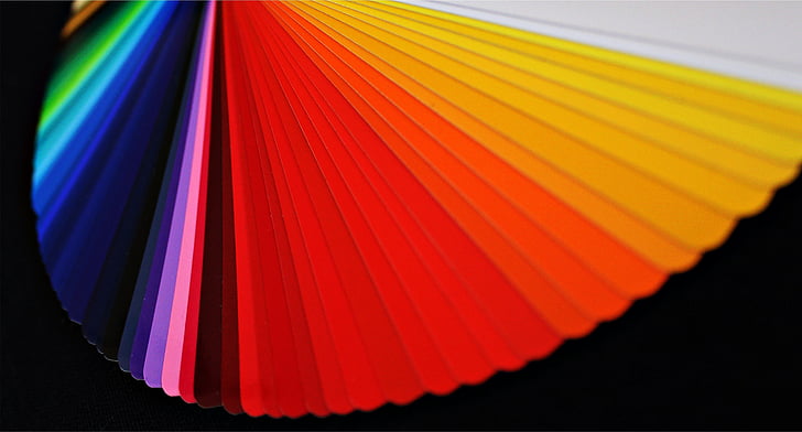
Choosing the Right Color Palette for Visual Appeal
So, you’re ready to dive into the world of color palettes and make your visuals pop! Choosing the right color palette is crucial for creating visual appeal and grabbing your audience’s attention. Here are some tips and tricks to help you along the way:
First things first, consider the emotions you want to evoke with your visuals. Different colors can trigger different emotional responses, so choose wisely. Need some guidance? Here’s a quick cheat sheet:
- Red: Bold, passionate, and powerful
- Blue: Trustworthy, calming, and professional
- Yellow: Happy, energetic, and attention-grabbing
- Green: Fresh, peaceful, and environmentally friendly
Next, think about the overall vibe you want to convey with your visuals. Are you going for a modern and sleek look, or a more cozy and inviting feel? Your color palette should reflect the personality of your brand or project. Remember, consistency is key!
Lastly, don’t be afraid to get a little adventurous with your color choices. Mix and match unexpected combinations to create visual interest and add a unique touch to your designs. The world is your color palette, so have fun and get creative with it!
Embracing Minimalism for Timeless Elegance
Minimalism is the new black, darling. Who needs all that clutter when you can achieve timeless elegance with just a few key pieces? Simplify your life, simplify your style.
Instead of drowning in a sea of clothes, why not invest in a few high-quality staples that will never go out of fashion? A crisp white shirt, a perfectly tailored blazer, a classic pair of black pumps – these are the building blocks of a chic wardrobe that will stand the test of time.
And let’s not forget about your home. Say goodbye to knick-knacks and tchotchkes cluttering up your space. Embrace the clean lines and open spaces of minimalism for a home that exudes sophistication and tranquility.
Remember, less is more. By paring down your possessions and focusing on what truly brings you joy, you can create a life filled with beauty and simplicity. Embrace minimalism, embrace elegance – you won’t regret it.
FAQs
How can architectural precision elevate a logo design?
Architectural precision can help to create a logo design that is visually striking and perfectly balanced. By paying close attention to measurements, proportions, and symmetry, you can ensure that your logo will exude a sense of professionalism and sophistication.
What are some key elements to consider when crafting a logo with architectural precision?
When crafting a logo with architectural precision, it’s important to pay attention to details like line thickness, spacing between elements, and overall balance. You’ll also want to consider using geometric shapes and clean, straight lines to create a sense of order and structure in your design.
How can architects apply their skills to logo design?
Architects have a unique ability to visualize three-dimensional spaces and understand how different elements work together to create a cohesive design. This skillset can be invaluable when designing a logo, as it allows architects to create visually dynamic and structurally sound designs that stand out from the competition.
Can architecture-inspired logos resonate with a wider audience?
Absolutely! Logos that are crafted with architectural precision often convey a sense of stability, reliability, and sophistication. These are qualities that can appeal to a wide range of audiences and help to establish your brand as a trustworthy and professional entity.
What are some examples of logos that have utilized architectural precision effectively?
Some great examples of logos that have successfully utilized architectural precision include the logos for Apple, Volkswagen, and Mercedes-Benz. Each of these logos features clean lines, balanced proportions, and a sense of order that helps to convey a sense of quality and reliability.
Time to Build Your Brand with Architectural Precision!
Thanks for joining us on this journey of crafting innovative logos with architectural precision! Just like a skilled architect, you now have the tools and knowledge to design a logo that will stand the test of time. So go ahead, unleash your creativity and build a brand that will leave a lasting impression. And remember, when it comes to logo design, precision is key!


