Attention all gamers and aspiring logo designers! Are you tired of seeing the same old generic logos slapped onto every gaming merchandise out there? Do you want to give a new level of geek-chic to your favorite pastime? Welcome to the world of crafting gamer-approved logos, where pixels collide with creativity and joystick meets design. Get ready to level up your logo game and learn the secret art of designing for gaming. Let’s dive into the digital universe and embrace the power of pixelated perfection!
Understanding the Gaming Industry
Whether you’re a casual gamer or a hardcore enthusiast, it’s important to have a solid grasp of the ever-evolving gaming industry. Here are some key points to help you understand the wild world of gaming:
- Console Wars: Think of it like a modern-day Game of Thrones, with Sony, Microsoft, and Nintendo vying for the Iron Throne of gaming dominance.
- Microtransactions: Like a sneaky leprechaun, these in-game purchases may seem harmless at first, but they can quickly drain your bank account faster than you can say “credit card statement.”
- Indie Games: These underdog gems may not have the big budgets of AAA titles, but they have heart and creativity in spades – like a scrappy street fighter taking on a giant robot.
Remember, in the gaming industry, change is the only constant. New technology, trends, and controversies pop up faster than you can say ”Respawn.” So buckle up, stay informed, and may your gaming adventures be as epic as a final boss battle!
Analyzing Top Gaming Logos
Let’s dive right into dissecting the top gaming logos out there! These symbols are more than just eye candy, they’re the virtual battle cries of our favorite gaming companies. So, buckle up your seatbelts, we’re about to embark on a logo analysis rollercoaster!
First up on our list is the iconic logo of Nintendo. This bad boy has been around since the days of oversized controllers and blowing into cartridges. With its bold, red font and sleek, white outline, it screams, “Get ready to kick some virtual butt in the Mushroom Kingdom!”
Next, we have the logo of PlayStation. Ah, the sweet nostalgia of booting up your PS1 and hearing that satisfying startup sound. The sleek, minimalist logo of PlayStation screams sophistication and class – like a fine wine, but for gamers.
And let’s not forget about the infamous logo of Xbox. With its futuristic, green “X” looming menacingly over your living room, you know you’re in for a wild ride. This logo says, “Prepare yourself for epic battles and hours of screen time – your social life is officially on pause!”

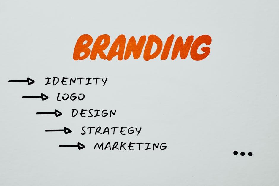
Key Elements of Gamer-Approved Logos
When creating a logo that will appeal to gamers, there are a few key elements that are essential for success. These elements will ensure that your logo is not only visually appealing, but also resonates with the gaming community. Let’s dive into what makes a logo gamer-approved!
1. Bold and Eye-Catching Design: Gamers are drawn to logos that stand out and grab their attention. Make sure your logo has a bold color palette and unique design that sets it apart from the competition. Remember, you want your logo to be instantly recognizable and memorable.
2. Incorporation of Gaming Icons: To truly resonate with gamers, consider incorporating elements that are synonymous with gaming culture. This could be anything from a controller or console to popular game characters or symbols. By including these icons, you are appealing to the nostalgia and passion that gamers have for the industry.
3. Versatility for Different Platforms: In the fast-paced world of gaming, your logo needs to be versatile and adaptable to various platforms and sizes. Whether it’s on a website, social media, or merchandise, your logo needs to look great across all mediums. Make sure your logo is scalable and fits the screen perfectly every time.
![]()
Color Psychology in Gaming Logo Design
When it comes to gaming logo design, choosing the right colors is crucial. Each color has its own unique psychological associations that can impact a player’s perception of a game. Here are some key considerations to keep in mind:
Red: This vibrant color is often associated with passion, excitement, and intensity. It can be a great choice for gaming logos that want to convey a sense of energy and action.
Blue: Blue is calming and soothing, making it a popular choice for gaming logos that want to project a sense of stability and trustworthiness. It’s also associated with intelligence and logic, perfect for games that require strategy and problem-solving skills.
Yellow: Bright and cheerful, yellow is a great choice for gaming logos that want to convey a sense of fun and positivity. It can also grab attention and stimulate mental processes, making it a good choice for games that want to stand out.
Incorporating Symbols and Icons
Have you ever felt like your content is missing that extra oomph? That special something that will make your readers go ”wow!”? Well, look no further because symbols and icons are here to save the day! These tiny graphical elements can pack a big punch and take your content from basic to brilliant in no time.
One way to spice up your content is by adding symbols to your headlines. Whether it’s a star, a heart, or even an emoji, these little guys can catch the eye of your readers and draw them in. Plus, they add a fun and playful element to your text that can help lighten the mood and make your content more engaging.
Icons are another great way to incorporate visual interest into your content. From simple checkmarks and arrows to more complex designs, icons can help break up long sections of text and make your content more visually appealing. Plus, they can help guide your readers’ eyes on the page and make important information stand out.
So, don’t be afraid to get creative with symbols and icons in your content. Whether you’re adding them to your headlines, using them to break up text, or simply incorporating them for fun, these little graphical elements can make a big impact. So go ahead, give it a try and watch your content come to life!
Typography Tips for Gaming Logos
Typography can make or break a gaming logo, so it’s important to choose the right fonts to convey the right message. Here are some tips to help you level up your typography game:
- Keep it simple: When it comes to gaming logos, less is more. Stick to one or two fonts to avoid overwhelming your audience with a chaotic mess of letters and numbers.
- Choose a font that matches your game: If you’re working on a logo for a fantasy RPG, go for a medieval-inspired font. For a futuristic shooter, opt for a sleek, sci-fi typeface. This will help set the tone for your game and give players a taste of what to expect.
- Make it readable: No one wants to squint at a logo to figure out what it says. Choose a font that is easy to read, even at smaller sizes. Avoid overly fancy or decorative fonts that can be difficult to decipher at a glance.
- Play with different styles: Don’t be afraid to experiment with bold, italic, or even custom fonts to create a unique look for your gaming logo. Just make sure it still aligns with the overall theme and aesthetic of your game.
Crafting a Unique, Memorable Logo
So, you want to create a logo that stands out from the crowd, huh? Well, you’ve come to the right place! is no easy task, but with a little bit of creativity and a sprinkle of pizzazz, you’ll be on your way to logo greatness in no time.
First things first, let’s talk about color. When it comes to creating a memorable logo, you want to choose colors that pop. Think neon pink, electric blue, and radioactive green. Forget about boring old black and white - we want your logo to be seen from outer space!
Next up, let’s talk about fonts. Times New Roman? Comic Sans? Pfft, that’s child’s play. Go for something bold and daring, like Impact or Rock Salt. Your logo should scream “look at me!” in the loudest, most obnoxious font you can find.
And finally, don’t forget to add a little bit of personality to your logo. Whether it’s a sneaky squirrel or a dancing pineapple, a quirky mascot can take your logo from forgettable to unforgettable in no time. So go ahead, let your creativity run wild and craft a logo that’s as unique and memorable as you are!
FAQs
How can I create a logo that appeals to gamers?
To create a logo that appeals to gamers, you’ll want to incorporate elements that are recognizable to the gaming community. Think about using bold, eye-catching colors, dynamic fonts, and imagery that evokes the spirit of gaming.
What are some common design trends in gaming logos?
Some common design trends in gaming logos include pixel art, retro aesthetics, futuristic elements, and vibrant color schemes. By incorporating these trends into your logo design, you can create a look that resonates with gamers.
What should I consider when designing a logo for a specific gaming genre?
When designing a logo for a specific gaming genre, it’s important to research the visual tropes and themes that are associated with that genre. For example, if you’re creating a logo for a fantasy game, you might want to include mythical creatures or medieval imagery in your design.
How do I ensure my gaming logo is memorable and stands out?
To ensure your gaming logo is memorable and stands out, focus on creating a unique and distinctive design that sets you apart from other gaming brands. Consider using clever visual elements or incorporating interactive features that engage the viewer.
What are some tips for incorporating text into a gaming logo?
When incorporating text into a gaming logo, it’s important to choose a font that is easily legible and complements the overall design. Additionally, consider using stylized lettering or typography effects to add a personalized touch to your logo.
How can I test the effectiveness of my gaming logo design?
To test the effectiveness of your gaming logo design, consider conducting focus groups or surveys with members of the gaming community. Ask for feedback on the design, color scheme, and overall appeal of the logo to ensure it resonates with your target audience.
Level Up Your Logo Design Skills!
Congratulations, you’ve mastered the art of crafting gamer-approved logos! Remember, when designing for the gaming industry, it’s all about creativity, precision, and understanding your audience. So go forth, fellow designer, and create logos that will make gamers everywhere press start with excitement. Happy designing!


