Picture this: you’re walking down the street, minding your own business, when suddenly you spot a swoosh or an apple or even a golden arch. No, you’re not in a surreal dream – you’re just encountering some of the most iconic logos in the world. But have you ever stopped to think about how these logos came to be? Join us on a journey through the evolution of logos as we explore the art of crafting brand identity. Trust us, it’s logo-nna be a wild ride!
concept-to-creation”>Design Process: From Concept to Creation
So you’ve got this amazing idea in your head, and you’re ready to bring it to life. Congratulations, you’re about to embark on a wild ride through the design process! Get ready to see your concept transform into a tangible creation that will blow everyone away.
First things first, gather your brainstorming supplies – a whiteboard, some colored markers, and maybe a cup of coffee or two (or three). Let those creative juices flow as you sketch out your initial concept and start refining your ideas. Remember, every great design starts with a rough draft.
Next up, it’s time to dive into the nitty-gritty details. Break down your concept into smaller components and start fleshing out each one. Consider color schemes, typography, layouts, and any other design elements that will bring your vision to life. Don’t be afraid to think outside the box – creativity knows no boundaries!
Once you’ve nailed down the specifics, it’s time to roll up your sleeves and get to work. Fire up your design software of choice and start translating your ideas into digital form. Play around with different options, experiment with different styles, and don’t be afraid to take risks. Remember, design is all about pushing the boundaries and creating something that’s truly unique. And before you know it, your concept will have blossomed into a beautiful creation that’s ready to take the world by storm. Happy designing!

Historical Perspective: Tracing the Origins of Logo Design
Long before graphic designers started looking for inspiration on Pinterest, logos were being created by ancient civilizations to represent their values, beliefs, and organizations. Let’s take a stroll down memory lane and trace the origins of logo design!
Ancient Egyptians were one of the first civilizations to use symbols as a form of communication. They used hieroglyphs to represent words and concepts, which were essentially the first logos! Imagine trying to fit a hieroglyphic logo on a t-shirt – talk about a fashion statement!
Jumping forward a few centuries, the Romans utilized family crests as a way to identify noble families. These crests were packed with symbolism, just like modern logos. It must have been confusing when trying to choose a crest that accurately represented your family – would you go for the lion to symbolize courage or the unicorn to represent uniqueness?
As time went on, logos became more elaborate and intricate, with each culture putting its own spin on design. From the intricate patterns of the Byzantine Empire to the bold simplicity of Japanese mons, logo design has come a long way! Just imagine an ancient graphic designer getting frustrated with their stone chisel – talk about a tough crowd!

Influence of Technology: How Digitalization Transformed Logos
Remember when logos used to be just a simple image or text that represented a company? Well, thanks to the wonders of technology and digitalization, logos have undergone a major transformation. Here’s how:
First and foremost, the rise of digital design tools has allowed for logos to become more intricate and detailed than ever before. Designers can now play around with different colors, textures, and effects to create visually stunning logos that truly stand out.
Additionally, the advent of social media and the internet has made it easier for companies to showcase their logos to a wider audience. Logos are no longer confined to just business cards and billboards – they can now be shared instantly across multiple platforms, reaching millions of people at the click of a button.
And let’s not forget about the rise of responsive design. With more and more people accessing websites and apps on their mobile devices, logos now need to be adaptable to different screen sizes and resolutions. Thanks to digitalization, logos can now seamlessly scale and adjust to fit any device, making for a more user-friendly experience.

Iconic Examples: Exploring Famous Brand Identity Transformations
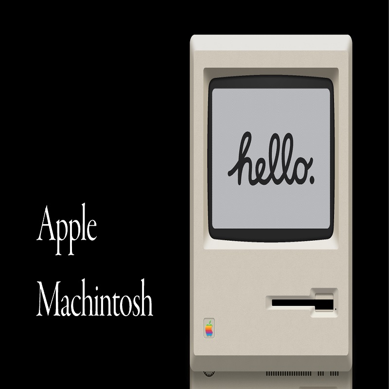
Remember when Apple was just a fruit? Well, now it’s synonymous with sleek technology and trend-setting gadgets. Just like how a caterpillar transforms into a butterfly, Apple underwent a stunning brand identity transformation.
And who can forget the evolution of the Starbucks mermaid? She went from a modest, two-tailed creature to a full-on, coffee-sipping diva. Talk about a glow-up!
Another iconic example is the Coca-Cola logo. It went from classic script to a more modern and dynamic design. It’s like the logo went to the gym and got a whole new look!
Brands like Nike and McDonald’s have also had some major identity makeovers. It just goes to show that even the most famous brands aren’t afraid to switch things up and keep things fresh!

Current Trends: Minimalism and Simplicity in Logo Design
In the world of logo design, minimalism and simplicity are all the rage right now. Forget about intricate details and busy graphics – less is definitely more when it comes to creating a memorable logo that stands out from the competition.
One of the key characteristics of minimalist logo design is the use of negative space. By cleverly incorporating empty spaces into the design, designers are able to create logos that are both simple and striking. This technique not only makes the logo more visually appealing but also allows for greater flexibility in terms of scaling and reproduction.
Another trend in logo design is the use of clean, sans-serif fonts. Gone are the days of fancy script typefaces – today’s logos are all about crisp, modern typography that exudes professionalism and sophistication. Remember, when it comes to fonts, less is more!
So if you’re looking to give your brand a fresh new look, consider jumping on the minimalism bandwagon and simplifying your logo design. Who knows, maybe less really is more!
Consumer Perception: Understanding the Impact of Logos on Brand Image
Logos are like the fashion accessories of brands – they can make or break an outfit. But how exactly do they impact consumer perception? Let’s dive into this logo-licious world and uncover the secrets behind their influence on brand image!
First things first, a logo is the face of a brand. Just like how your face reflects your personality, a logo reflects a brand’s identity. Is it bold and edgy like a punk rocker, or sleek and sophisticated like a smooth jazz musician? Consumers subconsciously pick up on these vibes and form opinions about a brand based on its logo.
Next, logos are like little love notes to consumers. They communicate a brand’s values, mission, and personality in a visually appealing way. Think of it as a secret language only cool kids can understand. A well-designed logo can instantly create a connection with consumers, making them feel like they belong to the brand’s tribe.
Lastly, logos have the power to evoke emotions. Just like seeing your favorite band perform live can give you goosebumps, a well-loved logo can stir up feelings of nostalgia, excitement, or trust. It’s like magic, but better because it’s all about brands and logos and stuff. So, the next time you see a logo, remember - it’s not just a pretty picture, it’s a gateway to a brand’s world!
FAQs
What’s the biggest mistake companies make when designing a logo?
Trying to be too literal with their design. Who needs an actual apple in the Apple logo? Just draw a random fruit and call it a day.
How important is it for a logo to be versatile?
Very important! Your logo should be able to withstand being printed on a tiny business card or blown up on a giant billboard. Don’t make your logo a diva.
Why do logos need to evolve over time?
Because even logos need a glow-up, honey! Trends change, companies evolve, and logos need to keep up to stay relevant. It’s like sending your logo to the gym for a makeover.
What makes a timeless logo?
A timeless logo is like a fine wine – it gets better with age. It should be simple, yet memorable, and able to withstand the test of time without looking like it’s stuck in the 90s.
How can a company infuse their brand’s personality into their logo?
Put a bit of soul into it, darling! Your logo should capture the essence of your brand - whether it’s playful, sophisticated, or just plain weird. Let your logo be a reflection of who you are.
Conclusion: Don’t Logo-nore Your Brand Identity!
So there you have it, folks! The journey of logo evolution is like a caterpillar transforming into a beautiful butterfly – except in this case, it’s all about your brand identity spreading its wings and taking flight. Remember, your logo is the face of your brand, so don’t skimp on its design. Let it be as bold, memorable, and unique as you are (or as you wish you were). Keep evolving, keep rebranding, and most importantly, keep logo-nizing the importance of your brand identity. It’s logo-tastic!


