Are you tired of staring at boring, uninspired logos that make you want to snooze before you even take a sip of your morning coffee? Well, fear not, dear marketing professionals, because we’ve got the ultimate guide to help you craft a logo that will have your competitors quaking in their designer boots. From brainstorming to execution, we’ll show you how to create a logo that’s so good, it might just make you famous (or at least get you a high-five from the boss). So grab your glitter glue and strap in for a wild ride through the fantastical world of logo design – it’s time to unleash your inner Picasso and craft a logo that’ll have everyone saying, “Now that’s one logo I wouldn’t kick out of bed for eating crackers!
Understanding the Importance of a Strong Logo Design
Having a strong logo design is crucial for any business looking to make a lasting impression. Your logo is like the face of your company, so you want it to be memorable, eye-catching, and reflective of your brand’s personality. Here are a few reasons why a killer logo is so important:
1. Brand Recognition: A well-designed logo helps customers easily identify your brand in a sea of competitors. Think of it as your business’s signature outfit!
2. Professionalism: A polished logo gives off the impression that your company is reputable and trustworthy. You wouldn’t show up to a job interview in your pajamas, would you?
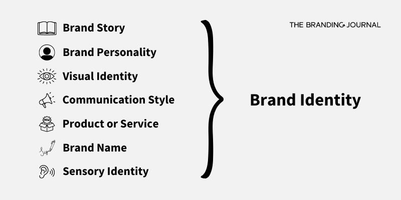
3. Consistency: Your logo should appear on all of your marketing materials, from business cards to social media posts. Consistent branding helps solidify your brand identity in the minds of consumers.

Key Elements to Consider When Designing a Logo
When designing a logo, there are several key elements to keep in mind to ensure your brand stands out from the crowd. Here are some tips to help you create a logo that is memorable and visually appealing:
- Color: Choose colors that reflect the personality and values of your brand. Avoid using too many colors, as this can make your logo look cluttered and unprofessional.
- Typography: Select a font that is easy to read and complements the overall design of your logo. Avoid using trendy fonts that may quickly become outdated.
- Simplicity: Keep your logo design simple and uncluttered. Remember, less is often more when it comes to logo design.
Additionally, it’s important to consider how your logo will look across different platforms and mediums. Make sure your logo is scalable and looks good in both color and black and white. You don’t want your logo to lose its impact when printed on a small business card or displayed on a large billboard!
By paying attention to these key elements and taking the time to carefully design your logo, you can create a visual identity that effectively communicates the essence of your brand and leaves a lasting impression on your audience.

How to Choose the Right Colors and Fonts for Your Logo
When it comes to choosing the right colors and fonts for your logo, it’s important to remember that first impressions are everything! You want your logo to stand out and make a statement, so make sure you choose colors and fonts that reflect your brand’s personality.
When selecting colors, think about the emotions you want your logo to evoke. Here are some tips to help you choose the right colors:
- Consider your target audience and what colors will appeal to them
- Think about the psychological effects of different colors
- Test out different color combinations to see what works best for your brand
When it comes to fonts, remember these important considerations:
- Make sure your font is legible and easy to read, especially in small sizes
- Choose a font that complements your brand’s aesthetic and message
- Consider using a mix of fonts to create visual interest
Ultimately, your logo should be a reflection of your brand’s identity, so don’t be afraid to get creative with your color and font choices. Experiment, have fun, and don’t be afraid to think outside the box!

Tips for Ensuring Your Logo is Timeless and Versatile
When designing your logo, it’s important to consider its longevity and adaptability. Here are some tips to make sure your logo stands the test of time and works in a variety of situations:
First and foremost, keep it simple! A complex logo may look flashy now, but in a few years, it could end up looking dated. Stick to clean lines and minimalistic design to ensure your logo remains timeless.
Another key factor is choosing the right colors. Opt for a color scheme that is versatile and can be easily adapted to different backgrounds and mediums. Avoid trendy colors that may fall out of fashion quickly.
Consider how your logo will look scaled down or enlarged. A good logo should still be recognizable even when it’s as tiny as a postage stamp or blown up on a billboard. Test out different sizes to make sure your logo remains clear and legible.

The Role of Market Research in Logo Design
Market research plays a crucial role in logo design because it helps ensure that your logo will resonate with your target audience. By conducting market research, you can gather valuable insights into your customers’ preferences, interests, and values, which can inform the design of your logo.
One of the key benefits of market research in logo design is that it can help you avoid costly design mistakes. By understanding what your target audience likes and dislikes, you can create a logo that is more likely to appeal to them and effectively communicate your brand message.
Additionally, market research can help you identify trends in your industry that can be incorporated into your logo design. By staying current with the latest design trends, you can ensure that your logo looks modern and relevant. Plus, incorporating popular trends can help your logo stand out from the competition.
So, next time you’re designing a logo, be sure to conduct thorough market research to ensure that your logo is not only visually appealing but also speaks to the hearts (and wallets) of your target audience. Remember, a well-researched logo is a logo that will bring in the big bucks!
Best Practices for Implementing Your Logo Across Different Platforms
When it comes to implementing your logo across different platforms, consistency is key. You want your brand to be instantly recognizable no matter where it appears. Here are some best practices to ensure your logo looks its best no matter where it goes:
First and foremost, make sure your logo is scalable. You never know where your logo might end up – from tiny social media icons to giant billboards. Your logo should be able to adapt to any size without losing its impact. A logo that looks pixelated or blurry is a surefire way to make your brand look unprofessional.
Another important factor to consider is color. Your logo should look the same regardless of whether it’s printed on a business card or displayed on a website. Make sure to use the same color codes (hex, RGB, or CMYK) across all platforms to maintain consistency. And remember, just because you can use every color of the rainbow doesn’t mean you should – less is more when it comes to color in your logo.
Lastly, don’t forget about placement. Your logo should be prominently displayed on all platforms, but that doesn’t mean it has to be front and center every time. Get creative with where you place your logo – try it in a corner, as a watermark, or even hidden in the background. Just make sure it’s always visible and doesn’t overpower your content.
FAQs
How important is having a well-designed logo for a brand’s success?
Oh, it’s crucial! A logo is like the face of a brand – would you trust a brand with a wonky, unappealing face? I think not!
What elements should be included in a memorable logo?
Think of your logo as your brand’s superhero outfit – it needs to be unique, memorable, and represent your brand’s values. So, include elements that showcase your brand’s personality and make it stand out from the crowd.
How can a marketing professional ensure their logo doesn’t get lost in a sea of competitors?
Ah, the age-old question! To avoid fading into obscurity, make sure your logo is bold, simple, and has a strong visual impact. Don’t be afraid to be a little daring – you want your logo to be the Beyonce of the branding world, not the background dancer.
What role does color play in creating a successful logo?
Colors can make or break a logo! Think of colors as the seasoning in a dish – use them wisely to enhance the flavor and make your logo pop. Choose colors that resonate with your target audience and convey the right emotions.
Should a logo be updated periodically, or is it better to stick with one design long-term?
As they say, “out with the old, in with the new!” A logo should reflect the current trends and changes in your brand’s identity. So, don’t be afraid to give your logo a makeover when needed. Just make sure it’s a glow-up, not a disaster!
Time to Logo Off!
And there you have it, folks! You are now equipped with the knowledge and tools to craft a winning logo that will make your brand stand out in a sea of mediocrity. So go forth, marketing warriors, and create a logo that will make your competition quiver in their boots. Logo off, my friends!


