Logo design: the gateway drug of branding. It’s the first step on the slippery slope of crafting a powerful brand identity that will have your competitors quaking in their designer jeans. So grab your pencils, fire up your Adobe Suite, and get ready to embark on a wild ride through the mysterious world of logo design. It’s time to show the world who you really are – with a little help from a spiffy new logo, of course.
Establishing Your Brand’s Identity
Defining Your Brand’s Unique Personality
So, you’ve decided to establish your brand’s identity – congrats! Now comes the fun part – figuring out who your brand really is. Remember, your brand is more than just a logo or a catchy tagline. It’s about creating a personality that your customers can connect with. Here are some tips to help you define your brand’s unique personality:
- Get to know your target audience: Understanding who you’re trying to reach is key to shaping your brand’s identity. Are they young and edgy? Or maybe more traditional and conservative? Tailor your brand’s personality to appeal to your target demographic.
- Identify your core values: What does your brand stand for? Is it all about innovation and cutting-edge technology? Or maybe it’s about sustainability and eco-friendliness. Make sure your brand’s personality reflects your core values.
Crafting Your Brand’s Visual Identity
Now that you’ve nailed down your brand’s personality, it’s time to bring it to life visually. Your brand’s visual identity should be a reflection of its personality and values. Here are some tips to help you craft a visually appealing brand:
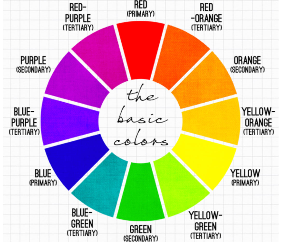
- Choose a color palette that speaks to your brand: Colors can evoke emotions and convey messages. Pick colors that align with your brand’s personality - bold and vibrant, or muted and sophisticated?
- Create a logo that stands out: Your logo is often the first thing people will associate with your brand. Make sure it’s unique, memorable, and visually represents what your brand is all about.

Understanding the Importance of Logo Design
When it comes to logo design, it’s not just about creating a pretty picture to represent your brand. It’s about crafting a visual identity that speaks volumes about who you are and what you stand for. A logo is like the superhero cape of your business – it’s the first thing people see, and it better make a good impression!
Here are a few reasons why nailing your logo design is crucial:
- First Impressions: Your logo is often the first thing customers notice about your brand. It’s like the cover of a book – if it’s boring or unappealing, no one’s going to want to pick it up.
- Brand Recognition: A well-designed logo helps people remember your brand. Think of it as your business’s signature – the more unique and memorable it is, the more likely customers will remember you.
- Professionalism: A polished logo shows that you mean business. It’s like wearing a suit to a job interview – it gives off an air of professionalism and trustworthiness.
So, if you’re still using that clip-art logo you made in Microsoft Paint back in 2001, it might be time for an upgrade. After all, you don’t want potential customers mistaking you for a time traveler stuck in the early 2000s, do you?

Choosing the Right Colors and Fonts
When it comes to for your design project, it can be quite a daunting task. But fear not, we are here to guide you through this colorful journey!
First things first, colors! *HTML color names* are like a box of chocolates - you never know what you’re gonna get. But fear not, with a little bit of trial and error, you will find the perfect shade that speaks to your soul. Remember, when in doubt, stick to the classics like *red*, *blue*, *yellow*, and *green*. They never fail to impress!
Next up, fonts! Ah, the world of typography – a place where serifs and sans-serifs live in harmony (or not). Choosing the right font is like choosing the right outfit for a first date – you want to make a good impression without trying too hard. Stick to the classics like *Arial*, *Times New Roman*, and *Helvetica* for a timeless look. And remember, when in doubt, always go for *Comic Sans* – just kidding, please don’t.
In conclusion, for your design project is no easy feat. But with a little bit of creativity and a dash of humor, you will be able to create a masterpiece that truly stands out. So go forth and unleash your inner Picasso! *Happy designing!*
Creating a Memorable and Timeless Logo
When it comes to , it’s all about standing out from the crowd. Sure, you could go with a generic design that looks like every other logo out there, but where’s the fun in that? Instead, why not think outside the box and come up with something truly unique?
One key to creating a memorable logo is to keep it simple. Avoid cluttering your design with unnecessary elements that will only detract from your message. Think about some of the most iconic logos out there – Apple, Nike, McDonald’s – they all have one thing in common: they’re clean and easy to recognize. So, follow their lead and embrace the power of simplicity.
Another tip for creating a timeless logo is to consider the longevity of your design. Trends come and go, so it’s important to think about whether your logo will still be relevant in a year, five years, or even ten years from now. Stay away from anything that feels too trendy or of-the-moment, and instead focus on creating something that will stand the test of time.
And finally, don’t be afraid to inject some personality into your logo. After all, your logo is often the first impression that people will have of your brand, so make it count! Whether it’s through vibrant colors, quirky typography, or a clever hidden message, let your logo reflect the essence of your brand and leave a lasting impression on your audience.

Testing and Tweaking for Maximum Impact
So you’ve put in the hard work creating your masterpiece, but now it’s time to fine-tune it to perfection with some testing and tweaking. Here are some ways you can ensure maximum impact for your project:
First things first, ***A/B testing*** is your best friend. Try out different versions of your project to see which one resonates best with your audience. Whether it’s changing up the colors, fonts, or layout, testing different options can help you optimize for maximum impact.
Don’t forget about ***user testing***! Get some fresh eyes on your project to see how real users interact with it. You might be surprised by their feedback and insights, which can help you make significant tweaks to improve user experience.
***SEO optimization*** is crucial for ensuring maximum impact. Make sure your project is optimized for search engines by including relevant keywords, meta tags, and descriptions. This can help drive traffic to your project and reach a broader audience.
Implementing Your Logo Across All Branding Materials
So, you’ve got yourself a killer logo that represents your brand perfectly. Now comes the fun part – slapping it on everything in sight! Here’s how you can implement your logo across all your branding materials:
- Business Cards: Sprinkle that logo on your business cards like confetti at a party. Make sure it’s front and center so people know who they’re dealing with.
- Letterheads: Your logo should be the crown jewel of your letterhead. Imagine it sitting there, all regal and majestic, ready to impress anyone who receives a letter from you.
- Social Media Profiles: Don’t be shy – plaster that logo all over your social media profiles. Your followers will recognize it in their sleep and dream of your amazing products.
Remember, consistency is key when it comes to branding. Whether it’s on your website, packaging, or even your coffee mug, make sure your logo is front and center, screaming “Look at me, I’m fabulous!”
FAQs
Why is the logo design important for a brand identity?
The logo is like the face of your brand. It’s what people see first and remember most. Just like you wouldn’t go out in public with spinach in your teeth, you wouldn’t want a poorly designed logo representing your brand.
How can a logo design influence consumer perception?
Think of it this way: if your logo looks like it was designed by a monkey with a crayon, people might assume your products were made by monkeys with crayons. A well-designed logo can convey professionalism, trustworthiness, and style.
What elements should be considered when creating a logo design?
It’s not just about picking pretty colors and cool fonts. You need to think about your target audience, your brand’s personality, and how you want to be perceived. It’s like putting together an outfit – you want it to be stylish, but also appropriate for the occasion.
Is it necessary to hire a professional designer for logo creation?
Do you really want to risk your brand’s reputation on your cousin’s roommate’s friend who was once good at drawing stick figures? A professional designer will know how to create a logo that not only looks great but also speaks to your brand’s values.
How can a brand ensure consistency in logo usage across different platforms?
Consistency is key, just like putting on matching socks. Make sure your logo is scalable, so it looks good whether it’s on a billboard or a business card. And create brand guidelines to make sure everyone knows how to use the logo correctly – no rogue interns using Comic Sans allowed!
Time to Make Your Mark!
Congratulations on taking the first step towards crafting a powerful brand identity through logo design! Remember, your logo is the visual representation of your brand, so make sure it packs a punch and leaves a lasting impression on your audience. Stay true to your brand values and personality, and don’t be afraid to think outside the box.
Now go forth, armed with this newfound knowledge, and create a logo that will make your competitors green with envy. The design world is your oyster, so get crafting and show the world what your brand is all about!


