Are you tired of your construction company‘s logo looking like it was designed by a kindergartener wielding a crayon? Well, fear not, because we’re here to help you construct a logo that will have your competitors green with envy (pun intended). In this article, we’ll be dishing out some top-notch logo design tips specifically tailored for all you builders, hammer-wielders, and blueprint aficionados out there. So grab your hard hat and get ready to build some serious brand recognition!
colors-and-fonts“>Choosing the Right Colors and Fonts
When it comes to for your design, it’s important to remember that you want to make a statement without causing a headache. Think of your color palette as your outfit for a first date – you want to look put together, but not like you’re trying too hard.
Start by selecting a primary color that speaks to your brand’s personality. Whether you’re feeling bold and sassy with a hot pink or chill and mysterious with a dark navy, make sure it reflects who you are. Then, add in some complementary colors to help bring your design to life – like the sidekicks that make your main character shine.
When it comes to fonts, think of them as the supporting actors in your design. You want them to add depth and character without stealing the show. Choose a simple, easy-to-read font for your body text, like Arial or Helvetica. Then, pick a fun and quirky font for your headlines to show off your playful side. Just remember, too many fonts can be like having too many cooks in the kitchen – chaos will ensue!
So, take your time, experiment, and don’t be afraid to step out of your comfort zone. After all, design is like a box of chocolates – you never know what you’re going to get! Just trust your instincts, follow your gut, and remember that at the end of the day, it’s all about having fun with it. Happy designing!
Creating a Strong, Memorable Icon
When , it’s important to think outside the box and come up with something unique. Here are some tips to help you stand out:
- Simplicity is key: A complicated icon can be easily forgettable. Keep it simple, but make sure it still conveys your message effectively.
- Color psychology: Choose colors that evoke the right emotions in your audience. Whether it’s bold and eye-catching or calming and soothing, the right colors can make a huge impact.
- Research your competition: Take a look at what other icons are out there in your industry. Make sure yours is distinct and doesn’t get lost in the crowd.
Remember, your icon is often the first impression people will have of your brand, so make it count! Don’t be afraid to get creative and think outside the box. With a little bit of effort and the right approach, you can create an icon that truly stands out and leaves a lasting impression on your audience.
Balancing Simplicity and Detail
When it comes to design, finding the perfect balance between simplicity and detail can be quite the challenge. It’s like trying to walk a tightrope while juggling flaming swords – one wrong move and everything goes up in flames!
On one hand, you have the minimalist approach, where less is more and simplicity reigns supreme. It’s all about clean lines, negative space, and a sleek, modern aesthetic. But if you go too far down this path, your design might end up looking like it was created by a robot with no sense of style.
On the other hand, you have the detailed approach, where every inch of your design is packed with intricate patterns, textures, and embellishments. It’s like a visual feast for the eyes, with something new to discover around every corner. However, if you get carried away with the details, your design could end up looking like a cluttered mess, like a hoarder’s house filled with trinkets and baubles.
So how do you strike the perfect balance between simplicity and detail? It’s all about finding that sweet spot where the design feels clean and uncluttered, yet still has enough visual interest to capture the viewer’s attention. Think of it as a delicate dance between yin and yang, where each element complements the other in perfect harmony. Remember, less is more, but sometimes, a little more can be just enough!

Ensuring Scalability and Versatility
When it comes to , it’s all about being prepared for any situation. Just like a good Boy Scout, you need to have your tools ready to tackle any challenge that comes your way. Without the right tools, you might find yourself in a sticky situation!
One key tool in your arsenal should be cloud computing. Cloud computing allows you to easily scale your operations up or down as needed, without the hassle of physical infrastructure. It’s like having your own personal army of robots ready to do your bidding at a moment’s notice!
Another essential tool is automation. By automating repetitive tasks, you can free up valuable time and resources to focus on more important things, like binge-watching your favorite shows or perfecting your meme game. Who needs to waste time on tedious tasks when you could be living your best life?
And finally, don’t forget about the importance of flexibility. Being able to adapt to changing circumstances is crucial in the fast-paced world of technology. Like a ninja warrior gracefully dodging obstacles, you must be agile and quick-thinking to stay ahead of the game. So, remember to stay flexible, stay nimble, and stay ready for anything!

Best Practices for Layout and Composition
When it comes to layout and composition, it’s important to remember that you’re not just throwing text and images onto a page willy-nilly. Oh no, there’s an art to it, my friend. And lucky for you, I’m here to spill the beans on some of the best practices that will have your designs looking snazzy in no time.
First off, let’s talk about white space. This stuff is your best friend, seriously. Don’t be afraid to give your elements room to breathe. Cluttered layouts are a big ol’ no-no. Embrace the white space, let it work its magic, and watch your design come to life.
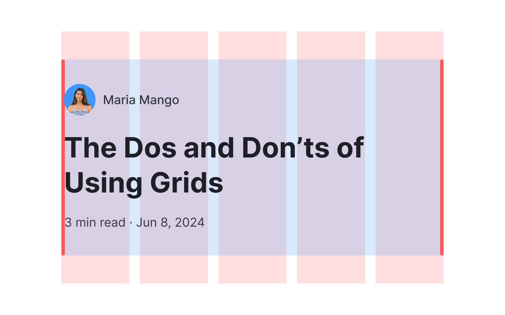
Next up, alignment is key. Make sure your text, images, and other elements are all lined up nice and neat. Nothing throws off the vibe of a design quicker than wonky alignment. You want everything to flow together harmoniously, like a well-choreographed dance routine. **So straighten up and fly right, my friend.**
Lastly, don’t forget about hierarchy. You want to make sure the most important elements of your design are front and center, while the supporting elements take a back seat. Think of it like a rock band – the lead singer gets the spotlight, while the drummer hangs out in the background. **Give each element its moment to shine, and you’ll have a design that’s as catchy as a hit single.**
Testing for Legibility and Impact
Let’s face it, we’ve all seen websites with text that looks like it was written by a sleep-deprived sloth using crayons. Testing for legibility is like making sure your outfit matches before leaving the house – it’s crucial for making a good first impression. But how do you know if your text is actually readable or if it’s just a confusing jumble of words? Fear not, we have some handy tips to help you test for legibility and make a real impact on your audience.
First things first, size matters (yes, even in the world of typography). Make sure your font size is large enough for people to actually read without squinting or pulling out a magnifying glass. A good rule of thumb is to aim for a font size of at least 16px for body text and 24px for headings. Remember, you want your text to be welcoming, not intimidating.
Next up, it’s all about contrast. Is your text standing out like a neon sign on a dark night, or is it blending into the background like a chameleon in a forest? Ensure there’s enough contrast between your text and its background to make it pop. **Bold** text, italics, or different colors can help draw attention to important information and make your content more visually appealing.
And don’t forget about spacing! Just like giving people some elbow room at a crowded party, adding enough space between lines and paragraphs can make your text easier to read and digest. Use line spacing and margin adjustments to break up your content and create a more comfortable reading experience. Remember, nobody likes a wall of text – give your words some breathing room.
In conclusion, is crucial for creating content that engages your audience and leaves a lasting impression. By paying attention to font size, contrast, and spacing, you can ensure that your text is not only legible but also visually appealing. So go forth, brave designer, and conquer the world of typography with confidence and style!
FAQs
What are some key elements to consider when designing a logo for a construction company?
When designing a logo for a construction company, it’s important to incorporate elements that reflect strength, reliability, and professionalism. Consider using bold fonts, sturdy shapes, and earthy colors to convey a sense of stability and durability.
How can a construction company ensure their logo stands out from the competition?
To make sure your logo stands out from the competition, try to avoid cliché construction symbols like hard hats and tools. Instead, think outside the toolbox and come up with a unique concept that effectively communicates your company’s values and mission.
What are some common mistakes to avoid when designing a logo for a construction company?
Avoid using overly complicated designs that are difficult to reproduce in various sizes and formats. Also, steer clear of trendy fonts and colors that may quickly become outdated. Remember, a timeless logo is always in style!
How can a construction company ensure their logo effectively represents their brand?
To ensure your logo effectively represents your brand, take the time to consider your company’s values, target audience, and overall aesthetic. Your logo should serve as a visual representation of who you are as a company and what you stand for.
What are some tips for working with a designer to create the perfect logo for a construction company?
When working with a designer, be sure to communicate your ideas and vision clearly. Provide them with examples of logos you like and dislike, as well as any specific preferences you may have. Remember, collaboration is key to creating a logo that truly reflects your company’s identity.
Time to Build Your Success!
Congratulations, aspiring construction company owner! Armed with these logo design tips, you’re well on your way to constructing a successful brand that stands tall amid the competition. Remember, just like a sturdy foundation is key to a building’s longevity, a well-designed logo is essential for your company’s success. So grab your hard hat and get ready to build your empire!


