Diving into the world of logo design is like picking out a new outfit for a blind date – you want to make a good impression, stand out from the crowd, and not accidentally end up wearing the same shade of red as your arch nemesis. But fear not, color connoisseurs, because we’re here to guide you through the wild and wacky world of choosing the right hues for your logo. So grab your color wheel and hold on tight, because we’re about to uncover the psychology behind successful design in a rainbow of hilarity.
Understanding Color Psychology
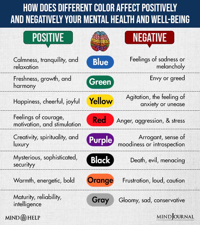
Color psychology is a fascinating topic that explores the emotional and mental effects that different colors can have on individuals. Let’s dive into the colorful world of hues, shades, and tints. Brace yourself for a rainbow of knowledge!
Ever wonder why fast-food restaurants love to use the color red in their branding? It’s because red is associated with energy, urgency, and excitement. So, when you see those golden arches or a big red sign, your brain immediately thinks, “I must eat those fries now!” Red is like a bull charging at the color wheel, full speed ahead!
On the other end of the spectrum, we have blue, the color of calm, serenity, and trust. When you walk into a spa with cool blue walls, you can feel your stress melting away like ice cream on a hot summer day. Blue is like a calm ocean wave, gently washing over your psyche and saying, “Hey, chill out, man.”
And let’s not forget about yellow, the color of happiness, sunshine, and… caution tape. That’s right, yellow is a double-edged sword, bringing joy and warning signs in equal measure. So, next time you see a yellow traffic light, just remember that life is all about balance, my friend!

Color Associations and Meanings
When it comes to colors, we all have certain associations and meanings that come to mind. Whether it’s feeling calm and serene when surrounded by blues and greens, or feeling energized and invigorated by vibrant reds and yellows, color plays a big role in how we perceive the world around us.
Think about it – how many times have you walked into a room painted in a deep, moody purple and immediately felt a sense of mystery and intrigue? Or what about when you see a bright, sunny yellow – does it not make you want to grab a margarita and head to the beach?
Below are some common that we all can relate to:
- Red: Passion, energy, love, and anger. So basically, a rollercoaster of emotions in one color.
- Blue: Serenity, calmness, trust, and the feeling of being one with the ocean (even if you’re miles away from it).
- Green: Growth, renewal, nature, and sometimes, the urge to become a plant parent – they’re just so dang cute!
- Yellow: Happiness, optimism, sunshine, and the sudden craving for lemonade and summer vibes.

Choosing the Right Color for Your Brand
So, you’ve decided to take the leap into creating a brand for yourself. Good for you! But now comes the hard part – choosing the right color that will represent your brand. Luckily for you, I’m here to guide you through this treacherous journey of hues and shades.
First things first, consider the message you want to convey with your brand. Are you a fun and quirky company? Maybe go for bright and bold colors like blue, red, or yellow. Are you more serious and professional? Stick to more neutral tones like black or grey.
Next, think about your target audience. Are you trying to appeal to children? Go for playful colors like pink or green. If you’re targeting a more mature demographic, opt for sophisticated colors like purple or brown.
Remember, the color you choose will be the first thing people associate with your brand. So, take your time, don’t rush, and make sure to pick a color that truly represents who you are. Good luck on your colorful journey!

How Colors Influence Consumer Behavior
Ever wondered why some products just seem to fly off the shelves while others collect dust in the corner? It’s all about the power of color! Yes, that’s right, the hues and shades of a product can make or break its success in the market. So buckle up, folks, as we take a colorful journey through the fascinating world of consumer behavior.
First up, we have red. This fiery hue is known to grab attention and stimulate the senses. It’s no wonder that fast-food chains like McDonald’s and KFC use red in their logos and branding. When you see that vibrant red, your brain goes into overdrive, making you crave a juicy burger or a crispy fried chicken sandwich. It’s like a Pavlovian response, but with fries on the side.
On the flip side, blue is known for its calming and trustworthy vibes. That’s why banks and financial institutions love to incorporate blue into their branding. When you see that serene shade of blue, you immediately feel a sense of security and reliability. It’s like a warm hug from your friendly neighborhood bank teller, reassuring you that your money is in good hands.
And let’s not forget about yellow, the color of sunshine and happiness. Yellow is known to evoke feelings of joy and optimism, making it a popular choice for brands in the food and beverage industry. Just think about how a can of refreshing lemonade or a bag of buttery popcorn can instantly lift your spirits. It’s like a burst of sunshine in a world full of gray clouds.

The Role of Contrast and Complementary Colors
Have you ever noticed how certain colors just seem to pop when they are placed next to each other? That’s the magic of contrast and complementary colors at work!
Contrast colors are like the odd couple of the color wheel – they shouldn’t work together, but somehow they complement each other perfectly. Think of bold and vibrant combinations like blue and orange, green and pink, or purple and yellow. They create visual excitement and make your designs truly stand out.
On the other hand, complementary colors are like two peas in a pod – they were made for each other. Pairings like red and blue, yellow and purple, or green and orange create a harmonious balance that is pleasing to the eye.
So next time you’re designing something, don’t be afraid to play around with contrast and complementary colors. Who knows, you might just discover a new favorite color combination that will take your creations to the next level!
Tips for Creating a Memorable Logo Design
Creating a memorable logo is no easy feat, but fear not! With these tips, you’ll be well on your way to designing a logo that sticks in people’s minds like gum on a shoe.
First things first, keep it simple, stupid! A cluttered logo is like a messy room – no one wants to stick around for long. Make sure your design is clean and easy on the eyes. Remember, less is more!
Next, think about colors that pop like a bag of popcorn in the microwave. Bright, bold colors can grab someone’s attention faster than a squirrel spotting a nut. Choose colors that reflect your brand’s personality and make a statement. And don’t forget about contrast – make sure your colors play nice together!
Lastly, be unique! Your logo should stand out in a crowd like a flamingo in a flock of pigeons. Do some research to see what your competitors are doing and then do the opposite. Be bold, be daring, and most importantly, be yourself! Your logo should be a reflection of your brand’s identity, so don’t be afraid to take risks. After all, fortune favors the bold!
FAQs
Why is color choice important for logos?
Color choice is important for logos because it can greatly influence people’s perception of a brand. Different colors can evoke different emotions and associations, so choosing the right color can help convey the right message about your brand.
How can I choose the right colors for my logo?
When choosing colors for your logo, it’s important to consider the message you want to convey and the emotions you want to evoke. Think about your target audience and what colors resonate with them. Also, consider the industry you’re in and what colors are commonly associated with that industry.
What are some examples of successful color choices in logos?
Some examples of successful color choices in logos include Coca-Cola’s use of red to convey energy and excitement, and Starbucks’ use of green to convey freshness and growth. These brands have cleverly used color psychology to effectively communicate their brand values.
Can I use multiple colors in my logo?
Absolutely! Using multiple colors in a logo can help create visual interest and convey a wider range of emotions. Just make sure the colors you choose complement each other and work together harmoniously.
Should I follow current color trends when designing my logo?
While it’s always good to stay current, it’s more important to choose colors that align with your brand and the message you want to convey. Trends come and go, but a well-thought-out color scheme that resonates with your audience will stand the test of time.
In conclusion, remember: it’s not just a color, it’s a statement!
Choosing the right colors for your logo can make or break your brand. So next time you’re designing a logo, don’t just pick your favorite color – think about the psychology behind it! Whether you want to convey trust with blue, passion with red, or creativity with purple, the right color choice can speak volumes about your brand. So go ahead, unleash your inner color psychology guru and watch your logo shine!


