In a world full of bland and boring logos, it’s time to inject a little personality into your brand with some color psychology! No more throwing darts at a color wheel and hoping for the best – it’s time to choose the right hues for your logo design with a little help from our friend, the subconscious mind. Get ready to dive deep into the wild world of color psychology and come out on the other side with a logo that truly speaks to your brand’s essence. Let’s get colorful, baby!
Understanding Color Psychology
Color psychology is a fascinating field that delves into the mysterious ways in which colors can affect our emotions and behaviors. It’s like having a whole secret language right at the tip of your paintbrush! Let’s dive into the colorful world of hues and shades, and uncover the hidden meanings behind those vibrant pigments.
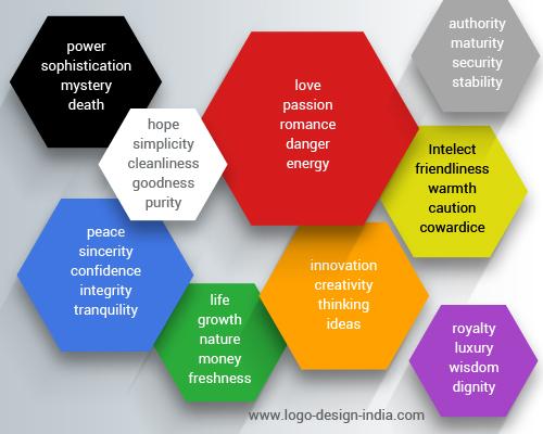
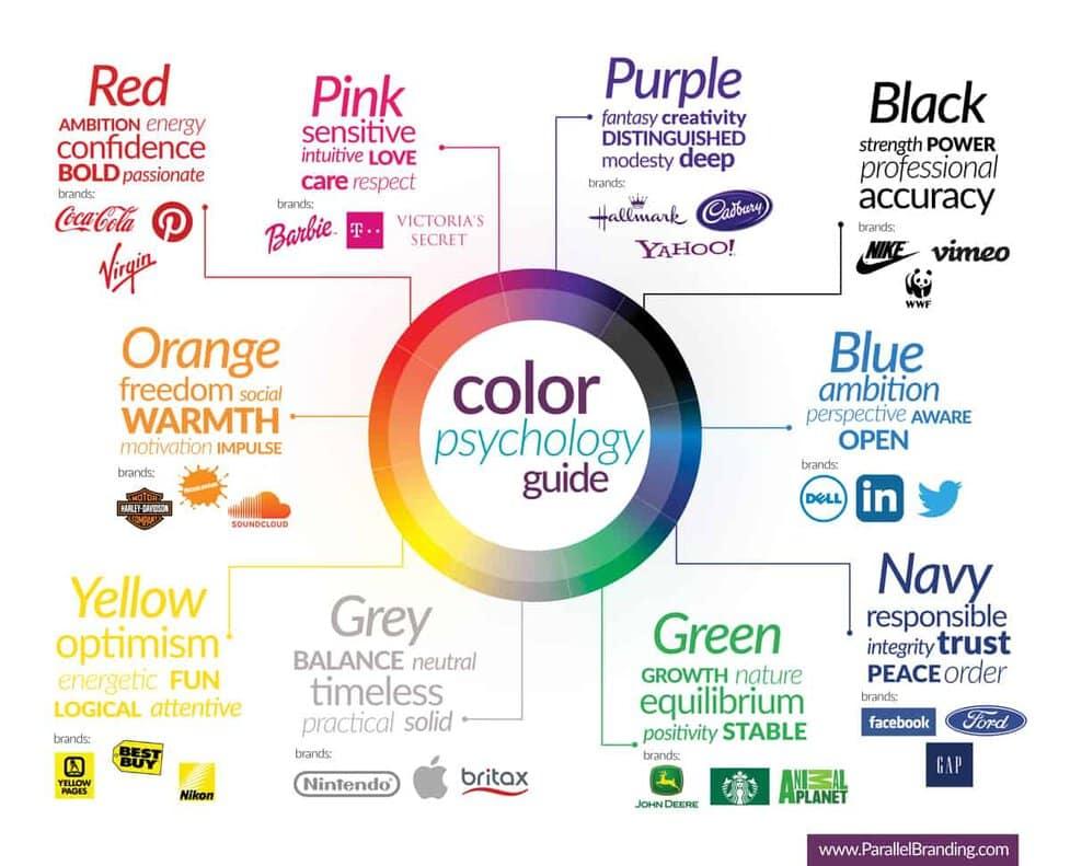
Ever notice how you feel energized when you see a bright red sports car zoom by? That’s right, red is the color of passion and excitement. It’s like your brain thought it saw a speeding love affair on wheels! On the other hand, blue is the color of calm and tranquility. It’s like a serene ocean lullaby that whispers “shhhhh, don’t worry about that impending deadline, just float away on these peaceful waves.”
Yellow is the color of sunshine and happiness, like a giant smiley face painted across the sky. It’s impossible not to feel a little more cheerful when you’re surrounded by this sunny hue. And let’s not forget about purple, the color of royalty and luxury. It’s like wearing a crown on your head, even if your kingdom is just a messy studio apartment.
So next time you’re trying to set the mood for a room or make a statement with your outfit, consider the power of color psychology. After all, life is just a big, beautiful rainbow waiting to be painted!
Impact of Color on Consumer Perception
When it comes to consumer perception, the impact of color cannot be underestimated. Just think about how certain colors can make you feel hungry (hello, McDonald’s red and yellow combo!) or relaxed (looking at you, calming shades of blue).
But did you know that color can also influence how much you’re willing to spend? It’s true! Research shows that certain colors like black and gold can make a product appear more luxurious, while bright colors like orange and yellow can make it seem more affordable.
So, next time you’re designing a website or packaging for your product, remember to choose your colors wisely. Here are some key points to keep in mind:
- Red: Creates a sense of urgency and excitement.
- Blue: Associated with trustworthiness and dependability.
- Green: Evokes feelings of growth and health.

Choosing Colors Based on Brand Identity
So you’re trying to pick the perfect colors for your brand, huh? Well, let me tell you, it’s not as easy as choosing your outfit for the day. You can’t just throw on any old color and call it a day. Your brand’s colors need to speak to your target audience, represent your values, and give off the right vibes. It’s like picking out the perfect wine to pair with your meal – it’s an art!
When choosing colors for your brand, it’s important to consider the psychology behind each color. Different colors evoke different emotions and can influence how people perceive your brand. Here are a few tips to help you choose colors that align with your brand identity:
- Consider your target audience: Are you catering to a fun-loving, adventurous crowd? Maybe go for bright, vibrant colors. Or are you targeting a more sophisticated, professional audience? In that case, you might want to stick to more neutral tones.
- Think about your brand values: What do you stand for as a brand? If you’re all about sustainability and eco-friendliness, consider using earthy tones like greens and browns. If you’re a high-end luxury brand, you might opt for rich, luxurious hues like gold and navy.
- Don’t be afraid to get creative: Who says your brand colors have to be the same as everyone else’s? Be bold and think outside the box. Maybe you’re a tech startup that wants to stand out – why not go for a bold, electric blue as your primary color?

trust-and-credibility-through-color-selection”>Building Trust and Credibility through Color Selection
When it comes to , you might think it’s as simple as picking a color that looks good. But oh no, my friends, it’s so much more than that! The colors you choose for your brand can actually convey different emotions and messages to your audience. It’s like your brand’s own little secret language!
So, let’s break it down, shall we? Here are a few color selections that can help you build trust and credibility:
- Blue: Ah, the color of trustworthiness! Want your audience to see you as reliable and dependable? Blue is your go-to color!
- Green: Feeling a little eco-friendly? Green screams trust and growth. Plus, who doesn’t love a color that’s good for the environment?
- Black: If you want to exude sophistication and authority, black is the way to go. It’s like the power suit of colors!
Remember, folks, the colors you choose for your brand say a lot about who you are and what you stand for. So pick wisely, and watch as your audience falls head over heels for you and your colorful charm!

The Role of Color in Evoking Emotions
Colors, colors everywhere! From the vibrant hues of a rainbow to the subtle shades of grey, color plays a significant role in evoking emotions. Have you ever wondered why you feel instantly happy when you see a bright yellow sunflower or calm and relaxed when surrounded by cool blues and greens? Well, my friend, it’s all thanks to the magical powers of color!
Let’s break it down, shall we? Here’s a little crash course on how different colors can make you feel:
- Red: The color of passion and energy. It can evoke feelings of love, excitement, and even anger. Just think about how your heart races when you see a stop sign!
- Blue: Ah, the color of tranquility. Blue is known for its calming effects and is often associated with feelings of serenity and peace. It’s like a mini vacation for your eyeballs!
- Yellow: The color of sunshine and happiness. Yellow can brighten your mood in an instant and make you feel all warm and fuzzy inside. Who needs a ray of sunshine when you’ve got yellow?
So next time you’re feeling a certain way, take a look around you and see if the colors in your environment are playing a trick on your emotions. It’s like being in a real-life mood ring! Who knew that something as simple as color could have such a powerful impact on how we feel? It’s like magic, but with a paintbrush!
Creating a Memorable and Recognizable Logo
When it comes to , there are a few key elements to keep in mind. First and foremost, your logo should be simple yet impactful. Think about some of the most iconic logos out there – Nike, Apple, McDonald’s – all of them are simple, yet instantly recognizable.
Another important consideration is color. Choose colors that not only reflect your brand’s personality but also stand out and grab people’s attention. Whether you go for bold and bright or subtle and sophisticated, make sure your colors are consistent across all of your marketing materials.
Don’t forget about fonts and typography. The font you choose can say a lot about your brand – from playful and whimsical to sleek and modern. Experiment with different fonts until you find the perfect fit for your logo.
Lastly, consider incorporating unique elements into your logo that make it truly stand out. Whether it’s a hidden message, a clever play on words, or a clever graphic, adding a little something extra can make your logo unforgettable.
Implementing Color Theory in Logo Design
Color theory is a crucial aspect of logo design that should never be underestimated. Like a chef meticulously choosing the right ingredients for a dish, a designer must carefully select the perfect colors to make a logo truly stand out. Here are some tips to help you implement color theory in your next logo creation:
- Start by understanding the psychology of colors. Did you know that blue is often associated with trust and loyalty, while red can evoke feelings of passion and boldness? Utilize this knowledge to convey the right messaging through your logo.
- Consider the color wheel and how different shades interact with each other. Complementary colors, such as blue and orange or red and green, create a visually appealing contrast that can make your logo pop. Avoid using clashing colors that might confuse or distract the viewer.
- Experiment with different color combinations to find the perfect balance. Don’t be afraid to think outside the box and try unconventional pairings that could make your logo memorable. Remember, the goal is to create a logo that is not only visually striking but also conveys the brand’s personality and values.
Remember, the colors you choose for a logo can greatly impact how it is perceived by the audience. So take the time to explore various color options and find the perfect palette that will make your logo shine. With a little creativity and a solid understanding of color theory, you can create a logo that truly stands out from the crowd.
FAQs
Why is color psychology important in logo design?
Color psychology plays a crucial role in logo design because different colors evoke varying emotions and associations in people’s minds. By strategically selecting colors based on psychological principles, you can communicate the right message to your target audience.
How can I choose the right colors for my logo?
When choosing colors for your logo, consider the feelings and messages you want to convey. For example, if you want to appear trustworthy and reliable, you might opt for blue. If you want to exude energy and excitement, red or orange could be the way to go.
Are there any colors I should avoid in logo design?
Absolutely! Be cautious when using colors like brown or gray, as they can come across as dull or somber. Additionally, be mindful of cultural meanings behind certain colors to ensure your logo is well-received across different audiences.
Can I use multiple colors in my logo design?
Of course! Using multiple colors can add depth and complexity to your logo. Just make sure the colors complement each other and work together harmoniously to create a cohesive design.
How do I know if the colors I’ve chosen are effective in my logo design?
One way to gauge the effectiveness of your chosen colors is through feedback from others. Show your logo to friends, family, or even strangers and ask them how the colors make them feel. Their responses can give you valuable insights into the impact of your color choices.
In conclusion: Let your logo colors do the talking!
So there you have it, folks! When it comes to choosing the right colors for your logo design, remember to consider the psychology behind it. Don’t just pick your favorite color because it looks pretty – think about what message you want to convey to your audience.
With the right colors, your logo will not only look visually appealing but will also connect with your target market on a subconscious level. So go ahead, have fun experimenting with different color combinations and watch your brand’s identity come to life!
Remember, when in doubt, trust the experts. And always remember: a little splash of color can go a long way in making your logo stand out from the crowd!


