Welcome, logo aficionados, brand warriors, and design divas! Today, we’re diving headfirst into the wild and wonderful world of crafting a cohesive brand image through the magic of logo design. Picture this: your brand is the star of its own epic blockbuster, and the logo is its trusty sidekick, guiding your audience through twists, turns, and unexpected plot twists. So buckle up, grab your sketch pad, and get ready to whip your logo into shape – this is one design journey you won’t want to miss! Let’s make your brand shine brighter than a disco ball in a ’70s dance party.
Creating a Strong Concept
In order to create a strong concept, you need to brainstorm like your life depends on it. Get those creative juices flowing and let your imagination run wild. Take inspiration from everyday life, pop culture, or even that weird dream you had last night. Remember, the more out-there your ideas, the stronger your concept will be.
Once you have a bunch of ideas floating around in your head, it’s time to narrow it down to the one that truly speaks to you. Ask yourself questions like “Does this concept excite me?” or “Will this concept stand out in a sea of mediocrity?” Trust your gut, but also trust your mom – she knows what’s up.
Now that you’ve chosen the winning concept, it’s time to flesh it out. Give your concept some depth by creating a backstory, defining its purpose, and envisioning how it will be brought to life. Use mood boards, sketches, or interpretive dance – whatever helps you fully visualize your concept.
And finally, don’t be afraid to run your concept by others for feedback. Your friends, colleagues, or that guy who sits next to you on the bus can offer valuable insights and help you refine your concept even further. Remember, a strong concept is like a fine wine – it only gets better with age (and a little constructive criticism).

Understanding Brand Identity
So you want to understand brand identity, huh? Well, buckle up buttercup because we’re about to take you on a wild ride through the wonderful world of branding. Strap in, because it’s going to be a bumpy, yet oh so fabulous, journey.
First things first, let’s talk about what brand identity actually is. It’s like your brand’s own unique fingerprint – it sets you apart from the rest of the herd. It’s what makes you, well, you! Think of it as your brand’s personality – quirky, fun, and oh-so-memorable.
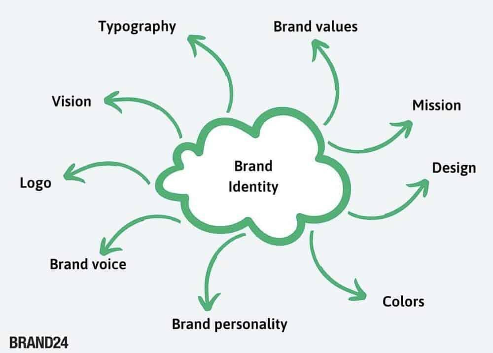
Now, let’s break it down further. Your brand identity consists of a few key components:
- Your brand’s logo – the crown jewel of your visual identity
- Your brand’s color palette – because who doesn’t love a pop of color?
- Your brand’s tone of voice – are you sassy and sarcastic? Or sweet and charming?
- Your brand’s mission and values – what do you stand for? Let your freak flag fly!
So there you have it, folks. Brand identity in a nutshell. It’s your brand’s way of saying, ”Hey world, this is who I am, and I’m damn proud of it!” So go forth, embrace your brand identity, and show the world what you’re made of!

typography“>Choosing Colors and Typography
When it comes to for your project, you want to make sure you don’t end up with a hot mess. The color scheme you select will set the mood and tone for your design, so choose wisely. Think of it like picking out the perfect outfit for a first date – you want to make a good impression, but you also want to be yourself (unless you’re secretly a unicorn, then by all means, go for the rainbow brights).
Take a moment to think about what emotions you want to evoke with your design. Are you aiming for relaxing and serene? Bold and eye-catching? Playful and whimsical? Once you have a clear idea of the vibe you’re going for, it’s time to pick your colors. Consider using a tool like Adobe Color Wheel to help you find complementary colors that work well together. Just remember, there’s no need to reinvent the wheel – if you’re feeling indecisive, stick with classic color combos like black and white, or blue and yellow.
When it comes to typography, it’s all about finding the perfect font to complement your color choices. Don’t be afraid to mix and match different fonts to create a unique and eye-catching design. Just make sure they play nicely together – you wouldn’t want Comic Sans and Times New Roman to get into a font fight on your webpage. Keep it cohesive, but don’t be afraid to play around with different styles and sizes to create visual interest. And remember, when in doubt, you can never go wrong with a classic like Helvetica or Arial.
Ensuring Scalability and Adaptability
When it comes to , it’s crucial to remember that one size does not fit all. Your business needs to be able to grow and evolve alongside the ever-changing landscape of the market. So, how can you make sure your company is flexible enough to handle whatever comes its way? Here are a few tips to keep in mind:
- Stay Agile: Just like a gymnast in a limbo competition, your business needs to be able to bend and flex without breaking. Embrace change and be willing to pivot when necessary.
- Think Outside the Box: Don’t be afraid to try new things and experiment with different strategies. You never know what might work until you give it a shot!
- Invest in Technology: In a world where advancements are constantly being made, it’s important to stay ahead of the curve. Embrace new technologies that can help streamline processes and make your business more efficient.
Remember, the key to success in today’s fast-paced world is the ability to scale and adapt. By staying nimble and open-minded, you can ensure that your business is prepared for whatever challenges come its way. So, don’t be afraid to shake things up and make the changes necessary to thrive in an ever-evolving marketplace!
Designing for Versatility
is kind of like being a Swiss Army knife – you need to be ready for anything that comes your way. When you’re creating a design that needs to be versatile, you have to consider all the different ways it could be used. Will it be printed on a t-shirt? Displayed on a billboard? Featured on a website? Maybe even projected onto the side of a building? The possibilities are endless!
One of the key elements of is making sure your design is scalable. You want it to look just as good on a tiny business card as it does on a massive banner. With the power of HTML, you can easily adjust the size and layout of your design to fit any format. Embrace the flexibility and let your design shine in any situation.
Another important factor to consider is color. **Bold** and vibrant colors can make a design pop, but they might not always be appropriate for every situation. Think about creating a palette of colors that can be easily adjusted to suit different contexts. A neutral base with pops of color can give your design the flexibility it needs to work anywhere.
And don’t forget about typography! Choosing the right fonts can make a huge difference in how your design is perceived. Consider using a mix of serif and sans-serif fonts to create visual interest. Play around with different sizes, weights, and styles to find the perfect combination that will make your design stand out no matter where it’s used.
Maintaining Consistency across Platforms
So you’ve finally realized the importance of maintaining consistency across all platforms – congratulations! Now, you may be wondering how exactly to achieve this seemingly insurmountable task. Have no fear, we’re here to help!
First and foremost, it’s crucial to establish a clear brand voice and tone. Whether you’re tweeting, posting on Instagram, or writing a blog post, your tone should remain consistent. This doesn’t mean you have to be a robot, though. Inject some personality into your content to keep things interesting!
Next up, let’s talk about visuals. Keep your design elements consistent across all platforms. From your logo to your color scheme, make sure everything is cohesive. This will not only help with brand recognition but also make your content look more professional. And remember, a little bit of pizzazz never hurt anyone!
Lastly, don’t forget about your messaging. Your core values and key messages should be consistent no matter where you’re posting. This will help build trust with your audience and keep them coming back for more. So go forth, dear reader, and conquer the world of cross-platform consistency with confidence!
FAQs
What makes a good logo design?
Think of it like a Tinder profile: it has to be attractive, memorable, and represent your brand in a way that makes you want to swipe right.
Why is it important to have a cohesive brand image?
Would you show up to a job interview wearing a Hawaiian shirt, a tuxedo jacket, and sweatpants? No? Well, having a cohesive brand image is like dressing appropriately for every occasion in the business world.
How can a well-designed logo help establish brand identity?
Imagine your logo is like the Batman signal: as soon as people see it, they know you’re swooping in to save the day with your amazing products and services.
What are some common mistakes to avoid when designing a logo?
Avoid overcomplicating things – your logo shouldn’t look like a toddler’s finger painting after they’ve raided the glitter glue. Keep it simple, folks!
How can a business ensure their logo design is consistent across all platforms?
It’s like the golden rule of relationships: communication is key. Make sure all your platforms are on the same page when it comes to your logo design, so there’s no confusion or hurt feelings.
In Conclusion: Logo-ntly Crafting Your Brand Image
And there you have it! By putting some thought into your logo design, you can weave together a cohesive brand image that truly reflects your company’s values and messaging. So, go forth and design with purpose, my fellow creatives! Remember, a strong logo is like a superhero cape for your brand – it’s what helps you stand out in a sea of competition. Happy crafting!


