Have you ever stopped to think about why certain logos make you feel happy, hungry, or even strangely nostalgic? Turns out, it’s not just because of clever design/” title=”Accounting Logo Design”>marketing or catchy slogans - it’s all in the colors! In this article, we dive deep into the fascinating world of color psychology in logo design. So buckle up, because we’re about to take you on a wild ride through the rainbow-filled rollercoaster of consumer emotions. Hold on to your hats (or your color wheel), folks – we’re about to blow your mind!
The Influence of Color on Consumer Perception
Have you ever wondered why you’re always drawn to that bright, neon sign in the window? Or why that luxury car in the showroom catches your eye every time you pass by? It’s all in the colors, my friends. Yes, colors have a sneaky way of manipulating our minds and influencing our perception of products.
For example, red is known to create a sense of urgency and excitement. That’s why fast-food chains love to splash it around on their logos and signage. It subconsciously tells us to hurry up and order that burger and fries before it’s too late!
On the other hand, blue tends to convey trust and reliability. That’s why banks and insurance companies often use this calming color in their branding. It’s like a gentle pat on the back, reassuring us that our money is safe with them.

Creating Brand Identity through Color Psychology
When it comes to creating a brand identity, color psychology plays a crucial role. You want your brand to evoke certain emotions and associations, and choosing the right colors can help you achieve that. Here are a few tips to help you harness the power of color psychology in your branding:
First and foremost, think about the message you want to convey with your brand. Are you aiming for a sense of luxury and sophistication? Consider using regal colors like deep purples and golds. Want to come across as fun and energetic? Opt for bright, vibrant colors like neon greens and hot pinks.
Another important factor to consider is your target audience. Different colors have different meanings and associations in various cultures, so make sure you do your research before settling on a color scheme. For example, while white may symbolize purity and cleanliness in Western cultures, it can represent mourning in Eastern cultures.
Lastly, don’t be afraid to get creative with your color choices. Remember, the goal is to stand out from the competition and make a memorable impression on your audience. Consider using unexpected color combinations or incorporating bold accents to make your brand pop.

The Power of Color Association in Logo Design
When it comes to logo design, color association plays a huge role in how a brand is perceived. It’s not just about picking your favorite color, it’s about sending a message to your audience. Let’s dive into !
**Red**: This color is bold, passionate, and demands attention. It’s perfect for brands that want to stand out from the crowd. Think Coca-Cola or Target – you can’t miss them even if you tried!
**Blue**: The color of trust, reliability, and professionalism. If you want your brand to exude a sense of calm and dependability, blue is the way to go. Just ask Facebook or IBM – they’re the cool, collected kids of the branding world.
**Yellow**: Bright, cheerful, and energetic, yellow is the color of optimism. Brands like McDonald’s and Best Buy use yellow to create a sense of excitement and fun. Who wouldn’t want to be associated with that kind of positivity?

Utilizing Color Theory to Enhance Brand Messaging
When it comes to branding, color theory can make or break your message. Think of it like a game of chess - use the right colors, and you’ll be checkmating your competition in no time. Here are some fun ways to utilize color theory to make your brand stand out:
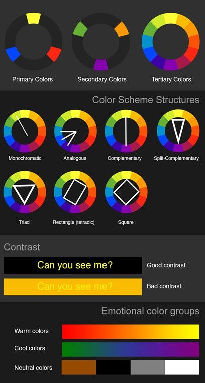
1. **Choose your brand colors wisely**: Just like picking the right outfit for a hot date, your brand colors should be chosen with care. Make sure they represent your brand personality and values. Use warm colors like red and orange to convey energy and excitement, or cool colors like blue and green for a more calming effect.
2. **Create contrast**: Want your message to pop? Use contrasting colors to grab attention. Think of it like a neon sign in the middle of a dark alley – you can’t help but look. Pair complementary colors like purple and yellow or red and green to create a visually striking message that’s impossible to ignore.
3. **Consider cultural meanings**: Different colors hold different meanings in various cultures. For example, in Western cultures, white represents purity and innocence, while in some Asian cultures, white is associated with death. Make sure you’re mindful of these cultural differences when choosing your brand colors to ensure your message is understood and well-received globally.

Maximizing Impact with Strategic Color Choices
Choosing the right colors for your design can make all the difference in maximizing impact. Here are a few tips on how to strategically pick colors that will leave a lasting impression:
- Consider the emotions you want to evoke with your color choices. Bright, bold colors can convey energy and excitement, while soft pastels can evoke a sense of calm and relaxation.
- Think about your target audience and what colors are most appealing to them. If you’re targeting a younger demographic, vibrant hues might be the way to go. For a more mature audience, sophisticated neutrals could be more effective.
- Pay attention to color psychology. Certain colors have been shown to evoke specific emotions and behaviors. For example, red can convey passion and urgency, while blue is often associated with trust and reliability.
When it comes to strategic color choices, don’t be afraid to think outside the box! Experiment with different color combinations to see what works best for your design. Remember, the goal is to make a bold statement that will capture your audience’s attention and leave a lasting impression.
Psychological Effects of Different Colors in Logos
Have you ever wondered why certain logos make you feel a certain way? It turns out, the colors used in logos can have a profound impact on our psyche. Let’s delve into the !
1. Red: This fiery color is often associated with passion, excitement, and urgency. Logos with red evoke feelings of intensity and energy. Think Coca-Cola or Netflix – these brands definitely know how to grab your attention!
2. Blue: The color of the sky and the ocean, blue is often seen as calming and trustworthy. Logos with blue instill a sense of security and reliability. Brands like Facebook and IBM use blue to create a sense of stability and professionalism.
3. Yellow: Bright and cheerful, yellow is often associated with happiness and optimism. Logos with yellow can make you feel cheerful and energetic. Just think of the iconic golden arches of McDonald’s – you can’t help but smile!
4. Green: Symbolizing nature and growth, green is often used to convey a sense of freshness and health. Logos with green can make you feel relaxed and rejuvenated. Brands like Starbucks and Whole Foods use green to promote a sense of well-being and sustainability.
Implementing Color Psychology for Successful Branding
When it comes to successful branding, color psychology plays a key role in influencing customer perceptions and emotions. By understanding the psychology behind different colors, brands can strategically choose colors that resonate with their target audience and effectively communicate their brand message.
One of the most important aspects of implementing color psychology for branding is choosing a color scheme that aligns with your brand personality and values. For example, if your brand is all about creativity and innovation, you might want to consider using vibrant and bold colors like red, yellow, and blue to evoke a sense of excitement and energy.
On the other hand, if your brand is focused on sophistication and elegance, colors like black, white, and gold can convey a sense of luxury and exclusivity. By selecting the right color palette, you can create a cohesive and memorable brand identity that resonates with your target audience.
Remember, it’s not just about choosing the right colors, but also how you use them in your branding materials. Whether it’s your logo, website, packaging, or marketing materials, consistency is key. Make sure to use your brand colors strategically to create a strong and cohesive visual identity that leaves a lasting impression on your customers.
FAQs
What impact do colors have on consumer perception?
Well, imagine if a company had a bright red logo – you’d probably think they were fiery and passionate. On the other hand, a soothing blue logo might make you feel calm and relaxed. So, colors can actually evoke certain emotions and associations in consumers, shaping their perception of a brand.
How can a logo’s color affect brand recognition?
Think of it this way – if you saw a pair of golden arches, you’d immediately think of McDonald’s. That’s the power of color in logo design! Using consistent colors helps consumers recognize and remember your brand more easily. It’s like creating visual cues that stick in people’s minds.
Can certain colors convey specific messages or meanings?
Absolutely! For example, green is often associated with health and nature, while purple can convey luxury and sophistication. By choosing the right color for your logo, you can communicate important messages about your brand without saying a word. It’s like visual communication magic!
How do cultural differences play a role in color choices for logos?
Oh, cultural differences are like the wildcard in the color game! While white may symbolize purity and innocence in Western cultures, it can represent mourning in some Eastern cultures. So, it’s important to consider the cultural context when choosing colors for your logo to avoid any unintended meanings.
Do color combinations matter in logo design?
Absolutely! Just like mixing ingredients in a recipe, combining colors in a logo can create a whole new flavor. Complementary colors can make your logo pop, while analogous colors can create a harmonious feel. It’s all about finding that perfect color cocktail that suits your brand’s personality.
How can I use the psychology of color to make my logo stand out?
Well, it’s like being a color wizard! By understanding how different colors can influence emotions and perceptions, you can strategically choose colors that align with your brand values and personality. Whether you want to stand out as bold and daring or elegant and sophisticated, the psychology of color can be your secret weapon in logo design.
Color Your Logo with Purpose!
And there you have it! The fascinating world of color psychology in logo design. From the warm embrace of red to the cool confidence of blue, each hue has its own unique impact on our brains. So next time you’re designing a logo, remember to choose your colors wisely and make sure they send the right message. Happy designing!


