Ah, the age-old question that has plagued humanity for centuries: What do your logo-design/” title=”Law Firm Logo Design”>brand‘s colors say about you? Are you a bold, adventurous risk-taker with a fiery red logo, or a calm, collected zen master with a soothing blue hue? Decoding logo design is no easy feat, but fear not, dear reader - we’re here to guide you through the wild world of color psychology and help you select the perfect palette for your brand. So sit back, grab your color wheel, and prepare to unlock the secrets of your brand’s true identity!
Understanding the Psychology of Colors
Have you ever wondered why you feel so calm and peaceful when surrounded by blue walls, or so energized and passionate when seeing the color red? It’s all thanks to the magical world of color psychology!
Let’s break it down:
- **Red:** Associated with passion, energy, and excitement. It’s like the shot of espresso in the color world. Red says, “I’m here, I’m loud, and I’m not apologizing for it!”
- **Blue:** The color of tranquility, trust, and calmness. Blue is like a soothing lullaby for the eyes. It whispers, “Relax, everything will be okay.”
- **Yellow:** The sunshine in the color palette. Yellow is all about happiness, optimism, and creativity. It’s the color that says, “Why be grumpy when you can be fabulous?”
So next time you’re feeling a certain way, take a look at the colors around you. They might just be playing mind games with you!

Identifying Your Brand’s Personality
So, you’ve decided to tackle the daunting task of . Don’t worry, it’s not as scary as it sounds! Here are some tips to help you figure out what makes your brand unique:
First things first, ask yourself: “If my brand were a person, what kind of person would it be?” Would they be the life of the party or more of a wallflower? Think about the qualities that best represent your brand and make a list of words that come to mind. Here are a few examples to get you started:
- Fun-loving
- Quirky
- Sophisticated
- Adventurous
Next, think about your target audience. Who are you trying to reach with your brand? What kinds of traits would appeal to them? If your target audience is young and trendy, you’ll want your brand’s personality to reflect that. If you’re targeting a more mature demographic, you’ll need to adjust accordingly.
Don’t be afraid to let your brand’s personality shine through in everything you do, from your social media posts to your packaging. Remember, people are drawn to brands that have a strong personality, so don’t be afraid to show off what makes yours unique!

Choosing the Right Color Palette
When it comes to choosing the perfect color palette, it’s crucial to consider your brand’s personality and target audience. You don’t want to pick colors that clash like an awkward blind date or are too bland like a plain rice cake. Instead, aim for a palette that is as harmonious as a catchy pop song or as vibrant as a double rainbow.
One way to narrow down your options is to think about the emotions you want your brand to evoke. Do you want to exude confidence like a peacock strutting its stuff, or do you prefer a more calming vibe like a lazy cat lounging in the sun? Once you’ve identified the mood you’re going for, choose colors that reflect that feeling.
Consider the psychological impact of different hues on your audience. For example, red can evoke passion and energy, while blue conveys trust and reliability. Think about how you want your customers to feel when they interact with your brand, and select colors that will elicit those emotions.
Don’t be afraid to get creative and mix and match different shades to create a palette that is uniquely yours. Just remember, the key to success is finding the right balance of colors that will make your brand stand out like a peacock in a sea of pigeons.

Utilizing Color Theory in Logo Design
When it comes to designing logos, color theory is your best friend. It’s like having a trusty sidekick that knows all the secrets to making your logo pop. By understanding how different colors work together, you can create a logo that not only looks visually appealing but also conveys the right message to your audience.
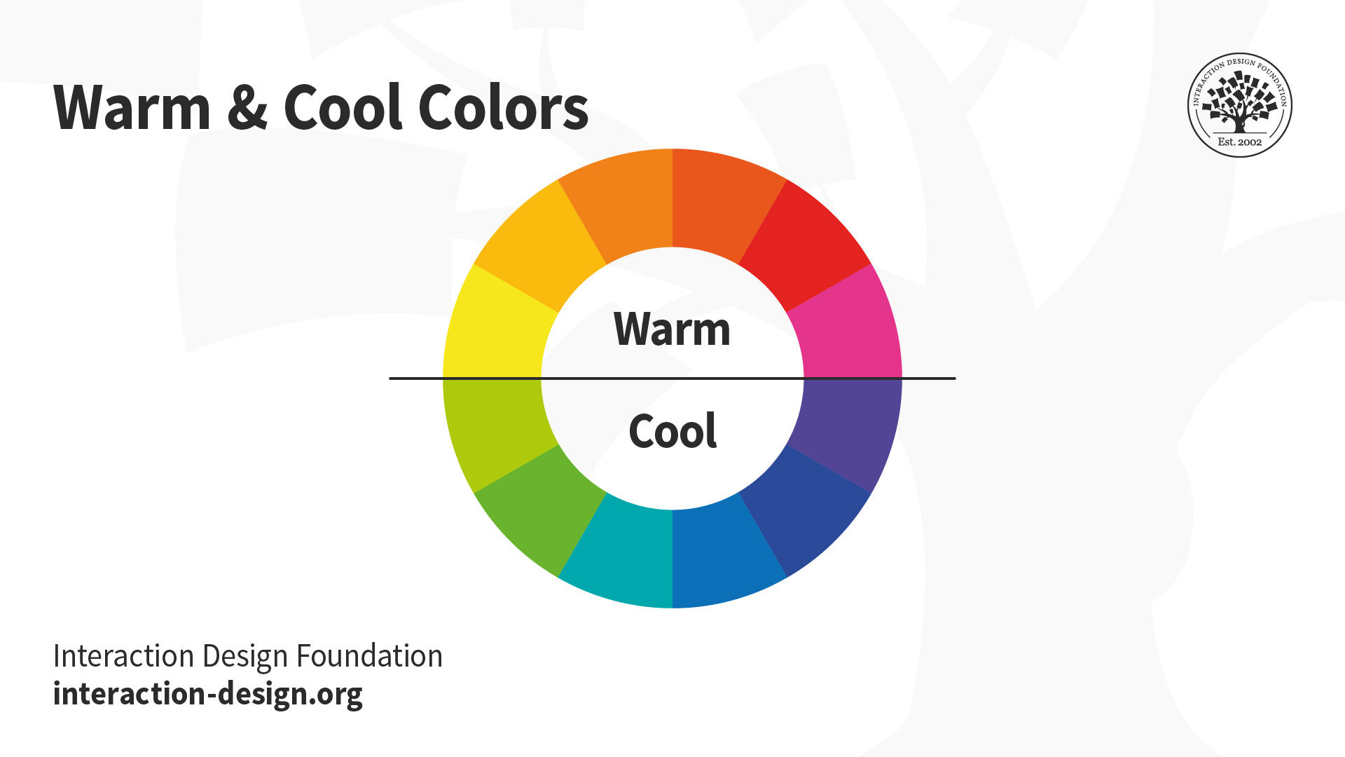
Think of color theory as your own personal magic potion for logo design. Want to evoke a sense of trust and professionalism? Opt for cool tones like blues and greens. Need to inject some energy and excitement into your logo? Go for warm tones like reds and oranges. By choosing the right color palette, you can set the tone for your brand and leave a lasting impression on your customers.
Remember, colors have the power to evoke emotions and associations in people’s minds. That’s why it’s important to choose colors that align with your brand’s values and personality. Whether you want your logo to exude sophistication with a touch of gold or convey a sense of playfulness with a splash of pink, color theory can help you achieve the desired effect.
So next time you’re designing a logo, don’t be afraid to channel your inner color theorist. Experiment with different color combinations, play around with shades and tints, and let your creativity run wild. Who knows, you might just stumble upon the perfect color palette that takes your logo to the next level!

Creating Visual Consistency Across Platforms
Ever tried to describe your brand’s color palette to a designer only to have them respond with confused looks and endless questions? It’s like trying to explain the color of a sunset to someone who’s never seen the sun. Well, fear no more! is actually a lot easier than you think.
One of the key elements to achieving visual consistency is establishing a brand style guide. This document will become your brand’s bible, containing all the necessary information for designers, marketers, and anyone else who dares to dabble in your brand’s aesthetic. Think of it as your brand’s very own Hogwarts spellbook, but instead of waving wands, we’re waving hex codes and font pairings.
Another trick to maintain visual consistency is to stick to a certain set of fonts. No one likes a brand that can’t make up its mind about which font to use—it’s like watching a movie with subtitles that keep changing in every scene. Choose a primary font for headings and a secondary font for body copy, and stick to them like they’re the last slice of pizza at a party.
Remember, visual consistency is not just about slapping your logo on everything you see. It’s about creating an immersive brand experience that makes people say “Wow, this brand really has their act together!” So, grab your color palette, your fonts, and your brand style guide, and create visual harmony across all platforms like a boss.
Evaluating the Impact of Color on Consumer Perception
Have you ever stopped to think about how the colors of products impact our perception as consumers? Well, buckle up, because we’re about to take a deep dive into the world of hue manipulation. Trust me, it’s more exciting than it sounds!
So, picture this: you walk into a store and see two identical products, one packaged in bright red and the other in muted gray. Which one are you more likely to pick up? Studies have shown that color plays a huge role in grabbing our attention and influencing our purchasing decisions. Basically, marketers know how to play us like a fiddle with their clever use of shades and tints.
But it’s not just about catching our eye – color can also create feelings and associations that impact how we perceive a product. For example, cool blues and greens might make us think of freshness and health, while warm reds and yellows could evoke feelings of energy and excitement. It’s like those sneaky marketers are playing mind games with us…and winning.
Next time you’re out shopping, take a moment to appreciate the power of color in influencing our consumer behaviors. Who knew that something as simple as a splash of color could have such a profound impact on our perceptions? It’s like living in a technicolor dream world where every shade tells a story and every tint whispers sweet nothings in our ears. Yep, color is more than meets the eye – it’s a master manipulator of our minds and wallets!
FAQs
What role do colors play in logo design?
Colors in logo design are like the glitter on a fabulous unicorn – they add pizzazz and personality! Each color has its own unique psychology, evoking different emotions and associations. So, choose wisely!
How do I choose the right colors for my brand’s logo?
Choosing colors for your logo is like choosing toppings for your pizza - it has to be just right. Start by thinking about what emotions and vibes you want your brand to convey. Are you fun and quirky? Go for bright, playful colors. Are you sophisticated and elegant? Opt for classy, muted tones.
Can I use any color combination for my logo?
Sure, you can use any color combination for your logo – but just like wearing polka dots with stripes, some may be more visually appealing than others. Stick to a color scheme that is harmonious and reflects your brand’s personality to ensure your logo stands out in a good way.
What does it mean if my logo colors unintentionally send the wrong message?
Oops, if your logo colors accidentally make your brand look like a clown car, it might be time for a color revamp. Colors can make or break a logo, so it’s important to get them right and ensure they align with your brand’s identity.
Are there any trends to follow in logo design color schemes?
Trends in logo design color schemes come and go faster than a fidget spinner, so it’s best to focus on timeless colors that represent your brand authentically. While it’s fun to stay current, make sure your logo colors withstand the test of time like a fine wine.
Color Outside the Lines with Your Brand’s Logo
Congratulations! You are now a certified logo color connoisseur. Armed with this newfound knowledge, go forth and select the perfect hues for your brand’s logo. Remember, the color wheel is your oyster, so don’t be afraid to get creative and think outside the box (or color palette). Your logo is the face of your brand, so make sure it’s as vibrant and eye-catching as you are. Happy designing!


