Colors are more than just a pretty sight for sore eyes – they can also be powerful tools in logo design. From making a statement to triggering emotions, the right color choice can make or break a brand’s image. So buckle up, grab your color wheel, and get ready to dive into the colorful world of logos!
Primary Colors in Logo Design
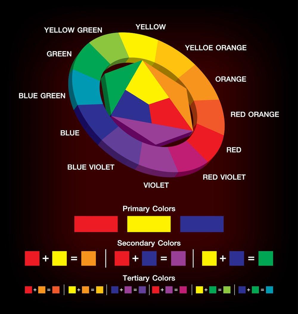
Primary colors are a key component in logo design, as they are the building blocks for creating a brand identity that catches the eye and sticks in the mind. So what exactly are these primary colors, you ask? Well, let me break it down for you in a way that even a colorblind chameleon could understand.
First up, we have **RED** – the color of passion, power, and pizazz. It screams “look at me!” and demands attention like a toddler throwing a temper tantrum in a candy store. Red is perfect for logos that want to make a bold statement and stand out from the crowd.
Next, we have **YELLOW** - the color of sunshine, happiness, and caution signs. It’s like a burst of energy in logo form, radiating positivity and optimism. Yellow is great for brands that want to convey a sense of warmth and friendliness to their audience.
And finally, we have **BLUE** – the color of tranquility, trustworthiness, and sadness (but we won’t dwell on that one). Blue is like a calming breeze on a hot summer day, reassuring customers that they can trust your brand to deliver on its promises. It’s a classic choice for logos that want to exude professionalism and dependability.
So there you have it, folks – the are like the Spice Girls of the branding world, each bringing their own unique flair to the party. Mix and match these hues wisely, and you’ll be well on your way to creating a logo that makes the competition green with envy (even though green isn’t a primary color, but we won’t hold that against it).
Psychological Impact of Color Choices
Ever wonder why you feel calm and relaxed in a room painted in soft blues and greens, yet feel energized and ready to conquer the world in a room of vibrant reds and oranges? Well, my friend, that’s the wacky world of color psychology for you!
Colors have the sneaky ability to influence our moods and emotions without us even realizing it. Here’s a breakdown of some common color choices and their psychological impacts:
- Red: The color of passion and energy! Surround yourself with red when you need a boost of motivation or confidence. But be warned, too much red can also lead to feelings of aggression or stress.
- Blue: Ah, the calming color of serenity and relaxation. Blue is perfect for creating a peaceful and stress-free environment. Just be careful not to overdo it, or you may end up feeling a little too detached from reality.
So, next time you’re picking out a paint color or deciding on a new wardrobe, take a moment to consider the psychological impact of your choices. Who knew that something as simple as color could have such a powerful effect on our minds? It’s a colorful world out there, so choose wisely!

Color Symbolism Across Cultures
In many cultures, colors symbolize a variety of meanings and beliefs. From white symbolizing purity to black representing death, the interpretations of colors can vary greatly.
Here are some examples of color symbolism across different cultures:
- Red: In Western cultures, red is associated with love and passion. In China, it symbolizes good luck and happiness. However, in South Africa, red is the color of mourning.
- Yellow: In many Asian cultures, yellow symbolizes happiness and prosperity. In Egypt, yellow represents mourning and sadness.
- Blue: In Western cultures, blue is often associated with sadness and depression. However, in many Middle Eastern cultures, blue is a color of protection, with the evil eye often depicted in shades of blue.
Color symbolism can be a fascinating way to learn about different cultures and their beliefs. So next time you see someone wearing a specific color, take a moment to think about what it might symbolize in their culture!

Creating Brand Identity through Color
When it comes to creating a strong brand identity, color plays a crucial role in conveying the personality and values of a company. Think about the bold red of Coca-Cola or the sleek silver of Apple – these colors are instantly recognizable and evoke specific emotions and associations in consumers’ minds.
Using color psychology can help businesses choose the right hues to connect with their target audience. For example, using blue can convey trust and professionalism, while yellow can bring a sense of optimism and energy to a brand. It’s all about finding the perfect shade that resonates with your message.
Remember, consistency is key when it comes to brand colors. Use the same palette across all your marketing materials, from your logo to your website to your social media posts. This creates a cohesive and memorable brand experience for your customers.
So, don’t be afraid to get creative with color! Experiment with different combinations and shades until you find the perfect mix that truly represents your brand. After all, a little splash of color can go a long way in making your brand stand out in a sea of competition.

Color Trends in Logo Design
Forget about following those outdated . It’s time to kick things up a notch and embrace the unexpected! Here are some quirky color combinations that are sure to make your logo stand out:
- Cotton Candy Pink and Slime Green: Who knew these two colors could work so well together? This fun and playful combo is perfect for brands looking to add a pop of color to their logo.
- Neon Orange and Baby Blue: Want to grab people’s attention? Look no further than this vibrant and eye-catching duo. It’s like a party in your logo!
- Electric Purple and Lemon Yellow: Amp up the energy with this electrifying pairing. It’s bold, it’s bright, and it’s guaranteed to make a statement.
Don’t be afraid to think outside of the color wheel when designing your logo. After all, rules are meant to be broken – especially when it comes to creating a logo that truly stands out from the crowd!
Color Harmonies and Contrast Techniques
To create visually stunning designs, understanding is essential. By utilizing these concepts effectively, you can captivate your audience and make your creations pop like never before. Let’s dive into some tips and tricks to elevate your design game!
First up, let’s talk about color harmonies. **Analogous colors**, such as red, orange, and yellow, sit next to each other on the color wheel and create a harmonious and pleasing palette. **Complementary colors**, like blue and orange or purple and yellow, are direct opposites on the color wheel and bring a striking contrast to your design. Experiment with these color relationships to find the perfect balance for your project.
Now, onto contrast techniques. **Value contrast** involves using light and dark shades to create depth and visual interest in your design. Whether it’s through bold typography or subtle shading, playing with light and dark tones can really make your design pop. **Texture contrast** is another fun way to add dimension. Mixing smooth and rough textures can create a tactile experience for your audience and add a unique touch to your design.
In conclusion, are powerful tools in the world of design. Don’t be afraid to experiment, mix and match, and push the boundaries of your creativity. Remember, the key is to find balance and harmony in your choices while creating contrast that catches the eye. So go forth, fearless designer, and create your masterpiece!
The Power of Color in Brand Recognition
Color is a weapon in the branding world. It’s like a secret sauce that can make or break a company’s image. Just imagine if McDonald’s decided to ditch the golden arches for a dull grey logo – would you still be craving those fries now?
Let’s break it down further. Blue is the color of trust and stability – that’s why you feel confident handing over your money to Facebook (even though they might be spying on you). Red, on the other hand, screams passion and energy – perfect for companies like Coca-Cola who want you to get hyped up on sugar water.
And don’t even get me started on green. It’s like the color of money and Mother Nature cuddled up and had a baby. That’s why companies like Whole Foods use it to lure you into buying overpriced organic kale. Sneaky, right? But hey, it works!
So, next time you’re designing a logo or a brand identity, remember one thing – colors speak louder than words. Use them wisely, my friends, and watch your brand recognition skyrocket faster than you can say “ROYGBIV”.
FAQs
Why is color important in logo design?
Color is important in logo design because it can evoke emotions, convey brand personality, and make a memorable impression on consumers. Plus, who wants a logo that’s as bland as a piece of unbuttered toast?
How do different colors affect consumer perception?
Well, it’s kind of like how wearing a red shirt makes you feel powerful and confident, while wearing a yellow shirt makes you feel like a walking ray of sunshine. Colors can affect consumer perception in similar ways, influencing how they feel about a brand and how likely they are to buy its products or services.
What does the color blue typically signify in logo design?
Blue typically signifies trust, credibility, and professionalism. It’s like the color equivalent of that one friend who always remembers to bring snacks to movie night – dependable and always there when you need it.
Can using too many colors in a logo design be a bad thing?
Absolutely! I mean, imagine trying to paint a masterpiece with every color in the rainbow – it would just end up looking like a chaotic mess. The same goes for logo design. Stick to a few carefully chosen colors to avoid overwhelming your audience and diluting your brand message.
How can I choose the right color for my logo design?
Choosing the right color for your logo design is like picking the perfect ice cream flavor - it’s all about knowing your audience and what will resonate with them. Consider your brand personality, target market, and the emotions you want to evoke, then pick a color that ticks all the boxes. And if all else fails, just go with your favorite color – because let’s be real, who doesn’t love a logo that’s as fabulous as a unicorn in a rainbow suit?
Color Me Impressed!
And there you have it, folks! The colorful world of logo design never fails to amaze us with its ability to captivate and influence consumers. So next time you see a logo, remember to think about the colors it uses and how they might be affecting your perception. And who knows, maybe you’ll even be inspired to design your own vibrant logo masterpiece! Color us excited for the possibilities!


