In the world of branding, a logo is like a first date – you only get one chance to make a lasting impression. And just like a dapper suit or a dazzling smile, typography plays a crucial role in creating a memorable logo. So grab your designer’s toolbox and buckle up, because we’re about to dive deep into the wild world of crafting logos that will make even your grandmother do a double take. Design“>Typography in Logo Design”>
The Importance of Typography in Logo Design
Typography in logo design is like the frosting on a cake – it may seem like a small detail, but it can make a huge difference in how your brand is perceived. Imagine trying to sell a luxury product with a logo that looks like it was made by a kindergartener using Comic Sans – not a good look, right?
Choosing the right font is crucial to creating a successful logo. It sets the tone for your brand – whether you want to convey professionalism, creativity, or playfulness. Just like choosing the right outfit for a job interview, your font choice can make or break your brand’s first impression.
Not all fonts are created equal – some are bold and attention-grabbing, while others are sleek and sophisticated. By carefully selecting the right typography for your logo, you can ensure that your brand message is clear and consistent.
In the world of logo design, typography is king. So next time you’re tempted to slap on any old font and call it a day, remember the importance of choosing the right typeface for your logo. Your brand will thank you!
Choosing the Right Typeface for Your Brand
So, you’ve decided to take the plunge and choose a typeface for your brand. Congratulations! This is a big decision, kind of like choosing which pizza topping to order – it might seem simple, but it can make or break your entire experience. No pressure, right?
First things first, consider the personality of your brand. Is it fun and whimsical, or sophisticated and elegant? **Helvetica** might be great for a law firm, but probably not so much for a children’s toy store. Think about the vibes you want to convey and choose a typeface that matches.
Next, think about readability. You don’t want your audience squinting at their screens trying to decipher your company name, do you? **Arial** and **Roboto** are safe bets for easy reading, while **Comic Sans** might make people question your life choices.
Lastly, remember that less is often more. You don’t need to choose a dozen different fonts for your brand - that’s like wearing a neon rainbow sweater with polka dot pants. Keep it simple, keep it classy, and your brand will thank you later.

Balancing Readability and Aesthetics in Logo Typography
When it comes to logo typography, finding the perfect balance between readability and aesthetics is crucial. You want your logo to be eye-catching, but also easy to understand at a quick glance. Here are some tips to help you navigate this delicate tightrope:
- Font selection: Choose a font that is unique, but not so quirky that it becomes unreadable. Remember, you want your audience to remember your brand, not strain their eyes trying to decipher your logo.
- Spacing: Make sure the letters in your logo are spaced evenly so that each word is easy to read. Avoid crowding or stretching the text too much, as it can make your logo look messy.
- Color scheme: Opt for colors that complement each other and make your text pop. Avoid using clashing colors that make your logo hard on the eyes.
Remember, a well-designed logo should be able to stand the test of time. Avoid trendy fonts or colors that may look outdated in a few years. By finding the right balance between readability and aesthetics, you can create a logo that is not only visually appealing but also easy to recognize.

Utilizing Typography to Convey Brand Personality
When it comes to branding, typography plays a crucial role in conveying the personality of a brand. The fonts you choose can make a big impact on how your audience perceives your brand. Here are some ways you can utilize typography to make sure your brand personality shines through:
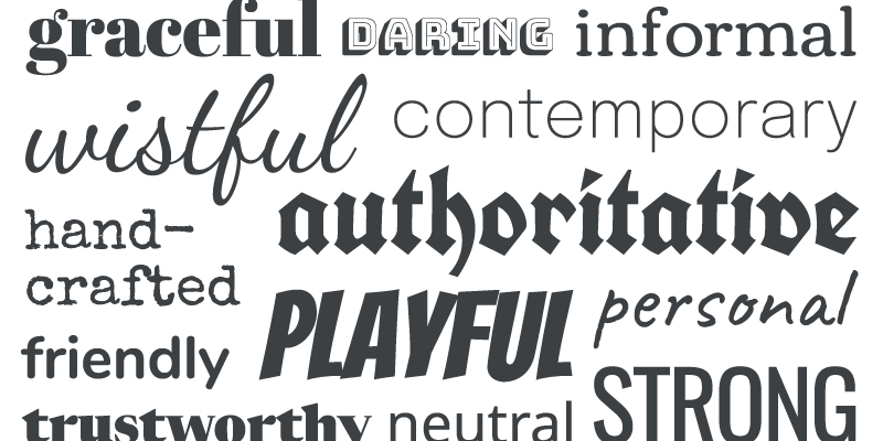
1. Choose fonts that match your brand persona: If your brand is fun and quirky, opt for playful and whimsical fonts. On the other hand, if your brand is more serious and professional, go for clean and sleek fonts. Remember, your typography should reflect the overall vibe of your brand.
2. Experiment with different font styles: Don’t be afraid to mix and match different fonts to create a unique look for your brand. Try pairing a bold, attention-grabbing font with a more subtle, elegant font to create contrast and visual interest.
3. Use typography to evoke emotions: Certain fonts can evoke specific emotions in your audience. For example, script fonts can convey a sense of elegance and sophistication, while bold, sans-serif fonts can create a more modern and energetic feel. Think about the emotions you want your brand to evoke and choose fonts accordingly.
In conclusion, typography is a powerful tool that can help you establish and reinforce your brand personality. Don’t underestimate the impact of fonts on how your brand is perceived. Take the time to choose fonts that truly represent your brand and watch as your audience connects with your brand on a whole new level.
Creating a Timeless Logo with the Right Typography Choices
Typography is the unsung hero of logo design. Sure, everyone wants a flashy graphic or a trendy color scheme, but without the right typography, your logo is basically naked. And nobody wants to see that. It’s like showing up to a job interview in your birthday suit – not a good look.
So, how do you choose the right typography for your logo? Well, first off, you need to consider the overall vibe you’re going for. Are you a serious law firm or a trendy coffee shop? Your typography should reflect that. Remember, like a bad haircut, a font can say a lot about you.
Next, think about readability. No one wants to squint at your logo, trying to figure out if that’s an “O” or a “Q”. Make sure your font is clear and easy to read, unless you want people scratching their heads and wondering if you hired a dyslexic designer.
And finally, don’t be afraid to think outside the box. Sometimes the most eye-catching logos use unconventional typography to make a statement. Just like wearing a fanny pack in 2021, it’s risky but it might just pay off big time. So go ahead, break the rules. Be bold. Be unique. And let your typography do the talking. You never know, it might just be the key to creating a timeless logo that stands the test of time.
Remember, when it comes to typography, the font is mightier than the sword. So choose wisely, my friends. Your logo’s reputation depends on it.
FAQs
Why is typography important in logo design?
Well, my friend, typography is like the seasoning to a dish – it can make or break the entire meal! In logo design, typography sets the tone, conveys the brand’s personality, and creates a lasting impression on the audience. Choose your fonts wisely!
How can I choose the right font for my logo?
Ah, the age-old question! When picking a font for your logo, consider your brand’s personality. Is it fun and quirky? Time for some playful script fonts! Is it sleek and modern? Opt for some clean, sans-serif fonts. Just remember, no Comic Sans allowed!
Should I use multiple fonts in my logo design?
While mixing fonts can add visual interest, tread carefully, my friend! Too many fonts can make your logo look like a ransom note. Stick to one or two fonts that harmonize beautifully together. Less is more, as they say!
How can I make my logo typography stand out?
To make your logo typography pop, try playing with different weights, sizes, and colors. Contrast is key! You can also experiment with customizing fonts or incorporating unique lettering styles to make your logo truly one-of-a-kind. Go ahead, let your creative juices flow!
What are some common typography mistakes to avoid in logo design?
Ah, the pitfalls of typography! Avoid using overly trendy fonts that might look dated in a few years. Watch out for poor legibility, cramped spacing, and inconsistent font choices. And for the love of all things design, please don’t stretch or distort your fonts – they deserve better!
Say Goodbye to Boring Logos!
Crafting memorable logos is no easy feat, but with the power of typography, your designs can truly stand out from the crowd. Remember, a great logo isn’t just a piece of art – it’s a piece of your brand’s personality. So, have fun, get creative, and let your typography do the talking! Good luck, fellow logo crafters - may your designs be unforgettable and your clients be impressed!


