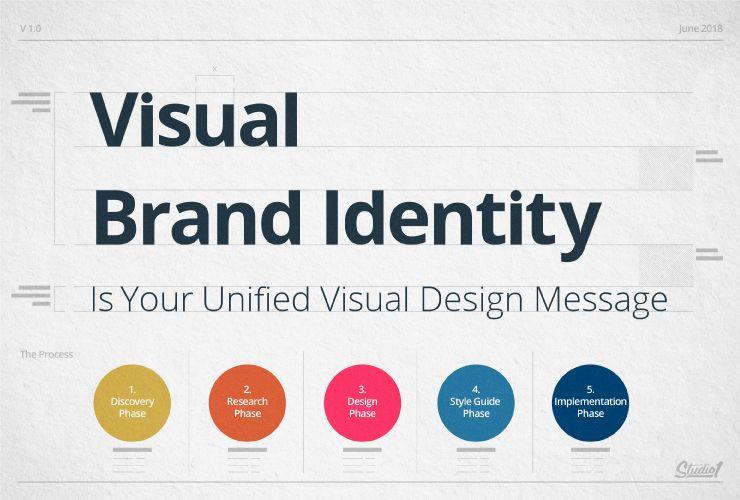
Like the elusive golden snitch in a game of Quidditch, brand consistency can often seem just out of reach for many companies. But fear not, dear readers, for we are here to guide you through the magical world of ensuring brand consistency in all your materials. So grab your wands (or pens, we won’t judge) and let’s dive into this adventure together. After all, who needs a invisibility cloak when you have a strong, consistent brand to showcase to the world? Let’s work our magic and make sure your brand is a certified wizard in the marketing world!
Brand Guidelines and Standards
So you’re finally ready to dive into our ! Bravo, you’re about to enter a magical world where consistency reigns supreme and creativity is both encouraged and slightly policed.
We take our brand very seriously around here (not as serious as Monday mornings, but close), so strap in and get ready to learn the dos and don’ts of all things brand-related. Here are a few key points to keep in mind:
- Logo Lockup: Always use the full logo lockup with our tagline unless a designer made a mistake and then feel free to blame them.
- Color Palette: Our color palette is like a good bottle of wine – it must be savored and used sparingly, lest you end up with a headache the next day.
- Tone of Voice: We like our tone of voice like we like our coffee – bold, punchy, and with just the right amount of sass. Feel free to sprinkle in some puns and witty remarks for good measure.
Remember, these guidelines are here to help you, not hinder you. Use them as your creative compass as you navigate the treacherous waters of brand consistency. And if all else fails, just remember the age-old saying: “When in doubt, call the brand police.” Just kidding, we don’t actually have brand police. Or do we?

Key Elements of Brand Identity
Alright folks, let’s dive into the juicy details of what makes up the essence of a brand’s identity. These key elements are what sets a brand apart and makes it unforgettable:
- Logo: This little symbol is like a brand’s signature, it’s the first thing people notice and the last thing they remember. A good logo is like a superhero cape, it gives your brand some serious visual power.
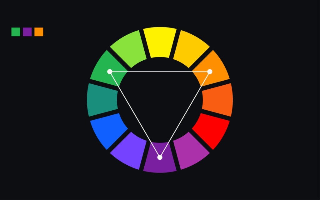
- Color Palette: Colors can evoke emotions, trigger memories, and create a vibe for your brand. So choose wisely, because you don’t want your brand to be known as the clown with the neon green pants.
- Typography: The fonts you use can say just as much about your brand as the words themselves. Whether you’re more of a sophisticated serif or a playful script, make sure your typography speaks the same language as your brand.
And last but certainly not least,
Brand Voice: Your writing style and tone can make or break your brand’s identity. Are you a cool and casual brand, or more of a buttoned-up professional? Make sure your brand voice matches your personality, or you might end up sounding like a confused teenager trying to find their identity.

Consistent Use of Logo and Typography
Are you tired of your logo looking like it’s been through a washing machine one too many times? Does your typography make you cringe more than a bad haircut? It’s time to step up your branding game and commit to a !
First things first, let’s talk about your logo. Your logo should be the shining star of your brand, not the embarrassing relative no one wants to sit next to at a family reunion. Make sure your logo is crystal clear, both in print and online. Consistency is key here, so no more using that pixelated logo you found on Google images.
Next up, let’s chat about typography. Consistency in typography is like finding your soulmate – it just feels right. Stick to a few key fonts that represent your brand’s personality. Mix and match them like peanut butter and jelly, but for the love of Comic Sans, don’t overdo it! Keep your fonts consistent across all platforms – your website, social media, and even your grandma’s birthday card.
So there you have it, folks. Commit to a and watch your brand shine brighter than a disco ball on New Year’s Eve. Embrace the power of a well-designed logo and typography, and you’ll be the envy of all your competitors. Now go forth and conquer the design world!

Color Palette and Brand Image
When it comes to our brand image, we take our color palette very seriously. We want our colors to reflect our fun and quirky personality, so we’ve chosen a bold and vibrant selection to represent us. Think of it like a rainbow threw up on a canvas!
Our primary colors are a bright and cheerful hot pink and a lime green that screams “look at me!” These colors are complemented by our secondary colors, which include a electric blue and a sunshine yellow. Together, they make for a palette that is as eye-catching as it is unforgettable.
When you see our brand colors, you’ll immediately think of us and all the fun we bring. Whether it’s on our website, social media, or packaging, our color palette ensures that our brand image is always top of mind. Plus, who doesn’t love a pop of orange here and there to keep things exciting?
Remember, it’s not just about the colors themselves, but how we use them to create a cohesive brand image. From our logo to our marketing materials, our color palette ties everything together in a way that is unmistakably us. So next time you see a burst of hot pink or lime green, you’ll know exactly who it belongs to!

Maintaining Tone and Voice Across Materials
When it comes to maintaining tone and voice across all your materials, consistency is key. You don’t want your brand to sound like a high-strung news anchor in one piece and a laid-back surfer dude in another. Here are a few tips to help you keep your messaging on point:
- Know your audience: Are you targeting millennials who prefer emojis and slang, or middle-aged professionals who appreciate a more formal tone? Make sure your voice aligns with the demographic you’re trying to reach.
- Develop a style guide: Create a document that outlines your brand’s tone, voice, and preferred language. This will help ensure that everyone on your team is on the same page when it comes to writing content.
Remember, consistency breeds familiarity. If your audience recognizes your brand’s voice right away, they’re more likely to engage with your content. So, whether you’re drafting an email, writing a social media post, or creating a landing page, always keep your tone and voice in mind.
FAQs
Why is brand consistency important in materials?
Because if your materials are all over the place, your brand is going to look like it has multiple personality disorder. And let’s be honest, that’s not a good look for anyone.
How can I ensure brand consistency in my materials?
Step one: Establish brand guidelines and stick to them like glue. Step two: Don’t let anyone mess with those guidelines. Step three: Repeat steps one and two until everyone gets the memo.
What are some common mistakes companies make when it comes to brand consistency?
Oh, where do I even begin? Using the wrong colors, using the wrong fonts, using the wrong logo size… the list goes on. Basically, if you’re not paying attention to the details, you’re probably screwing up somewhere.
How can I get my team on board with maintaining brand consistency?
Make it a competition. Whoever screws up the brand guidelines the least gets a prize. Nothing motivates people like the promise of free stuff.
What are some tools and resources that can help with maintaining brand consistency?
There are plenty of tools out there that can help you keep track of your brand assets and guidelines. Just do a quick Google search and you’ll find more than you can shake a stick at.
Don’t Let Your Brand Suffer from an Identity Crisis!
Now that you’ve learned the importance of ensuring brand consistency in all materials, you can rest easy knowing that your brand won’t suffer from an identity crisis. Remember, a strong and consistent brand identity not only builds trust with your customers, but also sets you apart from the competition. So go forth and conquer the world of marketing, armed with the power of a unified brand!
And if you ever find yourself doubting the importance of brand consistency, just remember this: even superheroes wouldn’t be as cool if they kept changing their outfits every day. Stay true to your brand, and you’ll be flying high in no time!


