Have you ever looked at a logo and wondered, “How the heck did they come up with that?” Well, my friend, you are not alone. The mysterious world of logo design is filled with twists, turns, and more hidden meanings than a Dan Brown novel. But fear not, dear reader, because we are about to embark on a journey to unravel the enigma that is logo design. So grab your magnifying glass and strap in, because we are about to decode the inner workings of logo masters.
evolution-of-logo-design”>The Evolution of Logo Design
Logo design has come a long way since the cavemen started doodling on cave walls. We’ve gone from simple stick figures to intricate, eye-catching designs that have the power to make or break a brand. Let’s take a look at how logo design has evolved over the years:
First off, let’s talk about the good ol’ days of logo design. Back in the day, logos were pretty straightforward – just a simple drawing of a product or service. Think cavemen drawing a picture of a wheel to represent their wheel-making business. It was simple, effective, and definitely got the point across.
Fast forward to the 20th century and suddenly logos started getting all fancy and complicated. Designers started incorporating colors, fonts, and shapes to create more visually appealing logos. Who knew that a swoosh could become synonymous with a certain athletic brand? And don’t even get me started on the golden arches – talk about iconic!
Today, logo design has reached a whole new level of sophistication. With the advent of technology and digital design tools, logos are more versatile and creative than ever before. Logos can now be animated, interactive, and even three-dimensional. The possibilities are endless! Who knows what the future holds for logo design – holographic logos, anyone?
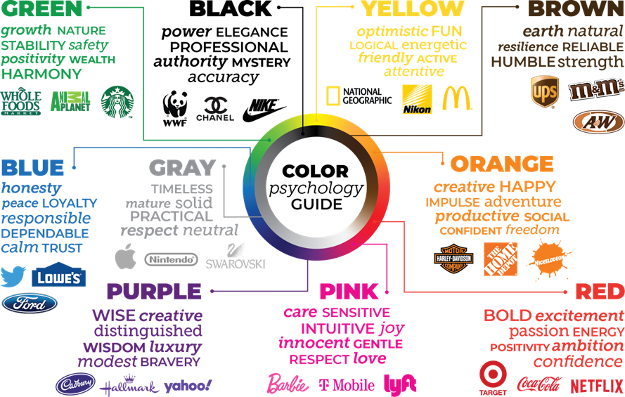
The Role of Color Psychology in Logo Creation
When it comes to creating a logo, color psychology plays a crucial role in evoking certain emotions and associations in your target audience. Choosing the right colors can make or break your brand image, so it’s important to consider the psychological impact of each hue.
Here are a few key points to keep in mind:
- Red: This color is often associated with passion, energy, and excitement. It can grab attention and create a sense of urgency.
- Blue: Blue is calming and trustworthy, making it a popular choice for corporate logos. It conveys a sense of stability and reliability.
- Yellow: Bright and cheerful, yellow is often used to convey optimism and friendliness. However, too much yellow can be overwhelming, so use it sparingly.
- Green: Symbolizing growth, harmony, and nature, green is a versatile color that appeals to environmentally-conscious consumers.
By carefully selecting the right combination of colors for your logo, you can create a visual identity that resonates with your target audience and effectively communicates your brand message. So next time you’re designing a logo, don’t underestimate the power of color psychology!
typography-choosing-the-right-font-for-your-brand”>Typography: Choosing the Right Font for Your Brand
When it comes to typography, choosing the right font for your brand is crucial. You wouldn’t want to be known as the company that uses Comic Sans for everything, right? So, let’s delve into the world of fonts and find the perfect one for your brand!
First things first, consider the personality of your brand. Is it serious and professional, or fun and quirky? Your chosen font should reflect that. For a sleek and modern vibe, opt for something like Helvetica Neue. If you want to show off your playful side, try Bangers or Baloo. Just remember, consistency is key!
Next, think about the readability of your font. You want your audience to actually be able to read what you’re putting out there. Avoid overly decorative fonts that may be hard to decipher. Stick to clear, simple options like Roboto or Open Sans. After all, you don’t want people squinting at your marketing materials!
Lastly, don’t be afraid to mix and match. Pair a bold headline font with a more subtle body font to create contrast and visual interest. Experiment with different combinations until you find the perfect match. Your brand’s font should be like a good relationship – it just clicks!

simplicity-in-logo-design”>The Importance of Simplicity in Logo Design
When it comes to logo design, simplicity truly is key. Think about it – the best logos are the ones that stick in your mind, and you don’t want to overwhelm your audience with too much going on. Keep it simple, silly!
One of the main reasons simplicity is so important in logo design is that it makes your logo versatile. You want a logo that can be scaled down to fit on a business card or blown up to cover a billboard. A simple design ensures that your logo will look great no matter what size it is.
Another benefit of simplicity is that it helps with brand recognition. A clean, uncluttered logo is easier for people to remember and associate with your brand. Plus, you don’t want your logo to be so busy that people can’t figure out what it’s supposed to represent!
So, remember - keep it simple, keep it bold, and keep it memorable. Your logo is often the first impression people have of your brand, so make it count!

symbols-and-icons”>Exploring the Use of Symbols and Icons
One of the most interesting aspects of graphic design is the use of symbols and icons. These little images can pack a big punch when it comes to conveying a message. From emojis to logos, symbols are all around us, silently communicating with a wink and a nod.
Have you ever noticed how a simple thumbs up can make you feel warm and fuzzy inside? Or how a skull and crossbones can send shivers down your spine? Symbols have a way of speaking to our subconscious, tapping into our primal instincts and emotions.
Imagine a world without symbols and icons. How would we know where to find the nearest bathroom, or how to express our love for pizza in a single image? Life would be a lot less fun, that’s for sure. So let’s raise a glass to symbols and icons, the unsung heroes of the graphic design world!
- Icons are like the emojis of the digital age – they speak a universal language that transcends words.
- Logos are the ultimate symbol of a brand – they’re like a secret handshake that only true fans can decipher.
- Symbols have been used since ancient times to communicate complex ideas in a simple, visual way – who needs words when you have a picture worth a thousand of them?
Strategic Placement: Where to Position Your Logo on Marketing Materials
When it comes to positioning your logo on marketing materials, it’s all about finding that sweet spot that catches the eye without being too in your face. You want your logo to be like the cool kid at a party - effortlessly standing out without trying too hard.
One popular spot to place your logo is in the top left corner. Why? Because let’s face it, most people read from left to right (thanks, Western civilization). Placing your logo in the top left corner means it’s the first thing people see, setting the tone for the rest of your marketing material. It’s like being the opening act for the main event – sure, you might not be the headliner, but you’re still pretty darn important.
Another strategic placement option is smack dab in the middle. This is like getting a prime spot at the front of a concert – everyone’s eyes are on you. Placing your logo in the center sends the message that you are confident, bold, and not afraid to stand out. Just make sure your logo is visually appealing enough to handle all the attention - no one wants to be the one everyone’s staring at for the wrong reasons.
And let’s not forget about the bottom right corner. This is like being the mysterious ninja of logo placement – subtle, sneaky, but still packing a punch. Placing your logo in the bottom right corner allows the rest of your marketing material to shine while still giving your brand the recognition it deserves. It’s like being the secret ingredient in a recipe - you might not see it right away, but you sure can taste the difference.
FAQs
Why do logos matter?
Well, imagine a world without logos. No Nike swoosh, no golden arches of McDonald’s, no Apple with a bite taken out of it. Logos are like a visual handshake – they introduce a company to the world and leave a lasting impression. Plus, without logos, how would we know which products to trust and which ones are just a knock-off in a shady alleyway?
How do logo masters come up with their designs?
Think of logo masters as modern-day magicians, conjuring up designs that seem to appear out of thin air. They start by diving deep into the brand’s values, mission, and personality – kind of like a logo therapist. Then, armed with this knowledge, they let their creative juices flow, mixing colors, shapes, and typography like a mad scientist in a lab.
What makes a good logo?
A good logo is like a fine wine – it gets better with age. It’s simple yet memorable, versatile yet timeless. It should be able to stand the test of time, like a trusty sidekick that never lets you down. And most importantly, a good logo should make you feel something – whether it’s excitement, trust, or hunger (thanks, McDonald’s).
Do logo masters have any secret tricks up their sleeves?
Oh, they definitely do! From hidden messages and double entendres to clever optical illusions and symbolism, logo masters are like the James Bonds of the design world – always one step ahead. They know how to play with your mind and make you see things that aren’t really there. It’s all smoke and mirrors, baby.
Is it worth investing in a professional logo designer?
Absolutely! A professional logo designer is like a fairy godmother for your brand – they can make your wildest dreams come true (well, at least in terms of design). Sure, you could try your hand at DIY-ing a logo with clipart and Comic Sans, but trust us, it won’t have the same impact as a logo crafted by a true master.


