Do you ever stare at a design/” title=”Law Firm Logo Design”>logo and wonder, “What does this squiggle even mean?” Well, you’re not alone. In the mesmerizing world of brand identity, decoding logo design is like cracking a secret code. But fear not, my fellow logo sleuths, for we are about to embark on a wild ride through the twisted tunnels of branding madness. So grab your magnifying glass and prepare to unravel the mysteries of logo design like never before. It’s time to decode brand identity, one quirky logo at a time!![]()
Understanding the Importance of Logo Design
When it comes to logo design, it’s not just about slapping together some random shapes and calling it a day. Your logo is like the face of your brand – it’s the first thing people see and it needs to make a good impression. Here are a few reasons why logo design is so important:
- Brand Recognition: A well-designed logo helps your brand stand out from the competition. Think of it as your brand’s signature – something that people can easily recognize and remember.
- Professionalism: A poorly designed logo can make your brand look amateurish and untrustworthy. On the other hand, a well-crafted logo shows that you take your brand seriously and that you’re invested in your business.
- Memorability: A good logo is like a catchy jingle – it sticks in people’s minds. Think of some of the most iconic logos out there, like the Nike swoosh or the Apple apple. They’re simple, yet memorable.
So, the next time you’re tempted to skimp on your logo design, remember that it’s not just a pretty picture – it’s a crucial element of your brand’s identity. Put some thought and effort into it, and you’ll reap the rewards in the long run.

Elements of Effective Logo Design
When it comes to designing a logo that stands out, there are a few key elements that can make all the difference. First and foremost, **simplicity** is key. You want your logo to be easily recognizable and memorable, so keep it clean and straightforward. Avoid cluttering your design with unnecessary details or complex graphics. Remember, less is more!
Another important element of effective logo design is **relevance**. Your logo should accurately represent your brand and convey its message to your target audience. Think about what sets your company apart and incorporate that into your design. Whether it’s a play on words, a hidden message, or a clever visual metaphor, make sure your logo speaks to your brand identity.
**Versatility** is also a crucial factor to consider when designing a logo. Your logo should look good in a variety of contexts, from business cards to billboards. It should be scalable, meaning it can be resized without losing its impact. Additionally, consider how your logo will look in black and white, as well as in color. A versatile logo will ensure your brand remains consistent and recognizable across all platforms and mediums.
Lastly, **timelessness** is key when creating a logo that withstands the test of time. Avoid trendy design elements that may quickly become outdated. Instead, opt for classic and timeless features that will remain relevant and impactful for years to come. By incorporating these key elements into your logo design, you’ll be well on your way to creating a logo that truly represents your brand and leaves a lasting impression on your audience.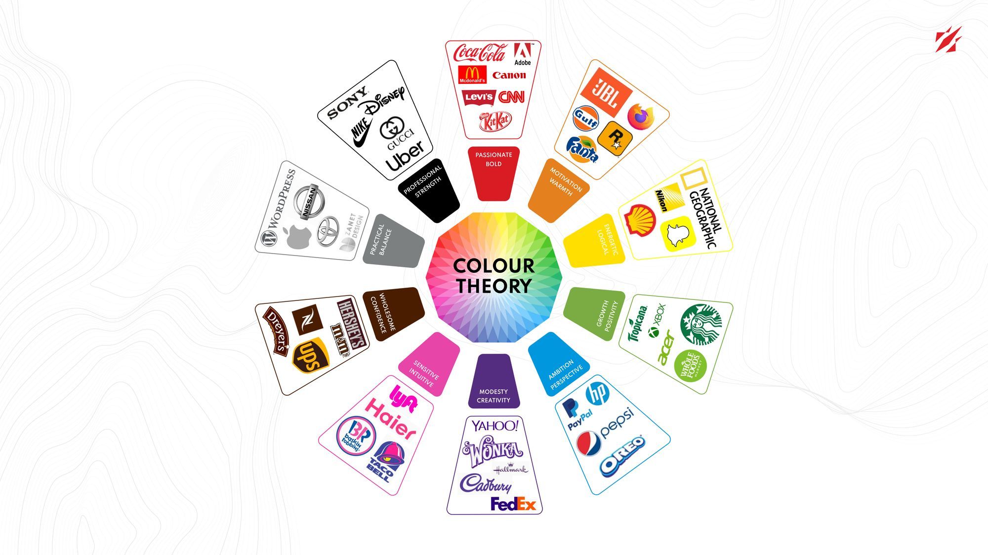
Analyzing Color Choices in Logo Design
When it comes to logo design, color choices can make or break a brand’s image. Let’s dive into the fascinating world of color psychology and how it impacts the success of a logo.
First off, **blue**. This cool and calming color is commonly used by tech companies to evoke trust and reliability. Think Facebook, IBM, and Twitter. Blue is like the reliable friend that always has your back, which is why it’s a popular choice for brands that want to establish a sense of security.
On the flip side, **red** is the color of passion and energy. Brands like Coca-Cola and Target use red to grab attention and create a sense of urgency. It’s like the friend who’s always ready for a night out on the town – energetic and bold.
Then there’s **green**, the color of nature and growth. Companies like Starbucks and Whole Foods use green to convey a sense of wellness and sustainability. It’s like the friend who’s always eating kale salads and going on hikes – fresh and eco-conscious.

The Impact of Typography in Brand Identity
Typography plays a crucial role in shaping a brand’s identity. By choosing the right fonts, companies can convey their personality, values, and message to their audience in a clear and impactful way. Here are some ways in which typography impacts brand identity:
- Consistency: Consistent use of typography across all brand materials helps establish a cohesive and recognizable visual identity. Imagine how confusing it would be if Coca-Cola suddenly started using Comic Sans as their main font!
- Personality: Different typefaces have different personalities – some are serious and professional, while others are playful and whimsical. By choosing the right fonts, a brand can reinforce its desired image. Just like choosing the right outfit for a job interview, but with more serifs.
- Legibility: Legible typography is essential for effective communication. If customers can’t read your message because you’ve used a fancy script font, they’re not going to stick around to decipher it. Remember, it’s not a secret code, it’s a brand message!
In conclusion, typography is more than just selecting pretty letters - it’s a powerful tool for shaping how consumers perceive and interact with a brand. So next time you’re choosing a font for your company’s logo or website, remember that every typeface has a story to tell. Make sure it’s the right one!
Incorporating Symbols and Icons in Logo Design
Symbols and icons can add a touch of personality and flair to your logo design. Think of them as the cherry on top of your logo sundae, adding that extra oomph that makes your brand stand out from the crowd. By incorporating symbols and icons into your logo, you can create a visual representation of your brand that is not only memorable but also full of character.
When choosing symbols and icons for your logo, there are a few things to keep in mind. First and foremost, make sure the symbol or icon you choose is relevant to your brand. You don’t want to confuse your customers with a random icon that has nothing to do with your business. **Stay on brand, people!** Additionally, consider the style and tone of your brand when selecting symbols and icons. Is your brand fun and playful? Go for a quirky icon. Is your brand sleek and modern? Opt for a more minimalist symbol.
Symbols and icons can also be used to convey a specific message or meaning in your logo design. For example, a heart symbol can represent love and care, while a lightning bolt can symbolize speed and power. **Choose your symbols wisely, my friends, for they speak louder than words!** By incorporating symbols and icons that resonate with your target audience, you can create a logo that not only looks good but also communicates the essence of your brand effectively.
is all about striking the perfect balance between creativity and functionality. Don’t be afraid to think outside the box and experiment with different symbols and icons until you find the perfect fit for your brand. Remember, a great logo is like a great outfit – it should make a statement and leave a lasting impression. **So go forth, logo designers, and let your creativity run wild!**
Case Studies: Successful Logo Redesigns
Who knew that a simple logo redesign could make such a big impact? These case studies will show you just how powerful a fresh new look can be.
First up, we have the classic soda giant, Coca-Cola. When they decided to update their logo, they went for a sleeker, more modern look. The result? A whole new level of brand recognition and a surge in sales. Turns out, sometimes all it takes is a little tweak to make a big splash!
Next, let’s talk about the fast-food favorite, McDonald’s. Their iconic golden arches have been a staple for decades, but when they decided to streamline their logo, they saw an immediate boost in customer engagement. Who knew that a few less lines could make such a difference?
And finally, we can’t forget about Nike. When they updated their famous swoosh logo, they created a whole new wave of excitement among consumers. With a fresh new look, they proved that sometimes, you just need to do it!
Future Trends in Logo Design
In the age of virtual reality and artificial intelligence, logo design is moving towards more interactive and dynamic experiences. Gone are the days of static logos that sit passively on a website or business card.
Here are some future trends that we can expect to see in logo design:
- Animated Logos: Logos that come to life through animation will be all the rage. Imagine a logo that spins, flips, and changes colors to grab the viewer’s attention.
- 3D Logos: Say goodbye to flat designs. 3D logos will give brands a whole new depth (literally) and make them stand out in a crowded market.
- Interactive Logos: Logos that respond to user interactions will become more common. Users will be able to click, swipe, or tap on a logo to reveal hidden elements or navigate through a brand’s story.
As technology continues to advance, logo designers will have more tools at their disposal to create memorable and engaging brand identities. The future of logo design is exciting and full of endless possibilities!
FAQs
Why is logo design important for a brand?
Oh, dear reader, let me tell you why! You see, a logo is like the face of a brand - it’s the first thing people see and remember about a company. It sets the tone for the brand’s identity and helps to establish brand recognition. Plus, a well-designed logo can convey the values and personality of a brand in an instant.
What key elements should be considered when designing a logo?
Well, my inquisitive friend, when designing a logo, one must consider elements such as color, typography, shape, and imagery. Each of these elements plays a crucial role in communicating the brand’s message and connecting with the target audience. Remember, a logo should be simple, memorable, versatile, and relevant to the brand.
How can a logo impact consumer perception of a brand?
Oh, curious reader, the impact of a logo on consumer perception is quite profound! A well-designed logo can create a positive association with a brand, build trust with consumers, and differentiate the brand from competitors. On the flip side, a poorly designed logo can turn potential customers away and damage the brand’s reputation.
What are some examples of successful logo redesigns?
Ah, you’re in for a treat with this question! Some iconic examples of successful logo redesigns include Starbucks, Apple, and Pepsi. These companies revamped their logos to better reflect their evolving brand identities and connect with modern consumers. The result? Increased brand recognition and loyalty, my friend.
How can a brand ensure its logo design resonates with its target audience?
Ah, the age-old question of resonating with the target audience! To ensure that a logo design connects with its intended audience, a brand must conduct thorough market research, gather feedback from consumers, and consider cultural and industry trends. By understanding the preferences and expectations of their target audience, brands can create a logo that truly speaks to their hearts.
Wrapping Up the Logo Code
Alright, folks, it’s time to put away your decoder rings and close the case on logo design. Remember, a brand’s logo is like its fingerprint – unique, distinct, and ready to leave its mark on the world. So go forth, armed with your newfound logo knowledge, and decode the brand identities all around you. Just remember, with great logo power comes great responsibility. Happy logo hunting!


