Buckle up, folks, because we’re about to take a spin through the fascinating world of color psychology in branding-tomorrows-clean-logo-trends/” title=”Revolutionizing Car Wash Branding: Tomorrow's Clean Logo Trends”>car wash branding! Forget horsepower and tire shine–we’re talking about the real horsepower behind your business: the colors you choose to represent it. From fiery reds that scream “speed” to calming blues that say ”trust me, I’ll treat your car right,” we’re diving deep into the psychology of color and how it can make or break your car wash brand. So grab your soap and sponges, because we’re about to splash some color on this industry!
Understanding Color Theory in Branding
The power of color in branding
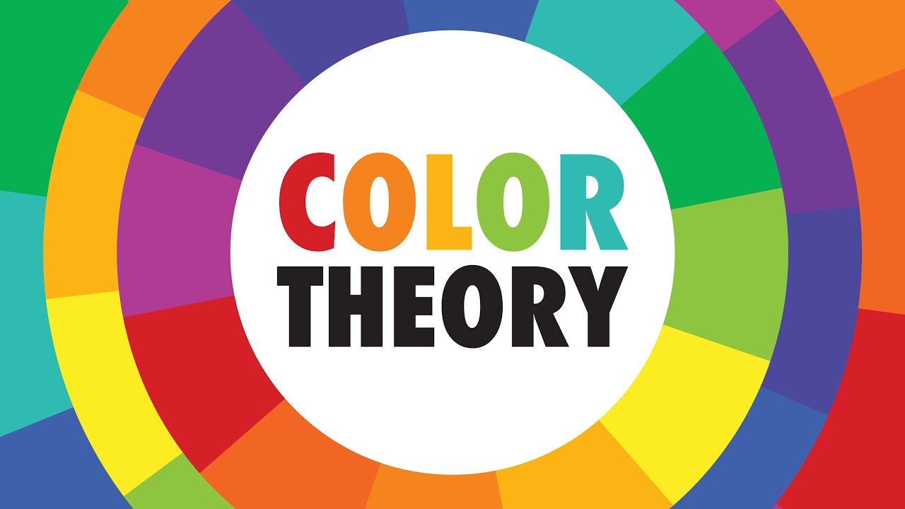
Color plays a crucial role in branding, and understanding color theory can help you create a strong and memorable brand identity. Here’s a little crash course in color theory to get you started!
Primary colors
Primary colors are like the cool kids in school – they’re the base of everything. Just like red, yellow, and blue, these colors can’t be created by mixing other colors. They serve as the foundation for all other colors on the color wheel.
Complementary colors
Complementary colors are like peanut butter and jelly – they just go together. These are colors that are opposite each other on the color wheel, such as red and green or blue and orange. When used together, they create a vibrant and eye-catching contrast that can make your brand stand out.
Color psychology
Yes, believe it or not, colors can influence our feelings and behaviors. For example, red is often associated with passion and energy, while blue is seen as calming and trustworthy. When choosing colors for your brand, think about the emotions you want to evoke in your audience and select colors accordingly.
So, next time you’re designing your brand’s visual identity, remember that every color choice matters. Understanding color theory can help you create a brand that not only looks good but also connects with your target audience on a deeper level. So go ahead, mix and match those colors like a pro!
Choosing the Right Colors for a Car Wash Business
When it comes to choosing the right colors for your car wash business, you want to make sure you stand out from the competition while still appealing to your target market. Here are some tips to help you make the perfect choice:
- Consider the psychology of color: Colors can evoke different emotions and perceptions in customers. For example, blue is often associated with trust and reliability, while yellow is seen as energetic and inviting. Think about what message you want to convey to your customers and choose your colors accordingly.
- Think about your branding: If you already have a logo or brand colors, you’ll want to make sure your car wash colors complement them. Consistency is key when it comes to branding, so try to incorporate your existing colors into your car wash design.
- Don’t be afraid to be bold: While it’s important to consider the preferences of your target market, don’t be afraid to think outside the box and choose colors that will make your car wash stand out. A bright, eye-catching color scheme can attract attention and draw in customers.
Ultimately, the most important thing is to choose colors that reflect the personality of your business and appeal to your customers. Whether you opt for a classic blue and white color scheme or go for something more vibrant and unexpected, the right colors can help set your car wash apart and create a memorable brand image.

The Psychological Effects of Different Colors
Have you ever thought about how the color of your walls could be affecting your mood? Well, let’s dive into the fascinating world of color psychology and explore how different hues can impact your mental state.
First up, we have blue. This calming color is said to promote feelings of tranquility and relaxation. That’s probably why so many spas have blue decor - they want to make you feel zen AF. So, if you’re feeling stressed out, maybe consider giving your bedroom a fresh coat of blue paint and see if it helps you chill the heck out.
Next, we have red. This fiery hue is often associated with passion and energy. It can get your heart racing and your blood pumping. So, if you need a little boost of motivation, surround yourself with some red. Maybe paint your office walls crimson and watch as your productivity levels skyrocket (or maybe just your blood pressure, who knows?).
And finally, we have green. This color is all about growth and harmony. It’s like a big ol’ hug from Mother Nature herself. So, if you’re feeling out of balance, try spending some time in nature or adding some green accents to your home. Who knows, maybe it’ll help you feel more grounded and at peace with the world.

The Impact of Color on Customer Perception
Have you ever noticed how certain colors can make you feel a certain way when shopping? It turns out, there’s actually a science behind it! The colors you see in a store can have a big impact on how you perceive a brand or product. Let’s dive into some examples of how color can affect customer perception.
First off, did you know that certain colors can actually make you feel hungry? That’s right! Colors like red and yellow are known to stimulate appetite, which is why you often see these colors used in fast food chains like McDonald’s and Burger King. So, if you’re feeling a little peckish, maybe it’s not just your stomach talking!
On the flip side, calming colors like blue and green are often used in hospitals and spas to create a sense of relaxation. So, the next time you walk into a spa with walls painted a soothing shade of blue, just take a deep breath and let the color do its magic.
And let’s not forget about the power of black and white. These classic colors are often associated with luxury and sophistication, which is why you see them used in high-end fashion brands like Chanel and Prada. So, if you’re looking to convey an air of elegance, black and white might just be the way to go.

Creating a Consistent Brand Identity Through Colors
Do you ever find yourself lost in a sea of colors when trying to build a consistent brand identity? Fear not, my friend! I’m here to guide you through the wild world of color psychology and how it can help shape your brand’s identity.
Step 1: Pick a color palette that speaks to your brand’s personality. Are you bold and adventurous? Go for vibrant reds and oranges. Are you calm and collected? Opt for soothing blues and greens. Remember, your colors should reflect your brand’s essence.
Step 2: Once you’ve chosen your colors, stick to them like glue! Consistency is key in building brand recognition. Use your colors across all marketing materials, from your website to your business cards. This will help reinforce your brand identity in the minds of your audience.
Step 3: Don’t be afraid to get creative with your color choices. Mix and match different shades to create depth and visual interest. Just remember to keep your core colors consistent to maintain brand recognition.
Utilizing Color Psychology to Enhance Customer Experience
Ever wonder why fast-food chains like McDonald’s use bright red and yellow colors in their logos and decorations? It’s not just because they want to remind you of ketchup and mustard. Color psychology plays a huge role in how customers perceive a brand and can even influence their purchasing decisions.
One way to enhance customer experience through color psychology is to create a cohesive color scheme throughout your store or website. Think about the emotions you want your customers to feel when they interact with your brand. Are you going for a calming vibe with blues and greens, or do you want to create a sense of urgency with reds and yellows?
Another tip is to use contrasting colors to draw attention to important elements, like call-to-action buttons or promotional signage. A pop of bright color against a neutral background can make all the difference in grabbing the customer’s attention and guiding them towards their next purchase.
Remember, color psychology is not just about choosing pretty colors. It’s about strategically using colors to create a positive and memorable customer experience. So next time you’re designing your store or website, think about how you can utilize color psychology to make your brand stand out and leave a lasting impression on your customers.
FAQs
Can the colors I choose for my car wash brand really affect customers’ moods?
Absolutely! Just imagine the difference between a bright, cheerful yellow car wash and a dark, gloomy one. The colors you choose can definitely impact how customers feel when they pull up to your business.
What colors should I use to create a calming atmosphere at my car wash?
If you want to create a relaxed and peaceful vibe, consider using soft blues and greens. These colors are known for their calming effects and can help customers feel at ease while they wait for their car to be washed.
How can I use color psychology to make my car wash stand out from the competition?
To stand out from the crowd, try using bold and vibrant colors that command attention. Bright oranges, reds, and yellows can draw customers in and make your car wash impossible to miss.
Are there any colors I should avoid when it comes to car wash branding?
While there are no hard and fast rules, it’s generally a good idea to steer clear of drab or dull colors that might make your car wash seem boring or unappealing. Instead, opt for colors that are eye-catching and memorable.
How can I use color psychology to create a cohesive brand identity for my car wash?
To create a cohesive brand identity, choose a color scheme that reflects the values and personality of your car wash. Whether you want to convey professionalism with sleek blacks and silvers or friendliness with warm yellows and oranges, the colors you choose should reinforce your brand’s overall message.
Ready to make a splash with your car wash branding?
Congratulations, you are now a color psychology master in the world of car wash branding! So go ahead, rev up those engines, and let your vibrant colors shine bright like a freshly waxed car. Remember, the key is to make a lasting impression that leaves your customers feeling squeaky clean and satisfied. Now go out there and color the town red, blue, or maybe even neon pink - the choice is yours! Just remember, when it comes to car wash branding, the sky’s the limit… and maybe a sprinkle of glitter too!


