Welcome to the colorful world of brand identity! We’re diving into the impact of color on how consumers perceive and interact with their favorite companies. From the bold reds of Coca-Cola to the soothing blues of Facebook, the hues of a brand can make or break its image faster than you can say “royal purple.” So grab your rainbow sunglasses and get ready to explore the vibrant landscape of branding and color psychology. It’s going to be a technicolor adventure!
The Psychology of Color in Branding
Color psychology in branding is like a box of chocolates – you never know what you’re gonna get. From vibrant reds to cool blues, brands use colors to evoke emotions and create connections with consumers.
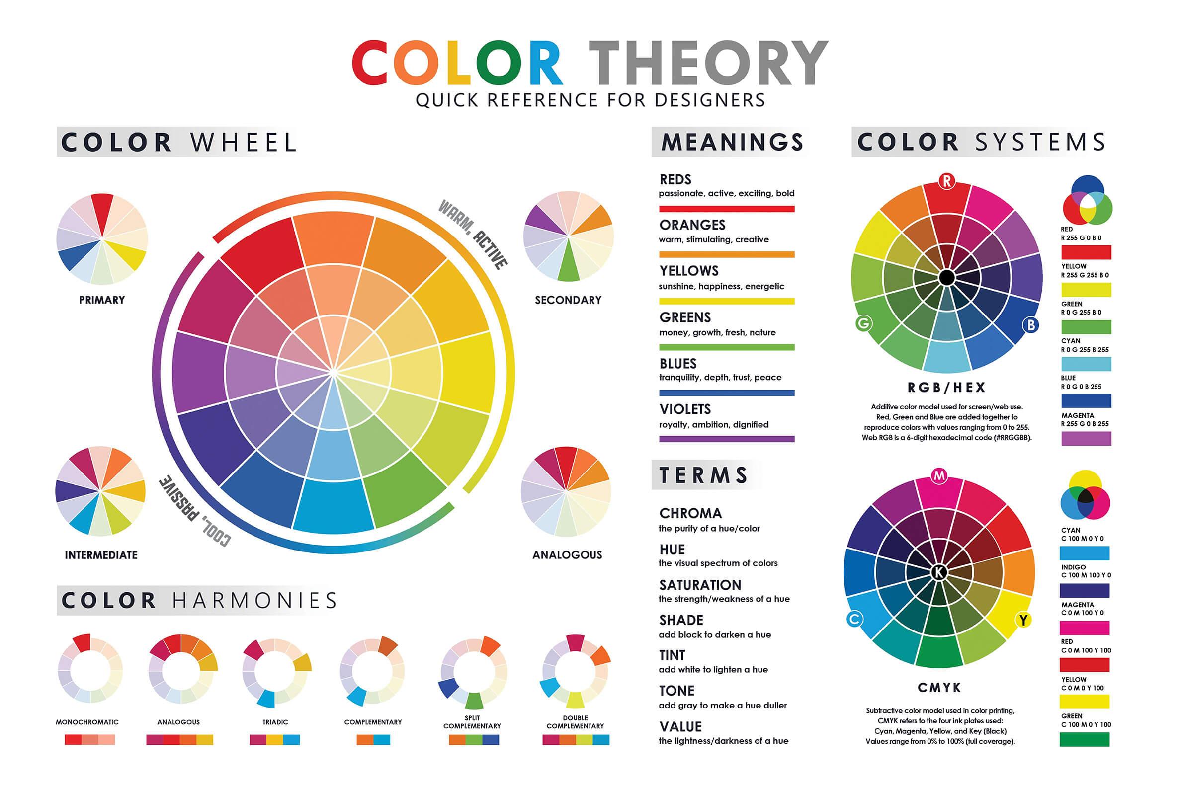
When it comes to choosing the right colors for your brand, it’s important to consider how each color will be perceived by your target audience. For example, red is often associated with passion and energy, while blue is seen as calming and trustworthy. So, if you’re starting a new energy drink brand, you might want to steer clear of baby blue logos.
But it’s not just about picking a color and calling it a day. Different shades of the same color can also have different meanings. For instance, a bright yellow can represent happiness and positivity, while a dull yellow can come off as sickly and unappetizing. Nobody wants a brand that reminds them of a bad batch of bananas.
So, when it comes to , remember to think outside the crayon box. Choose colors that reflect your brand’s personality and connect with your target audience on a deeper level. After all, nobody wants to be known as the brand with the neon pink logo that screams “mid-life crisis.”

Color Associations and Brand Perception
When it comes to branding, the colors you choose can play a huge role in how your company is perceived. It’s not just about picking your favorite color or the shade that looks the prettiest – it’s about understanding the psychological implications behind each color choice.
For example, did you know that red is often associated with passion and excitement? It can make your brand seem bold and dynamic, but be careful – it can also come off as aggressive or domineering if not used correctly. On the other hand, blue is seen as calm and trustworthy, making it a popular choice for many corporate logos.
But what about green? This color is often linked to nature and health, making it a great choice for eco-friendly or wellness brands. And let’s not forget about purple – a color associated with luxury and sophistication. If you want your brand to exude elegance, purple might just be the way to go!
Ultimately, the colors you choose for your brand can have a significant impact on how you are perceived by your audience. So next time you’re brainstorming logo ideas, don’t just pick your favorite color – think about the message you want to send and choose accordingly!

Color Trends in Brand Identity Design
In the world of brand identity design, the color trends are constantly changing faster than fashion trends. It’s like trying to keep up with the latest TikTok dance craze - if you blink, you might miss it!
But fear not, dear designers, for I have curated a list of the hottest color trends that will make your brand identity designs pop like bubble wrap:
- Neon Pastels: Think of these colors as the lovechild of a neon sign and a cotton candy machine. They’re bright, they’re fun, and they’re guaranteed to make your brand stand out in a sea of boring designs.
- Metallic Madness: Metallics aren’t just for robots anymore. Gold, silver, and copper are making a comeback in brand identity design, adding a touch of luxury and sophistication to any logo or packaging.
- Earthy Tones: Just like a hipster coffee shop, earthy tones like terracotta, olive green, and mustard yellow are all the rage. They give off a cozy, down-to-earth vibe that’s perfect for brands looking to connect with nature-loving millennials.
So there you have it, folks – the latest and greatest . And remember, when in doubt, just throw some rainbow sprinkles on it and call it a day!

Cultural Implications of Color in Branding
Color plays a crucial role in branding, and it has deep cultural implications that can either make or break a company’s image. Let’s take a look at how different colors are perceived in various cultures:
In Western cultures, red is often associated with passion, love, and power. However, in some Eastern cultures like China, red is seen as a symbol of luck and prosperity. So, if you’re a company selling red dresses, you might want to target your marketing efforts accordingly.
On the flip side, white is typically associated with purity and innocence in Western cultures. But in some Asian countries, white is the color of mourning and funerals. So, if you’re planning on launching a new line of white wedding dresses, maybe steer clear of marketing them in Japan.
Let’s not forget about green, which is often associated with nature, growth, and freshness. However, in some Middle Eastern countries, green is seen as a color of wealth and prosperity. So, if you’re a company that wants to convey a sense of luxury, maybe consider adding a touch of green to your branding.

Using Color to Differentiate Your Brand from Competitors
When it comes to standing out from your competitors, color can be your secret weapon. Think of all the iconic brands that immediately come to mind when you see their signature hues – McDonald’s golden arches, Starbucks’ green siren, and Target’s bold red bullseye. These companies have mastered the art of using color to create a lasting impression on consumers.
One way to use color to your advantage is by thinking about what emotions you want to evoke in your customers. For example, red is often associated with passion and excitement, while blue conveys trust and professionalism. By choosing a color palette that aligns with your brand’s personality, you can create a unique and memorable identity that sets you apart from the competition.
Another tip for differentiating your brand through color is to consider the cultural associations of different hues. For example, in Western cultures, black is often associated with sophistication and elegance, while in Asian cultures, it can symbolize mourning or negativity. By understanding these nuances, you can ensure that your color choices resonate with your target audience in a meaningful way.
Ultimately, using color strategically can help you tell a visual story about your brand that sets you apart from the crowd. So don’t be afraid to think outside the box (or the color wheel) and experiment with bold and unexpected hues. After all, in the world of branding, a little splash of color can go a long way!
The Role of Color in Brand Loyalty and Recognition
Have you ever wondered why you always crave a certain brand of soda simply because of the color of the can? Well, that’s the power of color psychology in brand loyalty and recognition! Let’s dive into the colorful world of branding and see how it influences our purchasing decisions.
First off, colors have the amazing ability to evoke specific emotions in consumers. For example, seeing the bold red of a can of Coca-Cola might make you feel energized and excited, whereas the serene blue of a can of Pepsi might make you feel calm and relaxed. It’s like each color has its own secret superpower to make us feel a certain way!
Secondly, colors help to differentiate brands from their competitors. Just think about how easy it is to spot a Starbucks logo from a mile away with its iconic green and white color scheme. It’s like a beacon calling out to all the caffeine lovers in the vicinity, saying, “Come hither, and indulge in your favorite latte!”
In conclusion, is not to be underestimated. So next time you find yourself reaching for that familiar red and white can of soda, just remember that it’s not just the taste you’re craving – it’s the power of color at work!
FAQs
Why is color so important in brand identity?
Color is like the cherry on top of a logo sundae – it’s the first thing people notice and can make or break a brand’s image. Just like you wouldn’t wear mismatched socks to a job interview, you wouldn’t want your brand colors to send the wrong message.
How do I choose the right colors for my brand?
Choosing the right colors for your brand is like picking out the perfect outfit for a first date – it’s all about sending the right vibes. Consider your target audience, your industry, and what kind of emotions you want to evoke. And remember, no one looks good in neon yellow.
Can I change my brand colors once they’re established?
Changing your brand colors once they’re established is like deciding to dye your hair pink after years of being a brunette - it’s a big statement. While not impossible, it can confuse customers and dilute your brand identity. Proceed with caution, my friend.
How can color influence consumer behavior?
Color is like a Jedi mind trick – it can influence consumer behavior without them even realizing it. Different colors evoke different emotions and associations, so choosing the right ones can make consumers feel all warm and fuzzy inside (and more likely to buy your stuff).
Do I need to follow color trends for my brand’s identity?
Following color trends for your brand is like wearing bell-bottoms in the 21st century – sure, you might turn some heads, but will it be in a good way? It’s important to stay true to your brand’s identity and choose colors that reflect your values and personality, not just what’s trendy at the moment.
Thanks for Seeing the Colorful Side of Brand Identity!
And there you have it – the colorful world of brand identity and how it’s impacted by the use of color. Whether you’re feeling blue, seeing red, or going green with envy, remember that the colors you choose for your brand can have a big influence on how it’s perceived by your audience. So next time you’re brainstorming your brand’s look, remember to think outside the box…of crayons, that is! Happy branding!


