In the world of logos, not updating your design is like wearing the same outfit to a party year after year – sure, it’s comfortable, but people will start to wonder if you even own any other clothes. So, if your logo is a little outdated, fear not! We’re here to guide you through the treacherous waters of redesigning your logo professionally. Grab your compass and get ready to navigate the wild world of brand makeovers with style and grace.
redesign“>Understanding the Importance of Logo Redesign
So you’ve had the same logo since the 90s and you’re wondering if it’s time for a change. Well, let me tell you, a logo redesign is more important than you think! Here’s why:
First of all, your logo is like your company’s face. It’s the first thing people see and the last thing they remember. So if your logo looks like it was designed by a third-grader with a crayon, it’s time for an upgrade.
Secondly, a logo redesign can breathe new life into your brand. It’s like giving your company a makeover. Just like how a new haircut can make you feel like a whole new person, a new logo can reinvigorate your business and attract new customers.
Plus, a fresh logo can show that your company is keeping up with the times. If your logo still looks like it belongs in the 90s, people might think your business is stuck in the past. A modern, sleek logo can show that you’re relevant and up-to-date.
trends-in-logo-design”>Researching Trends in Logo Design
Are you tired of seeing the same old boring logos everywhere you look? Do you dream of designing logos that will make heads turn and jaws drop? Well, then you’ve come to the right place! We’re here to help you stay ahead of the curve by researching the latest trends in logo design.
Whether you’re a seasoned designer or just starting out, it’s important to stay on top of what’s hot and what’s not in the world of logos. So, put on your trendiest outfit, grab a cup of coffee (or tea, we don’t judge), and let’s dive into the world of logo design trends!
From minimalistic designs to bold and vibrant colors, there’s a whole spectrum of logo trends to explore. Here are some of the hottest trends that are currently taking the design world by storm:
- Flat Design: Say goodbye to gradients and shadows – flat design is here to stay!
- Geometric Shapes: Circles, squares, triangles – oh my! Embrace your inner geometry nerd.
- Hand-drawn Logos: Give your logos that personal touch with hand-drawn elements.
- Responsive Logos: In this digital age, your logo needs to look good on all devices – from smartphones to billboards.

Collaborating with Design Professionals
So you want to collaborate with design professionals, huh? Well, buckle up because you’re in for a wild ride! Working with these creative geniuses can be both a thrilling adventure and a hair-pulling experience. But fear not, we’ve got some tips to help you navigate the world of design collaboration like a pro.
First things first, make sure you communicate your vision clearly. Design professionals are not mind readers (well, most of them aren’t), so you’ll need to spell out exactly what you’re looking for. Use bold, italic, underline – heck, use ALL the formatting options to get your point across.
Next, be open to feedback. Designers are artists, and they take their craft seriously. So if they suggest a different approach or style, try not to take it personally. Remember, they’re the experts – you’re just here for the ride.
Finally, don’t be afraid to get a little quirky. Designers love to flex their creative muscles, so don’t be afraid to throw out some off-the-wall ideas. Who knows, that weird, wacky concept you came up with could be the next big thing in the design world!

Gathering Feedback from Stakeholders
So, you’ve decided to gather feedback from your stakeholders. Congrats! You’re about to embark on a wild ride of opinions, suggestions, and maybe even a few complaints. But fear not, brave soul, for you are on a mission to improve and grow. Let’s dive into this pool of feedback, shall we?
First things first, set the stage for your stakeholders. Make sure they know that their feedback is valuable and will be taken into consideration. Show them some love, butter them up a bit, and watch the feedback roll in like a well-oiled machine. Maybe throw in a few compliments here and there – who doesn’t love a good ego boost?
Next, create a survey or feedback form that is as delightful as a fluffy puppy in a field of daisies. Ask open-ended questions to really get those creative juices flowing. And don’t forget to include a few multiple-choice questions for those stakeholders who are feeling a bit indecisive. Remember, variety is the spice of life!
Once you’ve gathered all the feedback, it’s time to put on your detective hat and start analyzing. Look for patterns, trends, and common themes. Maybe even create a word cloud to visualize the most frequently mentioned topics. And don’t forget to thank your stakeholders for their input – a little appreciation goes a long way in keeping those feedback channels open!

Refining Concepts and Receiving Design Revisions
So you think your design is perfect, huh? Well, think again! It’s time to refine those concepts and receive some well-needed design revisions. Trust me, you’ll thank us later.
First things first, gather all the feedback you’ve received so far. Make a list of what’s working and what needs a little love. Remember, constructive criticism is your best friend.
Next, roll up your sleeves and get ready to dive back into the design process. Play around with different color palettes, typography options, and layout variations. Don’t be afraid to think outside the box – creativity knows no limits!
Once you’ve refined those concepts, it’s time to present your updated designs to the team. Be prepared for some heated discussions, but remember, collaboration is key. Embrace the feedback and use it to make your design even better.
Implementing the Final Logo Design Update
We finally have the perfect final logo design update ready to go live! It’s been a long journey filled with endless revisions and debates, but we have emerged victorious. Now it’s time to implement this bad boy and show the world what we’re made of.
First things first, let’s gather the team and break the news. Get everyone pumped up and excited for the big reveal. It’s like announcing a new baby, except this baby is a sleek and modern logo that will set us apart from the competition.
Next, we need to update all our branding materials. From business cards to social media profiles, everything must reflect our fabulous new logo. Don’t forget to update the website and make sure it shines like a diamond with our fresh design.
Lastly, let’s spread the word! Use all the marketing channels at our disposal to showcase our updated logo to the world. **Social media posts**, **email newsletters**, and **blog updates** are just a few ways to get the word out. Let’s make sure everyone knows that we mean business with our new and improved look.
Maintaining Consistency Across Branding Materials
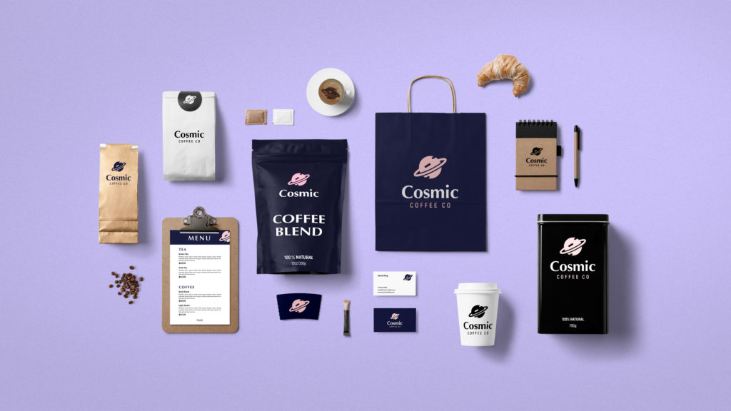
When it comes to maintaining consistency across your branding materials, think of it like dressing for a first date – you want to make sure all your pieces are working together seamlessly to make a great impression.
One key way to ensure consistency is by establishing a set of brand guidelines. These guidelines should cover everything from your color palette (no, fifty shades of gray is not a good look) to your font choices (Comic Sans is never the answer… like, ever).
Another tip is to create templates for your various materials, whether it’s social media graphics, sales sheets, or business cards. This will help you keep everything looking cohesive and prevent any rogue elements from sneaking in (we’re looking at you, random clip art).
Remember, consistency is key to building brand recognition and trust with your audience. So, keep it classy, keep it fun, and keep it consistent!
FAQs
Why is it important to update my logo professionally?
Updating your logo professionally helps to ensure that your brand image remains current and relevant in today’s ever-changing market. A well-designed logo can also increase brand recognition and credibility, helping you stand out from the competition.
What should I consider when updating my logo?
When updating your logo, it’s important to consider your target audience, brand values, and overall business goals. You should also think about how your logo will look across different platforms and mediums, ensuring that it remains versatile and easily recognizable.
How do I choose a design agency to help me with the redesign process?
When choosing a design agency to help with your logo redesign, it’s important to look for a team that has experience working with businesses in your industry and a portfolio of successful rebranding projects. You should also consider their creative process, communication style, and pricing structure before making a decision.
What are some common mistakes to avoid during the logo redesign process?
Some common mistakes to avoid during the logo redesign process include rushing the design process, ignoring feedback from stakeholders, and straying too far from your brand’s established identity. It’s important to take your time, gather input from key stakeholders, and stay true to your brand’s core values.
How can I ensure a smooth transition when revealing my new logo to the public?
To ensure a smooth transition when revealing your new logo to the public, it’s important to communicate the changes effectively through your marketing channels and social media platforms. You should also be prepared to address any feedback or questions from customers and fans, showing that you value their input and are committed to maintaining a strong brand presence.
In conclusion, remember the three P’s of logo redesign:
Patience: Rome wasn’t built in a day, and neither was your new logo. Take your time and trust the process.
Persistence: Don’t be afraid to iterate and tweak your design until it’s just right. Perfection takes time!
Pizzazz: Inject some personality into your new logo. Make it pop, stand out, and represent your brand in a unique way.
So go forth, brave designer, and navigate the redesign process with grace and style. Your logo will thank you!


