Gradients took the design world by storm in the ’90s and have endured as a mainstay in modern design. While not all designs call for them, gradients can breathe life into an otherwise flat logo by injecting color and texture.
In this article, we’ve compiled a handful of companies that are currently leveraging gradients. We’ll discuss why these designs work for these particular brands. If your brand has a similar aesthetic (or you just find yourself attracted to vibrant color palettes), you should definitely consider integrating a gradient into your logo and marketing materials.
Table of Contents
- What is Gradient Design?
- When to Use Gradients
- Instagram Logo Design
- Asana Logo & Web Design
- Tria Beauty Packaging
- What Makes a Great Logo Design?
What is Gradient Design?
Gradient designs use transitions to blend colors smoothly. Some gradients may be limited to two colors, while others utilize three or more. The goal is to slowly blend colors together to go from one hue to the next.
Gradient colors will sometimes find themselves located close on the color wheel, such as a dark green blending softy into a lighter green. Alternatively, they may be more complementary, perhaps with a dark pink morphing into a pale blue. These transitions can be implemented subtly in the background or can be bold and powerful, thus taking center stage.
Everyone who has seen a sunset (or used PowerPoint religiously in the early 2000s) is already familiar with gradients. Sunsets are a natural version of a gradient. The goal when using this type of technique is to recreate this blending. In fact, many brands have chosen to use “sunset” colors in their gradient designs. You’ll see this with Instagram, as they seamlessly fuse the bold pink, purple, yellow, and orange hues which quickly catch the eye.
When to Use Gradients
Gradient design is a great way to add depth or texture to a logo, but it’s best used in small doses. Gradient aesthetics tend to best lend themselves to creative ventures and healthcare marketing. We’ve also seen it work well with tech companies, but, again, all things should be done in moderation. If a gradient is used exclusively, it may drown out the messaging or brand ethos. Modern color combinations and style are essential to prevent the logo from appearing outdated.
When you add gradient design to a logo, you typically want to keep the usage small unless the gradient connects strongly to who you are as a brand. If you want to invoke nostalgia or bring in a playful element, you may want to consider using a more eye-catching gradient. Ideally, you want the gradient to stay confined to either the brand’s name or the associated symbol. Pairing the gradient scheme with a solid typeface for the brand name can create a dynamic logo option for companies.
When you decide to incorporate gradient elements into your logo design or packaging materials, do it because it makes sense for your brand. Consider the industry and consider the color palette. Make sure that you understand what colors to use. A logo designer can help, but too many times we’ve seen companies attempt to mix colors that do not make sense together. For example, red, pink, blue, and purple can easily tie into one another. However, if you try to mix red and green, you’ll end up with brown, which is typically not a good look.
Instagram Logo Design
![]()
Instagram is perhaps one of the most popular companies utilizing a gradient in its logo. Instagram has long marketed itself as not only a social brand but a creative one. The gradient design helps the logo stand out, and it also communicates to consumers that Instagram is a fun, playful, and creative space to explore. Instagram users often use their photography, video, and meme-making skills to share innovative, unique, and engaging information online.
The Instagram logo uses a solid color for the word “Instagram,” so the gradient is confined to the brand’s app icon and logo design symbol. The symbol is in the shape of a camera but located within a box that mimics the app shape designs commonly found on iPhone and Android devices. This was a clever technique because it creates instant brand recognition and doesn’t require altering the logo beyond the app image. The gradient colors chosen are playful and fun, but the bold appearance keeps the app grounded. Using solid white for the camera icon creates a stark contrast so that the image is immediately recognizable. The opposite, for example, (white background with a gradient camera icon) would have been much less bold. Can you picture the Apple Music app icon off the top of your head? If not, perhaps that is because it uses a white background with a gradient music note.
Asana Logo & Web Design
![]()
Asana also uses a gradient style with its logo and web design. This project management app is a great tool that people across all industries rely on to streamline their day-to-day workload. Asana opted to use a modern, elegant, all-lowercase typeface to represent their brand name. Then, they created a symbol that uses three small circles assembled into a triangle. The circles each feature a gradient that moves from a dark red to pink to orange to yellow, creating a feeling of unity.
The circles were used as a way to convey collaboration and connection between Asana team members. The idea is that shared energy creates for better work experiences and a better working environment. Asana also wanted a logo that was colorful, cheerful, and a bit quirky. They wanted to showcase what a fun/hip work environment would look like while still expressing a sense of collaboration and connection. The gradient style and colors from the three circles are also used throughout Asana’s website design. You can find it as a background on individual pages and used in various symbols throughout the popular project management tool.
Tria Beauty Packaging
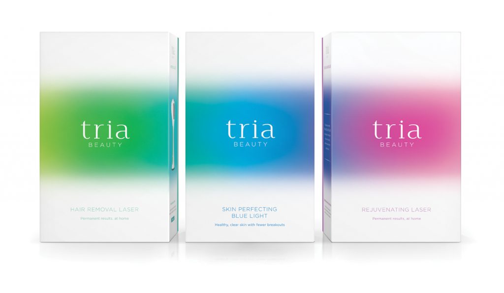
Tria is an example of a company that has a solid color for its logo but incorporates a gradient into its packaging and marketing materials. Tria has three different products on display that unify a variety of gradients spanning across the color spectrum. The three dominant colors are green, blue, and pink. Tria’s gradient aesthetic exudes a sense of wellness and tranquility while adding a touch of modern chic (that will surely catch the consumers’ eyes on the shelf).
Again, Tria follows Instagram’s footsteps and uses the gradient as the background element. The bold colors bring an added punch to help the words “Tria Beauty” really pop. One aspect we might change about this brand design, however, is the font used for “Beauty.” It’s thin and elegant, but readability might be a challenge for some consumers. Making it appear in a slightly larger or bolder font would aim to counter this potential pitfall. Besides, the brand name “Tria” isn’t recognizable on its own, so packaging that more prominently featured the word “Beauty” would be helpful for consumers. With all that said, the overall packaging remains sleek and modern. The gradient adds a youthful element that consumers want to see (and, more importantly, feel) when they think of beauty.
What Makes a Great Logo Design?
A great logo design is one that can quickly and effectively communicate a company’s core values. It is a company’s calling card for customers and clients. We are constantly bombarded with different kinds of media: print, digital, social, television. Throughout every stage, we make split-second, snap judgments about what (or who) we want to learn more about. A great logo design anticipates these quick judgments and seeks to deliver a message that can be easily digested.
Are you interested in gradient design? Contact us today, and we’d love to help you redesign your logo with a modern gradient style. We pride ourselves on delivering custom, memorable logo designs that convey your brand’s core values. Let’s work together and create a successful logo and branding identity for your business.


