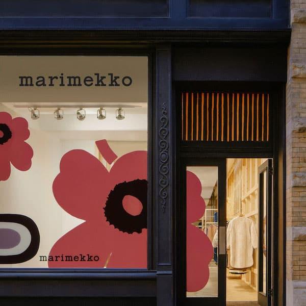
Welcome to the wonderful world of logo design, where creativity knows no bounds and the only limit is your imagination…and maybe a few deadlines. Crafting an eye-catching logo is like painting a masterpiece, except instead of brushes and paint, you’re armed with pixels and a whole lot of caffeine. In this article, we’ll dive into the art of dynamic design and explore the magic that goes into creating logos that make heads turn and wallets open. Buckle up, because we’re about to take you on a wild ride through the wonderful world of logo design!
Understanding the Basics of Logo Design
So you’ve decided to dive into the world of logo design, huh? Well, buckle up and get ready for a wild ride through the basics of this creative process!
First things first, let’s talk about the importance of simplicity in your logo design. You don’t want your logo to look like a Picasso painting on steroids. Keep it clean, keep it simple, keep it memorable!
Next up, colors! Ah, colors – the spice of life. When it comes to choosing colors for your logo, remember that less is more. Pick a couple of colors that work well together and stick with them. Your logo shouldn’t resemble a rainbow threw up on a canvas.
Lastly, fonts are like the clothes your logo wears. Choose a font that speaks to the personality of your brand. Whether it’s bold and loud or sleek and sophisticated, make sure it fits like a glove.

Exploring the Power of Color and Shape
Have you ever stopped to think about the true power of color and shape in our lives? They can influence our mood, our decisions, and even our appetites!
Think about it – the color red can make us feel bold and passionate, while yellow can make us feel happy and energetic. And don’t even get me started on the power of shapes. Circles can make us feel comforted and secure, while triangles can make us feel powerful and dynamic.
Next time you’re feeling down, try surrounding yourself with some vibrant colors or interesting shapes. You’ll be amazed at how quickly your mood can change!
So, let’s embrace the power of color and shape in our lives. Whether it’s through the clothes we wear, the art we create, or the spaces we inhabit, let’s make a conscious effort to use color and shape to enhance our experiences!
Utilizing Typography for Impactful Logos
When it comes to creating impactful logos, typographic choices can make all the difference. Sure, it may seem like just a bunch of letters and numbers, but don’t underestimate the power of a well-chosen font! Here are some tips to help you utilize typography to make your logo stand out:
First and foremost, choose a font that embodies the personality of your brand. Are you sleek and modern? Playful and whimsical? Classic and timeless? Whatever it is, make sure your font reflects that vibe. A font like Helvetica might work for a high-end luxury brand, but it won’t cut it for a fun and quirky children’s line.
Next, consider the spacing between your letters. This is where kerning comes into play. Tightening or loosening the spacing between letters can drastically change the look and feel of your logo. Experiment with different kerning options until you find the perfect balance.
Don’t be afraid to experiment with different font weights and styles. Mix and match bold with italic or underline with strike-through to create a dynamic and visually interesting logo. Remember, the goal is to make your logo memorable and eye-catching!

Incorporating Negative Space for Clever Design
When it comes to design, sometimes less is more. Incorporating negative space into your designs can help create clever and eye-catching visuals. Here are some tips on how to make the most of negative space in your designs:
1. **Embrace the White Space:** Don’t be afraid of white space. It’s not just empty space, it’s a powerful design element that can help draw attention to the important parts of your design.
2. **Use Negative Space to Create Optical Illusions:** Play around with negative space to create optical illusions in your designs. By strategically placing elements next to each other, you can create shapes and patterns that aren’t really there.
3. **Think Outside the Box:** Negative space doesn’t have to be just empty space around your design elements. Think creatively and use negative space to form part of the design itself, whether it’s incorporating text into the background or using it to create a hidden message.
By incorporating negative space into your designs, you can create visually interesting and clever designs that will surely stand out. So don’t be afraid to experiment and have fun with it!

Balancing Simplicity and Complexity in Logo Creation
When it comes to creating a logo, finding the right balance between simplicity and complexity is crucial. While a simple design can be easily recognizable and memorable, a complex design can add depth and sophistication to your brand identity. Finding that sweet spot between the two can be a challenging yet rewarding process.
One way to achieve this balance is by incorporating both simple and complex elements into your logo design. This could be done by using a simple, bold font for the text portion of the logo, while incorporating intricate illustrations or patterns in the background. This juxtaposition of simplicity and complexity can create a visually appealing logo that catches the eye and leaves a lasting impression.
Another approach is to focus on the overall concept of the logo rather than getting bogged down in every tiny detail. By keeping the core idea simple and clear, you can then add in more complex elements as needed to enhance the design. This way, you can still achieve a visually interesting logo without overwhelming your audience with too much information.
Ultimately, the key to striking the right balance in logo creation is to trust your instincts and not be afraid to experiment. Whether you lean towards simplicity or complexity, as long as the final design accurately represents your brand and resonates with your target audience, you’ve succeeded in creating a logo that stands out from the crowd.
Mastering the Art of Versatility and Scalability in Logo Design
When it comes to logo design, versatility and scalability are key. A logo should look just as good on a business card as it does on a billboard. So, how do you master the art of creating a logo that can adapt to any size or medium? Here are some tips to help you become a logo design ninja:
- Keep it simple: The best logos are often the simplest ones. A logo should be able to communicate your brand’s message in a single glance. Avoid cluttering your logo with unnecessary elements that may not scale well.
- Choose the right color palette: Colors can have a big impact on how your logo looks at different sizes. Make sure your logo looks good in both color and black and white. Test your logo on different backgrounds to ensure it stands out no matter where it’s placed.
- Experiment with different layouts: Don’t be afraid to play around with different arrangements of your logo elements. Try stacking text or making certain elements bigger or smaller to see how it affects the overall look of your logo.
Remember, versatility and scalability go hand in hand. A logo that can adapt to any situation will make your brand look more professional and memorable. So, get creative and start designing logos that are as flexible as a yoga instructor on a trampoline!
FAQs
Why is having an eye-catching logo important for a business?
Well, I don’t know about you, but I wouldn’t want to do business with a company that has a logo that looks like it was designed by a kindergartener. A good logo grabs attention, makes a lasting impression, and helps customers remember your brand. In other words, it’s kind of a big deal.
What are some essential tips for creating a dynamic logo design?
First of all, don’t be boring. No one wants to see yet another generic logo that looks like it was churned out by a robot. Be original, be creative, be bold! Secondly, keep it simple. Your logo should be easy to recognize and understand at a glance. And finally, make sure your logo reflects your brand’s personality and values. You don’t want to confuse your customers by having a logo that looks like it doesn’t belong to your company.
How can color and typography play a role in logo design?
Color and typography are like the dynamic duo of logo design. The right color palette can evoke certain emotions and associations in your customers, so choose wisely. And typography is more than just picking a pretty font – it’s about finding a typeface that complements your logo and reinforces your brand’s message.
What are some common mistakes to avoid when designing a logo?
Avoid being a copycat – no one likes a knockoff logo that looks suspiciously like another company’s. Also, steer clear of trendy design elements that will quickly become outdated. And last but not least, don’t overcomplicate things. Your logo should be clean, concise, and memorable – not a cluttered mess that no one can decipher.
How can a business ensure their logo stands out in a crowded marketplace?
Simple – be different! Take a look at what your competitors are doing, and then do the exact opposite. Don’t be afraid to take risks and think outside the box. And of course, make sure your logo is versatile enough to be used across all kinds of mediums – from billboards to business cards to social media profiles. You want your logo to shine bright like a diamond, not get lost in the crowd like a wallflower.
Time to Put Your Creative Hat On!
Congratulations, you’ve made it to the end of our journey into the world of crafting eye-catching logos! Now that you’ve learned the art of dynamic design, it’s time to put your newfound skills to the test. So grab your trusty pencil, fire up your favorite design software, and let your creativity run wild! Who knows, maybe your logo will be the next big thing to catch everyone’s eye. Happy designing!


