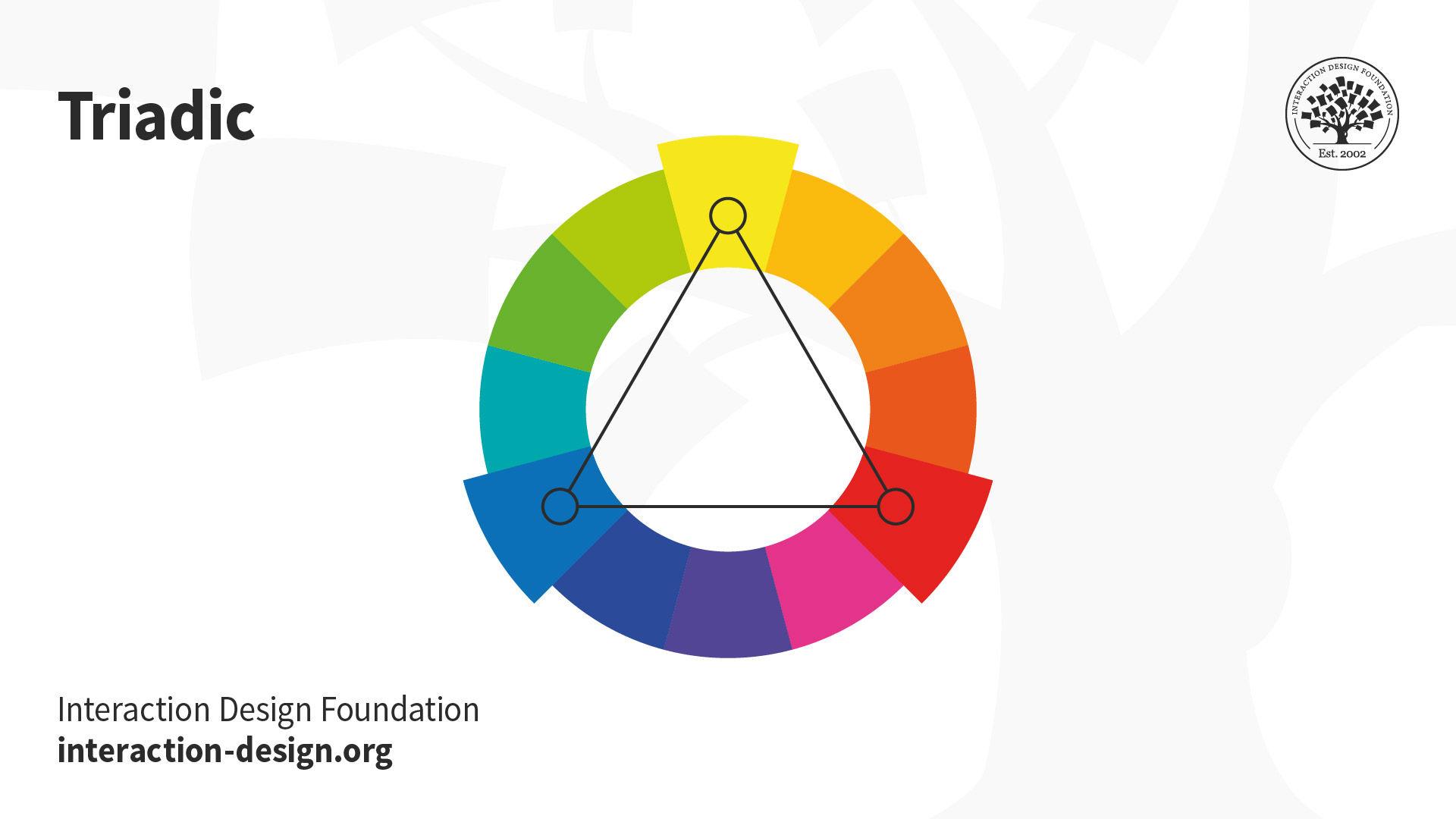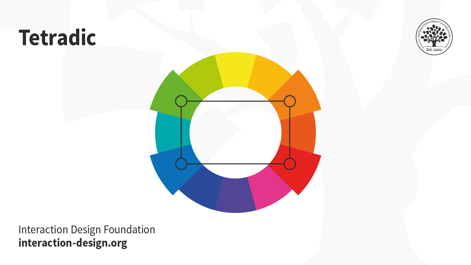
Colors are more than just pretty shades that make our world a little brighter. In the world of logo design, they hold the power to shape brand perception, captivate consumers, and make even the dullest of businesses seem as exciting as a double rainbow. So strap in, folks, because we’re about to dive into the colorful world of logo design and explore just how impactful a splash of red or a pop of yellow can be when it comes to capturing hearts and minds. So grab your color wheel and let’s paint the town logo!
Understanding the Psychology of Color in Logo Design“>Branding
When it comes to branding, choosing the right colors can make all the difference in how your brand is perceived. Let’s dive deep into the psychology of color to uncover the hidden meanings behind different hues.
**Red:** This color is bold, passionate, and attention-grabbing. It’s no wonder that so many fast-food chains use red in their branding – it makes you hungry just looking at it! On the flip side, red can also evoke feelings of anger or danger, so use it wisely.
**Blue:** Calm, trustworthy, and dependable – blue is the color of choice for many tech companies and banks. It’s no wonder that we associate blue with stability and reliability – just like your phone crashing every time you try to update it.
**Yellow:** Bright, cheerful, and optimistic, yellow is the color of sunshine and happiness. It’s a great choice for brands looking to convey a sense of playfulness and creativity. Just be careful not to overdo it - too much yellow can be overwhelming like getting stuck in a never-ending game of Candy Crush.

Choosing the Right Colors for Your Logo Design
So you’ve decided to create a logo for your business, congratulations! Now comes the fun part – choosing the perfect colors to represent your brand. Here are a few tips to help you make the right choice:
- Consider your target audience – are they fun and quirky, or professional and serious? Choose colors that will resonate with them.
- Take a look at your competitors’ logos – you don’t want to blend in with the crowd, so pick colors that will help you stand out.
- Think about the psychology of colors – for example, green can represent nature and growth, while red conveys energy and passion.
Remember, your logo is the face of your brand, so make sure the colors you choose reflect the personality and values of your business. Plus, if all else fails, just close your eyes and point to a color on the color wheel – hey, it’s worth a shot!

How Color Influences Consumer Behavior and Perception
Color may seem like just a pretty detail in our everyday lives but little do we know, it actually influences our behavior and perception in a major way. Just think about it, have you ever walked into a store and suddenly felt the urge to buy everything because of the color scheme? That’s not just a coincidence, my friend!
Here are some ways in which color plays tricks on our minds:
- Red: This color screams urgency and excitement. No wonder so many clearance sales signs are in red – it makes us want to buy things ASAP!
- Blue: Known for its calming effect, blue is often used in logos and packaging to build trust with consumers. No wonder Facebook and Twitter chose blue as their primary color!
- Yellow: This bright color is associated with happiness and optimism. That’s why it’s commonly used in children’s products and fast food chains – they want us to feel good while eating burgers!
So next time you’re out shopping or browsing online, pay attention to the color schemes around you. You’ll be surprised at how much they can influence your decisions without you even realizing it. Don’t say I didn’t warn you!

Creating a Strong Emotional Connection Through Color
Color can be a powerful tool in creating a strong emotional connection with your audience. By strategically using different colors, you can evoke a wide range of emotions that will leave a lasting impact. Here are some tips on how to harness the emotional power of color:
1. Red: Channel your inner passion and excitement with the color red. Use it to create a sense of urgency and importance in your messaging. Whether it’s a bold call to action button or a striking headline, red is sure to grab your audience’s attention.
2. Blue: Want to convey trust and reliability? Blue is your color. Incorporate shades of blue in your design to establish credibility and inspire confidence in your brand. From corporate logos to website backgrounds, blue is a classic choice for building a strong emotional connection.
3. Yellow: Inject a burst of energy and optimism into your marketing materials with the color yellow. Use it to spark creativity and innovation, or to convey a sense of playfulness and fun. Whether it’s a cheerful email newsletter or a vibrant social media post, yellow is sure to brighten your audience’s day.
![]()
Utilizing Color Theory to Establish Brand Identity
Have you ever thought about the power of color when it comes to establishing your brand identity? Well, strap in folks, because we’re about to dive into the wild world of color theory!
Choosing the right colors for your brand can make all the difference in how your customers perceive you. Remember, first impressions are everything, so make sure you’re putting your best foot forward by selecting colors that truly represent your brand personality.
So, how can you make the most out of color theory for your brand? Here are a few tips to get you started:
- Stick to a consistent color palette: Consistency is key when it comes to brand identity. Choose a set of colors that reflect your brand’s values and stick to them across all your marketing materials.
- Consider cultural associations: Different colors can have different meanings in different cultures. Make sure you’re aware of these associations to avoid any unintentional messaging mishaps.
- Use contrasting colors to make a statement: Want to grab your audience’s attention? Use contrasting colors to create eye-catching visuals that demand to be noticed.
The Impact of Color Contrast in Logo Design
Color contrast can make or break a logo design – it’s like the seasoning in a dish, you either sprinkle it just right or risk ruining the whole meal. Finding that perfect balance of colors is crucial for creating a logo that pops and grabs attention.
With the right color contrast, your logo can stand out in a sea of bland designs like a peacock in a flock of pigeons. Think of it as giving your logo a neon sign to shout out “Look at me!” to the world. You want your logo to be the Beyoncé of the graphic design world – fierce, fabulous, and impossible to ignore.
Imagine a logo without any color contrast – it’s like a black and white TV in a world of HD. Bleh! You want your logo to be vibrant, exciting, and visually stimulating. It’s like giving your brand a makeover with a flamboyant new wardrobe – who wouldn’t want to be friends with that logo?
So next time you’re designing a logo, don’t forget the importance of color contrast. It’s the secret ingredient that turns a bland logo into a show-stopping masterpiece. Embrace the power of color contrast and watch your logo shine brighter than a disco ball at a party – trust me, your brand will thank you!
Crafting a Memorable and Effective Logo with Strategic Color Choices
When it comes to creating a logo that truly stands out, color choices can make all the difference. Choosing the right colors can not only make your logo memorable, but also evoke the desired emotions and responses from your audience.
Before diving into the color wheel, consider what message you want your logo to convey. Are you a bold and adventurous brand? Or perhaps you prefer a more subtle and sophisticated approach. Once you have a clear idea of your brand personality, it’s time to start playing with colors!
Here are a few tips to help you craft a logo that pops:
- Stick to a maximum of three colors: Too many colors can overwhelm your audience and dilute your brand message. Keep it simple and impactful!
- Consider color psychology: Different colors can evoke different emotions. For example, red is often associated with passion and energy, while blue conveys trust and professionalism.
- Test your logo in black and white: A good logo should be able to stand on its own in black and white. If it loses its impact, it may be time to reconsider your color choices.
FAQs
Why is color important in logo design?
Color is important in logo design because it can evoke emotions, create associations, and help distinguish a brand from its competitors. Plus, who wants a logo that looks like it was designed by a sad, color-blind clown?
How do different colors affect perception of a brand?
Each color carries its own meaning and can influence how consumers perceive a brand. For example, red can convey passion or danger, while blue can evoke trust and professionalism. So, choose your colors wisely – your brand’s reputation depends on it!
What should a brand consider when choosing colors for their logo?
When choosing colors for a logo, a brand should consider its target audience, industry norms, and the desired brand personality. Remember, neon pink might not be the best choice for a funeral home logo!
Can changing the colors of a logo affect brand perception?
Absolutely! Just like putting on a different outfit can change how people perceive you, changing the colors of a logo can alter how consumers see a brand. So, if you want to give your brand a makeover, start with a fresh coat of paint!
Are there any rules for using color in logo design?
While there are no strict rules for using color in logo design, it’s important to consider factors like contrast, legibility, and consistency. It’s kind of like putting together a killer outfit – you want everything to match and make a statement!
Color Your World!
So there you have it, the colorful world of logo design! Remember, the power of color can shape brand perception, so choose wisely. Let your logo shine bright like a rainbow and watch your brand stand out from the rest. Don’t be afraid to be bold, be vibrant, and most importantly, be colorful!


