Are you tired of your logo looking like it was designed by a bored intern during their lunch break? Have you ever looked at your branding and thought, “Wow, this really doesn’t scream ‘proffessionalism’?” Well, fear not, because we are here to guide you through the thrilling world of logo redesign! Get ready to revamp your image and leave your competitors in the dust with our comprehensive guide to taking your logo from “meh” to ”heck yes!” It’s time to unleash your inner design diva and transform your logo into a work of art that truly represents your amazing business. Let’s dive in and give your branding the makeover it deserves!
Understanding the Purpose of Logo Redesign
So you’ve decided it’s time to give your logo a makeover, huh? Well, before you go diving headfirst into the world of redesign, let’s take a moment to understand why you’re even considering making this bold move.
First of all, your current logo might be about as outdated as your wardrobe from the ’80s. And trust me, neon spandex and shoulder pads are not making a comeback anytime soon. It’s time to bring your brand into the 21st century with a logo that screams “I’m relevant and hip!”
Or perhaps your current logo is just plain boring. I mean, we’ve all seen our fair share of generic logos that look like they were whipped up in Microsoft Paint in five minutes. It’s time to stand out from the crowd and show the world that you mean business with a logo that demands attention.
And let’s not forget about versatility. Your logo should be able to adapt to different mediums and sizes without losing its impact. If your current logo is as inflexible as a yoga newbie trying to touch their toes, then it’s time for a redesign that will make your logo as versatile as a contortionist at a circus.
Analyzing Your Current Logo
So you’ve got a logo, eh? Well, let’s take a closer look at that bad boy and see what we’re working with.
First things first, let’s talk about the colors. Do they complement each other like peanut butter and jelly, or do they clash like your Aunt Sally’s floral curtains and plaid couch? Make sure the colors you’ve chosen convey the right message and aren’t causing a visual headache for your audience.
Next up, the font. Is it sleek and modern like a sports car, or does it look like something straight out of a ’90s PowerPoint presentation? Choose a font that reflects your brand’s personality and is easy to read. After all, you don’t want people squinting at your logo trying to decipher what the heck it says.
And finally, the overall design. Does your logo make a statement, or does it fade into the background like your ex’s apology text? Make sure your logo is unique and memorable, standing out from the crowd like a unicorn in a field of horses. After all, you want your logo to be the Beyoncé of logos, not the Michelle.

trends-and-competitors”>Researching Trends and Competitors
So, you want to stay ahead of the game and crush your competition, huh? Well, strap in, my friend, because we’re about to dive head-first into the world of . But don’t worry, I promise it’s not as boring as it sounds.
First things first, let’s talk about trends. You know, those elusive little nuggets of information that everyone is chasing after like a puppy chasing its tail. **But fear not, with the right tools and a sprinkle of magic, you too can uncover the hottest trends in your industry**. Whether it’s scouring through social media, attending industry conferences, or simply reading up on the latest news, staying informed is key.
Now, onto the fun part – competitors. **These sneaky devils will stop at nothing to steal your spotlight**, so it’s crucial to keep a close eye on what they’re up to. Are they launching a new product? Expanding into different markets? Snatching up all the best talent? Your job is to gather as much intel as possible and use it to your advantage. Remember, knowledge is power!
So, there you have it - a crash course in . **Armed with this newfound knowledge, you’re now ready to take on the world**. Just remember, the competition is fierce out there, but with a little wit and a whole lot of determination, there’s no telling what you can achieve. Now go forth, my friend, and conquer!

Collaborating with Design Professionals
So, you’ve decided to dip your toes into the world of . Congratulations! You’re about to embark on a journey of creativity, innovation, and maybe a little bit of chaos.
First things first, make sure you and your design professional are on the same page. Communication is key in any collaboration, so be sure to set expectations, discuss timelines, and establish a clear vision for your project. And remember, a little humor never hurt anyone – design professionals love a good joke (especially if it involves Comic Sans).
Once you’ve laid the groundwork, it’s time to let the creative juices flow. Don’t be afraid to think outside the box (or the Pantone color palette). Embrace bold ideas, quirky concepts, and unconventional approaches – after all, that’s what design professionals live for. And hey, if things go awry, just blame it on a “design experiment gone wrong”.
And finally, don’t forget to show your appreciation for your design professional’s hard work. A simple thank you goes a long way, but an extra espresso shot or a gift card to the art supply store never hurt, either. Trust us, a happy designer is a productive designer – and who knows, they might even throw in a freebie or two along the way!

Creating a Design Brief
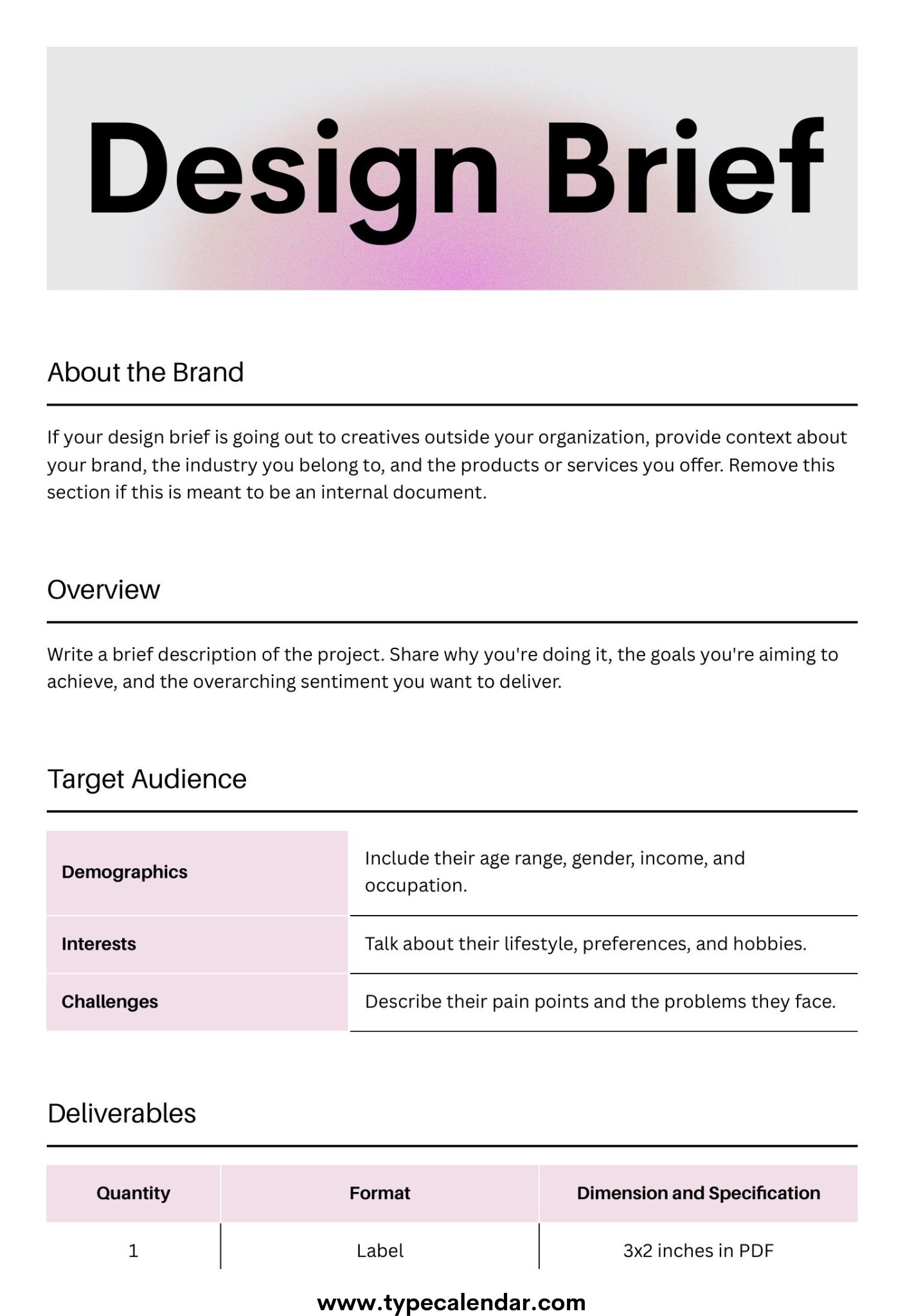
So you’ve been tasked with , huh? Don’t worry, it’s not as intimidating as it sounds. Think of it as your roadmap to design success! Here are some tips to help you craft the perfect design brief:
- Start by outlining the project goals – what are you trying to achieve with this design? Be as specific as possible, but don’t lose yourself in the details. Remember, brevity is key!
- Next, think about your target audience – who is this design for? What are their preferences, needs, and pain points? Understanding your audience will help you tailor your design to meet their expectations.
Now, it’s time to get into the nitty-gritty details. Be clear about the scope of the project, including deliverables, timelines, and budget. Don’t forget to include any brand guidelines or preferences that may influence the design process.
Finally, wrap it all up with a bow (figuratively speaking, of course). Make sure your design brief is well-organized, easy to read, and visually appealing. After all, a well-designed design brief sets the tone for a successful project!
Refining and Iterating on Concepts
After brainstorming a plethora of wild ideas, it’s time to refine and iterate on those concepts to bring them from whimsical dreams to tangible realities. Think of it as turning a lump of clay into a majestic sculpture, except in this case the clay is your idea and the sculpture is not a creepy face, hopefully.
First things first, take a magnifying glass to your concepts and look for any cracks or rough edges that need smoothing out. This is the time to weed out the weaklings and champion the strong contenders. It’s like being a ruthless judge in a reality TV show, but without the dramatic music and questionable fashion choices.
Next, it’s time to add some pizzazz to your concepts. Inject some personality, sprinkle in some creativity, and garnish with a dash of innovation. Think of your concepts as bland chicken breasts – they need some flavor! You want your ideas to stand out like a bejeweled peacock in a sea of pigeons.
Don’t be afraid to get a little crazy with your ideas during this refining and iterating process. Embrace the weird, court the eccentric, and dance with the unconventional. Remember, the greatest inventions in history started out as seemingly outlandish concepts. So go forth, brainstormers, and let your creativity run wild!
Implementing the New Logo Across Platforms
So, you’re ready to roll out the new logo across all platforms, huh? Well, buckle up because it’s going to be a wild ride!
First things first, let’s update that outdated logo on your website. Make sure to replace every instance of the old logo with the shiny new one. And don’t forget to double-check that everything is aligned perfectly – we wouldn’t want your logo to be looking crooked now, would we?
Next stop, social media! Time to let the world know that you’ve got a brand spankin’ new logo. Post about it on all your platforms and watch the likes and comments roll in. You’ll be a logo superstar in no time!
And finally, don’t forget about your print materials. Business cards, letterheads, brochures – they all need a makeover. It’s time to show off that new logo in all its glory and make sure your brand is looking snazzy wherever it goes.
FAQs
Why should I consider redesigning my logo?
Because your current logo looks like it was designed in the ’80s by a kindergartener using Microsoft Paint. It’s time to step up your image game!
How do I know if it’s time to update my logo?
If your logo looks outdated, doesn’t reflect your brand’s message, or simply makes you cringe every time you see it, then it’s probably time for a change.
How do I come up with a new logo design?
Start by brainstorming with your team, gather inspiration from other brands, and maybe even hire a professional designer if you’re feeling fancy (and have the budget).
What are some common logo design mistakes to avoid?
Avoid using clipart, trendy fonts that will be outdated in six months, and color schemes that make your eyes want to cry. Keep it simple and memorable!
How can I ensure my new logo reflects my brand identity?
Make sure your new logo aligns with your brand’s values, mission, and overall aesthetic. You want people to look at your logo and immediately think of your brand.
What are some examples of successful logo redesigns?
Just look at companies like Apple, Starbucks, or even Google. They’ve all undergone successful logo redesigns that have helped them stay relevant and memorable in the ever-changing market.
Farewell, Old Logo!
Say goodbye to your dated, lackluster logo and hello to a fresh new look that truly represents your brand. Armed with this comprehensive guide to logo redesign, you’re now equipped to take on the world of design with confidence and style. Remember, a logo is more than just a pretty image – it’s the face of your business, so make sure it’s sending the right message! Go forth and give your logo the makeover it deserves. Good luck, aspiring design gurus!


